


DHQ: Digital Humanities Quarterly
2015
Volume 9 Number 4
Volume 9 Number 4
Behind the Scenes of a Dissertation in Comics Form
Abstract
A behind the scenes look at the process and practice of the author's dissertation written and drawn entirely in comics form. Specifically, the commentary explores the thinking and sketches behind the opening part of the third chapter titled “The Shape of Our Thoughts,” which focuses on the interaction between image and text.
This serves as a behind-the-scenes look at the opening six pages from the third
chapter of my dissertation, which I wrote and drew entirely in comics form. Some
background: I completed the dissertation in May 2014 for a doctorate in education
from Teachers College at Columbia University. The work consists of 132 comics pages
along with references and such. Titled Unflattening,
through its very form it makes a metaphorical argument for the importance of visual
thinking in teaching and learning. A primary concern of the work is that the visual
is never mere illustration to accompany ideas in written text, rather the form
itself embodies the content. Visual and verbal are equally integral to making
meaning. In that regard, the following commentary is rather at odds with my point –
it’s all words about pictures. Thus, this behind-the-scenes look is
not meant to serve as an explanation – the pages stand on their
own and I’d recommend reading this only after seeing them. Due to Unflattening being published by Harvard University Press
(http://www.hup.harvard.edu/catalog.php?isbn=9780674744431), the pages
discussed only appear on my website here: http://spinweaveandcut.com/ch3-opening-amphibious-refraction/
Let me open with a brief overview of what has come prior to contextualize these
pages. In the opening chapters, I develop the notion of flatness as a narrowing of
sight and a contraction of possibilities in which inhabitants lack the critical
dimension to see beyond the borders of the systems they’re born into and are
ultimately complicit in perpetuating.
 Given the setting I’m theorizing within, I am addressing issues in
education and schooling, but neither term is ever used. This conscious avoidance of
specific terms and instead relying on verbal and visual metaphors is something I
employ throughout the entire dissertation, with the intention of creating a work
that doesn’t turn the reader away with specialized or politicized language, but can
invite them to find their own way of connecting to the material.
Given the setting I’m theorizing within, I am addressing issues in
education and schooling, but neither term is ever used. This conscious avoidance of
specific terms and instead relying on verbal and visual metaphors is something I
employ throughout the entire dissertation, with the intention of creating a work
that doesn’t turn the reader away with specialized or politicized language, but can
invite them to find their own way of connecting to the material.
 Having set up the problem, I suggest ways to move beyond flatness by
engaging in a discussion of interdisciplinarity through the metaphor of perspective
– a seeing through two (or more) eyes – as a means for stepping out of imposed
boundaries (and again, I never use such terms as “discipline” or
“interdisciplinary”).
Having set up the problem, I suggest ways to move beyond flatness by
engaging in a discussion of interdisciplinarity through the metaphor of perspective
– a seeing through two (or more) eyes – as a means for stepping out of imposed
boundaries (and again, I never use such terms as “discipline” or
“interdisciplinary”).
Figure 1.
Figure 2.
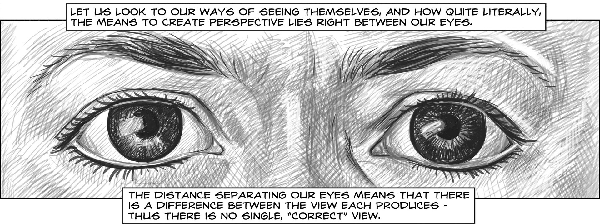
Figure 3.
With this third chapter, “The Shape of Our Thoughts,” I’m
turning from the more general approaches of engaging multiple modes set forth
earlier to specifically take up image and text. The chapter builds to a discussion
of how the comics form works – and why comics are so well-suited to convey and
embody my argument (though that falls outside of the excerpt discussed here).
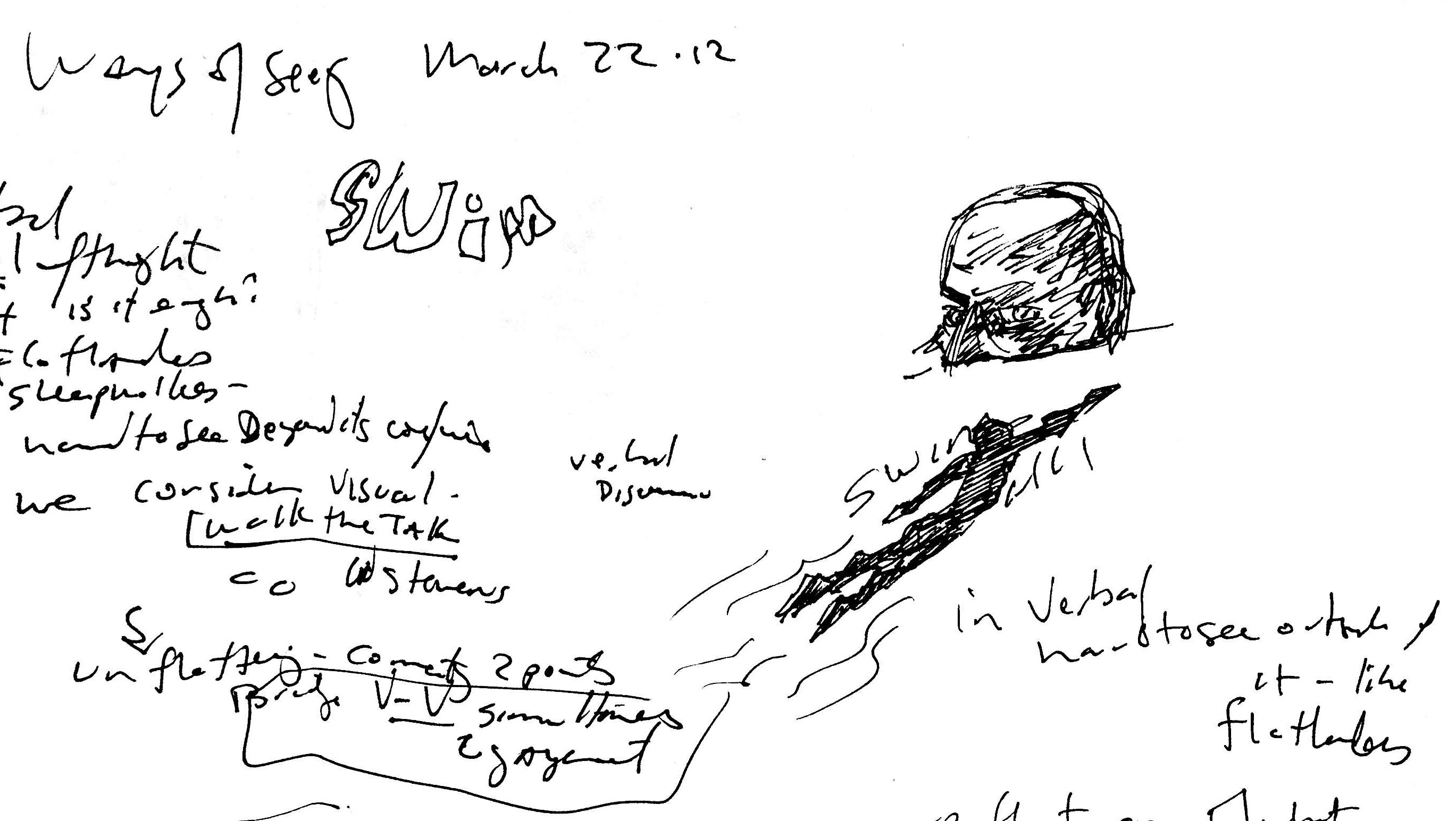
Figure 4.
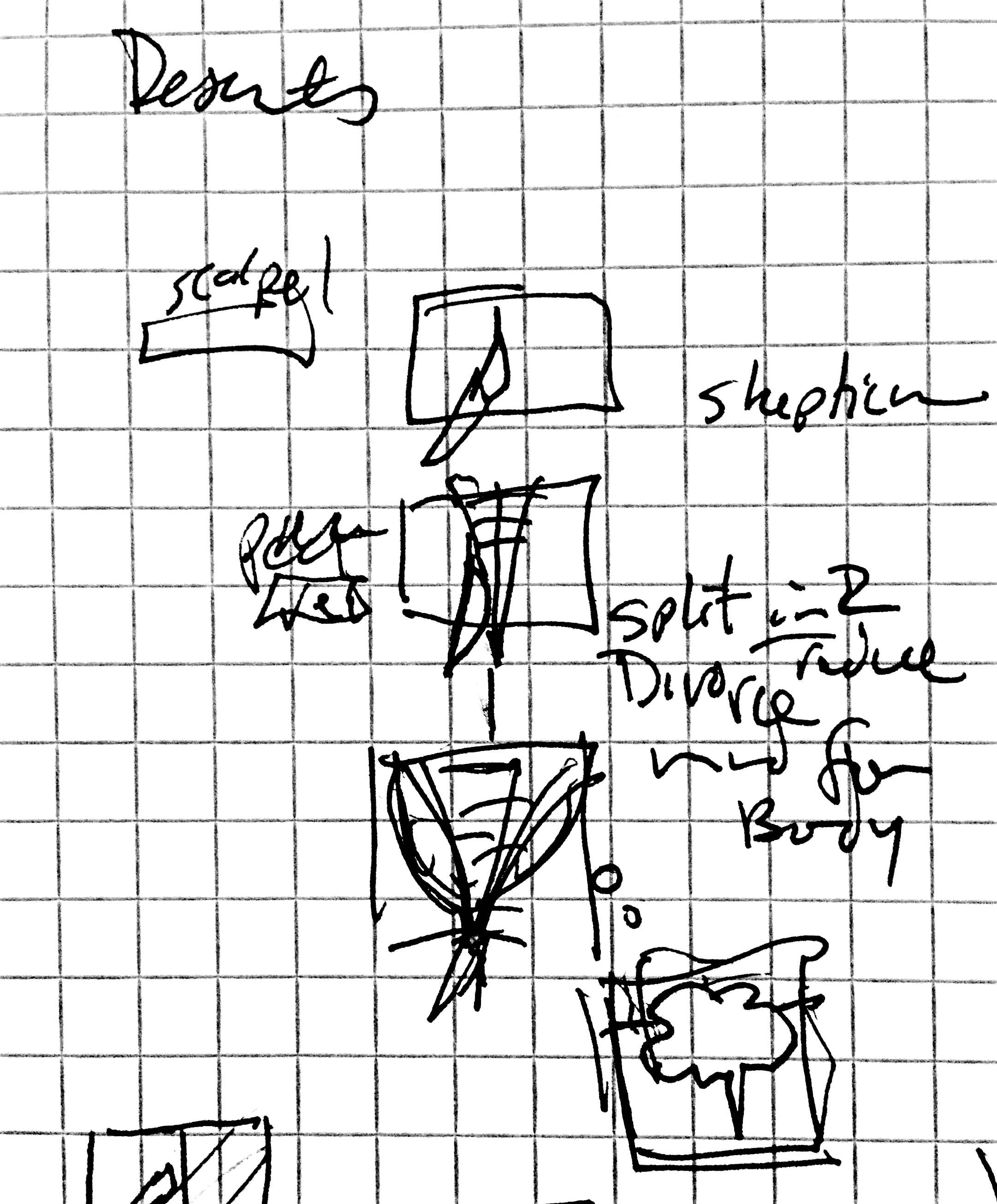
A little overview of my process: I’m frequently asked whether the words or pictures
come first. To which I answer each time, truthfully but not particularly helpfully,
“yes.” From an initial notion, I begin
jotting down notes and images to start to give it substance. It is then, in that
spatial interplay between my visual system and what I’ve sketched that the piece
starts to take shape. The sketches shown throughout this commentary are
representative of that process. Let me also here offer a few general thoughts about
making comics, at least from my perspective. Unlike storyboarding, to which comics
are often compared, working in comics requires a concern not just for what goes in
the panels, but also attention to the size, shape, and location of the panels on the
page – where they are and what they’re next to – really a consideration of the
entire composition as a whole experience. Art Spiegelman refers to this as
“architectonics,” and I think the connection between comics
and architecture and the way both disciplines organize spatial experiences for a
viewer/visitor to move through – is significant. Where a prose document can stop in
mid-thought and continue on the next page – comics can’t – each page needs to be
considered as a whole unit. Its shape (hence the title of this chapter) informs its
content and contributes significantly to the meaning conveyed.
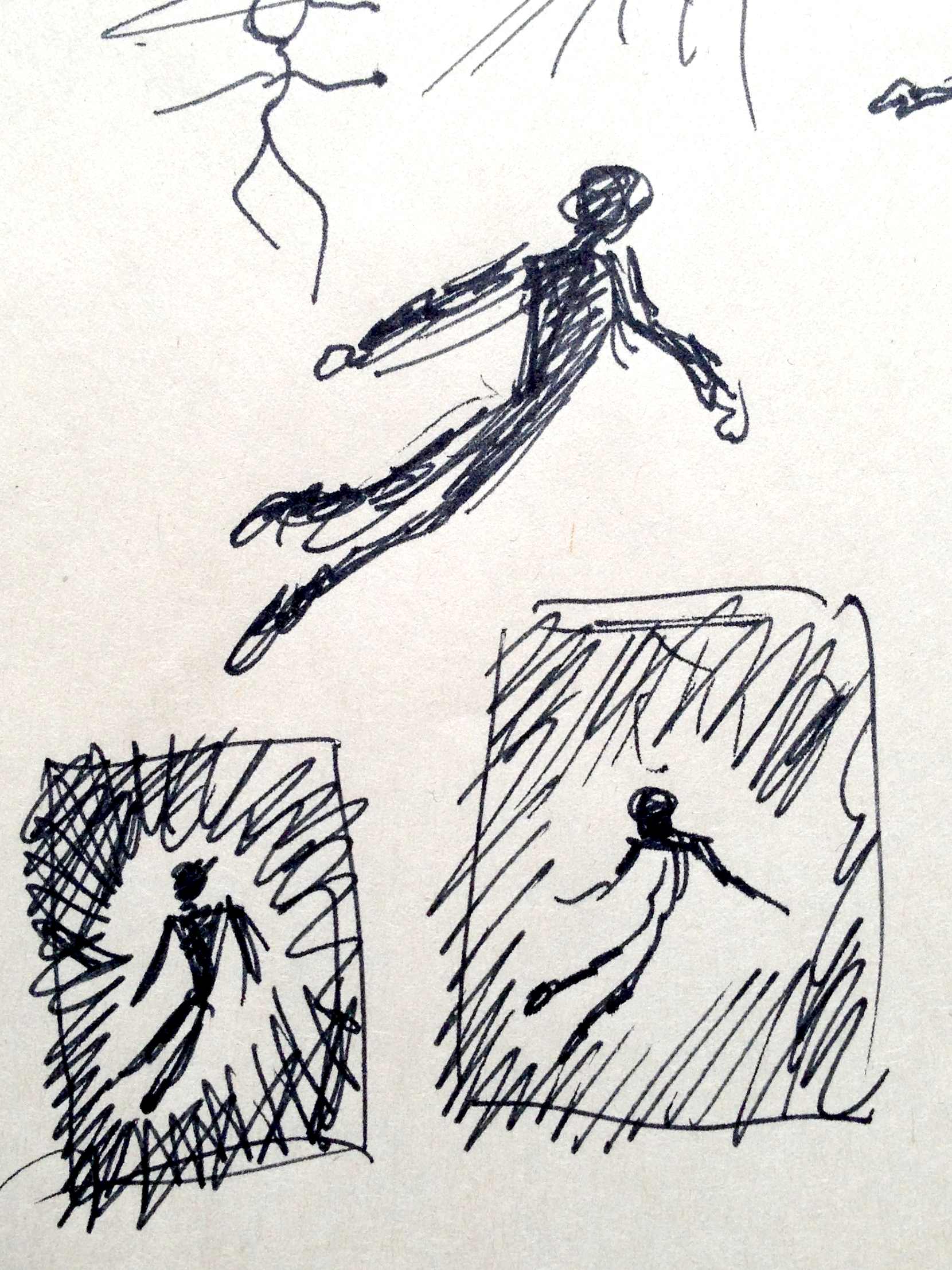
Figure 5.
Okay, on to the specifics: the initial image I sketched for this sequence was the
man’s head partially submerged on what has now become the third page. That partially
submerged image just kept asserting itself and so I moved outward from it as an
anchor from which to build the rest of the sequence. For some time, I’d been toying
with hybridity – specifically amphibiousness – as a metaphor for comics’ capacity
for holding both visual and verbal modes in a single form. The notion that language
is a sea we swim in was also a recurrent image and they complemented one another
nicely.
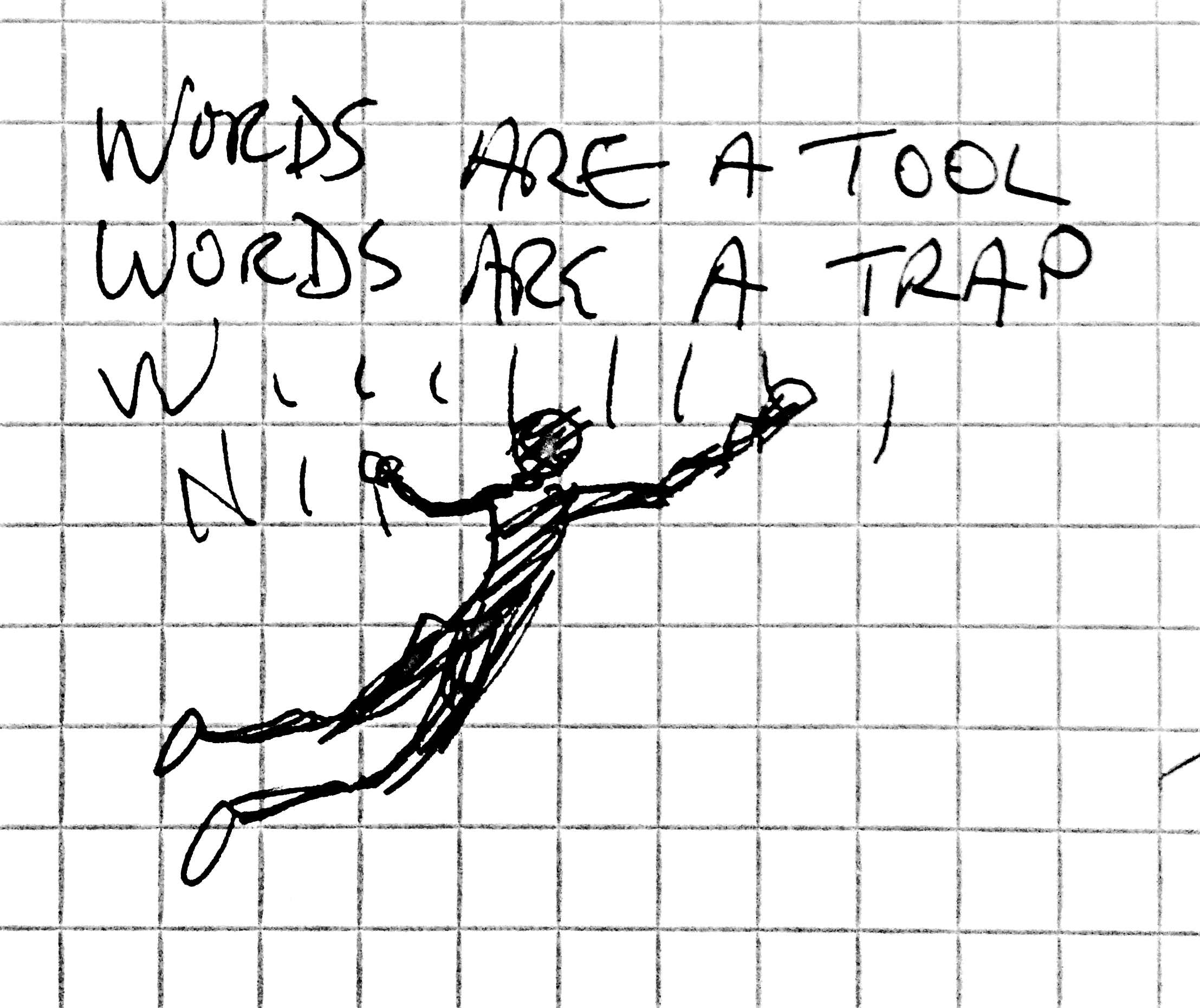 On this opening page, I wanted to draw the focus on this central figure,
impossibly deep, isolated and alone and immersed in his thoughts – this sea is his
entire world. Had this been an essay in text, I would likely have opened with
something about “words are a tool, words are a
trap” – but since the trap aspect is not evident in the imagery, I
shifted that language to another page, and that choice in turn shaped how the
following page came together.
On this opening page, I wanted to draw the focus on this central figure,
impossibly deep, isolated and alone and immersed in his thoughts – this sea is his
entire world. Had this been an essay in text, I would likely have opened with
something about “words are a tool, words are a
trap” – but since the trap aspect is not evident in the imagery, I
shifted that language to another page, and that choice in turn shaped how the
following page came together.
Figure 6.
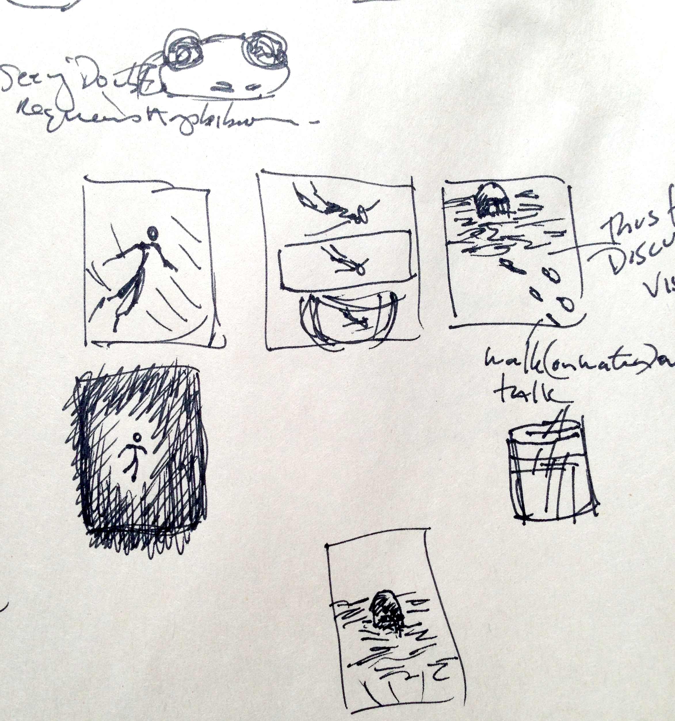
Figure 7.
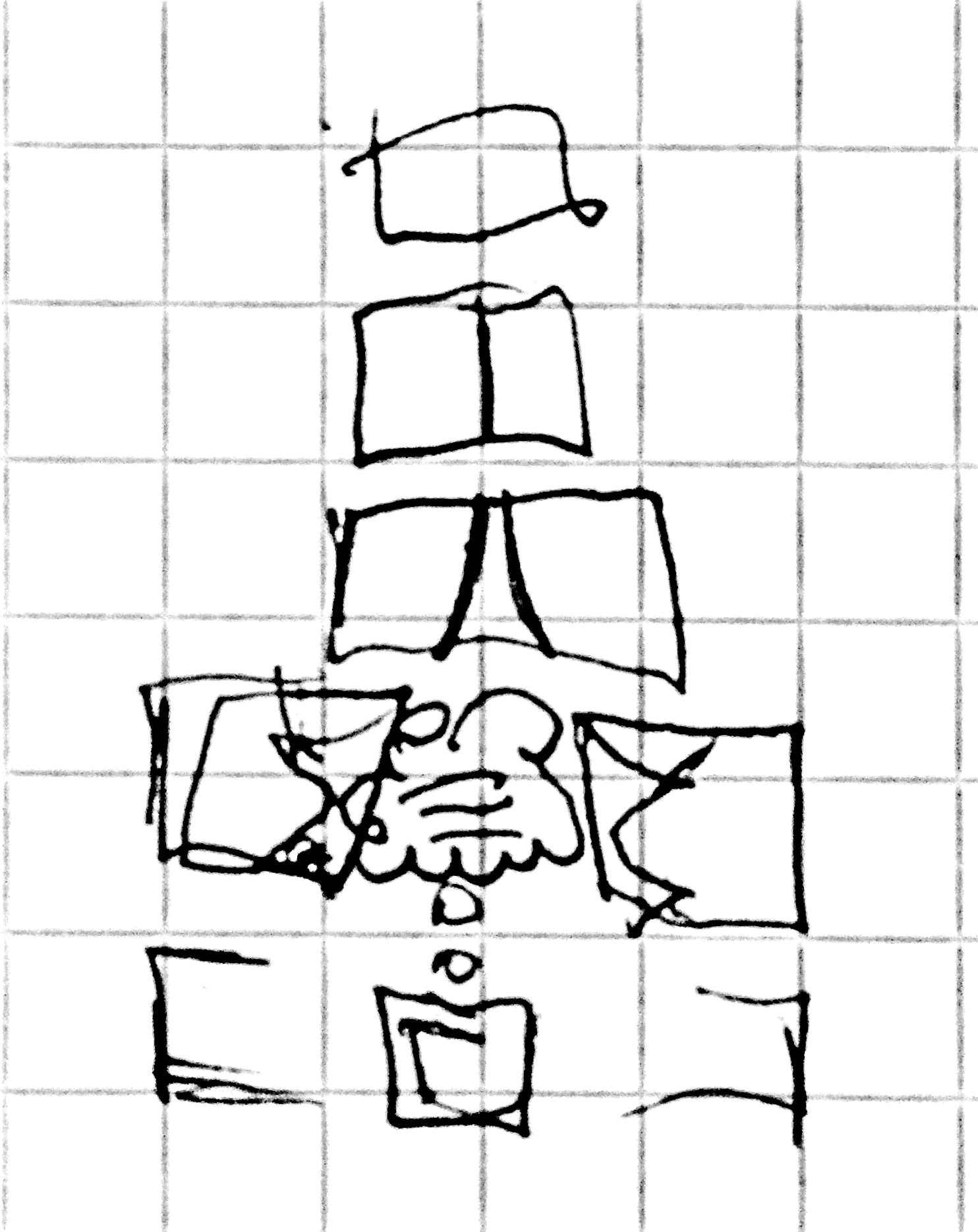
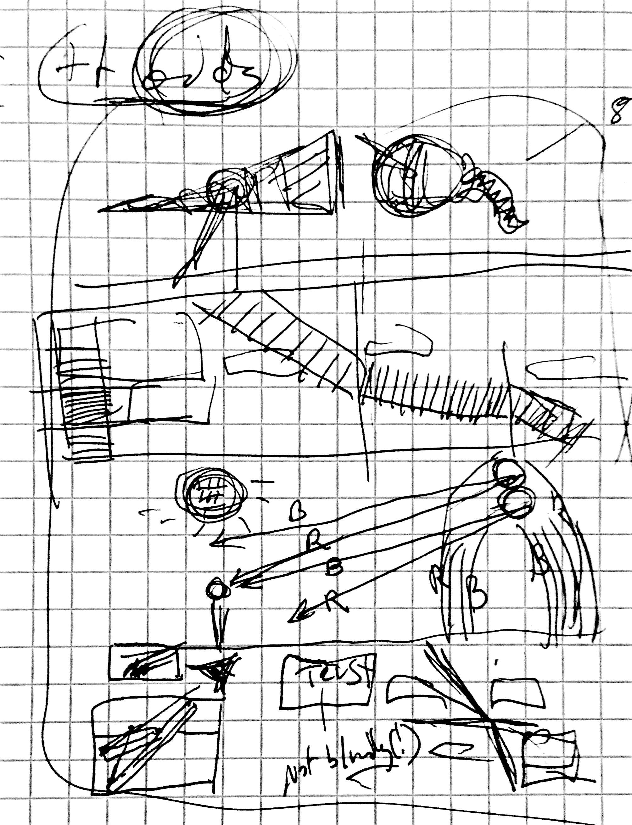
For the second page, I now could show this trap, conceived as a bubble of sorts that
would become evident as we pulled back further. This progression called explicitly
for a sequential series of images. I think my first attempt was to have him revealed
to be in a snow globe. This was ok, but it felt a little forced, and I knew, because
I had this amphibious figure to work towards, that somehow I needed him to emerge
from it, which didn’t work in a globe! Seeking inspiration, I happened to look at
the flowing vine-like glass sculptures my wife created, and saw that that world
inside the solid glass, with air bubbles trapped and frozen within, was a world much
like the one in which I envisioned this figure swimming. This idea was closer – it
had the right feel, if not the right form. As I laid out the three pages in
thumbnail form, I saw the connection between this scene and the close up on the
figure’s eyes in the next page. Of course, it was like a pupil enclosed by the iris!
 Essentially, it matched my earlier sketches of the bubble but now I had a
specific reason for its presence that held the page together. It seems strangely
obvious after the fact – this is all about seeing, how could it not be exactly this
image?! (This revelation reminds me of one of my favorite essays on the creative
process – a short piece by Alan Moore at the back of the collected edition of V for Vendetta. The book, as with most of Moore’s works,
appears to have been made from a perfect crystal, emerged fully formed from his
brow. But the details of the story’s creations as he outlines it, is this bizarre
set of wrong turns, stumbling luck, synchronicitous moments, and the willingness to
keep following along where it took him and artist David Lloyd to arrive at the final
result.) As for the particulars of this page’s layout, text and image are working
tightly together and informing one another. In the top panel, our figure is in the
depths but seems under control. Next, the boundaries begin to be revealed and by the
third panel we begin to see how he’s enclosed in something beyond his awareness.
Descending further, he’s smaller and more adrift than in charge. Finally, the eye is
clearly revealed, and the text returns to talking explicitly about seeing.
Essentially, it matched my earlier sketches of the bubble but now I had a
specific reason for its presence that held the page together. It seems strangely
obvious after the fact – this is all about seeing, how could it not be exactly this
image?! (This revelation reminds me of one of my favorite essays on the creative
process – a short piece by Alan Moore at the back of the collected edition of V for Vendetta. The book, as with most of Moore’s works,
appears to have been made from a perfect crystal, emerged fully formed from his
brow. But the details of the story’s creations as he outlines it, is this bizarre
set of wrong turns, stumbling luck, synchronicitous moments, and the willingness to
keep following along where it took him and artist David Lloyd to arrive at the final
result.) As for the particulars of this page’s layout, text and image are working
tightly together and informing one another. In the top panel, our figure is in the
depths but seems under control. Next, the boundaries begin to be revealed and by the
third panel we begin to see how he’s enclosed in something beyond his awareness.
Descending further, he’s smaller and more adrift than in charge. Finally, the eye is
clearly revealed, and the text returns to talking explicitly about seeing.
Figure 8.
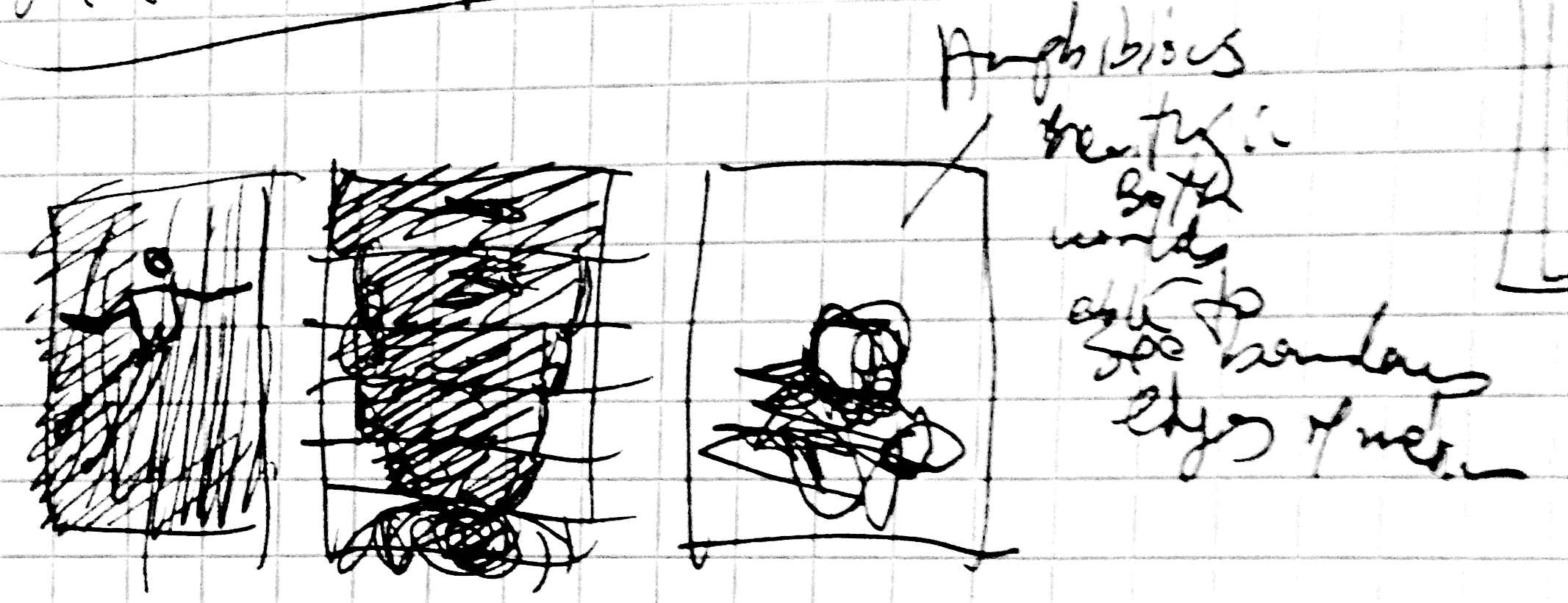
Figure 9.
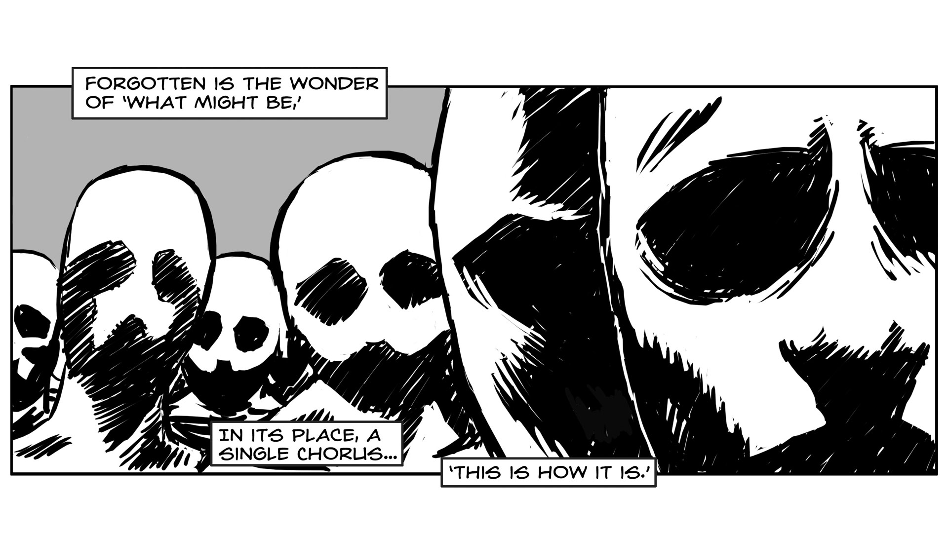
S.I. Hayakawa’s passage that opens the third page is from his introduction to Gyorgy
Kepes’s “Language of Vision,” and his two-page essay
served as significant inspiration for much of this chapter. My text, “to breach the surface…” is the first mention
specifically of the medium I’m working in. Comics as hybrid form. Its denizens must
be amphibious in terms of being at home and able to breathe in either text or image.
Our man remains submerged, not gasping for air. His eye is posed just as the final
panel of the previous page. Has that figure emerged or is he residing still within
himself – creating a loop of sorts. Looking to the text above him – we’re “seeing from other sides.” Again, thinking about
the page as a spatial experience, it is both a sequential reading experience as well
as a simultaneous viewing experience. Here the text is a visual element in terms of
moving our eye through the page. “Text immersed in
image,” came to me early on, but its partner for how to describe what
happens to pictures was more difficult. In an earlier piece, I’d played with the
idea of suggesting pictures in comics as being anchored by words, but I’d left it
out in not wanting to suggest text is more concrete than images are. But here it
came back to me, and the idea that the box would be below the other made it function
a bit like an anchor as well. This led me to recall Roland Barthes and his
description of image-text relations as “anchor” and “relay.” And then the
pieces all came together and I could use “relay” to come back to referring to
the boundaries and give a text reference to “fluid” to accompany the imagery.
It’s both discussion and demonstration at once. The final line is a joke that sets
up the most self-reflexive page of the piece.
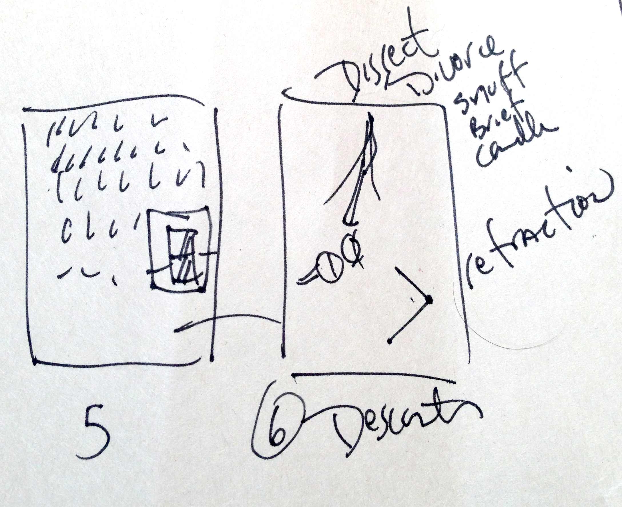
Figure 10.
I knew from the very beginning that at some point in the dissertation, that there had
to be a single page completely in text that looked exactly like a dissertation was
supposed to look. I thought it would be the first page of this chapter, but I think
it worked out more effectively here – the contrast is particularly jarring in the
midst of the narrative. In part this was inspired by conversations in my
dissertation proposal seminar, where colleagues suggested – out of expressed concern
for my behalf – that maybe I should do half in text to explain what I’m doing and
why I’m doing it in comics. As the political implications of this piece became
increasingly apparent, I realized there could be no hedging. In order to truly
demonstrate the form’s legitimacy, I found it essential to go all in. And that was
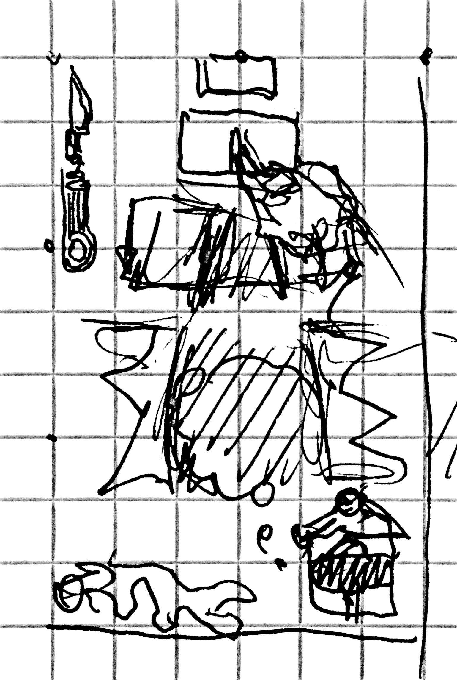
that moving forward. By including the image of the bent pencil, I really wanted
something that looks like and was set apart in just the way an illustration would be
in an academic text. (Though note, the juxtaposition of the text talking about
“mere illustration” and the illustration itself – despite the
form here, I’m still playing with image-text interaction.)
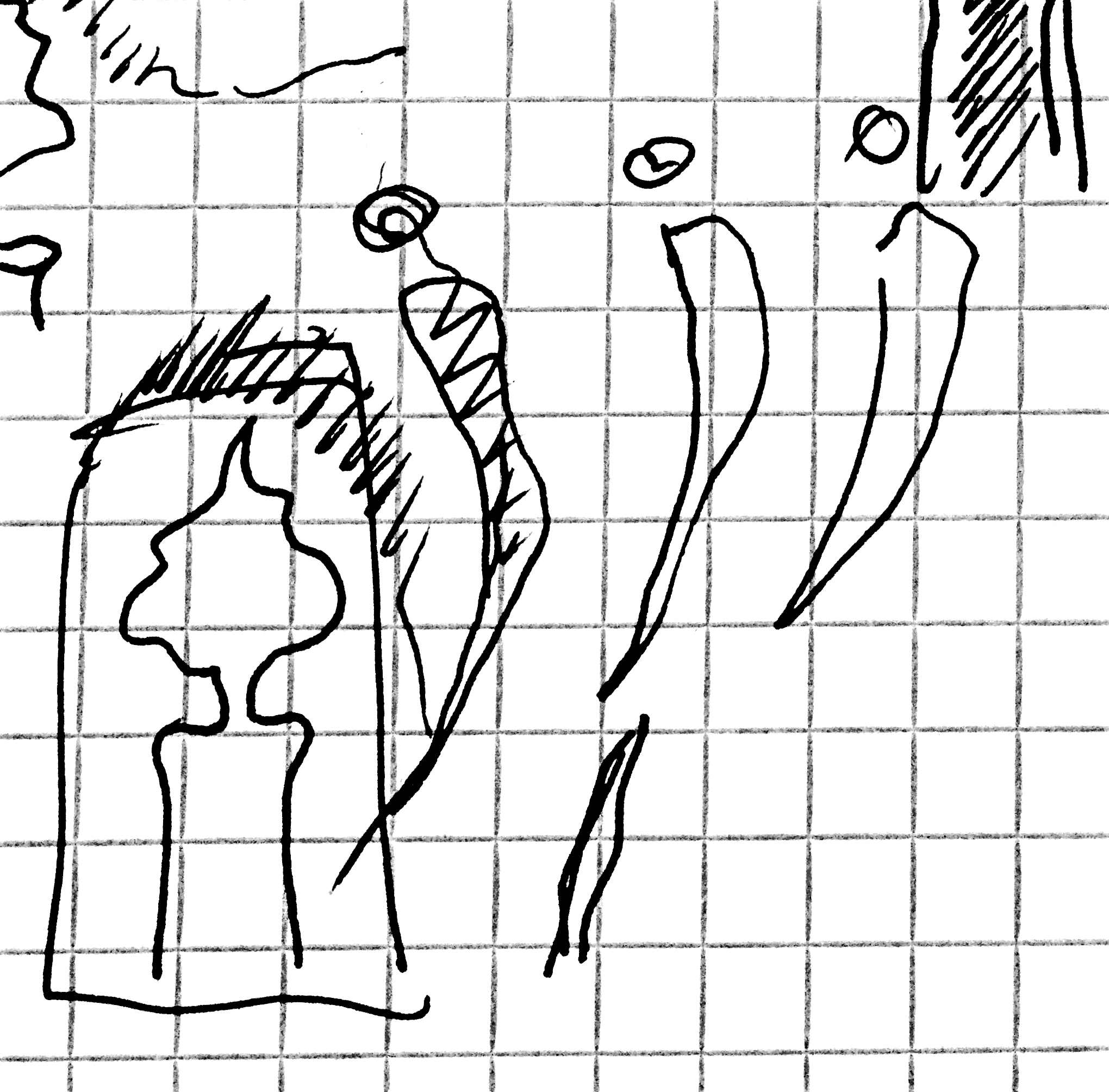 Plato’s cave is tangentially referenced earlier in the narrative, and I
had wanted to revisit that here. Initially, the Descartes discussion was a separate
page, but in thinking on Iris Murdoch’s discussion of Plato’s view of the arts in
her book The Fire and the Sun, I eventually made the
leap to join Plato’s sun/fire and Descartes’ candle, which would in turn provide
light for the cave wall shadows (and this image is plucked from an earlier chapter).
Again, this seems obvious in hindsight, but in the midst of it, it’s just an organic
mess of notes and sketches and some guiding notion that I’m trying to hang onto and
see where it leads. The burning of the page also came late in the process, but I
think that the use of trompe l’oeil holds the whole thing together – and points
strongly to the artificiality of a particular form being held up as what knowledge
should look like.
Plato’s cave is tangentially referenced earlier in the narrative, and I
had wanted to revisit that here. Initially, the Descartes discussion was a separate
page, but in thinking on Iris Murdoch’s discussion of Plato’s view of the arts in
her book The Fire and the Sun, I eventually made the
leap to join Plato’s sun/fire and Descartes’ candle, which would in turn provide
light for the cave wall shadows (and this image is plucked from an earlier chapter).
Again, this seems obvious in hindsight, but in the midst of it, it’s just an organic
mess of notes and sketches and some guiding notion that I’m trying to hang onto and
see where it leads. The burning of the page also came late in the process, but I
think that the use of trompe l’oeil holds the whole thing together – and points
strongly to the artificiality of a particular form being held up as what knowledge
should look like.
Figure 11.
Figure 12.
One more note on this page – when I submitted the dissertation to the office of
doctoral studies for corrections, it came back to me with almost no comments –
except that because this page had a “figure” on it (that bent pencil image), I
needed to have a list of figures denoting it at the beginning of the whole document.
Now, in a document completely made of images, I would have a list of images pointing
to exactly one page – the one with the most text on it of the entire piece and where
I most directly turned to the reader to point out the convention I’m challenging. A
rather delightful irony – and one I think only made my point stronger.
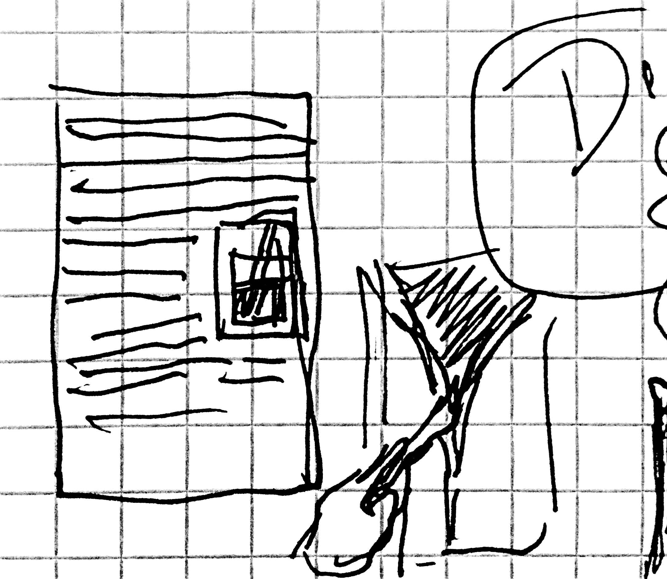
Figure 13.
The page on Descartes and dissection is part of my broader argument addressing the
reduction of the human to the thinking machine – and a removal of the role of the
senses in constituting thought. This had been all combined on a single page with the
page following, but that just kept not working – it was much too tight, so I pulled
it out and gave the idea of dissection and duality their own space. Often breaking
things apart like this has let me look at the images and ideas from a fresh
perspective, and figure out what it is I’m exploring with much greater understanding
than I had before.
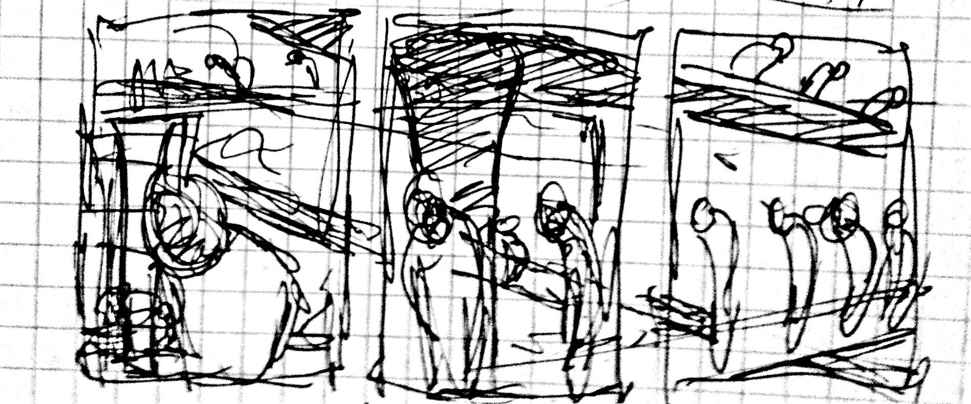
 Even with this clarity, this page still posed some particular challenges.
I wanted to show this incision as unfolding in time and opening up an interior
space.
Even with this clarity, this page still posed some particular challenges.
I wanted to show this incision as unfolding in time and opening up an interior
space.
 But, a knife moving down creates a cut moving upwards – which works
against the way we read it top to bottom – the reveal happens in time rather than in
space as it does in comics.) While I was mulling this over, one of my students in my
class made a sketch of a pattern of upside down “V”s.
But, a knife moving down creates a cut moving upwards – which works
against the way we read it top to bottom – the reveal happens in time rather than in
space as it does in comics.) While I was mulling this over, one of my students in my
class made a sketch of a pattern of upside down “V”s.
 This random image triggered a better solution for how to arrange the
composition. The brain in the vat – half-submerged – is also intended to return us
to the idea of being immersed in the sea that is language, while the dissection
imagery was in part triggered by thinking about dissecting frogs, which in turn
takes me back to thinking about amphibiousness.
This random image triggered a better solution for how to arrange the
composition. The brain in the vat – half-submerged – is also intended to return us
to the idea of being immersed in the sea that is language, while the dissection
imagery was in part triggered by thinking about dissecting frogs, which in turn
takes me back to thinking about amphibiousness.
Figure 14.
Figure 15.
Figure 16.
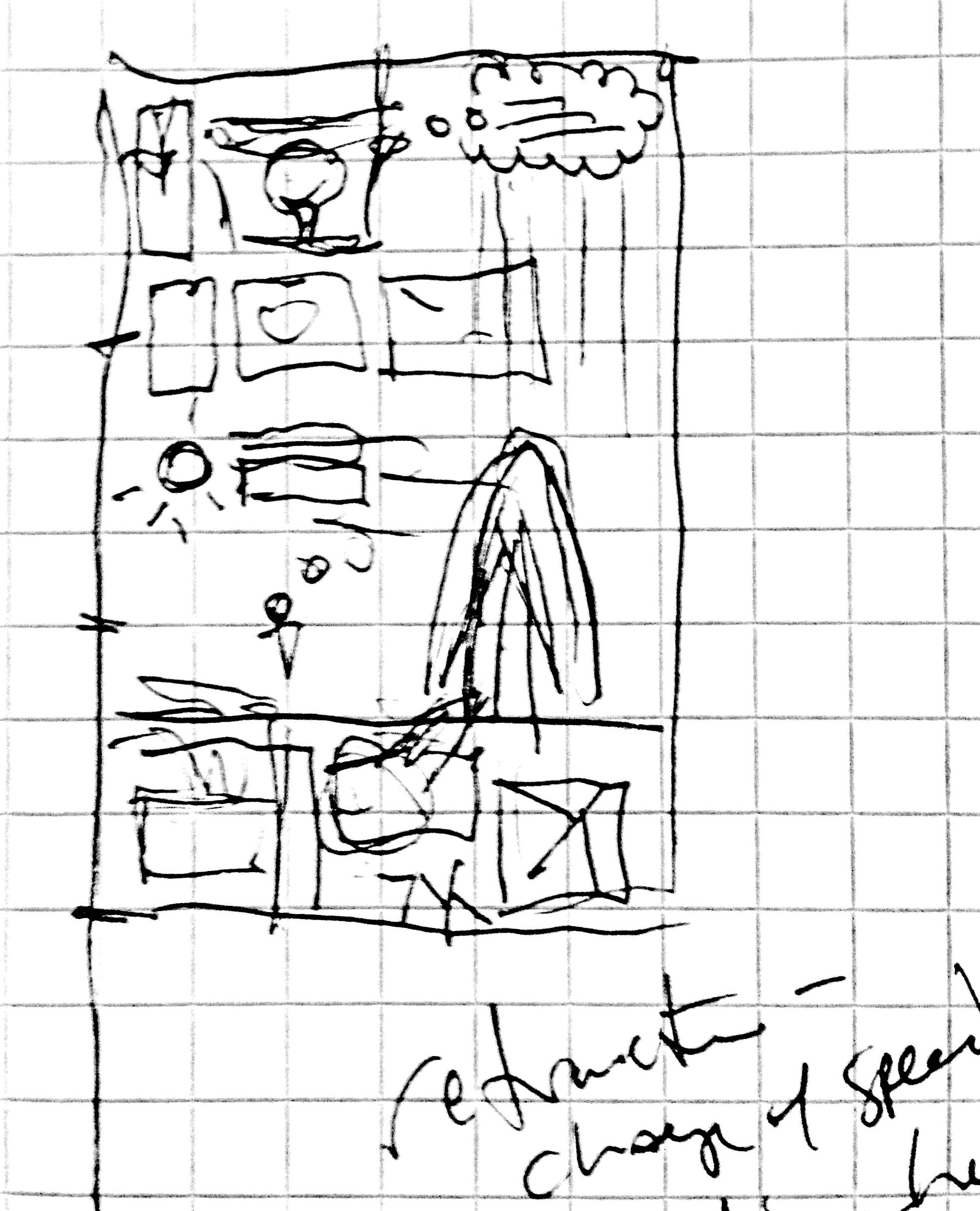
Figure 17.
The concept behind this final page came together as I was figuring out the entire
sequence, and really served as the glue that kept it all from reading as a series of
separate ideas. Reflecting briefly once more on my process, one of the guiding
principles was gleaned from my advisor Ruth Vinz, who places an emphasis on the
“search” in research, and sees it as a journey to follow where one’s
curiosity leads. In this case, I was exploring Descartes’ writings – unaware at the
outset of his role in explaining the phenomenon of refraction. But in coming upon
that, I had my eureka moment tying everything together. This is two-fold.
 First, there’s the James Burke-like aspect of it in terms of a series of
historical “Connections” linking Descartes and refraction as a means of
returning to and responding to Plato’s bent reed example. But still more exciting –
as I’d been referencing air and water throughout the chapter, in injecting the
concept of refraction that occurs between these two mediums, I could also use it as
a metaphor for the interaction of visual and verbal mediums (which continued to be
an important thread running through the rest of the chapter). Breaking into
scientific explanations might seem a bit extraneous, but throughout this work – as
with the concept of seeing perspective or being amphibious – I’m always seeking to
address two things at once. Here, refraction as phenomenon but also the way image
and text bend meaning in their respective ways. Perhaps the most important thing
that has emerged for me in working in the manner that I do, and is strongly evident
in this example, is that in trying to address aesthetic concerns, I’m prompted to do
more research, and delving into the reading pushes me to pursue new images. It’s a
generative cycle and I find it takes me places that absolutely wouldn’t occur to me
were I working only in text. In this regard, I find that comics are not only more
than up to the challenge of presenting serious inquiry, but also they serve as a
powerful thought-space to help expand our research process from the ground up.
First, there’s the James Burke-like aspect of it in terms of a series of
historical “Connections” linking Descartes and refraction as a means of
returning to and responding to Plato’s bent reed example. But still more exciting –
as I’d been referencing air and water throughout the chapter, in injecting the
concept of refraction that occurs between these two mediums, I could also use it as
a metaphor for the interaction of visual and verbal mediums (which continued to be
an important thread running through the rest of the chapter). Breaking into
scientific explanations might seem a bit extraneous, but throughout this work – as
with the concept of seeing perspective or being amphibious – I’m always seeking to
address two things at once. Here, refraction as phenomenon but also the way image
and text bend meaning in their respective ways. Perhaps the most important thing
that has emerged for me in working in the manner that I do, and is strongly evident
in this example, is that in trying to address aesthetic concerns, I’m prompted to do
more research, and delving into the reading pushes me to pursue new images. It’s a
generative cycle and I find it takes me places that absolutely wouldn’t occur to me
were I working only in text. In this regard, I find that comics are not only more
than up to the challenge of presenting serious inquiry, but also they serve as a
powerful thought-space to help expand our research process from the ground up.
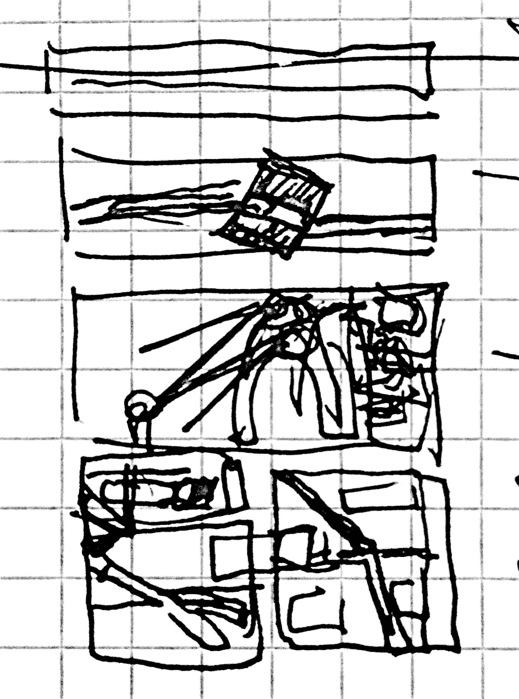
Figure 18.
Figure 19.
– Nick Sousanis
April 24, 2013 / July 29, 2014 /April 4 2015

URL: http://www.digitalhumanities.org/dhq/vol/9/4/000234/000234.html
Comments: dhqinfo@digitalhumanities.org
Published by: The Alliance of Digital Humanities Organizations and The Association for Computers and the Humanities
Affiliated with: Digital Scholarship in the Humanities
DHQ has been made possible in part by the National Endowment for the Humanities.
Copyright © 2005 -

Unless otherwise noted, the DHQ web site and all DHQ published content are published under a Creative Commons Attribution-NoDerivatives 4.0 International License. Individual articles may carry a more permissive license, as described in the footer for the individual article, and in the article’s metadata.
Comments: dhqinfo@digitalhumanities.org
Published by: The Alliance of Digital Humanities Organizations and The Association for Computers and the Humanities
Affiliated with: Digital Scholarship in the Humanities
DHQ has been made possible in part by the National Endowment for the Humanities.
Copyright © 2005 -
Unless otherwise noted, the DHQ web site and all DHQ published content are published under a Creative Commons Attribution-NoDerivatives 4.0 International License. Individual articles may carry a more permissive license, as described in the footer for the individual article, and in the article’s metadata.
