Abstract
This article reviews the difficulties of editing the “Comics
as Scholarship” special issue by contextualizing the history of
comics studies in English departments and the complexities of incorporating
scholarly multimedia into the digital humanities.
In the July 2014
Critical Inquiry special issue devoted
to “Comics and Media,” editors Patrick Jagoda and Hillary
Chute discuss their interest in “meticulous attention to the materiality
comics instantiates”
[
Chute and Jagoda 2014, 1–2]. “Comics and Media” combined articles, interviews,
and discussions about comics in textual form with several full-color comics by
numerous artists like Alison Bechdel, Lynda Barry, Seth, and Phoebe Gloeckner, among
others. With such a lineup, the editors felt that the issue should also express
“its own commitment to the physical
object by publishing at a larger size (7x10) and in full color
throughout,” to distinguish “it from any other issue in the history
of
Critical Inquiry”
[
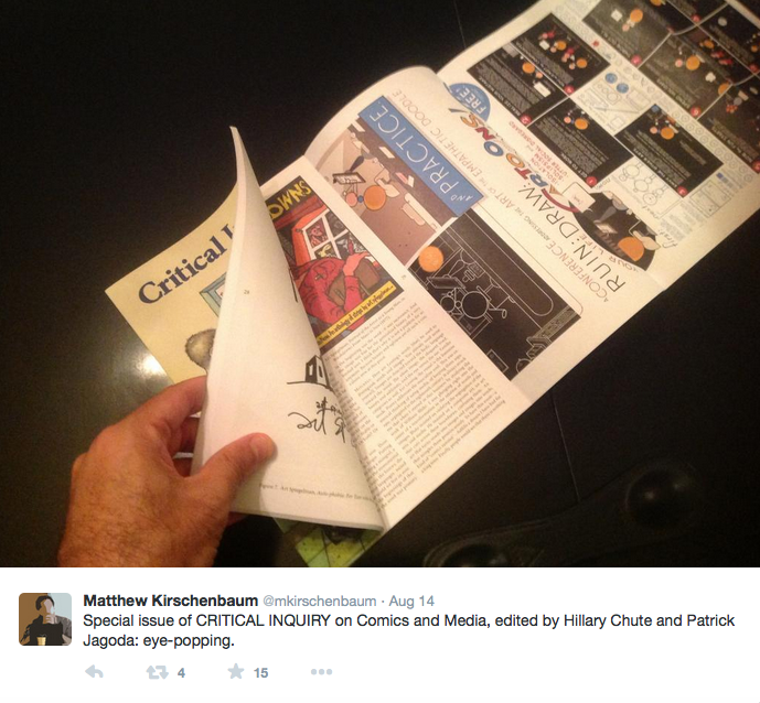
Chute and Jagoda 2014]. The issue is a beautiful physical object, with a large fold-out section
depicting Chris Ware’s poster to Chute’s 2012 “Comics Philosophy
and Practice,” a conference at the University of Chicago that provided
much of the material for the issue. Ware’s poster, entitled “A
CONFERENCE addressing the ART of the EMPATHETIC DOODLE,” not only
advertises the conference, it uses Ware’s typical form of satire in order to
describe the process of becoming a comic artist. “Ruin Your Life, Draw Cartoons! and Doom
Yourself to Decades of Grinding Isolation, Solipsism, and Utter Social
Disregard”
[
Ware 2014]. With 97 color plates occupying its 272 pages, a great portion of the book is
reserved for color illustration. The finished object was so “eye popping” that digital humanities scholar Matt
Kirschenbaum published a photo of the piece on Twitter the day he received the issue
[
Figure 1, [
Kirschenbaum 2014]].
[1]The brilliant physical presentation of “Comics and Media”
created several problems for its digital archiving and dissemination. University of
Chicago Press lists the price of the physical book at $30.00, while amazon.com sells
it for $28.50. For academics looking to access the issue electronically, JSTOR
publishes each of the articles and images as PDFs. Additionally, a Kindle version of
the journal issue is available for $9.99 and it is also archived on Scribd. Each of
these editions proves a poor substitute for the tactile fold-out grasped by
Kirschenbaum in his tweet, often handling the images as oversized JPGs or
downloadable PDFs. The Kindle version offers a larger scrollable image of the
poster, and yet the JPG used in that version is not high resolution and quickly
pixelates the smaller print abounding on Ware’s strip. JSTOR offers a much better
image, but the image also appears on its side when first downloaded and must be
rotated. To read Ware’s writing, the resolution must be increased to at least 200%
of its original size.
In addition, many questions emerge about the long-term archiving of the issue. It is
largely impossible to search for Ware’s poster by keyword or as a distinct object
apart from its placement in the
Critical Inquiry issue.
Whereas, for instance, Ware’s panel with Seth, Daniel Clowes, and Charles Burns
titled “Graphic Novel Forms Today” is easily accessed on
the MLA database with any of a number of subject searches, the poster doesn’t even
emerge on an author search for “Ware, Chris.” The metadata associated with
Ware’s contributions to the issue cover only three general subject terms: “Subject
literature: American Literature,”
“Period: 1900-2099,” and “Genre: Periodicals,” in addition to two skimpy
topic keywords: “The New Yorker” and “the role of cover illustration.”
Presumably, most of these keywords refer to Ware’s work providing covers for several
issues of
The New Yorker, none of them reflecting the
cynicism or the typographic, sequential, and print media brilliance of the fold-out
poster. As John Walsh’s description of Comic Book Markup Language shows, the
complexities of sequential art require a rich language for keyword searches. “A large corpus of digitized comic books, along with
encoded transcriptions and descriptive metadata,” Walsh argues, “would allow scholars to search the text of comic
books, search for keywords related to topics of interest, search for the
appearance of particular characters, or search for works by particular writers
and artists.” And if such a rich vocabulary is fully exploited, Walsh
continues, more complex searches would be possible along with “other forms of computer processing and
computational analysis — based upon structural aesthetic, and informational
and documentary features peculiar to the genre of comic books”
[
Walsh 2012].
Such complexities are not critiques of Jagoda and Chute’s issue, but they do suggest
that however much scholars write about comics and invite authors to discuss comics —
a whole set of institutional and technological divisions between the comics
industry, digital media, and academia continue to make such collaborations
difficult. When we began the process of editing a special issue of Digital Humanities Quarterly devoted to “Comics as Scholarship,” we believed such difficulties were
limited to the traditional scholarly preference for working in written text. But we
found that we overestimated the ability of digital technology to bridge those
divisions. What follows is a discussion of our three-year process editing this issue
as an introduction to the opportunities and complexities of producing comics as
scholarship, and the role of the digital humanities in either facilitating or
resisting such a project. Along the way, we’ll investigate the history of comics
studies and its need to justify itself as a literary discourse as symptomatic of the
difficulty English departments have in considering multimedia as legitimate either
as a form of communication or as an object of scholarship. We argue that these
difficulties have a central role in understanding the place of multimedia in the
digital humanities, and the future of comics as scholarship.
Multimodality, Comics, and the Digital
It is by no means obvious that a special issue tied to the production of comic
books belongs in the journal
Digital Humanities
Quarterly. Despite many commitments by digital humanities scholars
to new forms of scholarly communication, Douglas Eyman and Cheryl Ball point out
that the digital humanities continues to largely focus on textual markup and
digital archival work. Consequently, “no coherent body of scholarship
[exists] that offers a sustained analysis of scholarly multimedia and
its growing impact on digital scholarship in the humanities”
[
Eyman and Ball 2015]. In fact the most promising scholarship on the affordances of comics as a
form of communication comes from the field of multimodal composition. Dale
Jacobs, for instance, explores comics as a unique method for teaching multimodal
literacy and draws from the New London Group’s suggestion that, in Jacob’s
words, a “burgeoning variety of text
forms associated with information and media technologies” require a
broader definition of literacy and writing [
Jacobs 2013]
[
New London Group 1996]. Further, Emily Wierszewski underlines the importance
of producing comics for teaching multimodality to students, suggesting that the
process develops “a working
understanding of commonly used conventions [...] and the attendant values
and effects” involved in modalities that use a variety of images to
tell a story [
Wierszewski 2014]. While both Jacobs and Wierszewski
focus on students and media production, they do not apply the practices to the
production of scholarship — both of which are written mostly in scholarly prose
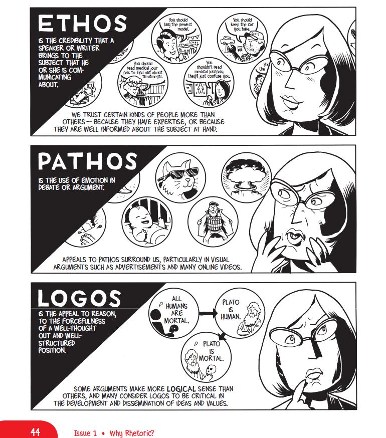
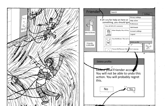
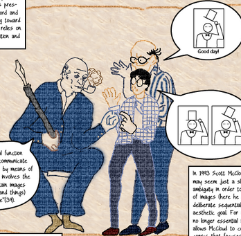
with few illustrations. Elizabeth Losh, Joshua Alexander, Alexander Canon, and
Zander Canon’s
Understanding Rhetoric: A Graphic Guide to
Writing, on the other hand, uses the comics form to communicate the
basics of rhetoric [
Figure 2].
The artistic style of
Understanding Rhetoric is
deliberately cartoony, reflecting Zander Canon’s work in his long-form
serialized comic
Heck where caricature reveals the
creepiness of a descent into Hell underneath an old house.
Understanding Rhetoric uses overemphasis, for instance, to reflect
the character of different rhetorical appeals on the visual representation of
Losh’s mood. In an interview on the blog
Reading with
Pictures, Alexander discusses how writing the book as a graphic
novel caused them to rethink many assumptions they had about scholarly
communication. Alexander explains that while “graphic books are often narratively driven through
dialogue,” he and Losh found themselves “relying heavily on text bubbles that narrated in a
‘universal’ voice.” Instead of using the
graphic form to illustrate the rhetorical lessons in the book, they were using
“expository communication,”
consequently “[e]ntire chapters had to
be rewritten to recast our exposition into dialogue”
[
Losh, Alexander, Cannon and Cannon 2013]. While considering the various affordances of
different modalities of scholarly communication, these composition scholars have
been able to use comics both as a pedagogical aid and as a communicative device
for exploring different forms of expression.
Still, for all of the commitment to the sequentiality and visual rhetoric of
comics, scholarship has yet to fully account for the remediation of comics as a
digital form. Many digital comics are direct translations of print, but
digitizing comics offers the opportunity to embed additional information, a
point Jaime Lee Kirtz illustrates in her study of paratextual elements like the
image processing that occurs when comics are made using Adobe Photoshop or
hyperlinks embedded in Kindle and iBook versions of comics that connect readers
to information about characters and creators [
Kirtz 2014]. The
relationship of comics with digital modalities has primarily been focused on the
web as a medium for distribution that allows for niche and independent comics
outside of traditional publishing models, taking the zine scene and its direct
distribution to the amplified modality of the web. Many comics produced for the
web are commonly referred to as “webcomics” thanks to their
mode of distribution, but as a medium they only rarely take advantage of what
the digital form offers them. Such webcomics typically take their formal
constraints either from the daily newspaper (as in Scott Kurtz’s
PvP, Ryan North’s
Dinosaur
Comics, Mike Krahulik and Jerry Holkins’s
Penny
Arcade, and Nicholas Gurewitch’s
Perry Bible
Fellowship), while others use the page layout of comic books
(Brennan Lee Mulligan and Molly Ostertag’s
Strong Female
Protagonist, R.K. Milholland’s
Something
Positive and Katie Cook’s
Gronk). Scott
McCloud famously proposed that comics would abandon the metaphor of the page
thanks to digital affordances in 2000, when he suggested that the screen could
act as an “infinite canvas”
[
McCloud 2000]. The continued popularity of comics online that could just as easily be
conveyed in print seems to contradict Scott McCloud’s vision.
The affordances of the web that have been most readily adapted are, in most
cases, less obvious: comics such as
Willis’s
Shortpacked, for instance, use mouseover text to add a second
punchline to the comic [
Willis 2005]. Zach Whalen has noted that
many webcomics make use of additional integrated elements of interactivity or
animation, like those of the Korean artist Horang, who programs webcomics that
take hold “of the browser’s scroll
function” and move “rapidly through a series of carefully juxtaposed images” in order to
startle their viewers [
Whalen 2012]. One of the most notable
examples of an animated comic that takes advantage of the digital medium is
Andrew Hussie’s
Homestuck
[
Hussie 2009]. The comic has included a range of multimodal
aspects (GIFs, chat logs, and Flash games and animations) and has a very strong
fan following. The story concerns a video game discovered by a group of
teenagers, and a Kickstarter campaign was funded to produce a video game around
the comic’s narrative. Such successes demonstrate that the addition of the web
modality to the comic form can transform the core interaction of the experience.
The interactive approach taken by Hussie in
Homestuck does not much resemble Scott McCloud’s prediction of a
comics form that would break out of the traditional page: while sections of the
comic are experimental and hybrid, the primary approach is still very much a
printed comic page. El Santo critiqued Scott McCloud’s proposal for the future
of comics by suggesting that an infinite canvas or scrollable page provides “too much information at once in a
medium that’s drowning in it”
[
El Santo 2009].
Yet despite this criticism there are several examples of scrolling comics,
including Emily Carroll’s “His Face All Red” (2010),
a vertical scrolling comic depicting a wolf hunt; and Drew Weing’s “‘Pup’ Ponders the Heat Death of the Universe”
(2003), which employs scrolling in both directions for exploring the scale of
the universe. These resemble Scott McCloud’s own infinite canvas comics, which
include his own meta-series of “Can’t Stop Thinking”
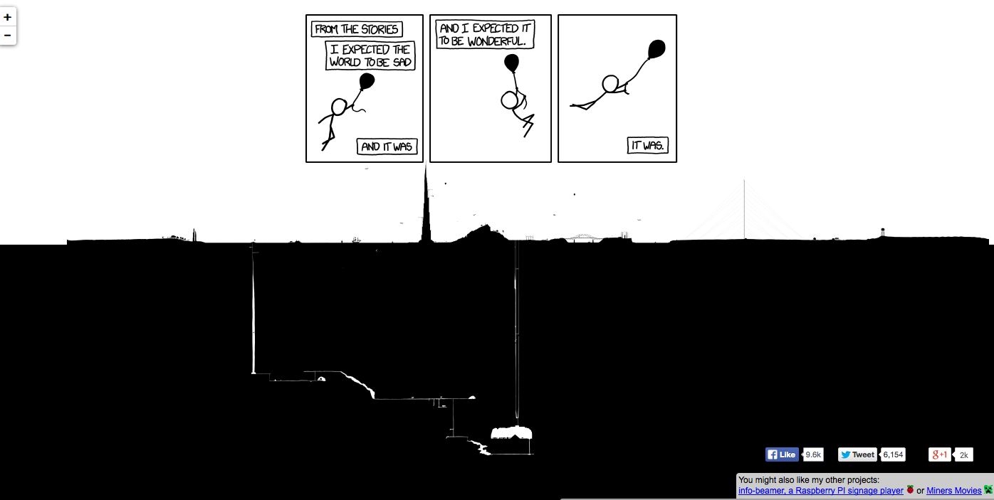
comics reflecting on the practice itself. Randall Munroe’s “xkcd” comics have offered some of the most compelling examples of
where these forms might lead. Munroe’s “Click and
Drag”, for instance uses an infinite canvas contained within a single
frame [
Munroe 2012a]. “Click and Drag”
had an explorable panel ranging from space to underground and offering so much
content that Florian Wesch’s Google Maps adaptation offers the best interface
for viewing it in its totality [
Figure 3, [
Wesch 2005]].
According to Erik McClure, the map is about 165888 pixels wide. He continues that
if an average human being were the size of one of the characters on the map, it
would take them “1.67 hours to walk from one end
of the image to another” and if the author “spent, on average, one hour
drawing each frame, it would take him 9.375 days of constant, nonstop
work to finish this. If he instead spent an average of 10 minutes per
frame, it would take ~37.5 hours, or almost an entire 40-hour work
week”
[
McClure 2012]. “Click and Drag” maps out an entire
underground civilization and features references to Mark Z Danielewski’s
House of Leaves, Super Mario Bros., H.P. Lovecraft,
and geeky programming humor. One frame, for instance, says “If you’re fencepost errors I feel
bad for you, son — I got 99 problems but somehow solved 101”
[
Munroe 2012a]. Fencepost problems point to simple errors where intuitive solutions to
programming problems might be one or two values off. The comic caused many
conversations online, and perhaps the most contested revolved around how Munroe
created it. Several readers thought that he simply created a programming script
that distinguished the space below and above the horizon, and filled those
spaces with black and white respectively. They expected, in other words, that
clicking on individual tiles would return a 404 error saying that they did not
exist on any server and were spontaneously generated by the script. Luis Montes
reports on a Google Plus post that he used HTML 5 canvas to stitch the tiles
together and reconstruct the image as a whole. “Firefox and Chrome both barfed on 225 (non-empty) huge tiles,”
Montes says, “so i had to scale them down first
with mogrify to 64x64 to even paint the thing on a 5120x2048
canvas”
[
Montes 2012].
The widespread interest from comic fans, programmers, and social media
commentators surrounding “Click and Drag” point to
the power comics have to reach multiple audiences, particularly when they are
enhanced with digital technology. Munroe’s “Time”
shows yet another possibility, in which he embeds 3,099 images in a single panel
that changed every thirty minutes. The comic inspired a devoted community that
followed the story as it unfolded from March to July 2013, complete with
messages in a writing system called “Beanish” that
followers had to decipher. The actions of those readers and their intense study
of the comic’s embedded texts and backstory are not unlike the labors of a
digital humanities project — with the forum conversation surrounding the comic
exceeding over 1,300 pages of commentary. An entire conversation emerged on the
xkcd forum when the first panel appeared on March 25, with the first poster
“rhomboidal” commenting that the comic seemed to communicate the idea “that while time might appear
to be a strictly linear phenomenon, its manifestation as life is
actually a profoundly open, richly holistic, poly-temporal intercreative
experience with many points, narratives, and interpretations as there
are participants in it”
[
rhomboidal 2013]. Such a description, while missing the point of most of the narrative
that followed, serves as a powerful commentary on the way digital comics can
inspire further creative expression. One fan, James Pryor, was inspired enough
to create “Time — at your own pace” in which the
panels of the comic could be scrolled through using a mouse-wheel instead of
relying on the time-based algorithm of the original comic. Fans also produced a
wiki-guide to the comic, a glossary of the world and its inhabitants, and wrote
songs relating to its themes [
Pryor 2013].
As we continue to consider the place of comics within the digital humanities, it
is worth noting that many of the creators working with digital comics are
careful to separate such artifacts from animation or other digital media. Comic
author Mark Waid, one of the more vocal digital comic enthusiasts, argues that
“the only place I stop short is at the
addition of voice, music, or anything else that takes the full and total
control of time away from the reader,” which he feels is an “essential” and “inviolate” element of comic books. Of course, Waid’s
distinction would rule out comics like xkcd’s “Time,”
and yet even Lara Hudson — commenting on Munroe’s comic — argues that the
temporality of the piece was “glacially slow for
animation, but imbued with a continual sense of motion that felt utterly
unique for a comic” [
Waid 2012]. It is clear from these comments that comics
continue to inhabit a liminal space between readerly narratives and animated
features that make them difficult to place for creators, critics, and scholars
alike.
When we recall the early publishing history of comics, which were closer to the
pulp ephemera of newspapers and cheap penny dreadfuls than to the elite literary
publications traditionally celebrated in English departments, it’s easy to see
this confusion.
[2] Donald Ault, who started teaching and
researching comics at Berkeley in 1972 and at Vanderbilt in 1978, recalls that
“Comics were the ‘whacko’
kinds of things that the news media expected would be taught at a
‘radical’ institution like Berkeley, where I had
acquired what I considered to be a badge of honor when Stephen Greenblatt
proleptically dubbed me ‘the Departmental trash
man.’” The technological situation at Berkeley also lead to
situations in which finding and distributing comics became increasingly
difficult:
Back issues of comics were not yet
readily available in quality reprints [...] so I had to put my own
copies on reserve in the library. When these photocopies were stolen, I
had to resort to putting photocopies on reserve. When the photocopies
were stolen, I realized some more secure framework, along the lines of
special collections or rare books had to be devised if the course were
to be practical at all.
[Ault 2003]
[3]Ault would go on to found
ImageTexT: Interdisciplinary
Comics Studies in 2003 the first online open access journal on
comics and cultural theory. It is our contention that — in 2014 — the
difficulties surrounding the
composition of comics in scholarly
contexts is less technological and more social. The institutions of scholarly
publishing, with some notable exceptions, continue to favor written prose to the
detriment of new technological possibilities that would make comics more favored
as a form of communication. As Anastasia, along with Nick Sousanis, Paul
Tritter, and Tom Neville recounted in a panel called “Expanded Forms of Scholarly Inquiry” at the
Imagining America: Arts and Scholars in Public Life 2012 conference
in New York City, these assumptions lead to problems like: accessing alternate
forms of scholarship in archival spaces, the demands on creators working with
expressive and analytic acts in different modalities, and the difficulties of
evaluating such forms given the dual demands of scholarly and artistic merit
[
Salter, Sousanis, Tritter, and Neville 2012]. As we chart the history of this issue,
we’ll look for inspirations and note specific limitations that resulted in the
shape of “Comics in Scholarship.”
THATCamp and Experimental Pedagogy
The idea for this issue was born out of a 2012 THATCamp session proposed by
Anastasia and attended by Roger entitled “Comic Books +
Playing with Scholarship”
[
Salter 2012]. THATCamp has traditionally been an entry point for
many scholars into digital humanities discourse, making it a particularly
productive ground for interdisciplinary projects and experimentation. The
THATCamp Comic Books session was inspired by existing examples of comics that
act as scholarship, a tradition best known through the work of Scott McCloud and
exemplified by some of the work in Jagoda and Chute’s “Comics and Media” issue. Other examples can be productively drawn
from outside of typical academic discourse. Art Spiegelman’s
MetaMaus, and, indeed, the historical and journalistic
work of
Maus itself, is frequently cited as a
central text on the Holocaust and the ultimate example of a comic book that
transcended genre to be hailed as a canonical text. In a similar vein of
intertwining journalism and scholarship, Mary Talbot and Bryan Talbot’s
Dotter of her Father’s Eyes examines the life and
influence of James Joyce’s daughter Lucia. Bryan Talbot is well-known for his
graphic epic
Alice in Sunderland, a work that
combines fiction, history, and myth to consider
Alice in
Wonderland as part of a web of literature.
From these initial influences, those of us gathered at the THATCamp “Comic Books + Playing with Scholarship” session
discussed a potential moment of convergence for scholars interested in comics as
a form for production as well as analysis. First, while journals specializing in
scholarly multimedia like
Kairos: A Journal of Rhetoric,
Technology, and Pedagogy,
M/C: Media and
Culture, and
MediaCommons have existed
for some time, the rise of interest in open access and alternative publishing in
the humanities that correspond with the needs of DH scholars makes publishing a
work in comic form a greater possibility than perhaps ever before. Second, more
accessible forms of digital production tools make the act of creating multimedia
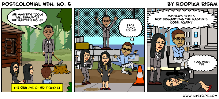
works easier. For instance, Roopika Risam, Anne Cong-Huyen, and Adeline Koh
employed the comic application Bitstrips to produce short, humorous, and rapid
postcolonial interventions into the digital humanities community [
Figure 4].
Risam’s strip exploits the ability of Bitstrips to show a wide variety of
expressions with a relatively limited amount of character poses and emotive
choices. In “Postcolonial #DH, No. 6” Risam uses
humor and different forms of technology to enact Audre Lorde’s well-known
critique of Franz Fanon’s optimism regarding the use of “the master’s tools” to contest colonialism. As Lorde
argues, “the master’s tools will never
dismantle the master’s house. They may allow us temporarily to beat him
at his own game, but they will never enable us to bring about genuine
change”
[
Lorde 1984]. The optimism shown by the characters in the strip soon turns to
frustration, with Risam rolling on the floor overwhelmed by “too. much. css”
[
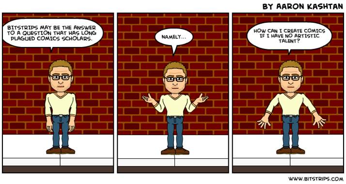
Risam 2013]. Aaron Kashtan, whose work is featured in this issue, sees Bitstrips
enabling his own practice-based experimentation in comic studies and media
studies. Connecting its use to a “long tradition
of using the comics medium to theorize itself” epitomized by Scott
McCloud’s
Understanding Comics and Wil Eisner’s
Comics and Sequential Art, Kashtan says that “my artistic talent is very
limited and [...] without tools such as Bitstrips and Comic Life, it
would be prohibitively difficult for me to engage in this sort of
theoretical exploitation”
[
Kashtan 2013]. While Kashtan's work suggests that such tools can make the visual and
symbolic rhetoric of comics accessible to the "non-artist," it is also a
reminder that when the medium theorizes itself it will likely be evaluated on
aesthetics alongside scholarship.
Third, graduate students are beginning to ask for different modalities of
communication to produce their dissertations. Nick Sousanis wrote his
dissertation as a comic and documented the process on his blog
Spin, Weave, and Cut from 2010-2014. In his article
“The Shape of our Thoughts: A Meditation In/On
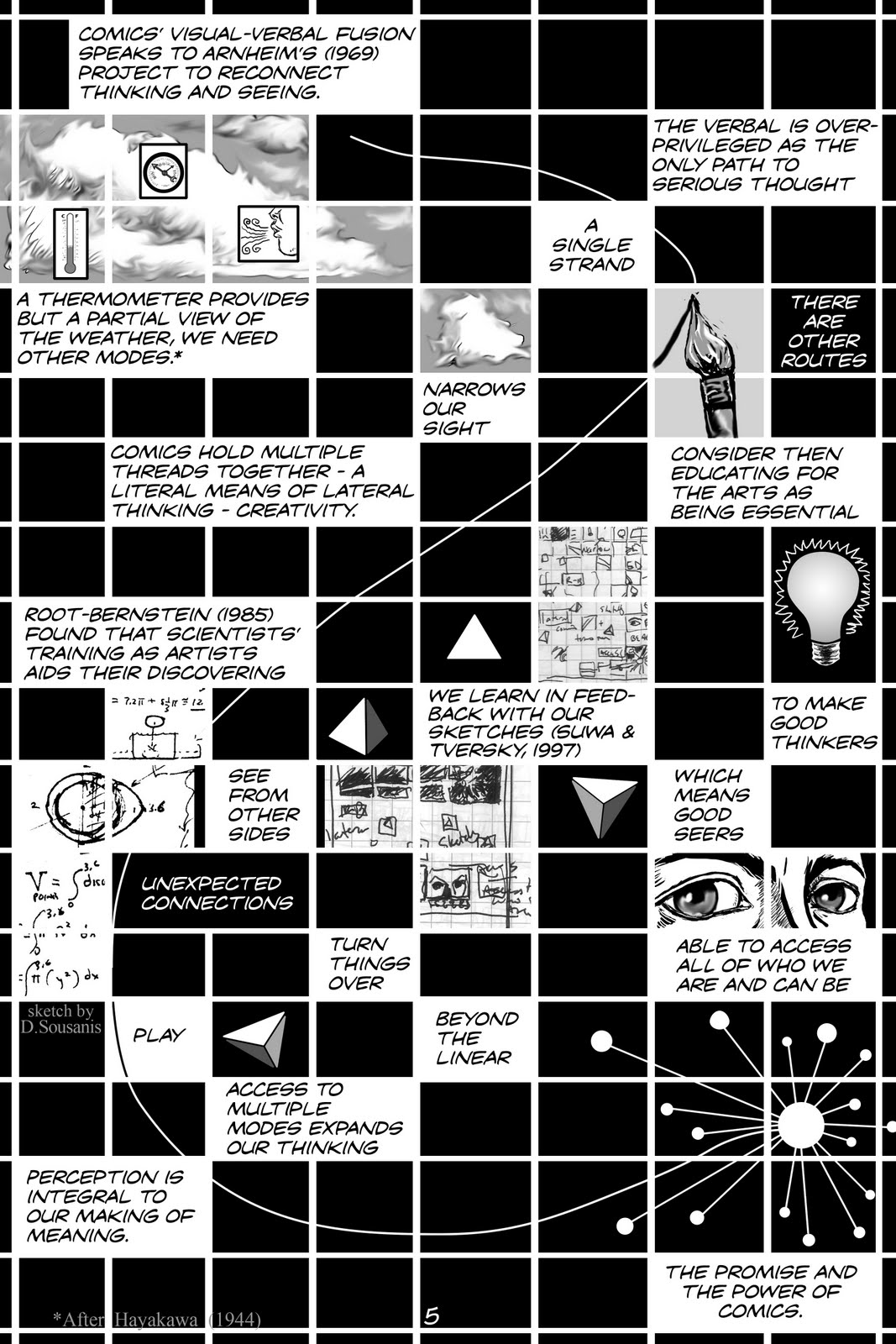
Comics,” Sousanis uses the form of a cross-word puzzle to discuss the
non-linearity of comics and their power to lead the reader to unexpected
insights not available in written prose [
Figure 5,
[
Sousanis 2012].
This page eloquently shows how the linear reading of text, signified by the comet
slowly floating down the page, breaks up in a myriad of visual and verbal
digressions. Each narrative box works modularly to compose different potential
readings of the page. We learn that “the verbal is overprivileged as the only path to
serious thought” and this could lead to “a single strand” and “narrows our sight,” but our eye could also
move to “other routes” or
any of the scientific studies or images featured on the page. The overall effect
points to Theirry Groensteen’s argument that comics are defined by “iconic solidarity,” which
means, “independent images that,
participating in a series, present the double characteristic of being
separated [...] and which are plastically and semantically
over-determined by the fact of their coexistence in presentia”
[
Groensteen 2007]. In Groensteen’s definition, it is the very fact that images are
presented together that makes it possible for them to be read sequentially and
not, for example, as a mosaic or as a single composition. Sousanis’s page plays
with the tension between the sequentiality and the simultaneity of the comic
page in order to show how ideas can be splintered apart and then combined into
new regions of thought. Sousanis produced a prose discussion of his process for
this issue, where he further uncovers the complexities and possibilities of the
comic form for scholarship. His dissertation is also now available as the book
Unflattening from Harvard University Press [
Sousanis 2015]. Jason Helms, whose work appears in this issue as
well, also wrote a dissertation that employs comics throughout. As a
“non-artist,” Helms began taking drawing classes in 2008 as part of his research
methodology, and defended his dissertation,
Rhiz|comics:
the Structure, Sign, and Play of Image and Text, in 2010. Helms’s
dissertation is less of a “pure” comic than Sousanis’s. It
features sections that look and feel like comics, but much of the dissertation
consists of text punctuated and interrupted by visual elements (the conclusion,
for example, is written entirely as calligrams). However, this is hardly an
oversight and reflects his argument for blurring the lines between comics and
other media as well as those between image and text. Helms has rewritten his
dissertation as a digital monograph for the University of Michigan Press’s
Sweetland Digital Rhetoric Collaborative imprint, where it is currently under
review.
Fourth, we found that writing teachers were experimenting with the comics form as
an alternative to traditional essays. Roger, for instance, taught two sections
of a comics class in 2011 as a Marion L. Brittain Fellow at Georgia Tech in
which he asked his students to create a 22-page comic book. Students spent the
semester pitching a title, researching audiences and comic genres, writing,
illustration, and finally publishing a comic book that they presented to members
of the University community at a campus comics convention.
Roger’s students spent a good amount of time considering the various impact of
different panel arrangements and — as the example above skillfully shows — the
effect of juxtaposing different artistic styles with one another [
Figure 6]. Here, we see Mark Price’s use of heavy
inks and wild composition contrasted with the relatively clean white and grey
space of the monitor screen. Fred Johnson discusses a similar project utilizing
comics by art-teacher Scott Kolbo in his article “Perspicuous Objects: Reading Comics and Writing Instruction.”
Kolbo’s project had students draw “themselves in two different
styles and observ[e] the differences”
[
Johnson 2014]. Both Johnson and Kolbo found that their students had difficulties with
basic aspects of sequential art like the use of images to communicate the
sadness of Chris Ware’s
Jimmy Corrigan: The Smartest Kid on
Earth or the way particular artistic styles might denote specific
emotional states. We’ll discuss how some of these difficulties extend to
scholars producing their own comics later on.
[4]Each of the examples above illustrates some of the grassroots efforts at
understanding comics from broader interdisciplinary perspectives and for a
variety of different purposes: journal articles, social media interventions,
dissertations and monographs, and teaching pedagogies. Our discussions at
THATCamp included many more of these examples, but we found no systematic
consideration of how they fit into the scholarship of our various fields. Our
purpose in creating this issue grew out of a desire to contextualize the
importance of these visual and verbal experiments for scholarly communication,
and also to explore the process necessary for creating, evaluating, and sharing
work of this kind. As we considered the possibilities, we created a
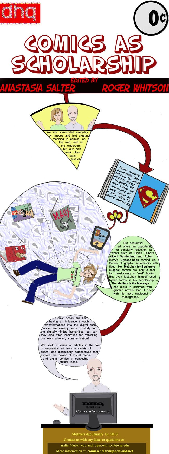
“call for papers” that acted as a comic itself. As we
considered the possibilities, we created a “call for papers”
that acted as a comic itself [
Figure 7].
The CFP was created with a combination of hand-drawing, GIMP, Photoshop, and HTML
5 coding. Even while noting Anastasia’s particular skill at rendering
caricatures of both of the editors, the CFP foregrounded some of the
complications that would emerge as the issue progressed. First, the banner was
created by Roger by copying the
Digital Humanities
Quarterly logo from the site and running it through several filters
on Photoshop. The “0 cents” is cropped from the digitized cover of
Detective Comics #27, which originally sold for 10
cents. Finally the font was chosen directly from Photoshop’s font library.
Connecting the banner to the images prepared by Anastasia was complicated due to
the varying styles and methodologies of both of the editors. It was unclear how
hand-drawn images, digitally-processed type fonts, and filters would work
together to create a clean, readerly design. Further, as neither Anastasia nor
Roger are trained comic artists, we felt some reluctance towards presenting our
CFP as sequential art. Thus, we posted the call in two forms: a traditional
prose version and the illustrated or sequential CFP. We also wondered if
scholars would take the call seriously. Anastasia, therefore, posted a call in
traditional prose in addition to the one rendered in sequential art. The text
call was easier to distribute in scholarly venues, including email lists and CFP
sites, as the rendered version presented both a large file size and difficulties
for those mediums. The comic CFP took some time to produce, a lesson we’d
integrate into the submission and revision process for the issue [
Salter and Whitson 2014].
Submissions, Revisions, Process
One of the difficulties of producing comics in scholarly circles is the
labor-intensive process involved in constructing sequential images that produce
a narrative. Rob Guillory, artist on the long-running series
Chew from Image Comics, discusses the time it takes to
produce a typical 22-page issue for a monthly book:
My overall monthly schedule looks
like this: The first week and a half of an issue is spent laying out the
issue via thumbnails, then penciling the whole thing out. The two weeks
after that are spent inking the pages in groups of two. Then, the last
week is spent coloring. My color assistant Taylor Wells sends me the
flat colors for the issue, and from there I add texture, lighting,
shadow and special effects to the page. So, in the end, it always seems
to round out to about 5 weeks per issue.
[Harper 2014]
Understanding this process and the fact that Guillory is one of the most
efficient professional artists in the industry, we knew that we couldn’t ask for
finished comics as first drafts. First, asking for finished drafts would mean
that the potential authors would have to invest a significant amount of time
before getting any feedback from the editors. Second, if the author was rejected
from the issue after producing finished drafts, we knew that it would be
relatively difficult for the work to be accepted elsewhere. In consultation with
DHQ editor Julia Flanders, we decided to ask
for abstracts in the first round, scripts and penciled layouts in the second
round (involving outside reviewers), then — if accepted by the reviewers — we
would ask for a finished comic book for the final draft.
Even with these failsafes in place, we had numerous complications. Five
contributors pulled out the issue at various stages, often citing lack of time
as a major concern. While this is a problem throughout academia, it seemed
particularly difficult in the context of producing works for this medium.
Outside reviewers, meanwhile, had a number of conflicting and confusing
responses to the drafts. Some were concerned that the comics were in a
less-than-complete state. Others didn’t understand how the submissions were
contributing to the field of digital humanities. Flimsy research and a lack of a
critical lens were often cited problems. One reviewer suggested that using
comics to make an argument about research is very similar to the work of Scott
McCloud, and that the use of humor to make a scholarly argument may be
inappropriate. Reviewers critiqued everything from the exuberance of using too
many exclamation points to the lack of an original argument, the use of populist
appeals to ground claims, and the lack of a bibliography or Works Cited page. We
mention these issues not to critique the review process, which significantly
added to the quality of the submissions. Rather, we wish to underscore just how
complicated producing comics can be, and the way certain modalities of
scholarship can create unexpected — and perhaps unwanted — opportunities for
different effects. Is it appropriate to use humor in order to assert a scholarly
claim? Can quotations and citations be managed using visual references rather
than bibliographical or textual ones? Such questions invigorated but also
complicated the process of producing the issue.
For the remainder of the introduction, we’d like to offer brief glimpses of the
production of each article for “Comics as
Scholarship,” with the purpose of showing how the process of review
transformed the submissions.
Nick Sousanis, who contributed
an annotated discussion of his dissertation, required the least amount of work.
In sum, it was difficult at first for Sousanis to completely contextualize his
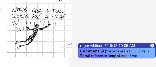
argument for broader audiences. Given that he produced the piece in a Word
document, we were able to use “Track Changes” to add
commentary [
Figure 8].
While some of the reviewers expressed hesitation with what they saw as a piece
without a central argument, we feel that having Sousanis’s discussion of
producing the first comic as a dissertation to be a highlight of the issue.
Sousanis explores “Chapter 3” of his dissertation, in
which he outlines the possibilities of multiple modes of knowledge. One
particular point of interest involves Sousanis’s self-reflexive discussion of
producing a single page of his dissertation. When asked if he produces words or
pictures first, he simply replies “yes.”
Sousanis writes notes and sketches simultaneously, then moves to a script, then
a storyboard, then revisions and drawing again. Sousanis’s words meld with their
images and produce sequential argumentation.
Jason Helms produced perhaps the most visually unique of our
pieces. He uses the comic form to explore the history of comics scholarship,
with a special emphasis on the field of rhetoric and composition. His first
images included a brilliant recreation of the Bayeux Tapestry, cited by McCloud
as one of the first pieces of comic art [
McCloud 1993]. Helms
beautifully appropriates the texture of the Tapestry to create his modern
history [
Figure 9].
While Helms wanted initially to include full block quotations as well as
caricatures from Deleuze and Guattari and media theorist Gregory Ulmer, we both
decided that streamlining the theoretical sections and highlighting Helms’s
digital artistry in the tapestry section would produce a better result. The
first draft of the sample image, further, featured a less-than-clear serif font.
A sans-serif combined with a CSS roll-over images that highlight the dialogue
and narrative balloons lead to greater readability.
In all, we felt that Helms’s invocation of the Bayeux Tapestry intervened
compellingly into the visualization of comics history. Richard Burt has
suggested that films appropriating the Tapestry into their opening and closing
sequences have used it to simulate the “texture” of the
medieval past and that such a simulation can point us to the idea that all
histories are mediated by the material modes of their presentation [
Burt 2007]. To be sure, the presentation of comics history has a
more recent self-reflexive history than the fields of film or literary
scholarship. Fred Van Lente and Ryan Dunlavey, for instance, produced a
Comic Book History of Comics that tells the story in
sequential art [
Lente and Dunlavey 2012]. Yet, Helms reminds us how often the
particular material affordances of comic history can often be overlooked in a
world where comics are produced in single issue floppies, trade paperbacks, and
digital formats.
Aaron Kashtan’s work on comics materiality similarly
highlights these affordances. Kashtan was enthusiastic about the project, yet
also had anxieties about producing art for a scholarly publication. Most of his
project emerged from early experiments with Bitstrips [
Figure 10].
As his style evolved, Kashtan found that his original definition of
“artistic talent” was too narrow and layered more
sophisticated BitStrips models with photographs, hand-written lettering,
filtered images, multiple fonts, paintings, manuscripts, word-clouds, Ebook
images, comic panels, and internet memes. While emphasizing the ability of
sequential art to highlight different materialities, Kashtan found his style by
combining those different modes into a unique collage.
Kashtan also used the form of comics to comment upon theories of materiality from
N. Katherine Hayles’s notion of a materiality that combines matter with human
signifying strategies to Matt Kirschenbaum’s distinction of forensic and formal
materiality and Jane Bennett’s theory of a vibrant matter, in which non-human
entities act and communicate without a human mediator [
Hayles 1999]
[
Kirschenbaum 2008]
[
Bennett 2010]. For us, the value of Kashtan’s work lies in
showing how comics “forcibly alert
the reader to the physicality of the reading experience,” in
Kashtan’s words, asserting that comic books are a vital object of study for
anyone interested in the history of the book, philosophy, media studies, or the
digital humanities.
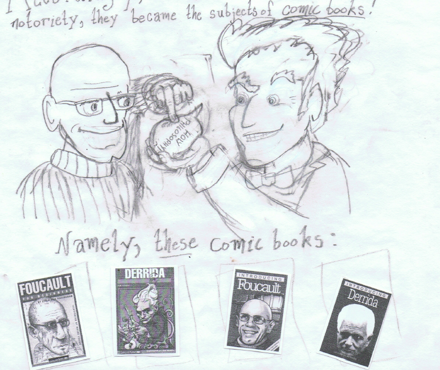
The use of multiple styles and fonts to illustrate and cite academic sources is
also at work in
Aaron Humphrey’s multimodal analysis of the
“Introducing” and “For
Beginners” series of comic book introductions to critical theory. In
some instances, photocopied and JPG images of the books mimicked the multimedia
production of the books themselves [
Figure 11].
Humphrey’s style was already established before he started work on the
issue. Much of his work explores the intersection between visual literacy,
comics, and education. He argues that his process of hand-lettering was much
more time-consuming and labor intensive than typing an article on a word
processor, but he wanted to give the sense that the lettering was inseparable
from the images he produced. The result is a piece in which words are also
objects that Humphrey places in different parts of the page for different visual
effects.
The initial stages of his work proposed to read the books on their own terms,
neglecting the powerful rhetorical possibilities inherent in the comic as a
multimodal form. As he explored the work of Gunther Kress and the New London
group for later revisions, Humphrey crafted a powerful piece comparing the
inseparability of different modalities of communication in comics to a division
of labor that demands different experts work on each part. He also underlined
his point by having his images and text respond to one another, and by asking
how such divisions might work to challenge the educational hegemony that sees
printed texts as more learned [
Kress 2001]
[
New London Group 1996].
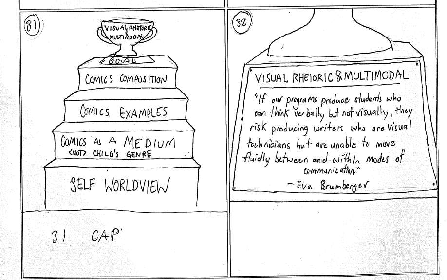
Robert Watkins and Thomas Lindsley expand the emphasis of
educational comics in pedagogy and the digital humanities by beginning their
work with Gene Luen-Yang’s
American Born Chinese,
which Cheryl Gnomes has lauded as being particularly useful for students with
learning disabilities [
Luen-Yang 2006]. Yet they also situate
their discussion of multimodality within the frame of ancient rhetoric and
critical pedagogy [
Figure 12].
Watkins began working by himself, but eventually added Thomas Lindsley
as a collaborator to do the art, coding, and web design. As they revised their
piece, Watkins and Lindsley also added a more diverse set of examples to back up
their claims about rhetoric and comics. Watkins and Lindsley also translated
their earlier drawings to HTML5. For us, the piece exemplifies a different
aspect of comics history and analysis than the other submissions because it
highlights the work of ancient rhetoric in contextualizing and shaping comics
history.
Watkins and Lindsley’s work also shows that teachers can demonstrate the
pedagogical effectiveness of the comic form by exploring sequential art similar
to their contribution, which visualizes collaborative practices accessible to
students as an alternative to the visual flattening of voices in the written
essay. This multimodal approach takes advantage of existing tools as well as a
grounding in rhetorical theory to explore sequential art as a method for
communicating both the process and results of a scholarly act.
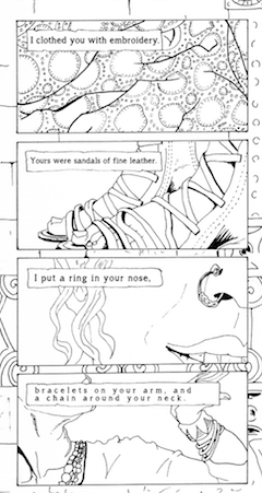
One of the more provocative yet also fascinating pieces came from Religious
Studies scholar
B.J. Parker, who traces some of the
intersections between gender and Judaism in Ezekiel. Unlike many of the other
contributors, Parker wanted to construct a fictional narrative out of scholarly
sources. The ambition of the piece was matched by early images that were clearly
polished and showed a degree of artistic skill [
Figure
13].
Parker integrates scholarly debates around Ezekiel directly into the
narrative. Parker’s initial proposal focused on exploring sexual objectification
in Ezekiel 16 through comics. Parker’s initial proposal focused on exploring
sexual objectification in Ezekiel 16 through multimodal presentations, including
this development of sequential art. Given that focus, B.J. Parker’s was one of
the most difficult pieces for our reviewers to grapple with. The piece deals
with subject matter that we don’t always engage with in digital humanities, and
some of the reactions to the early stages of the piece focused on apprehending
and responding to the disturbing subject matter. However, these responses and
the difficulties the piece poses are essential to Parker’s intentions, as
Parker’s work demands we engage with elements of the text that have otherwise
often been erased.
This concept of a scholarly retelling thus resembles the work of creating an
annotated edition, with Parker’s annotations expressed both through the editing
of the text and the juxtaposition of original imagery. Comic retellings are
often thought of as simplifications of the original text, an impression that
holds within it an underlying bias towards sequential art as a mode of narrative
expression.
The Classic Illustrated series, which
Parker’s work of adaptation evokes, was often dismissed despite its value. As
William B. Jones, Jr. describes in his survey of the series, between 1941 and
1962
Classic Illustrated made “the realms of the literary and
historical imagination accessible and immediate”
[
Jones 2011]. Parker’s work likewise makes the original text, and the debates and
cultural discourse it evokes, accessible in a way that highlights and
recontextualizes its place in religious discourse.
Conclusion
As you explore the diverse works included in this collection, we invite you
particularly to consider the scholarly process that is on display and the
opportunities we have in the digital humanities to embrace and refine these
processes. Each work represents the different strengths of its author(s) in
modality, use of original and remixed imagery, and textual methods. These works
only display a small section of what is possible in the broad realm that can be
analyzed as sequential art or comics. The history of humanities computing,
broadly construed, is filled with multimodal works: however, we are still at our
infancy in truly building spaces that are receptive to new methods, with systems
of peer review that encourage innovation and experimentation. The challenges we
faced in constructing this issue are a reminder that while the academic essay
and monograph are entrenched structures with strong institutional support, the
scholarly multimedia text is still emerging.
The practice of critiquing and understanding a mode of expression better through
working within its medium is not new, and we are not suggesting that comics are
a new method for the digital humanities or even that multimodal texts aren’t
already embraced in a number of spaces, such as the fields of digital rhetoric
and multimedia composition. However, there is a chasm between what is possible
in sequential art as an act of scholarship and what is supported and
institutionalized. We showcase these works as a provocation for building new
scholarly spaces and experimenting with multimedia research within the digital
humanities. We also suggest that these experiments form one part of Johanna
Drucker’s call in
Graphesis: Visual Forms of Knowledge
Production for an approach towards digital technology that
acknowledges the complex research in the humanities surrounding perspective and
point-of-view [
Drucker 2014]. As scholars consider the various
ways the culturally-rich forms of knowledge from the humanities can nuance
claims made by computational methodologies like big data visualization, it helps
to realize that all sorts of experiments with visual perception already exist in
the form of sequential art. Apart from simply communicating with comics, “Comics as Scholarship” also points to a possible future
for the digital humanities where data analysis is made even richer by modifying
temporal sequence, shifting points of view, or varying the style in which
visualizations are presented. More generally, such experiments can suggest that
studying comics may prove to be a fundamental part of understanding the digital
humanities in the future.
Works Cited
Ault 2003 Ault D. In the Trenches, Taking the Heat:
The Confessions of a Comics Professor. International Journal of Comic Art 5,
241–260.
Bennett 2010 Bennett, J. Vibrant matter: a
political ecology of things. Duke University Press, Durham (2010).
Burt 2007 Burt, R. Re-embroidering the Bayeux
Tapestry in Film and Media: The Flip Side of History in Opening and End Title
Sequences. Exemplaria: Medieval, Early Modern, Theory 19, 2, 327-350.
Chute 2008 Chute, Hillary J. Comics as Literature?
Reading Graphic Narrative. PMLA 123, 452–465.
Chute and Jagoda 2014 Chute, H. and Jagoda, P.
Comics and Media. Critical Inquiry 40, 1–10.
Drucker 2014 Drucker, J. Graphesis: visual forms
of knowledge production. Harvard University Press, Cambridge (2014).
Eyman and Ball 2015 Eyman, D., Ball, C.E. Digital
Humanities Scholarship and Electronic Publication, in: Ridolfo, J.,
Hart-Davidson, W. (Eds.), Rhetoric And the Digital Humanities. U of Chicago
Press, Chicago (2015), pp. 65–79.
Groensteen 2007 Groensteen, T. The system of
comics. University Press of Mississippi, Jackson (2007).
Hayles 1999 Hayles, K. How we became posthuman:
virtual bodies in cybernetics, literature, and informatics. University of
Chicago Press, Chicago (1999).
Jacobs 2013 Jacobs, D. Graphic encounters: comics
and the sponsorship of multimodal literacy. Bloomsbury Academic, London
(2013).
Jones 2011 Jones, W.B. Classics illustrated: a
cultural history. McFarland & Co., Jefferson (2011).
Kirschenbaum 2008 Kirschenbaum, M.
Mechanisms: new media and the forensic imagination. MIT Press, Cambridge
(2008).
Kress 2001 Kress, G.R. Multimodal discourse: the
modes and media of contemporary communication. Arnold, London (2001).
Kunzle 1973 Kunzle, D. History of the comic strip.
University of California Press, Berkeley (1973).
Lente and Dunlavey 2012 Lente, F.V., Dunlavey, R.
The comic book history of comics. IDW, San Diego (2012).
Lorde 1984 Lorde, A. The Master's Tools Will Never
Dismantle the Master's House, in: Sister Outsider: Essays And Speeches. Crossing
Press, Berkeley (1984), pp. 110–113.
Losh, Alexander, Cannon and Cannon 2013 Losh, E.M.,
Alexander, J., Cannon, K., Cannon, Z. Understanding rhetoric: a graphic guide to
writing. Bedford/St. Martin's, New York (2013).
Luen-Yang 2006 Luen-Yang, G., Pien, L.
American-Born Chinese. First Second, New York (2006).
McCloud 1993 McCloud, S. Understanding Comics:
The Invisible Art. Perennial, New York (1993).
McCloud 2000 McCloud. Reinventing comics: How
Imagination and Technology Are Revolutionizing an Art Form. Perennial, New York
(2000).
Salter, Sousanis, Tritter, and Neville 2012 Salter, A., Sousanis, N., Tritter, P., Neville, T., 2012. Expanding
Scholarship. Expanding Forms of Scholarly Inquiry within the Academy. Available
at:
http://expandscholarship.selfloud.net/ Sousanis 2012 Sousanis, N., The Shape of Our
Thoughts: A Meditation In/On Comics. Visual Arts Research 1, 1–10.
Sousanis 2015 Sousanis, N. Unflattening. Harvard
UP, Cambridge (2005).
Versaci 2007 Versaci, R. This book contains
graphic language: comics as literature. Continuum, New York (2007).
Ware 2014 Ware, C. Conference poster, “Comics: Philosophy and Practice,” May 2012. Critical
Inquiry 40, Foldout-10.
