Abstract
Assessing the relationships between art objects with network visualizations bears the potential to yield new insights into creative exchanges between makers.
Often limiting such mapping, however, are barriers to streamlined transformation of a dataset into a visualized network for analysis.
Moreover, limitations on customization of and collaboration within the current tools available for researchers further diminish
the potential for artistic network analysis to benefit art history.
In this paper, we provide an overview of our solution to these challenges in the form of the Artistic Network Toolkit (ANT)
that allows users to easily transform their data into a customized and collaborative website in which artistic relationships can be explored.
We provide a rationale for this project and its advances over prior work while also framing our goal
in ANT’s creation to democratize access to such visualization tools, both in accessibility to a
wide array of users and in its compatibility with a global repertoire of art historical data.
To that end, we point to this potential with some preliminary assessment of ANT’s functionalities
using our emerging artistic datasets. The ANT open-source library is available at https://github.com/tapilab/ant.
1 Introduction
A singular artwork can be a font for scholarly investigation, but more captivating can be the generative genealogy of an artwork told through relationships such as apprenticeships,
workshop circles, collaborations between artists, and patronage. Capturing these networks in traditional art historical scholarship,
however, can be difficult for several reasons. First, the general scholarly tendency to emphasize depth of analysis
over breadth results inadvertently in the rarity of spaces in which data about a larger network can be synthesized.
Second, there is a parallel tendency for aspects of this art historical data to migrate to the periphery of scholarly
assessments. This is particularly the case for workshop artists who, though often a vital part of an artistic ecosystem,
have over history been subsumed into another artist’s trajectory.
Thus, as a complement to traditional scholarship, artistic network analysis adds value by creating a forum that pulls together these
myriad points to cultivate the potential for new observations to be made and to un-silo the rich observations currently
compartmentalized behind out-of-print monographs and paywall-protected journals. By visualizing a body of artwork via this multitude of data,
those rich scholarly insights potentially gain new meaning as they come into visual conversation with other observations,
fostering a space for new links to be made.
Hampering the potential of such artistic network analysis, however, are the technological barriers that make art historians new to the field of computational studies feel out of their depth.
Many tools designed for such purposes still mandate a high level of computational knowledge to successfully model data in a meaningful way.
Meanwhile, the art historical data that is effectively captured in some means of network visualization can falter when the challenges of project
maintenance demand a similar level of computational expertise.
ANT overcomes these challenges as a gateway toolkit for anyone interested in analyzing art historical networks, from novice to expert.
It is designed to break down traditional barriers to digital art historical analysis by providing a simpler means of creating one’s own
visualization website that is both customizable and collaborative. Thus, ANT aims to democratize digital art history in two ways: (1) by enabling scholars
without coding expertise to more easily conduct network analysis of their data; and (2) by encouraging open data sharing.
In so doing, ANT aims to expand access to both digital technologies and art historical data relating to visual culture from a global perspective.
2 The Origins of ANT: A Preliminary Test Case
This project began by exploring the vast network of multimedia production of Italian Renaissance artist Raphael and his prolific circle during the period of the Urbinate’s Roman career (circa 1610-1527).
The impetus in selecting Raphael was twofold. First, though it is known that Raphael cultivated a rich and dynamic workshop, only hints of these relationships
have been handed down in texts like Giorgio Vasari’s
Lives of the Artists, and even these are suspected of inaccuracies and embellishments.
Furthermore, what is provided in accounts like Vasari’s tend to further elevate the status of Raphael while discounting the contributions of the
workshop associates [
Vasari 1586].
In his retelling of Raphael’s career, for example, Vasari first makes mention of Raphael’s
associates only later in his biography; furthermore, while these figures played peripheral roles in the discussion of Raphael’s career,
Raphael loomed large in their respective chapters, thereby leaving little space to consider objectively how these individuals worked together.
This marginalization of workshop artists proves problematic particularly in the assessment of late Raphael works, like his
celebrated
Transfiguration (1518-1520), where evidence of these associates’ contributions was overlooked for a considerable time.
Scholars have since worked to disentangle this workshop structure. From John Shearman’s seminal work in the 1980s to Robert Williams’ 2017 concept of Raphael’s meta-style and Linda Wolk-Simon’s incisive assessment of
collaboration and competition between these workshop artists published that same year, scholars have placed greater emphasis on the novelty of Raphael’s
workshop practice and the essential role of this artistic network in his professional success [
Shearman 1983]; [
Williams 2017]; [
Wolk-Simon 2017].
Second, the body of work produced by this wide network of artists was substantial yet siloed. Much of the assessment of this circle focused on singular makers or methods,
with often only one-to-one relationships considered [
Girometti et al 2020]; [
Bambach 2013]; [
La France 2013]; [
Falomir 2013]; [
LaMalfa 2020].
This is not a critique of these scholars, but rather a limitation of conventional scholarship, as the space of one essay or catalog
requires such focus. That said, it makes it more difficult to assess these working relationships more globally.
This space framed the ideal environment in which to develop novel tools that encouraged new ways of looking at large artistic corpora. Beyond simply amassing these works in a unified dataset – a task in itself useful for students and
scholars as it dismantles the siloed nature of many museum and archival collections – the mission became the creation of a toolkit that could intuitively transform artistic data into customizable and collaborative network visualizations
to afford enhanced accessibility to digital humanities investigations across expertise and aspects of visual culture.
3 ANT Architecture
In this section, we describe the motivation, design decisions, and implementation details of ANT.
3.1 Motivation and Design Goals
ANT builds on recent digital art history projects that demonstrate the potential of network analysis to provide insights into the dynamics of art production.
Examples include probing how Latin American artists influenced the early 20th-century Parisian art community [
Greet. 2016] illuminating under-recognized female
artists in postwar printmaking [
Weyl 2015]; tracing the development of the abstract art movement [
MoMA 2012];
and understanding collaboration in the Northern European print market between the sixteenth and eighteenth centuries
[
Lincoln 2017]. Network analysis, though, has potential pitfalls – e.g., reductionism, missing data bias, and misleading
visualizations – that have raised questions about its role in traditionally qualitative, humanistic modes of inquiry
[
Kiennle 2017]. These critiques stem in part from existing limitations in digital art historical projects. First,
most approaches require high-cost, closed-source custom software development to collect, store, and visualize artistic data.
This can result in static visualizations that limit the scholarly co-creation needed to organically expand and refine the
analysis. Second, prior work typically focuses on one or two types of relationships and ignores sources of uncertainty in
the data, which can oversimplify real-world connections and hide nuance in artistic production. Finally, much prior work
limits treatment of temporal aspects of artistic production, assuming a single, unchanging graph as the unit of analysis.
The currently available alternative to building a customized website for such analysis is to use existing, general-purpose analysis tools such as Gephi [
Bastian et al 2009] and Cytoscape [
Franz et al 2016].
While rich in functionality, these toolkits are customized for mathematical analysis of social, biological, or transportation network data, not artistic analysis and visualizations.
Moreover, these toolkits have a high learning curve for both use and data import and are designed for individual use – the software runs on a user’s personal machine,
rather than a public-facing website. Perhaps the best-known visualization toolkit aimed at humanistic inquiry is Palladio [
Stanford Humanities + Design Lab 2022], begun in 2013,
which similarly sought to democratize access to advanced visualizations of humanistic data. While Palladio promoted the use of network
analysis in humanities, and allowed customized visualizations with a user’s datasets, there are several important shortcomings [
Conroy 2021]
that ANT addresses by beginning with fundamentally different design goals. First, Palladio is not collaborative – a single user uploads data and specifies the network, but no shareable,
public-facing interface is created. Sharing is typically done by exporting non-interactive images, and each
project lasts only as long as the user’s browser session. Second, data uploaded to Palladio is not editable –
to make changes, a new file must be uploaded. Third, Palladio relies on a customized interface to upload data
and specify the schema, resulting in a high learning curve to start a new project. Finally, Palladio has limited
support for network analysis (e.g., it does not compute common measures such as betweenness centrality or clustering
coefficients).
ANT aims to address these challenges while democratizing access to advanced visualizations for exploring artistic creation,
thus becoming a tool both for students, who can visualize and explore different eras of art production,
and for scholars, who can initiate interdisciplinary collaborations without the burden of new, non-intuitive,
or siloed technological interfaces. By leveraging the growing functionality of open-source software for data curation, visualization, and analysis,
ANT will enable an ecosystem of art historical co-creation, promoting new insights into visual culture’s evolution amid artistic
exchange across media and time.
Based on this motivation, ANT was designed with the following goals in mind:
- One-click website creation: Building on advances in website deployment workflows and “platform-as-a-service” cloud computing [Middleton and Schneeman 2013],
users click a single button to create an ANT “clone” in the form of a public-facing website at a new URL. The user can then curate their own data and
customize the analysis as appropriate for their use case.
- Simple, collaborative knowledge co-creation: Rather than forcing users to learn new, siloed interfaces for data curation, ANT instead uses common collaborative tools
(e.g., Google Sheets) so scholars can update data and share editing permissions as desired. ANT will also support importing data corpora such as Getty’s ULAN [Getty 2024] and the Metropolitan Museum of Art’s open data API [Metropolitan Museum 2024].
- Multi-type, dynamic networks: Rather than restricting to static networks with one or two types of connections, ANT accommodates heterogenous, user-defined relationship types and enables visualizations to explore such
networks over time.
- Acknowledgement of uncertainty: Historical scholarship is full of uncertainty – of attribution, of dates, of locations. ANT allows users to express this uncertainty in the data and to navigate
it while exploring visualizations of artistic production.
ANT models a user-defined relational database of artistic production across media associated with a given artist set. It leverages 100% open-source technologies (Python, Django, PostgreSQL, D3, NetworkX) to develop an engaging network
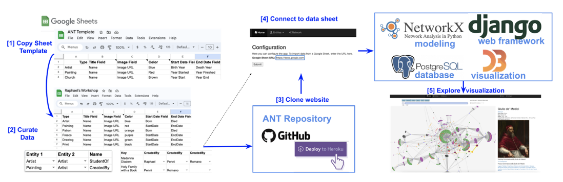
visualization interface for exploring connections among artists, works, patrons, and locations over time. Figure 1 gives an overview of the system. To summarize each system component:
(a) A user first curates their data in a Google Sheet, using an ANT supplied template; (b) Python’s Django web framework is used to implement the core website logic; (c)
PostgresSQL relational database is used to store all the data entered in the Google Sheet; (d) D3 is a Javascript library used to create interactive
network visualizations; (e) NetworkX is a Python library that computes network analysis statistics (e.g., betweenness centrality, clustering coefficients, described below).
These steps are described in more detail below.
3.2 Data Curation
An initial challenge in many digital humanities projects is defining the data schema, which determines the key entities and relationships of interest. First, let us specify some terminology from the database literature.
An entity is a thing of interest that can be uniquely identified, such as an Artist or Painting. A record is a specific instance of an entity, e.g., Raphael is an instance of the Artist entity.
An attribute is a property of an entity, such as birth year, which has a value, such as 1483. Finally, a relation specifies a connection between two entities,
such as CreatedBy (School of Athens, Raphael).
While mature technologies like SQL databases are commonly used to store and query complex relational data, it is an intricate design problem to determine what the structure of the database should be in the first place.
To reduce this complexity and rely on more familiar tools, ANT instead assumes that data is stored in a Google Sheet. To begin data entry, users create a copy of the ANT Sheet Template,
into which they can import their artistic datasets. The starter template includes examples of common artistic entities, attributes, and relations.
The goal of this template is to provide the user the essential components to begin, but as a project develops or as the user becomes more familiar with the sheet mechanics
the users may further customize the sheet to reflect the unique characteristics of the domain. Moreover, reliance on the Google Sheets platform affords collaboration as multiple
members (e.g., a student group or research team) can input and refine data simultaneously.
The sheet is organized into separate tabs for each entity of interest – for example, the Raphael database has tabs for Artist, Patron, Painting, Fresco, Drawing, and Print.
Within each tab, column headers specify attributes, and each row represents a record.
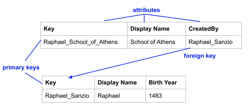
As an edge in a network visualization represents a relationship between two entities, a central issue is how to create a relationship in the sheet in a way that is both simple to maintain and not prone to error. To do so, we adopt the database notions of primary and foreign keys.
A primary key is a special entity attribute that uniquely identifies a record. For example, the School of Athens record may have a key Raphael_School_of_Athens, and the Raphael record may
have a key Raffaello_Sanzio. A foreign key is an attribute of one record used to reference another record. For example, the School of Athens record may have a foreign
key attribute called CreatedBy whose value is equal to Raffaello_Sanzio. Thus, a foreign key represents an edge between two entities in the network (see Figure 2).
In the ANT Sheet, then, each entity tab has a column called Key that represents the primary key, and a list of columns containing foreign keys for each type of relationship this entity has (e.g., CreatedBy, LocatedIn). Creating and maintaining such keys and relationships is highly error-prone.
Making sure that each primary key is unique, and that each foreign key points to a valid record, is typically part of the core logic of database management systems. We accomplish this in Google Sheets using a Google Apps Script,
a Java Script-like programming language to manipulate Google Documents. The script performs several checks as the user curates data, confirming the validity of primary and foreign keys and alerting the
user to any issues. Furthermore, the script uses built-in sheet validation to allow foreign keys to be selected from a dropdown menu, reducing data entry burden and error. Critically,
all of the required columns are added automatically, with appropriate dropdown menus pre-populated, so that the user can link entities appropriately.
Thus, the automation in the ANT sheet template allows users to create relational databases without having to worry about
whether primary and foreign keys are set correctly.
3.2.1 Schema Customization
While adding new attributes to each entity is as simple as adding columns to a tab in the sheet, supporting new entities and relationships can be more challenging. One must ensure that each relationship is reflected in an appropriate foreign key column,
and that the foreign key points to the correct tab of the related entity. To account for this, the ANT Sheet Template has two special tabs called Entities and Relationships.
The former lists each entity type (e.g., Artist, Painting), and the latter specifies the allowable relations (e.g., the CreatedBy relation between the Painting and Artist entities).
The App Script monitors these two sheets to update the data when new values are added. For example, when a new entity is added, a corresponding tab is created with the name of the
entity type and with relevant column headers for the primary key field. When a new relation is added, a new column is added in the appropriate sheet,
with a dropdown menu attached to each cell to ensure foreign keys are valid. Thus, as alluded to previously, while ANT provides users with an initial,
simple schema, it supports new, user-defined entities and relationships, without requiring users to be database experts
3.3 No-code Website Creation
With the spreadsheet populated, the next step is to create a website to support querying and visualizing the data. ANT contains a full website implementation based on Django, a popular Python web framework. The data from the Google Sheet is imported into a PostgreSQL database,
and a custom D3 network visualization module allows users to navigate the connections defined in the data.
Rather than require users to upload their data to a third-party website, thereby creating a dependency on the longevity and functionality of that website, ANT instead empowers users to create their own website that is fully under their own control.
While the default website generated is feature rich, users who do have software development expertise may freely customize the site further as desired.
ANT’s approach to supporting no-code website creation relies on recent advances in “platform-as-a-service” cloud computing [
Middleton and Schneeman 2013]. These services allow one to specify the code and configuration of any application inside of a container,
which abstracts away the details of the particular computer on which it runs. A popular service is Heroku,
which hosts websites as well as provides on-demand creation of virtual servers with automated configuration and installation of required software.
Using these technologies, users can easily create their own website that is a “clone” of the ANT infrastructure. By clicking the “Deploy to Heroku” button on the ANT GitHub page, users will get a new URL and public-facing website that performs network visualizations.
Once the website is created, users simply paste the URL of the Google Sheet into the configuration page. This will start an import process that reads the Google Sheet
data and creates a PostgreSQL database on the Heroku server.
In summary, the four steps required for a user to create their own public-facing, collaborative, network visualization website are as follows:
- Make a copy of the ANT Template Sheet.
- Update the schema and records of the sheet with the project data.
- Click the “Deploy to Heroku” button to create a clone of the ANT website.
- Copy and paste the project sheet URL into the website configuration page.
This streamlined framework contributes to the democratization of digital art history visualizations. Rather than requiring customized, one-off software, ANT provides a generalized platform with enhanced analysis capabilities including advanced exploration of multiple relationship types over time while properly
accommodating data uncertainty. At the same time, the template spreadsheet has been consciously designed to be as applicable as possible to the widest array of global visual culture.
With a new website now developed, the user can explore the heterogeneous relationships within their multi-type dynamic artistic network, but the benefit of ANT’s design is that this visualization is not the toolkit’s bounds. Rather, users can customize what they view within their site to better tailor their
experience, and they can continue to edit their original spreadsheet to refresh or update their visualization. Moreover, anyone who contributes to the Google Sheet template can act as a collaborator, meaning that colleagues from classrooms to
curatorial departments can co-create with relative ease.
3.4 Network Visualization
The website uses the Javascript library D3 to create the network visualization [
D3.js]. Each entity is a node in the graph, and edges connect nodes that participate in a relationship. By default, all entity and relationship types are displayed.
Clicking on each node displays in a sidebar all available information about the entity, including its attributes and linked entities.
The visualization uses the spring layout algorithm [
Nobre et al 2019], which aims to minimize edge crossings and distribute nodes evenly across the canvas to maximize visibility.
Nodes with high connectivity are typically positioned near the center of the graph, while nodes with lower connectivity are pushed to the periphery.
While this layout naturally focuses attention on the most well-connected nodes, ANT aims to support a more complete exploration of the network.
To do so, we implement the following features: (1) a search box, which allows users to quickly find nodes whose name or description matches query terms; (2)
simple pan/zoom functionality to easily navigate and between disparate parts of the network; (3) node/edge highlighting to traverse paths of connected entities;
(4) a date range slider to narrow in on years of interest; (5) an entity filter to focus on a subset of entities and relationships of interest.
4 Case studies
To demonstrate the visualizations and modeling one can conduct with ANT, below we describe three applications: Raphael’s workshop, art of the Viceregal Americas, and Chinese export wares.
The depth and breadth of our Raphael dataset allowed us to run initial tests with our emerging toolkit for initial refinements. This dataset includes roughly 1,500 artifacts of different media – paintings and frescoes, drawings and prints –
along with associated artists, patrons, and, when possible, locations. The value of working with this set stemmed from both its robustness and its complexity.
For example, the multitude of works documented by Raphael and his circle of associates allows for a dynamic array of relationships to be explored. At the same time, this dynamism allowed us to inspect how these relationships were visualized
and consider the implications of that modeling for use by a wide audience.
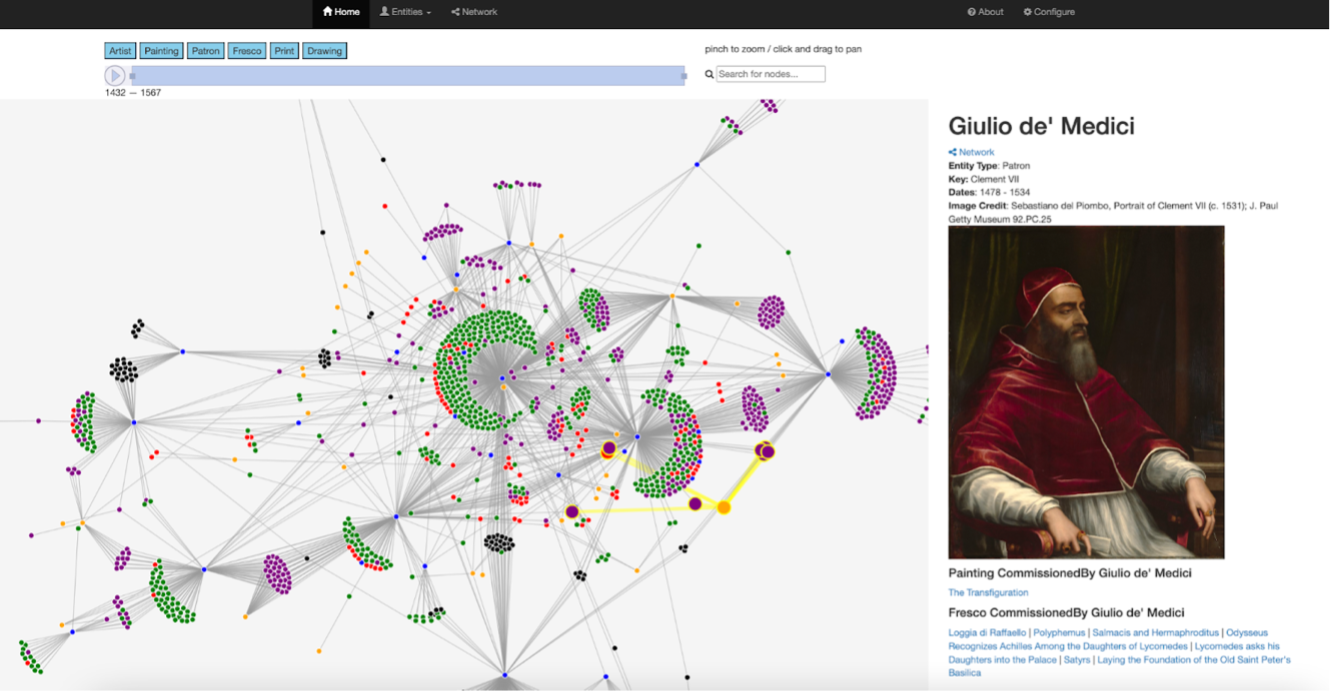
The product of this first pass is an easily navigable website that can be utilized in several ways. For example, the “Entities” tab at the top allows users to navigate through individual entities subdivided by identifiers (e.g., artist, painting, print, fresco, drawing, and patron).
Meanwhile, the “Network” tab (Figure 3) amasses these entities as nodes into a spring-loaded network that equally allows users to navigate relationships.
Once a node is selected – in this example, that for patron Giulio de’ Medici (Pope Clement VII) – the edges of the web of works associated with that node become highlighted so that the full range.
Users can also toggle between dates and entities above the visualization pane to refine the works included in the network.
Even in this early phase, ANT’s role as a valuable visualization tool is apparent. Generally speaking, the capacity to create an overarching map of this network offers an exciting new means to examine these artists’ output. For example, the central Artist nodes (blue) offer a
snapshot of each’s production range and also reinforce the spaces in which these figures collaborated. Adding value is the capacity to adjust the visualization to specific time periods or entities.
The default visualization shows all entities and relationships, however, a click on the toggle bar at top allows users to hide specific entities. This means that the map can easily be transformed to reflect a subset of the entities and relationships within a larger dataset.
Similarly, the time slider bar affords users the capacity to adjust the visualization to a specific time frame or to witness the ways this mapping moves with the passage of time.
Even more interesting insights emerge as one dives into specific relationships within this network. Samples like that illustrated in Figure 3 demonstrate how easily users can map the connectivity between the various identifiers included in one’s spreadsheet.
In other words, one can quickly visualize the network of commissions connected to Giulio de’ Medici and use these links as a springboard for further investigation.
Facilitating such deeper insights is the capacity for text search, where users can enter search terms, such as “Madonna” or ‘Medici”, to produce a dropdown menu of entities that incorporate those references.
Given that our goal is to develop a toolkit that democratizes access to such data visualizations across art history and visual culture, we built on the momentum of our Raphael dataset by turning to a wholly different corpus of artistic
networks that presents its own challenges and complexities to further assess our emerging toolkit viability and functionality. To that end, we began composing several new datasets, one of which is composed of work
made in the Viceregal Americas. Specifically, we have focused this development on the network of more than 100 artists producing in both the Viceroyalty of New Spain (1535-1821)
and the Viceroyalty of Peru (1543-1824). Our rationale in selecting these colonial outposts was primarily twofold.
First, it allowed us to migrate away from our Eurocentric Raphael dataset while still working within the relatively controlled condition of both dates and media.
Second, it promised to be a rich source for visualization given the ever-expanding field of scholarship that has begun documenting this web of
relationships between Latin and South American and European painters during this period [
Farago 1995]; [
Hyman 2021]; [
Frassani and Quiñones 2022];
[
Selama Stanfield-Mazzi and Vargas-Betancourt 2023]. In addition to familial lineages of artists and workshop networks of production,
the art of the Viceregal Americas created during this period showcased a rich examination and also adaptation of European visual traditions.
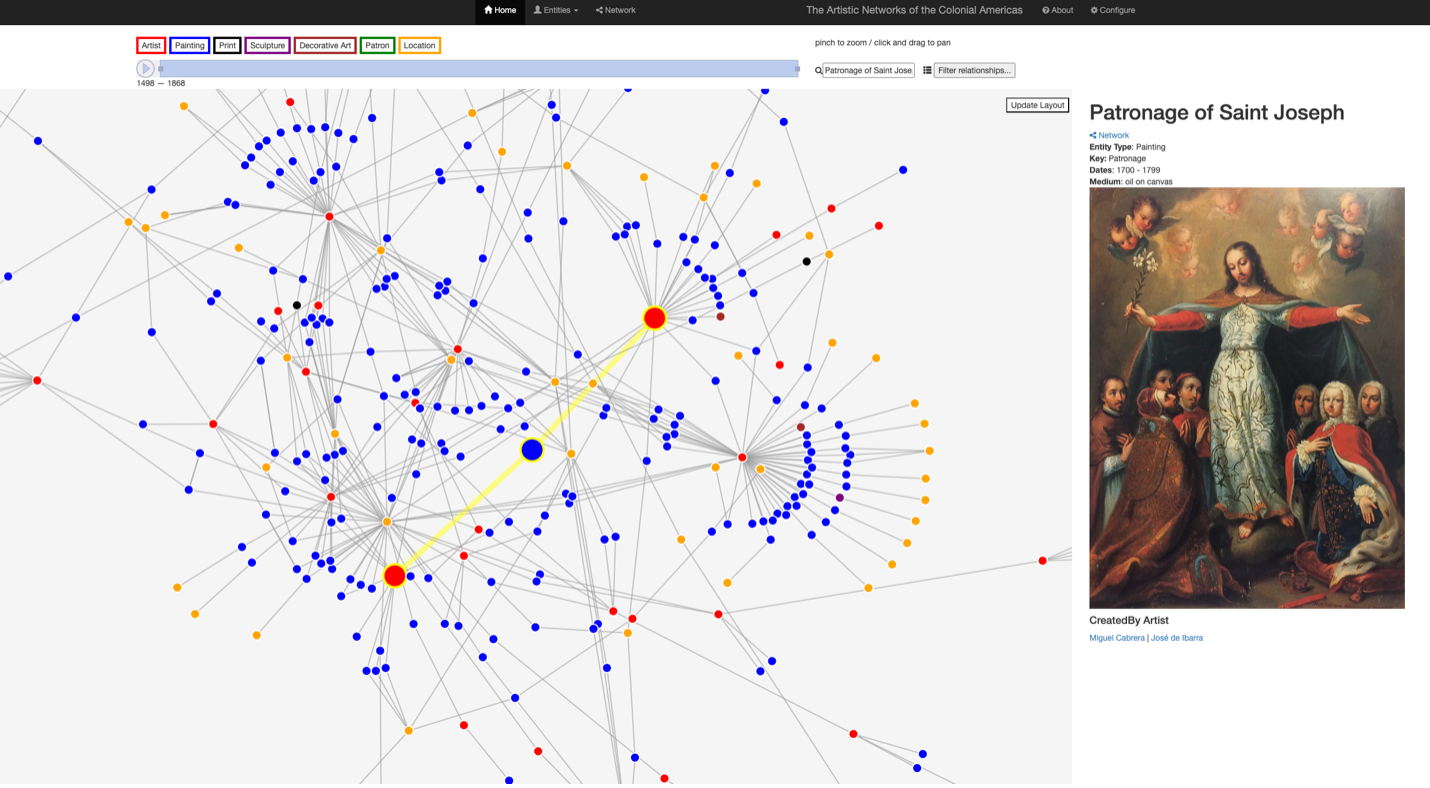
Following the same methods previously outlined in our discussion of the Raphael data, this emerging dataset following ANT transformation points to some additional examples of what this toolkit makes possible. The ability, for instance, to map relationships via potential collaborations on paintings opens up new avenues to consider authorship and attribution of works.
One case can be seen in a mapping of the dataset comprising the painters of New Spain, where the Patronage of Saint Joseph has been linked to the hand of Miguel Cabrera and José de Ibarra (Figure 4).
This potential collaboration has been noted in scholarship, however, the visual linkage between these makers creates a new space to synthetically consider the impact of these relationships. Imagine, as we continue to expand this dataset, that additional collaborations are
documented between these two artists (or, perhaps with other figures all together). What new themes might be revealed? The space of this visualization allows for such exploration.
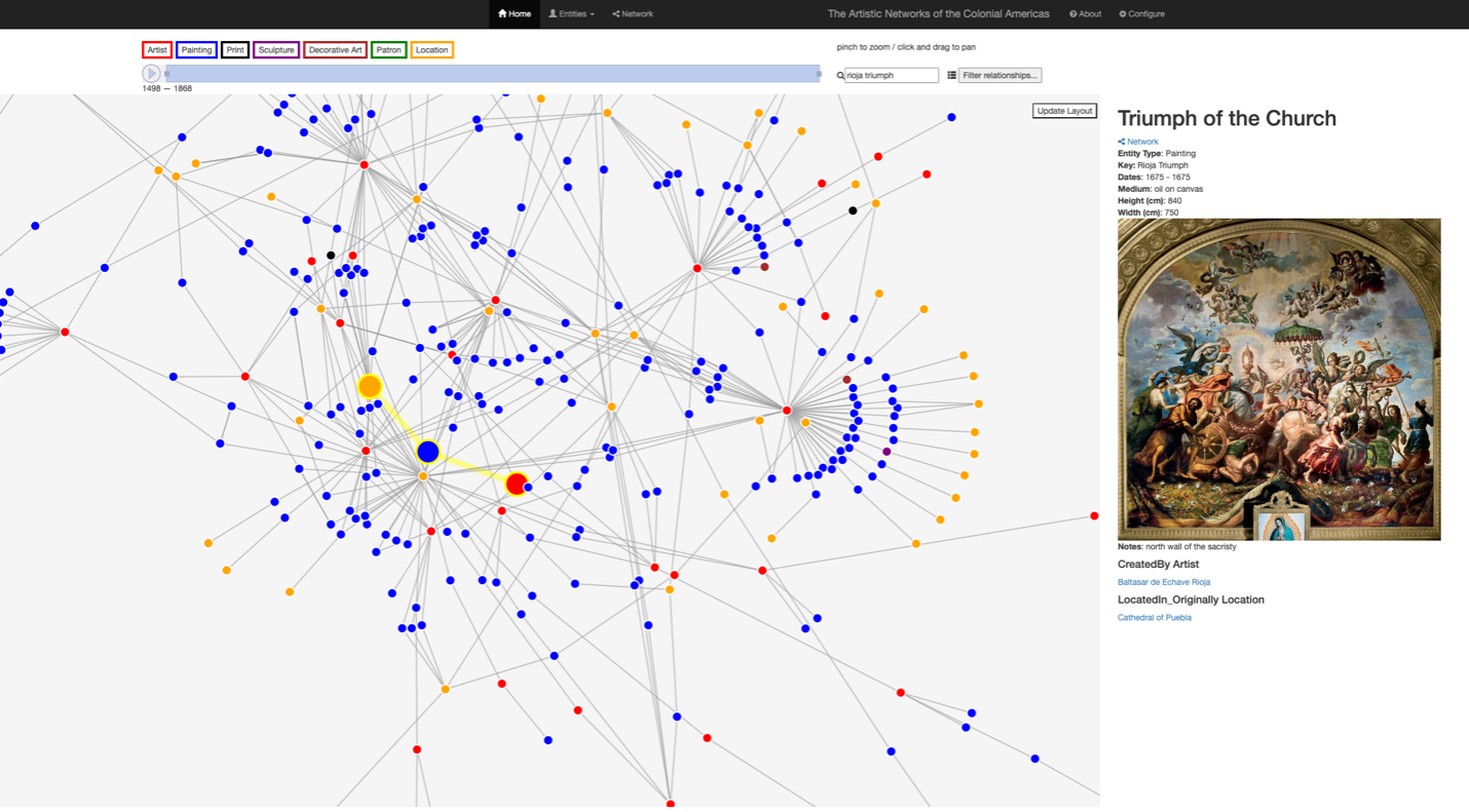
Similarly, early samples from this mapping reveal how relationships between workshops and relatives can be visualized anew. A prime example are the relationships established for seventeenth-century Mexican painter Baltasar de Echave Rioja (1632-1682).
In preliminary ANT-generated visualization, users can trace his tutelage under Seville-born artist Sebastían López de Arteaga (1610-1652). Simultaneously, familial artistic lineages can also be examined,
as Baltasar de Echave Rioja was reportedly the last of three generations of artists in the family (Figure 5). Patriarch Baltasar de Echave Orio (1558-1623) exported Spanish artistic training
to Mexico that was absorbed by his subsequent heirs culminating in the work of his grandson Baltasar de Echave Rioja (1632-1682).
The ability to bring together multiple generations of painters together in this new visualization space means users can consider more holistically
the various threads that might influence an artist’s body of work.
To date our Art of the Viceregal Americas dataset is small: our corpus of work from New Spain totals only 400 artifacts; the addition of our Peruvian Viceroyalty artifacts almost doubles that number, though it is still an inadequate sample of work from the period.
In the months to come we hope to continue expanding this corpus to a scale similar to that of the Raphael dataset. Nevertheless, experimenting with ANT using such a small set has its advantages in that it has allowed us to show that
even with a smaller data corpus these visualizations bear merit. Such accuracy is highly relevant, particularly in acknowledging that ANT should work as effectively with a corpus of 200 artifacts as it would with 20,000.
This recalls the strengths of our foundational spreadsheet design, as Google Sheets are capable of handling up to 10 million cells of data.
To further expand our analysis on a global level, we have also begun compiling a dataset of the myriad objects connected to the Chinese export market, ranging from Jingdezhen porcelain to Macau-made textiles of the fifteenth to eighteenth centuries.
Again, while chronologically similar to those artifacts within our Raphael dataset, the turn to such distinct entities of more diverse materiality – along with entities like paintings and prints –
allowed for us to begin investigating the strengths and limitations of our spreadsheet template design. It also afforded us the space to consider how the relationships between entities can be best illustrated.
For example, the directional relation between a preparatory drawing created by Giulio Romano for a subsequent painting by Raphael functions differently than a porcelain bowl that appeared in one of Willem Kalf’s seventeenth
century still-lifes.
The range of references also proved significant. The Raphael network was relatively geographically and culturally insular within the realm of Western Europe, and though the data pertaining to the art of the colonial Americas expanded beyond the continent’s bounds the reach the references
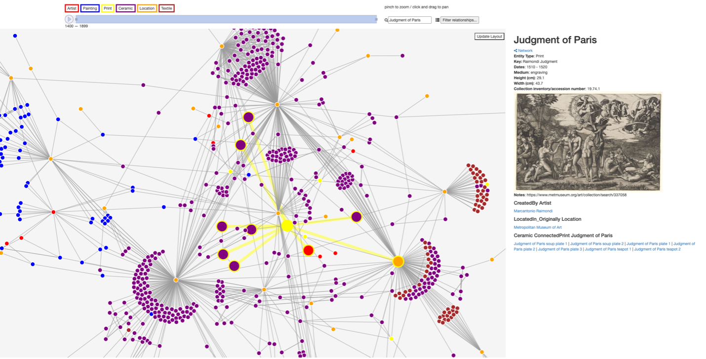
invoked in Chinese export production were global. As a case in point, one can note the mid-eighteenth-century porcelain service featuring a variation on The Judgment of Paris executed by Marcantonio Raimondi in collaboration with
Raphael more than a century prior (Figure 6).
While assessing this new data revealed some challenges, overall it pointed to our toolkit’s potential benefits for breaking down barriers to global assessment of artistic practice. First, similarly – if not more – beneficial than the case of our Raphael Dataset, immediate value is tangible in the overall mapping of these artifacts.
This is in part owed to the relative dearth of study of these wares alongside their accumulation in museum collections with minimal metadata to support their recovery by scholars. Far less studied than Raphael and his circle, the art made for the Chinese export market landed in collections around the globe.
The wealth of the collections that now hold these pieces combined with the (thankfully now fading) hierarchies that favored both Western tradition and “fine art” forms means that the accessibility of these objects remains minimal.
Bringing them together, however, in the space of our toolkit affords the potential for new insights. For instance, an early seventeenth-century kendi, or drinking vessel, in the form of an elephant held by the Metropolitan Museum of art might seem an outlier,
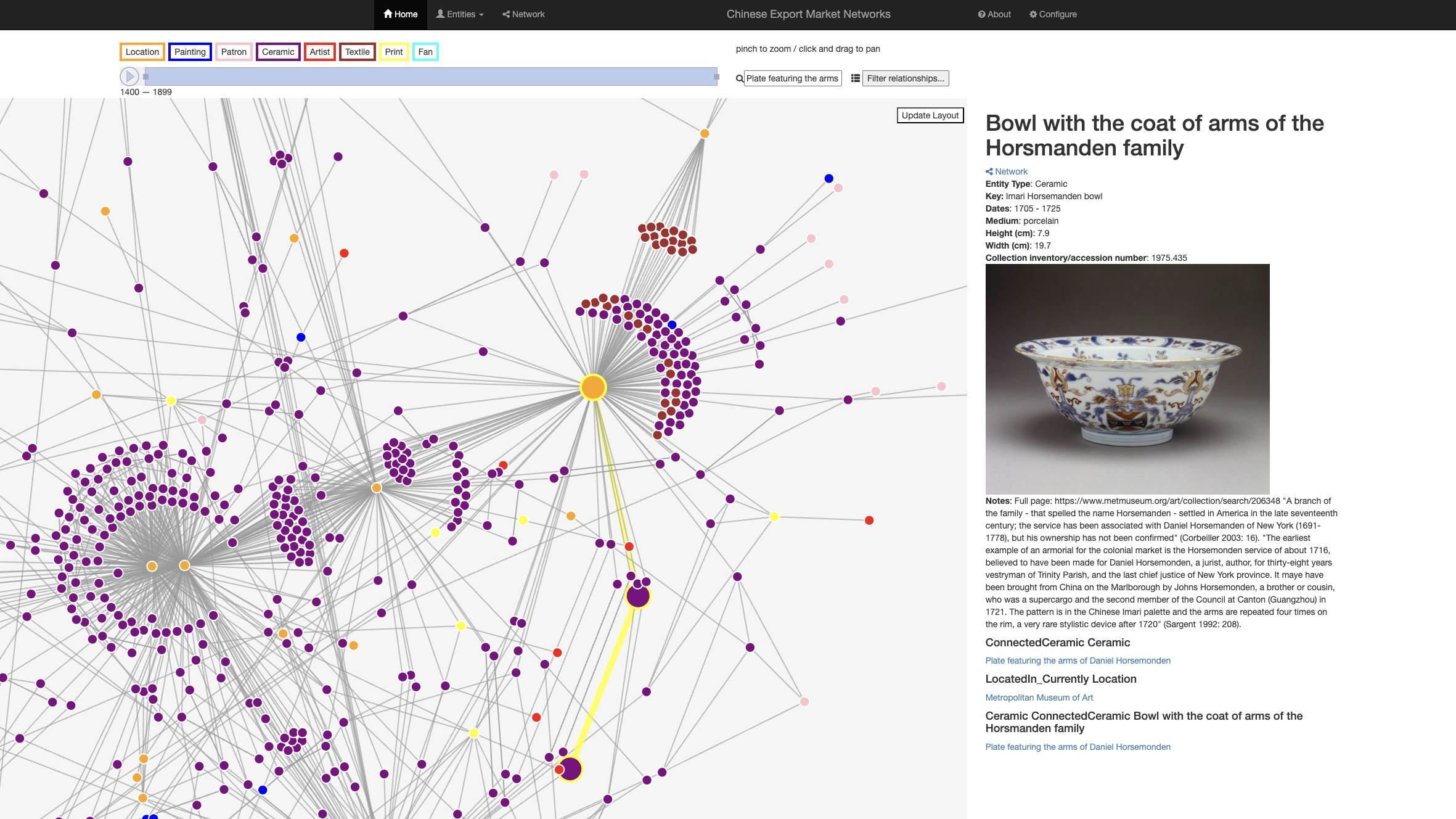
however, when this form is reunited with multiple members of its kin from global collections a richer space for exploring similarities in pattern and design emerges. Similarly, a piece from the early 18th-century Chinese Imari-style
Horsmanden armorial service gains new valence when it is “reunited” with a kindred vessel held in another museum collection previously obscured behind a spelling variation in the family name (Figure 7).
Furthermore, the ability to connect these works between media also presents a new space for assessment. A prime example is the previously mentioned motif dissemination borrowed from Raimondi’s Judgment of Paris print; another similar web can be found in porcelain wares bearing stylized versions of a series of paintings by
seventeenth-century painter Francesco Albani depicting the Allegories of the Elements (Earth, Air, Fire, Water). These exciting new links that begin to emerge in the spreadsheet alone can be further amplified when transformation into our toolkit’s network visualization.
Though larger than our Viceregal Americas corpus, our Chinese Export Market dataset to date comprises approximately 1,200 works across the media of ceramics, paintings, and textiles. This means it is approaching the scale of our Raphael Dataset yet given sheer production volume our goal is to build a set that surpasses that scope.
It also currently relies on examples from 100 museum collections (orange nodes) that are represented unequally in relation to the accessibility of their collection a point that demonstrates to some extent the earlier observation as to the siloing of
collection data within museum archives (as two of these museums – New York’s Metropolitan Museum of Art and London’s British Museum – have arguably made some of the greatest strides in terms of digitizing their collection for an online audience).
To be clear, this is not an exhaustive survey (as this dataset continues to be developed), but it seems valuable to note that even with this small data sample, we can showcase how our emerging toolkit allows us to build new links via collections to provide
a more informed metadata profile for each holding. If one extrapolates to a dataset of Chinese exports wares the same scale as the Raphael dataset, the potential for valuable insights and relationships grows exponentially.
To that end, it also recalls why the space of collaboration is so crucial to ANT’s design: by creating a toolkit that encourages collaborative data compilation, users can build and edit sets of an increasing scale. In other words, the more data that a team of students,
scholars, or curators can gather, the better the toolkit can perform as a reflection of these rich relationship webs. This collaborative potential makes such visualizations more efficient as teams can pool their resources and break down the barriers that might keep these relationships obscured.
At the same time, this collaborative capacity helps to bolster the integrity of both datasets and visualizations as it allows for a team – not an individual – to hold a valuable stake in metadata vetting thus resulting in more accurate and potentially less biased datasets overall.
5 Discussion
We have developed and publicly shared an open-source library that provides no-code solutions for flexible, collaborative network visualizations, and have demonstrated its application in three diverse domains. As we continue development of this library, there are several avenues of improvement we are pursuing.
In regard to data, our sets as previously noted are widely varied in scale and as such are not fully representative of the eras and production we hope to capture. This breadth is integral to our work because, in addition to using these sets as a training tool as we continue to develop ANT, we hope with ANT’s release to also provide these well-rounded corpora for public use.
To that end, we will continue to expand these sets and, as we do so, we will seek to identify any additional parameters that might be valuable to include. Of particular importance will be the incorporation of primary source links where applicable within the “Notes” section for each artistic entity.
We illustrate this in our publicly accessible Raphael Network, which now includes both references to primary sources that discuss specific works and nodes that demarcate scholarly attributions of works over history. As we develop and expand this component across our other case study sites ideally we will
tap into the rise in digitized versions of these sources so that users can easily move between them; that said, even a citation for these sources helps to further the space of ANT’s visualization as a springboard for novel scholarly investigations.
In terms of our toolkit design, our network visualizations are currently limited to entity relations. However, we are investigating extensions to support geographic relationships, as well as more sophisticated temporal modeling, to better situate art in time and place. The capacity to expand these relationships would prove particularly valuable when working with datasets like
those of the Viceregal Americas and of the Chinese Export market both to better appreciate the movement of ideas and material production and to be able to investigate the shift in production over time. Seventeenth-century hubs like Jingdezhen or Puebla appear in the same
“plane” as contemporary museum collections in both models; however, this anachronistic element can be overcome and will be the focus of our efforts in the coming months.
Second, we hope to improve support for uncertain information, for example by specifying time ranges for artistic creation, or multiple possible attributions for a given creation. We recognize the potentially reductive nature of network visualizations, wherein nodes and edges may obscure years of scholarly research around art and its creators.
In response, we are experimenting with allowing users to specify attributions as separate types of entities and relations in the data sheet, which provides an avenue for visualizing scholarly debates over critical facets of the data.
By adding scholars and their work to the network, one can explore the available evidence and reasoning behind each attribution, and how those attributions have changed over time as the field evolved.
Third, while our library is free and open-source, Heroku currently charges a small monthly fee to host the newly created website. We are investigating alternative cloud provider solutions that will allow us to host smaller demo projects at no cost, as well as providing a “sandbox” site that we host ourselves to allow users to experiment with ANT before committing to customizing their own website.
Fourth, we will add features to support importing data from existing art network databases, such as Getty’s ULAN [
Getty 2024] and the Metropolitan Museum of Art’s open data API [
Metropolitan Museum 2024]. By providing simple search interfaces into these existing data portals, we will allow users to construct more expansive datasets without having to manually enter each record. Challenges include harmonizing the schemas from these
disparate data sources to match the ANT database template and ensuring proper data licensing and usage are respected.
6 Conclusion
While our work on ANT is far from complete, the progress we have made thus far suggests that we are on track to produce a toolkit that will open doors to artistic data visualization for a wider, more global audience. Our drive to democratize access has allowed us to initiate a simple, intuitive design that allows users to easily transform their data into a customized and collaborative website in which artistic relationships can be explored.
While we continue to develop our case studies datasets to rigorously investigate the applicability and functionality of our toolkit across a global array of artistic production, we will scaffold these next steps upon the strong foundation of the beta prototype we have framed here.
7 Acknowledgements
We would like to thank our collaborative case studies team who have been valuable contributors to ANT’s development thus far. This team includes Kim Butler Wingfield (American University), Elizabeth Honig (University of Maryland), Lisa Pon (University of Southern California),
Sheryl Reiss (Newberry Library), Linda Wolk-Simon (Institute of Fine Arts, New York), and Fan Zhang (Tulane University),
as well as other research assistants from Tulane University that have contributed to the project: Caroline Casella, Sydney Feldman, Alessandra Fraim, Laura Malagrino,
Aine Powers, Rae Stevenson, and Jed Surio. This project is supported by the National Endowment for the Humanities under Digital Humanities Advancement Grant
#HAA-296281-24, by Tulane University's Newcomb Institute, and by Tulane's Lavin Bernick Grant program.
Works Cited
Bambach 2013 Bambach, C. (2013) “Leonardo and Raphael in Rome 1513-1516”, in Miguel Falomir (Ed.) Late Raphael: Proceedings of the international symposium. Madrid: Museo de Prado.
Bastian et al 2009 Bastian, M., Heymann, S., and Jacomy, M. (2009) “Gephi: An open source software for exploring and manipulating networks”, ICWSM, 3(1), pp. 361-362.
Conroy 2021 Conroy, M. (2021) “Networks, maps, and time: Visualizing historical networks using Palladio”, DHQ: Digital Humanities Quarterly , 15(1).
Falomir 2013 Falomir, M. (2013) “Raphael and Titian”, in Miguel Falomir (ed.) Late Raphael: Proceedings of the international symposium. Madrid: Museum del Prado.
Farago 1995 Farago, C. (ed.) (1995) Reframing the renaissance: Visual culture in Europe and Latin America, 1450-1650. New Haven: Yale University Press.
Franz et al 2016 Franz, M., Lopes, Christian T., Huck, G., Dong, Y., Sumer, O., and Bader, G. D. (2016) “Cytoscape.js: a graph theory library for visualization and analysis”, Bioinformatic, 32(2), pp. 309-311.
Frassani and Quiñones 2022 Frassani, A. and Quiñones Keber, E. (eds.) (2022) Visual culture and Indigenous agency in the early Americas. Leiden: Brill.
Girometti et al 2020 Girometti, S., Koln, H., Wagner, I.Y. (2020) Raphael and the madonna. Munich: Hirmer.
Greet. 2016 Greet, M. (2016) “Mapping cultural exchange: Latin American artists in Paris between the Wars”, in Thomas DaCosta Kaufmann, Catherine Dossin, and Béatrice Joyeux-Prunel (eds.) Circulations in the global history of art. Farnham Surrey: Ashgate. pp. 147-162.
Hyman 2021 Hyman, A. (2021) Rubens in repeat: The logic of the copy in colonial Latin America. Los Angeles: Getty Research Institute.
Kiennle 2017 Kiennle, M. (2017) “Between Nodes and edges: Possibilities and limits of network analysis in art history”, Artl@s Bulletin, 6(3).
La France 2013 La France, R. (2013) “Timoteo Viti and Raphael”, in Miguel Falomir (ed.) Late Raphael: Proceedings of the international symposium. Madrid: Museo del Prado.
LaMalfa 2020 LaMalfa, C. (2020) Raphael and the antique. London: Reaktion Books.
Lincoln 2017 Lincoln, M. D. (2017) “Continuity and disruption in European networks of print production, 1550-1750”, “Artl@s Bulletin”, 6(3): 2.
Middleton and Schneeman 2013 Middleton, N. and Schneeman, R. (2013) Heroku: Up and running: Effortless application deployment and sccaling. O'Reilly Media, Incorporated.
Nobre et al 2019 Nobre, C., Meyer, M., Streit, M., and Lex, A. (2019) “The state of the art in visualizing multivariate networks”, Computer Graphics Forum, 38(3): 807-832.
Schroth 2010 Schroth, S. (ed.) (2010) Art in Spain and the Hispanic world: Essays in honor of Jonathan Brown. London: Holberton Publishing.
Selama Stanfield-Mazzi and Vargas-Betancourt 2023 Selama Stanfield-Mazzi, M. and Vargas-Betancourt, M. (eds.) (2023) Collective creativity and artistic agency in colonial Latin America. Gainesville: University of Floirda Press.
Shearman 1983 Shearman, J. (1983) “The organization of Raphael’s workshop”, Art Institute of Chicago Museum Studies, 10: 41-57.
Vasari 1586 Vasari, G. (1586, republished 1996) The lives of the painters, sculptors, and architects, I: 736. Trans. by G. C. du Vere. New York: Alfred A Knopf.
Weyl 2015 Weyl, C. (2015) Networks of abstraction: Postwar printmaking and women artists of Atelier 17. Washington, D.C.: Archives of American Art.
Williams 2017 Williams, C. (2017) Raphael and the redefinition of art in renaissance Italy. New York: Cambridge University Press.
Wolk-Simon 2017 Wolk-Simon, L. (2017) “Competition, collaboration, and specialization in the Roman art world, 1521-1527”. In S, Reiss and K. Gouwens (eds.) The pontificate of Clement VII: History, politics, culture . London: Routledge. Kindle Edition. Chapter 14.