Abstract
Machine learning algorithms are increasingly used within the digital
humanities as heuristic methods in image analysis. Automated image
recognition methods and the sorting of image similarities provide access to
large image inventories, which are made accessible to a human eye primarily
via visual distance methods. In this context, the visualisations as an
interactive interface represent only one 'end product' of a dense series of
both qualitative and quantitative methodological decisions within a
research design. Especially these decision-making processes are the crucial
points within DH research, since with them the boundaries of
qualitative-image-scientific and quantitative-algorithmic approaches become
perceptible. This article addresses the process of a semi-automated
analysis procedure of large image data sets using Google Images on climate
change as an example. It results from a case study on cross-cultural
climate image comparison by the mixed-methods research team anci.[1] With the help of t-SNE
as a machine learning method for dimensionality reduction and the k-means
clustering method, the methodological process from data visualisation to
visualization is made critically and reflectively transparent. The term
pipeline serves as a metaphor for the methodological process.
Introduction
Algorithmic image sorting and its visualisation are increasingly used as tools in
digital art history and image science. These include, among others, their use as
hermeneutic and epistemic engines in art historical image search [
Bell and Ommer 2018], in the organisation of museum or collection-specific image
datasets [
Google Arts & Culture 2011], or in digital cultural analysis
[
Manovich 2020]. For this reason, for example, machine learning algorithms can
be used to automatically develop dimensions of image similarities. In
particular, human-computer interactions are enabled in the mode of “distant
viewing” [
Moretti 2020]. The visualisation of abstract data allows the
identification of trends and correlations in the data. A main component of
distance representation lies in the rapid recognition of optical patterns on the
part of the recipient [
Dörk and Glinka 2018] [
Dörk et al. 2020]. Graphical and image-specific methods of data representation are thus
given increased attention in DH research for knowledge production and
organisation – as opposed to primarily used textual methods. In our article we
discuss the development of methods for a semi-automated comparison [
Schnapp 2012].
The starting point for these questions is our research project on intercultural
comparison of climate images on the World Wide Web. Using the Internet search
engine Google Images, we collected images from different regional cultural areas
based on specific keywords related to climate change. Using machine learning as
a digital method, we want to find out how globalised or differentiated the
visual language of climate change is. For this purpose, we use a method of
dimensionality reduction (t-SNE) based on machine learning algorithms, which
enables human interaction with huge amounts of images by making them accessible
to the human eye in the form of a data visualisation. Within our mixed-methods
approach of quantitative computer science and qualitative image science,
qualitative image analysis and reflection thus begins with data visualisation,
which thus takes on a central role. However, our focus is not only on
visualisation as a quantitative end product or phenomenon. Rather, we focus on
the process of data processing and its curation, to which diverse data-shaping
decision-making processes are subjective: from collecting, to clustering, to
visualisation. Following Johanna Drucker's statement – “distant reading isn't”
[
Drucker 2017, 634] – we would like to emphasise that computer-assisted image
analysis including data visualisation is not only a distant viewing method in
the supposed sense of viewing:
Machine learning as a method is promisingly applicable within the digital
humanities, as it promises the analysis or comparison of large amounts of data.
However, the automated processes only ever consider the isolated structural
levels of the images. They are subject to unseen steps (black box) and
qualitative-curatorial decisions. The visualisation of the data as
visualisations of the distance within an operable interface is only a part of
it. Although the qualitative interpretation of the automated image sorting
starts from this distance view, we understand distanced seeing as the critical
dialogue between the pure image artifacts and the abstracted data visualisations
of computer vision [
Offert and Bell 2021]. With being distanced we focus on the
presupposition and technical standards that are used to abstract image data.
In the following, we would like to use the metaphor of the pipeline to critically
explain the development process of the t-SNE method. In individual steps, we
describe the process of method development and reflect on the central
qualitative as well as quantitative influences. Rather than focusing on the
added value of machine learning as a new method, we want to reveal how much the
structure of data and information is subject to constant decision-making
processes and how interdisciplinary difficulties emerge in the process. In this
deliberately open and critical handling of (visualised) image data, we see the
central added value of mixed-methods or DH research.
Methods pipeline
Within Google's image policy, one encounters a very standardised visual language,
which at the same time reveals considerable differences in the preferred image
types (e.g. photos, maps, curves, documents, comics) and in the framing of
climate change. Our present study on the cross-cultural comparison of climate
images is based on the framing approach from a qualitative image science
perspective [
Rodriguez and Dimitrova 2013], which was tested by means of
automated image analysis. We focus on the development of a technically
constructed gaze, which we critically explore in our study as part of the
pipeline. Its importance is particularly evident in corpus creation and Google's
page rank algorithms, as well as in image analysis based on the definition of
the machine learning algorithm. This led to our central research questions: What
is the role of automated image searches in terms of pre-sorting and ranking
climate images? What do machine learning algorithms [
Van der Maaten 2008] accomplish as a digital method for analysing image collections? To what
extent are qualitative human image sorting and t-SNE visualisation
interdependent?
As noted in the introduction, by distanced vision we mean the constant dialogue of
quantitative and qualitative decision-making processes. This already becomes
clear in the methodological orientation of our research project. As an
interdisciplinary mixed-methods research team, we oriented ourselves to the
so-called embedded design of mixed-methods research according to John W.
Creswell (
2007). Here, the quantitative and qualitative approaches are
considered separately, but in a consciously conceived interdependence in
dialogue. The focus is on the quantitative image data and their machine image
comparison using t-SNE as algorithmic image sorting and visualisation and the
subsequent qualitative reading of the resulting data images.
1 – Parametrisation - Thinking technically about cultural spaces
In this first step of project design, primarily qualitative distinctions are drawn
and decisions are made as to which phenomena of the object of study are
analytically and statistically usable. We call this basic step of formalising
the research project parameterisation.
Specifically, to describe intercultural climate image communication, two basic
aspects had to be formalised for our study: on the one hand, cultural spaces per se, and on the other hand, the spaces in which
climate images circulate. Thinking technically about cultural spaces turned out
to be a challenge. Our study looks at the most global arrangement of climate
communication possible, made possible by infrastructures such as the internet.
The political order of nation states is too reductionist in this structure, as
neither networked nor intercultural spaces can be thought of with the rigid
state model. The question, then, was how cultural spaces can be conceived on the
Net. After discussions with cultural scholars, we decided on the concept of locales as a unit of cultural space. A locale combines the idea of a specific language with a region or
country.
The second question about the representability of climate images related primarily
to their technical media spaces, since the global reality of image communication
on climate change is impossible to represent in its entirety. However, the
global technology of the internet allows us to consider the cultural
implications of this interconnectedness as a simplified model for cross-cultural
climate communications. Compared to social media such as Instagram or Tik Tok,
we were interested in the largest possible, extensively used, and highly
formalized media spaces. The focus therefore fell on the search platform Google
and Google Images as the largest manifestation.
So, in order to do justice to the technical idea of cultural spaces in the WWW and
Google as a search engine, we used the notion of locales.
We are aware that a locale does not correspond to the
idea of a cultural space, but is a heuristic for our research questions.
Setting the locales
The next step was to clarify which locales should be
compared with each other. We developed a focus list of eighteen locales. These locales form a
purely subjective selection based on previous research, contacts with
international researchers, and climate policy relevance. To counteract a
perceived biased perspective, we supplemented this with a number-based analysis
of climate indices, so that qualitative and quantitative approaches were mixed.
To do this, we created a two-dimensional mapping of the rankings for nation
states of two climate indices: the ND-GAIN index from the Notre Dame Global
Adaptation Initiative and the TCI indicator from the Stockholm Environment
Institute. In a subsequent identification of groupings, we captured five
clusters that outline focal points in each country's climate policy. The
following seven countries were exemplary selected: USA, Brazil, Germany, Kenya,
United Arab Emirates, Bangladesh, and Australia. Their locales were generated using simulated VPN searches.
Google image search – keywords
Our conducted image search via Google works by keywords. We were therefore
confronted with the problem of differentiating the climate change discourse into
a few but essential terms. In a highly iterative and qualitative process, we
randomly evaluated different keywords in different languages related to climate
change discourse in Google Image Search. We coordinated the exact definition of
the keywords with experts working in the field of climate research and
communication. In the end, we decided on eight terms to use as keywords and
search terms: (1) climate change, (2) climate change disaster, (3) climate
change impacts, (4) climate change risk, (5) climate emergency, (6) climate
crisis, (7) climate collapse, and (8) global warming.
2 – Google's image structure as a corpus
To create the image corpus, we extracted the essential data using the method of
web scraping via a Python script (via Beautiful Soup package). Web scraping
describes an automated procedure that makes it possible to retrieve specific web
pages and to retrieve previously defined elements of these pages. The data was
thus filtered by algorithms from the information architecture of Google Images.
This procedure is equivalent to an automated, qualitative curation of images
since it has to be manually decided which items from a website are taken. On the
basis of the Tor browser and its VPN tunnelling capabilities we technically
imitated search queries from different cultural regions concerning climate
issues.
For seven locales, we agreed on a subjectively determined quantity
of 250 images per keyword, since too many images would have limited the
qualitative evaluation of the image analysis at the level of perception. As a
tendency, it can be said that each technical arrangement benefits from more
data, but must remain manageable for the human eye to ensure qualitative
intervention. In addition to the image artifacts themselves, meta data of the
images and the source of origin were also collected.
The challenge that arose in our work with Google, understood by us as an epistemic
search engine, is which perspective of research with or about Google results
from this. According to the media scientist Richard Rogers, two approaches can
be described as “medium research” and “social research” [
Rogers 2017]. Medium
research asks about algorithmic mechanisms and political motivations, i.e., how
a web application is designed and for whom. As a critical research strand, the
technical limitations and ethical-social implications of Google and its
non-public page ranking algorithms are discussed here in detail. In contrast to
medium research, we have decided in favour of the second strand, social research
according to Rogers. This seeks not so much to expose the secret structures of
search algorithms, but rather to productively read the given structures of the
algorithm. For example, Google's rankings can be understood as indicators of
social trends, and questions about the popularity of search words and regional
emphases can be examined. Following this principle, we made a conscious decision
to use the t-SNE technology to visualise Google's ordering structures that
express the current social interest of global climate communication - i.e., our
research subject.
3 – Automated image analysis and its opacity
Our web scraping process resulted in a corpus of approximately 16,000 images. To
analyse this dataset, we searched for algorithms capable of formulating, at
best, their own criteria of similarity according to which image motif
recognition could be automated.
We used the artificial neural network method, specifically the Convolutional
Neural Networks (CNN) architecture [
LeChun 1999]. Another big resource
factor in neural network learning is the amount of data sets required. Our
16,000 images from Google Image Search are too few to make them usable for a
CNN. Again, for resource reasons, we therefore decided to use a pre-trained CNN
following Google's Inception v3 architecture [
Szegedy et al. 2015] based on
ImageNet's image dataset [
Stanford Vision Lab 2020]. In the practical
application, we had the approximately 16,000 images from Google Image Search
pre-processed by a Python script (via TensorFlow library) and obtained
multi-dimensional similarity vectors (2048 dimensions) for each image in
relation to the learned images and keywords from ImageNet by the pre-trained
neural network
Inception.
The identification of image similarities is central to our intercultural image
comparison. It is based in the method of image comparison, which is thought of
in a technical way compared to an art-historical orientation. Regarding the
exploration of the quantitative technical view, similarity means the structural
relation based on the trained ImageNet dataset. This can be structured in
colour, shape, but also semantic content. Only differences can be made that are
already created in the taxonomy of ImageNet. Since ImageNet is not specifically
designed for climate change imagery and Inception has not been explicitly
trained for this application, inaccuracies are to be expected. Thus, all images
are compared to the broadest classification system embedded within
ImageNet rather than particular climate image settings.
In addition, due to the structural complexity of neural networks, it is
difficult to identify the basis on which the algorithm has made decisions
[
Distill Pub 2007]. In addition to the black box in Google Images, another major
discordance is evident in the work with automated image analysis using
pre-trained neural networks.
4 – Dimension reduction or to be spoilt for choice
The 2048 dimensions of structural similarity resulting from the neural networks
are difficult to imagine for the human eye, which is why we applied techniques
for dimension reduction to an imaginable level in the next step. As statistical
methods, such methods have been developed in many different forms and focuses.
Established algorithms are, for example, principal component analysis (PCA) or
newer approaches, such as UMAP (Uniform Manifold Approximation and Projection).
Due to its effectiveness, performance, and resource-efficient implementation, we
decided to use a t-SNE (T-distributed Stochastic Neighbour Embedding) algorithm
[
Van der Maaten 2008]. t-SNE is a machine learning algorithm that
models high-dimensional objects through a two- or three-dimensional space in
such a way that, in principle, structurally similar objects are modelled by
nearby points and dissimilar objects by more distant points. These models can
then be represented by plots on a surface.
While t-SNE plots often appear to represent groupings, these visual clusters can
be strongly influenced by the calibration chosen, so a good understanding of the
variables for t-SNE is necessary. Thus, the creation of a t-SNE algorithm is
primarily a qualitative decision by the programmer about the variable values.
Calibrating the variables is a particularly consequential step within our
pipeline because it is on the basis of their data that the subsequent
visualisation is created: Reducing the high-dimensional relations to a two- to
three-dimensional space by the t-SNE algorithm creates distortions in the data
representation in every case. They manifest themselves in the fact that very
similar artefacts in a low-dimensional visualisation do not necessarily have to
be in spatial proximity to each other.
For our analysis, we created a t-SNE calculation for each locale and for each keyword. We calibrated the variables the same for
each locale due to the number of calculations and for
comparability reasons. In case of doubt, however, not every t-SNE is thus
optimally set up for the specific dataset. It is possible, in addition to the
general bias due to dimensionality reduction, that apparent groupings are not
present in the actual clustered data and thus may be spurious findings. This is
a principal challenge when working with automated dimension reduction and
subsequent visualisation. t-SNE visualisations cannot be simply read, but should
be understood primarily as a dynamic image under the calibration dependencies
described.
5 – Visualisation - Qualitative reading needs visibility
To merge the computational methods and the visualisation of the statistical
results, we created a web interface based on Yale University's PixPlot tools
with an interactive layout arrangement of the image corpus [
Yale Digital Humanities Lab 2017]. The web-assisted visualisation (WebGL) consists of a
two-dimensional projection in which similar images are grouped based on the
similarity vectors computed by the Inception v3 neural network.
In a further step, we complemented a k-means clustering in the t-SNE reduced
two-dimensional space of the images. Clustering is applied for the purpose of
identifying major centres of the t-SNE array by numerically comparing the
dimension-reduced similarity vectors. In the image analysis, these centres were
referred to as hotspots. It should be noted, however,
that t-SNE operates in continuous space, i.e., it does not group in a strict
sense. Thus, not every image in t-SNE corresponds to a complete and unique
centre, and thus there are no unique membership boundaries. The k-means
clustering does not perform the clear identification of clusters within the
t-SNE array, since the t-SNE data is not structurally meant to be clustered by
proximity. From a quantitative perspective, it serves only as an additional
statistical procedure to present the results for human perception in such a way
that one can orient oneself in the following t-SNE visualisation.
At this point, the important dual role of interfaces becomes clear: On the one
hand, only the visual representation allows access to the digital data
structures, which are thus imperceptible to human viewers. On the other hand,
the final representation allows little or no insight into the many
decision-making processes, constraints, and (subjective) interventions that led
to this representation.
From a humanities perspective, in the further course of the pipeline we asked
ourselves whether and to what extent the algorithmic t-SNE procedure can be
understood as a framing method for image masses. Because from the technical
sorting of Google's climate images, groupings of similarities resulted in this
pipeline that allowed thematic image focusses.
Overall, despite
locale-specific differences, we were able
to identify the following dominant or concise main motifs and image genres in
the collected images, which expressed themselves either as technically generated
image clusters or qualitative image groups. They can be understood as the result
of climate image communication in relation to Google's ranking and image
structures. In terms of image science, so-called “catch images” [
Diers 1997]
could be identified within the identified image groups, which were characterised
by recurring motifs and formal stylistics. These appeared more frequently in the
Google query due to their similarity and are reflected, among other things, in
the technically generated
hotspot images. The following
overview shows the most dominant image groups with central catch images as
single images.
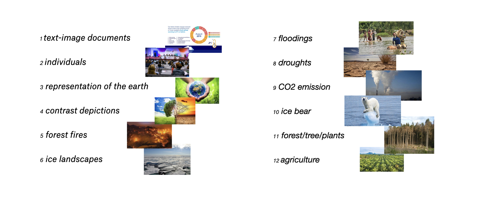
In total, three image types as an average of five concise main motif groups could
be located according to size:
- photographs, divisible into a) a group of images on the subject of environment,
nature, landscape, b) a group of people (conferences, groups, politics versus
protest/demonstrations), c) a group of images with representations of the earth,
and d) a group of images on the polar bear.
- text-image documents, including text-only documents, documents with diagrams,
covers of books and brochures, individual slides with text, activist posters
with slogans, occasional maps, cartoons or cartoon-style graphics, infographics,
and charts
- highly artificial photomontages (representations of contrast)
It could be determined that the t-SNE algorithm thus does not sort the images
exclusively according to image types and juxtaposes the image-text documents
with the photographs as central image clusters, but according to similar motifs
or image contents. In the t-SNE visualisations, images motivated by content – as
far as one can speak of content in computer image recognition – are placed next
to image clusters of another image type. This observation is significant because
it shows how similar technical-automated image vision and cultural-scientific
vision are on this level.
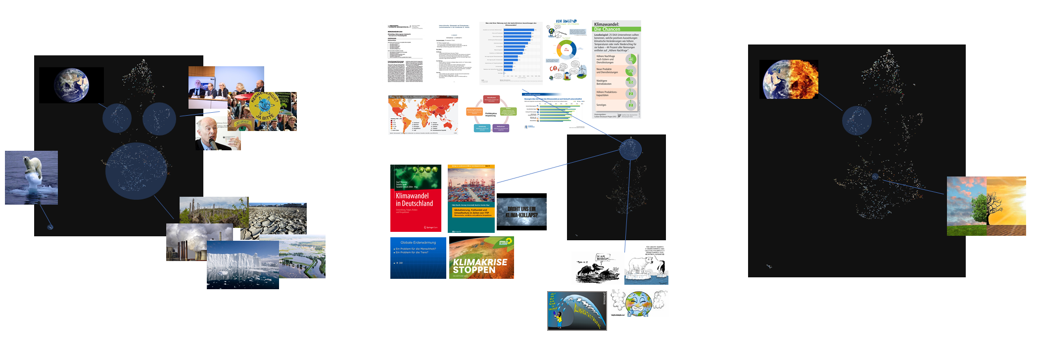
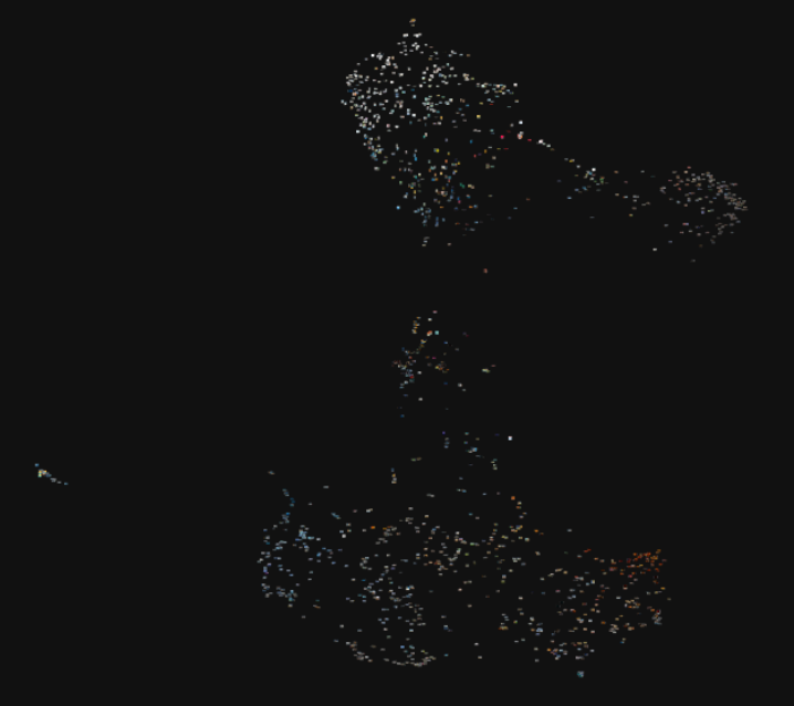
6 - Digital image swarms as a Gestalt
The qualitative assessment of the algorithmically sorted image motifs within the
t-SNE interface was based on the reception of large image swarms in which the
individual images were not perceived as such.
Thus, far from any visual content, initial hypotheses about the composition of the
visual landscapes could be detected on a structural level. For example, in the
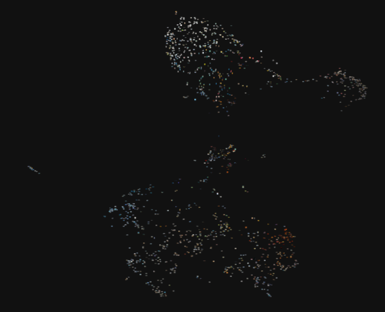
t-SNE of the search query for the Brazilian locale, a
total of five image groupings could be identified: a very large and colourful
one (centred), an isolated conspicuously dense and bright group (far upper
right), two image groups of heterogeneous colourfulness (centred right and lower
right), of which the centred one seems to merge into the large image group, and
a conspicuously strongly isolated elongated and dense image group in the colour
blue (lower left).
In addition, a very high similarity of the formation of the shape of the t-SNE
visualization from the Australian image query with that of the USA could be
found. Both image landscapes were similar in terms of density and distance or
scatteredness as well as colourfulness of the image landscapes. It was
reasonable to assume that despite different VPN tuning, these two locales were very similar in their Google image content
due to the same language of search terms.
Due to the visual complexity of the t-SNE visualisations from a distance, an
initial reading is based on Gestalt, as formulated by
perceptual psychology or Gestalt theory. Perceptible
were
- light-dark contrasts
- colour contrasts (white or coloured structures) and dominant colour
structures,
- an interplay between the homogeneity and density of the image tiles and
their heterogeneity and scatteredness.
Thus, the three perceptual patterns already allowed a comparison of the
country-specific t-SNE visualisations based on their different size ratios,
colour occurrence, and homogeneous or heterogeneous distribution of images.
With regard to the evaluation of the similarity of the images among each other,
hypotheses could be derived: The closer or denser the elements, the higher their
commonality is interpreted. The more elements are condensed into groups, the
more likely it is a common connection. This finding was expected after the
description of the technical clustering. However, it can be emphasized because
it is an expression for the actually invisible t-SNE-algorithm. Its logic of
image sorting becomes perceptible and operable as cluster visualisation for
content-related statements.
7 – Toggling as a digital image experience
On a qualitative level, the process of human perception of the climate images
versus the automated pattern analysis of the machine learning algorithm was
characterised by constant zooming in and out, a “toggling” process, within the
country-specific interfaces [
Schnapp 2012, 39]. In order to be able to
compare the image clusters according to their size and their content, it was
necessary to switch between individual images from a close view and the image
landscapes from a distant view. The procedure of the distance view, if
understood literally, offers the recipient an overview of the image collection
and helps to recognise patterns and structures, but it stands in contrast to the
individual viewing of objects: “At the same time, distance views, due to their
quantitative methods, are visually more abstract and more detrimental” [
Dörk et al. 2020, 120].
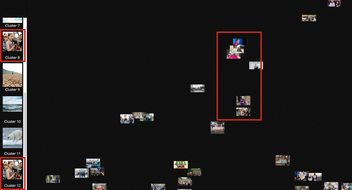
Using toggling, the individual hotspot images were
displayed by the machine learning algorithm as representative of a cluster in
the visualisation and qualitatively indexed with terms. The twenty
algorithmically evaluated hotspots were thus given a name
according to human classification and interpretation of the image object. The
qualitative naming of these hotspots served us as a first
step to get to know the image objects and to be able to name them descriptively.
It was done intuitively, but it was done iteratively by three different people.
This is because the indexing partly demanded a uniform and general naming of the
picture subjects or motifs (e.g., CO2 emission, polar bear, glacier), since
these occurred repeatedly in the intercultural country queries.
8 – Cluster versus image group
In the designation of the hotspots and their technical
image clusters, methodological differences between quantitative and qualitative
clustering emerged that had to be considered for the further course of the
qualitative image analysis:
- a) Hotspot images detected by the algorithm did not
correspond to any or only a very marginal cluster in the sense of an image group
according to qualitative assessment.
Methodologically, the question arose with regard to the t-SNE algorithm as to how
the computer technically defines a cluster and thus also detects the hotspot image. As the hotspot image of Greta Thunberg
from the Brazilian t-SNE visualisation, which occurred twice, showed, it was an
image that qualitatively did not take on any status as an image group. Rather,
the portrait of Greta Thunberg seemed to exhibit a high similarity factor
precisely in its duplicity.
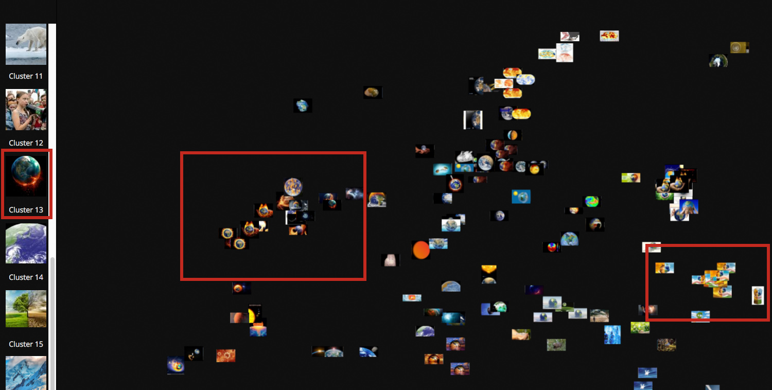
- b) At the same time, the problem arose that some images, which qualitatively
showed a high motivic similarity and evidence, were not detected as a hotspot by the algorithm. For example, the algorithm
identified images of the Earth as a colour contrasting globe within the t-SNE
visualisation of the locale Bangladesh as an hotspot image, while the same motif was merely a section
of the general cluster of Earths within the t-SNE-visualisation of the Brazil
locale.
Accordingly, it can be stated that the determination of a t-SNE cluster
technically does not necessarily result from a high number of images, but due to
a high similarity rate of sometimes only two images.
The German translation of the word cluster as accumulation or group therefore does
not find its fundamental meaning technically. We therefore used the word cluster
as a technical term in the sense of the t-SNE clustering algorithm, the word
image group as a qualitative determination of dominant motifs in their
frequency. Thesis-wise, it can be stated on a technical level that the higher
the similarity factor of the images, the more likely it is a technical cluster
with a hotspot. The higher the similarity value, the
closer the images tend to be to each other and the stronger the separation of
the cluster from the rest of the image swarm. On the level of human perception,
it can be stated that the higher the frequency of motifs with a common
similarity criterion, the more likely it is to be an image group.
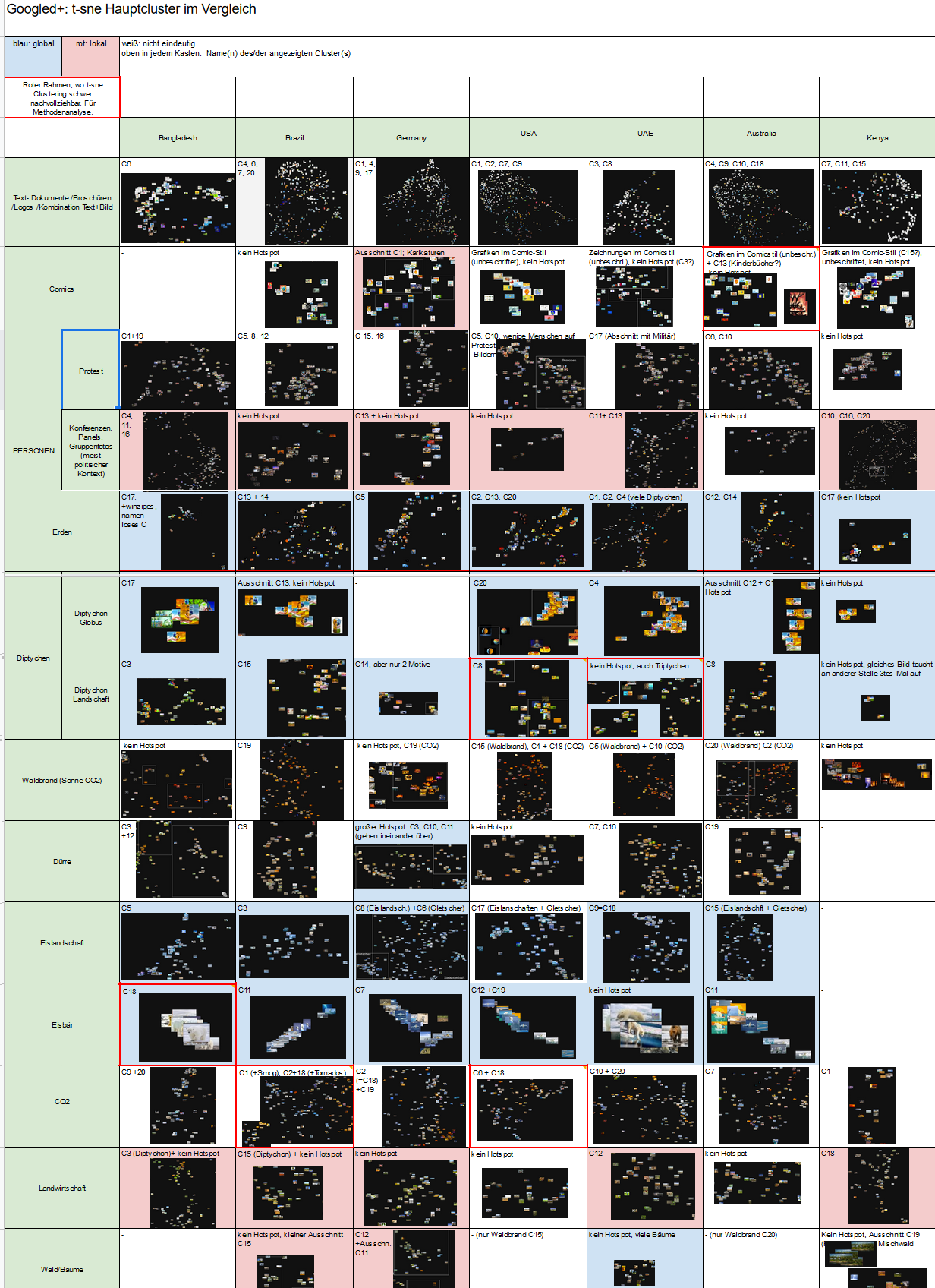
9 – Screenshot tableau
The distribution of denotatively determined main image content manifests itself
through observable variation among locales. We
qualitatively created a screenshot tableau that sorted and contrasted the
concise and central image clusters or groups of main motifs per locale. Methodologically, the systematic comparison of
the 90 screenshot clusters was a quantitative process within the qualitative
image analysis. As a procedure, the tableau in the form of a tiled overview
allowed us to determine size distributions, commonalities, and differences among
the clustered climate images.
The determination of the group sizes only took place in the form of tendencies.
The formation of the images according to iconographic similarity criteria is
partially interrupted by the algorithm due to formal-technical structural
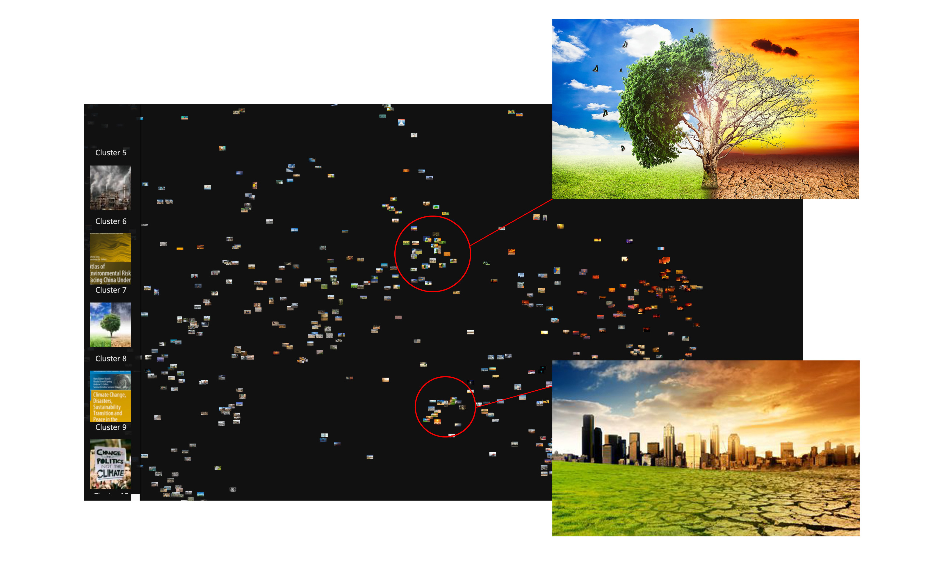
differences. For example, the photographs of artificially created contrast
representations diverged strongly in the visualisation of the Google images
according to the U.S. American locale. While from a
semiotic and iconographic perspective the green-orange contrast represents the
symbolic and evidential similarity feature for the dichotomy of healthy versus
dystopian climate futures, the algorithm separates this into two image clusters
distant from each other by structural image properties (structure of the tree
versus that of the landscape).
Conclusion
In the previous critical description of our pipeline, the qualitative inscription
and strong influence of the technical method of machine learning by us as image
researchers and due to 'external' software became clear. In contrast, the
qualitative view of the evaluation regarding the location of image groups was
strongly influenced by quantitative measurement and counting methods, such as in
the creation of the screenshot table. Becoming aware of this difficulty of
insight and technical complexity through the juxtaposition of different
algorithms is an essential building block in this form of mixed-method and thus
DH research. It is a circumstance that we will call
more-than-distant viewing for our study, building on Franco Moretti's
(
2000) concept of distant reading and following Johanna Drucker's (
2017)
countering approach of “distant reading isn't.”
Discussion of the methods: potentials and limits
While our automated image analysis described here is based on machine learning,
the algorithms are based on a lengthy and highly qualitative interpretation and
decision-making process. Thus, it became clear to us how our methodological
approach and use of Google as an access point to the universe of climate imagery
revealed more about current imagery occurrence in Google and how machine
learning algorithms can be made applicable to our topic, namely culturally
distinct climate imagery communication. The many preconceived technical
standards and qualitative inscriptions inherent in any computational process
became conspicuous at different levels and had a drastic effect on the entire
research process, including qualitative image analysis. We conclude with citing
four examples that illustrate this shift:
The basic parameterisation as a first step, for example, fundamentally shifted our
research question. In our example, the initially content-driven research
question about the globalisation of the visual language of climate change became
a formal description problem of how intercultural image communication can be
made measurable in itself. Such research then describes not so much the actual
object of research as the constraints and dynamics through abstraction for a
numerical logic. This statistical description and reductionist ordering of the
research object is the conceptual foundation for the so-called digital methods
in general, because every computer-based process needs the concrete distinction
and knows no spaces in between.
In a second step, we had to curate our image corpus of a global climate
communication. We are interested in mainstream image communication in cultural
spaces and, therefore, deliberately decided on the largest possible, extensively
used and highly formalized image space – Google Image Search. The so-called
PageRank algorithm that orders the search results via
Google Images was responsible for the type and diversity of climate images that
we analysed. It is known that around 200 factors [
Search Engine Land 2010] are
influencing this algorithm, while some are known the most relevant are kept well
hidden. This is why such a technical framework is often referred to as a
black box. Ultimately, this means that we do not know
the intrinsic ideas and models of the algorithms used and intentionally
reproduce them. In the end, what we ultimately analysed was not a neutral
perspective on climate communication, but the one shaped by google engineers.
One open challenge, therefore, is how to deal with the obvious but undetectable
biases of machine learning as a service applications.
Another challenge was the choice of algorithms for automated image analysis. We
decided to use machine learning algorithms for similarity comparison due to the
amount of climate images collected. This proved an important decision on several
levels: On the one hand, the productivity and the pure image volume that can be
processed were greatly expanded by automating the image analysis, as expected.
On the other hand, the calibration (training) and data
requirements of such machine learning algorithms are very expensive in
acquisition and maintenance, and thus far exceeded the resources of our project.
Therefore, we decided to use a pre-trained neural network called Inception v3 by
Google, which was trained based on the ImageNet dataset. The concrete
implications for the study are that the computed similarity between images is
not based on a dataset explicitly designed for the climate imagery corpus, but
is searched using a very generalist image corpus tagged with unknown motifs and
models. In addition, the machine learning architecture makes it not impossible,
but very difficult, to trace in detail the basis on which similarity relations
between images were found. We know that such algorithms develop a structural
view. We can thus deduce approaches, but not understand them in their
entirety.
Finally, the choice of dimension reduction had a decisive impact on the
qualitative reading of the visualisation. It decided on the definition of the
hotspots as well as the image clusters and,
connected to this, their reception in terms of content. The process of
qualitative perception and interpretation of the various image clusters or
groups turned out to be a challenging moment within the pipeline. In order to be
able to make content-related statements about Google's intercultural climate
image occurrence, it was necessary to permanently switch between distance view
and close view. Thus, a purely quantitative reading suggested by the t-SNE
technology and its visualisation could not be fulfilled. The quantitative
influence that the automated image analysis had on the qualitative image
analysis was unambiguous. For example, the indexing of the hotspot images manifested itself in a counting of recurring similar
terms and their comparison among the locales. In
addition, the creation of the screenshot table finally provided a measurement
method to decompose the t-SNEs into comparable components, to design order
tableaus, and to be able to make cross-cultural statements about climate image
occurrence.
Through the examples summarised, it is clear that our approach evolved over the
course of the study into more than distant viewing that
profoundly changed the epistemic practice of image analysis. Here, the
methodological combination of automated image analysis and qualitative reading
of data visualisation manifests itself as a challenging yet productive method
for examining large image datasets. The combination of machine learning and
visualization offers an alternative to graph-based layout methods and an
alternative to purely keyword-based image research, where clusters emerge via
language alone. The approach helps in the search for framings and the
exploration of images themselves. Ultimately, the following questions stood at
the end:
Why are Google image search results so clichéd in the case of climate change? At
the level of how climate change image searches differ in different regions and
language areas, the following points need to be discussed further: Climate
communication using images seems to be fairly standardised around the world. It
was striking how many similar and identical images Google displays in each
location. Each location has similar clusters such as polar bears, polar regions,
or people at conferences.
When we look at a t-SNE visualisation, the question is: How do these images
cluster? There is no automated method for detecting the clusters. We had no
comprehensible criterion for the hotspots or for
measuring the similarity of the images as what we eventually interpreted
visually. Discrepancies between the qualitative determination of a group of
images and the technical detection of the clusters by the algorithm became
apparent. Similarity in the technical sense in the form of the hotspots does not guarantee the determination of a high number of
related images. As we have seen, the term clustering as a hinge term between
methodological approaches can even be confusing. Thus, it is better to
understand hotspots as technical catch images instead of
(qualitative) image groups. Regarding the t-SNE approach, we can recommend to
mention the language use explicitly to be fair to the concepts of the different
disciplines.
To what extent do human and automatic image recognition differ in image sorting?
At first glance, it can be stated that humans tend to sort images according to
motifs, while algorithms sort images according to structure. This became
particularly clear in the form of a workshop in which we as a research team
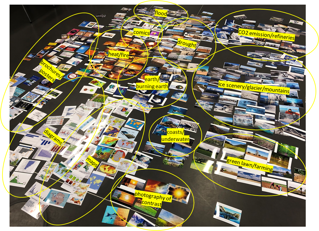
developed a section of the Google image corpus' on the German locale (550 images) as photographs and sorted them by hand. The
sorting was intuitive and based on themes and motifs. In doing so, unlike the
t-SNE algorithm in physical space, we did not set distances between image
groups, since we did not know at the outset how many images would belong to each
image group and since the size of the floor was limited. The efficiency of the
technology to manage huge amounts of images was clearly felt here. The colour
distribution of the manually created t-SNEs was a result of the image themes,
while the algorithm sometimes blew up content-related image correlations due to
different colour patterns. It nevertheless came out surprisingly that the human
image selection converged with that of the t-SNE in terms of clustering the
dominant image groups (drought/dry soil, heat/fire, earths, CO2- refineries,
maps, cartoons, etc.). This is significant because the process of creating t-SNE
visualisations from the source images does not extract semantic information from
the dataset.
Outlook
In conclusion, further research and in-depth arguments are needed to understand
the full implications and scope of the use of automated image recognition in
order to make a sound argument about the methods described. For example, Google
image ranking and the logic of the PageRank algorithm, i.e., the images Google
ranks on websites, need to be examined: Where exactly does the image corpus come
from? Who supplies the images to be found? Are there some globally ubiquitous
sources? Working with machine learning in the context of the Digital Humanities
also needs to be questioned, especially on an infrastructural level. This is
because working with datasets depends on software companies. There are few and
large tech companies able to offer their pre-trained algorithms (often free and
freely available). Reflection on the worldviews and values inscribed in them
must not give way to strong fascination with technical productivity. In general,
considering the qualitative moments in automation and the quantitative aspects
in analysis according to our model of 'more than distant viewing' is an
elaborate and laborious investment, but ultimately rewarding for the research
process.
Works Cited
Bell and Ommer 2018 Bell, P. and Ommer, B. (2018). “Computer Vision und Kunstgeschichte – Dialog zweier
Bildwissenschaften,” in Bell, P.; Dieckmann, L. and Kuroczyński, P. (ed.) Computing Art Reader: Einführung in die digitale
Kunstgeschichte. Heidelberg: arthistoricum.net. pp. 60-75.
Creswell and Clark 2007 Creswell, J. and Plano Clark, V. L. (2007) Designing and
Conducting Mixed Methods Research. CA: Sage.
Diers 1997 Diers, M. (1997) Schlagbilder: Zur politischen Ikonographie der
Gegenwart. Frankfurt a.M.: Fischer. p. 7.
Dörk and Glinka 2018 Dörk, M. and Glinka, K. (2018) “Zwischen Repräsentation und Rezeption –
Visualisierung als Facette von Analyse und Argumentation in der Kunstgeschichte,”
in Bell, P.; Dieckmann, L. and Kuroczyński, P. (ed.) Computing
Art Reader: Einführung in die digitale Kunstgeschichte. Heidelberg:
arthistoricum.net. p. 237.
Dörk et al. 2020 Dörk, M.; Bludau, M-J. and Brüggemann, V. (2020). “Zwischen Distanz und Nähe.
Formen der Betrachtung und Bewegung in (digitalen) Sammlungen,” in Geipel, A.;
Hohmann, G. and Sauter, J. (ed.) Das digitale Objekt –
Zwischen Depot und Internet. Munich: Deutsches Museum Verlag. pp.
115-123.
Manovich 2020 Manovich, L. (2020) Cultural Analytics, Cambridge: MIT
Press.
Moretti 2020 Moretti, F. (2000) Conjectures on World Literature. New
Left Review.
Offert and Bell 2021 Offert, F. and Bell, P. (2021) “Perceptual bias and technical metapictures:
critical machine vision as a humanities challenge,”
AI &
Soc, volume 36, pp. 1133–1144.
https://doi.org/10.1007/s00146-020-01058-z.
Rodriguez and Dimitrova 2013 Rodriguez, L. and Dimitrova, D.M. (2013) “The levels of visual framing,”
Journal of Visual Literacy, volume 30(1), pp. 48-65.
10.1080/23796529.2011.11674684.
Rogers 2017 Rogers, R. (2017) “Foundations of Digital Methods – Query Design,” in Van Es, K.
and Schäfer, M.T. (ed.) The Datafied Society – Studying
Culture Through Data. Amsterdam: Amsterdam University Press. pp.
75–94.
Schnapp 2012 Schnapp, J. et al (ed.) (2012) Digital Humanities.
Cambridge: MIT Press.
Szegedy et al. 2015 Szegedy, C. et al. (2015) “Going deeper with convolutions,” Proceedings of the IEEE conference on computer vision and pattern
recognition, pp. 1-9.
Van der Maaten 2008 Van der Maaten, L and Hinton, G.E. (2008) “Visualizing Data using t-SNE,” Journal of Machine Learning Research, volume 9, pp.
2579-2605.


.jpg)

