Abstract
Digital source materials such as films can be transformed in ways that suggest an
innovative path for digital humanities research: computationally manipulating sounds and
images to create new audiovisual artifacts whose insights might be revealed through their
aesthetic power and transformative strangeness. Following upon the strain of digital
humanities practice that Mark Sample terms the “deformed
humanities,” this essay subjects a single film to a series of deformations: the
classic musical Singin' in the Rain. Accompanying more than
twenty original audiovisual deformations in still image, GIF, and video formats, the essay
considers both what each new version reveals about the film (and cinema more broadly) and
how we might engage with the emergent derivative aesthetic object created by algorithmic
practice as a product of the deformed humanities.
On its face, film and media studies would seem to be a natural space for digital
humanities to grow and thrive, as it studies cultural objects that are either born digital
in origination, or digitized from cinematic or analog video originals for contemporary
distribution. Additionally, dedicated departments of film and media studies often include
video production in their scope, meaning that there are usually more digital resources and
expertise available than in other humanities departments. But in reality, most of the
methods that have been adopted in digital humanities pose challenges to apply to moving
images and sounds as an object of study, as with tricky technicalities of text mining from
audiovisual sources or copyright restrictions curtailing expansive digital editions of
films, or seem to work best when analyzing data outside of the media objects themselves,
as with mapping exhibition patterns or doing network analyses of actors across films. But
the existence of films and media texts as already-digital objects suggests another path
for digital humanities research away from quantitative data analysis: computationally
manipulating sounds and images to create new audiovisual artifacts whose insights might be
revealed through their aesthetic power and transformative strangeness.
[1]I have previously written about how we might consider videographic criticism as a digital
humanities research method, manipulating moving images and sounds to create new
audiovisual texts that convey arguments and ideas that would otherwise be impossible to
generate or articulate via the written word [
Mittell 2019]. In that essay, I
extended Mark Sample's “deformed humanities” to the videographic realm,
proposing three deformative techniques and applying them to a range of films to seek
discoveries within my research laboratory of Adobe Premiere. Such deformations apply
patterns and parameters to cultural works, looking to “break” the bound
object of a poem or film and create something new from the broken parts. As Sample argues,
the resulting deformations, which typically defy norms of sense and logic, do not need to
be returned into the rational realm of analysis to provide insights about the original's
design or meaning; instead, the strange deformed version can function as a new media
object, with aesthetic power and cultural resonances that are not circumscribed by their
relationship to their original. As he writes, “the deformed work is
the end, not the means to the end”
[
Sample 2012]; see also [
Samuels and McGann 1999]
[
Ramsay 2011].
Building upon my previous essay as well as other scholars' deformative videographic work
[
Ferguson 2019]
[
O'Leary 2019], this “sequel” takes a different approach:
subjecting a single film to a broad range of deformations as a way to explore the wide
array of deformative practices that might yield interesting results on a single object.
Singin' in the Rain is a particularly apt film to
repeatedly deform for a number of reasons. Few films are as well-known, beloved,
broadly-taught, and widely regarded as historically significant — if one effect of
deformative work is to make the familiar strange, it's useful to start with a film that is
quite familiar. Additionally, the film itself is about cinema at a moment of technological
transition from silent to sound, and thus it is thematically resonant to place it into a
technological laboratory to perform experiments with sounds and images, even if the film's
diegetic technologies are resolutely analog.
Singin' also features a broad
array of reflexive formal techniques and moments, including color, black-and-white,
dialogue, singing, dancing, film-within-film, and fantasy sequences, whose range and
variety encourages a playful approach via deformative operations, and thus might be
instructive and inspirational for other potential case studies. Finally, it is an unusual
film because it contains its own internal deformative moment: during the test screening of
The Dueling Cavalier, a synching glitch in the nascent sound film
technology causes the dialogue of two characters to swap; the diegetic audience's reaction
to this deformation via laughter and surprise highlights the pleasures of strangeness that
hopefully some of my deformations will provoke.
In providing an inventory of deformative practices, I do not aim to suggest
comprehensiveness nor a progression toward “better” methods and
revelations. This is a provisional list of techniques that I have found productive in
creating new cultural objects that seem meaningful and/or pleasurable, but I fully expect
many will find some of them uninteresting or unpleasant. I have thrown many techniques at
the proverbial wall, but will not inventory the failures that did not stick — except one
that might exemplify what a “failure” might mean in this context.
Inspired by the film's internal deformation of unsynched sound, I experimented with
“re-synching” that moment in Dueling Cavalier to line up
the proper dialogue, and then playing the rest of the film with this new sonic
synchronization — effectively making the strange moment normal, and the rest of the normal
moments strange. But the result was neither sufficiently strange nor interesting —
watching the film's dialogue and musical numbers with the sound lagging around two seconds
behind was simply annoying, not revelatory nor pleasurable. Thus the bar that each of my
subsequent deformations clears (at least to me) is to create something interesting and/or
enjoyable to watch and hear. I hope the same holds for all who proceed through this
strange wilderness of a broken classic film.
I fully admit that these resulting works are difficult to categorize. Are they acts of
scholarship? Do they contain or provoke arguments? Or are they creative works, more akin
to experimental films? Certainly there are many parallels with the latter, where the use
of algorithms and parameters on pre-existing footage creates new artworks, as with Martin
Arnold's glitchy remixes of cinematic fragments or Cory Arcangel's collages of YouTube
musical clips (see [
Bering 2014]
[
Zryd 2004]
[
Enns 2012]). I present these deformations here not in the context of an art
gallery or film festival, but rather embedded within a written scholarly essay, clearly
signaling them as academic expressions over artistic works. As I previously wrote
regarding the possibilities of videographic criticism, such works can embrace the poetic
and experimental scholarly impulse of Robert Ray's writing [
Ray 1995],
joining “scientific quantification and artistic poeticization
together, creating works that transform films and media into new objects that are both
data-driven abstractions and aesthetically expressive”
[
Mittell 2019, 230]. While each deformation falls short of the bar for
a piece of rigorous argument-driven scholarship, taken together I believe they do create
an argument for approaching an audiovisual work as a site of experimentation and play,
offering the possibility of revealing new dimensions and facets of a highly familiar
text.
#1: Still Frames
One of the first (and most inspirational) examples of filmic deformations I know of is
Kevin Ferguson's “summed frames” project. In
a wide-ranging website and associated
scholarly publications, Ferguson publishes still images of films that are derived from his
deformative manipulations. Using Quicktime, he exports a feature film into an image set,
typically a set of still frames sampled every few seconds of a film; Ferguson then
repurposes the open-source medical imaging software ImageJ to overlay all of these still
frames into a single “summed frame” image visual that distills all of
the light and color typically experienced flickering in front of our eyes over the course
of watching a film [
Ferguson 2016].
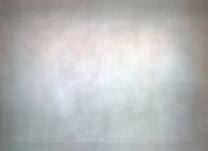
Ferguson's summed frame image of
Singin' in the Rain (see
Figure 1) is both beautiful and interesting. It presents
an impressionistic residue of the film's composition, lighting, and production design that
would be unidentifiable without context. Knowing the source material, we can see details
that resonate with significance, as with the outline of the screen-within-a-screen image
and red-tinted curtains on the margins that highlight the importance of cinematic
presentation within the film. Ferguson's work becomes more meaningful in comparison, as
the visual patterns and contrasts reveal insights into a corpus of films, as seen in his
collection of summed images of Disney features, Westerns, and gialli films [
Ferguson 2016]. Thus we could compare this image to those produced by summing
the frames of other MGM musicals, Gene Kelly performances, or Hollywood films from 1952.
But for the purposes of this project, I am less interested in using deformations to take
us outside
Singin' in the Rain than to revel in the strange
versions of the film that such methods produce.
Once we have broken the film into its component parts of still frames — in this case, a
folder of 925 still images sampling every six seconds of the film — we can perform other
operations to see what they might yield. Fellow deformation-minded digital humanist Zach
Whalen has developed
imj, a tool
that allows for straightforward web-based graphical analytics from a corpus of images
using three basic tools: plot, montage, and barcode [
Whalen 2016]. Plot is
by far the most analytical tool, offering data visualizations to plot an image corpus on a
grid with a range of variables to map onto the X and Y axes, including brightness, hue,
saturation, and luminance. Not surprisingly, the results create data-driven charts that
reveal tendencies and patterns within the film's imagery, but do not produce compelling
aesthetic objects in their own rights. The other two tools are more deformatively
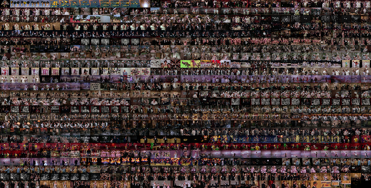
effective — the montage tool creates a visual grid of the film's frames laid out
sequentially. The resulting distillation offers some analytical insights into the scene
and shot breakdowns, but moreover it creates an experience that evokes
Singin' as we have never seen it before, simultaneously watching all scenes
at once but with a different visualization of temporality than Ferguson's summed frame
(see
Figure 2). If you know the film, you can identify
scenes, dance numbers, and narrative moments from this image, but you can also admire
designs that you could never see while watching the film.
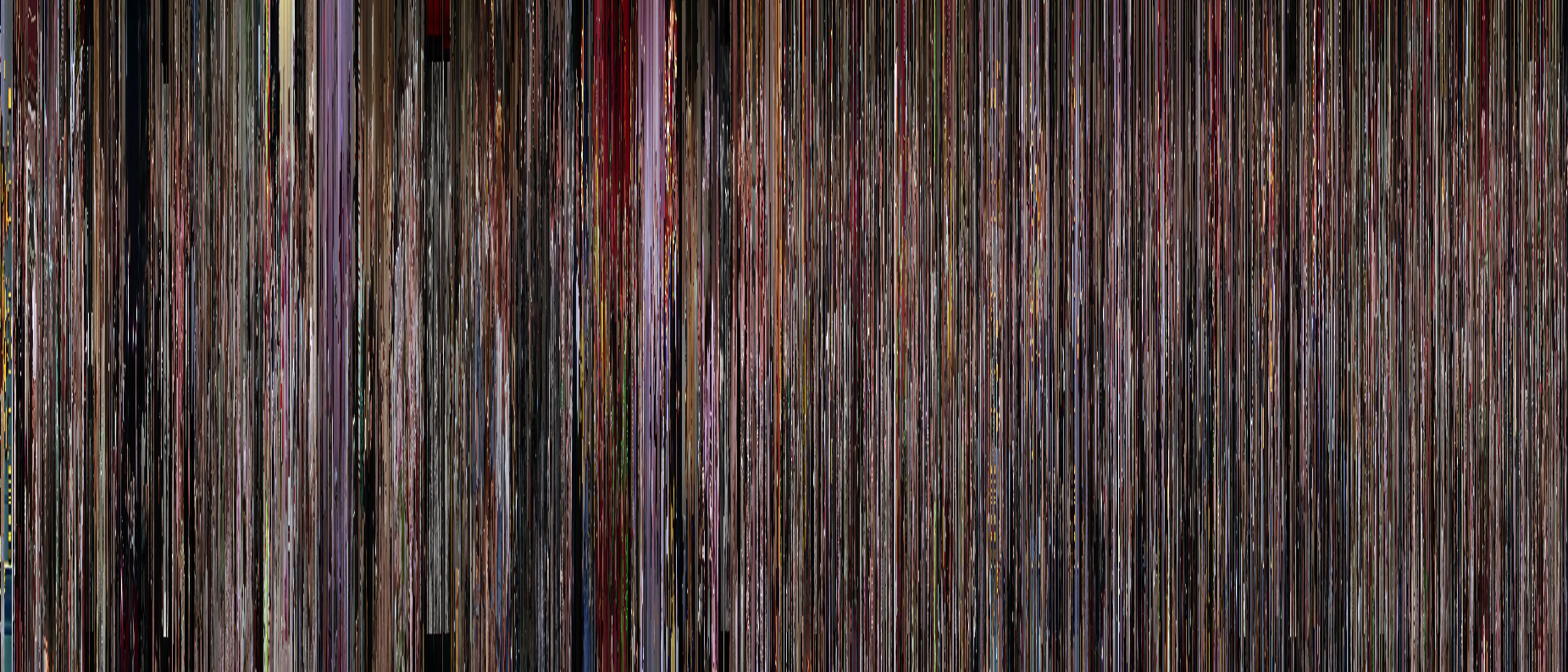
The third tool in Whalen's software package is the most deformative, presenting the sum
of the film's frames, but from a sideways perspective to create a barcode. The resulting
image certainly bears markers from the film, and knowing the source allows viewers to
identify scenes and even characters. But without knowledge of the source, it becomes a
work of abstract art — generated algorithmically from another work of art (see
Figure 3).
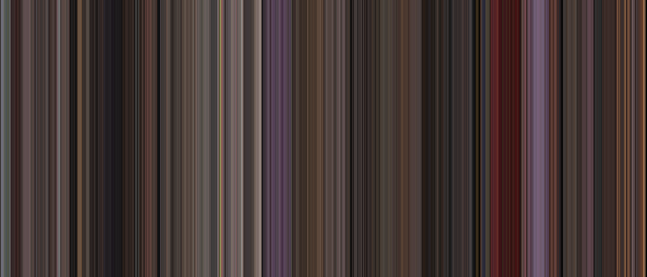
Of course, algorithms can be altered to create different results. Whalen's tool can
create a barcode that reduces each frame to its average or dominant color instead of
maintaining its core image pattern, as with the above image. The resulting barcodes, as
with this one below based on average colors of each frame, are much more abstract and
completely unidentifiable as a derivative work from one of Hollywood's most iconic films.
While such a barcode might be a more attractive pattern for a poster or pillowcase, as
an online shop does sell merchandise based on movie barcodes, it falls outside of
the nexus of aesthetic appreciation and analytic possibility where I contend most
effective deformations can be found (see
Figure 4).
A still frame itself could be thought of as a kind of manipulation of a film — even
though
Singin' in the Rain was originally composed of
approximately 146,000 still images projected sequentially, these frames were all designed
to create the illusion of movement. The deformations I've presented thus far have all
excluded movement as a design element, raising the question of how we might deform this
set of still images by reintroducing movement into their aesthetic. This question arose in
a conversation I had with Ferguson, as we brainstormed how to visualize the process of a
summed frame accruing over time. Most processes we explored via video editing programs
were underwhelming, as the accumulating image would coalesce into a composite blur after a
few seconds, with subsequent developments building up too subtly to notice.
[2] It became clear to me that a more
compelling version would require the images to slowly fade out, creating the effect of a
rolling accumulation of images that was too complicated for me to figure out in Adobe
Premiere. My solution, like with Ferguson's use of medical imaging software, involved
repurposing a tool designed for far different purposes — StarStaX, an image blending
program designed for star trail astronomical photography, proved to be the right tool to
create the desired effect, and then screen capture the process to create a videographic
deformation (see
Figure 05).
[3]The resulting video summing the film's frames creates a hypnotic tour through the film's
images in two minutes, creating an impressionistic collage effect that highlights color
and composition over plot and character. But the image-only version seemed lacking without
sound, so I tried to determine what the equivalent for “summed frames”
would be for sound. This challenge highlighted a core differential that creates challenges
for deformative videographic work: sound lacks clear units like
“frames” or “shots,” meaning that the entire
soundtrack is more continuous and fluid than the image track. My colleague David Miranda
Hardy helped me design a soundtrack that mimicked the frame sampling idea by isolating
sounds sequentially from the film, and using reverb effects to evoke the blurred
overlapping images. Together, the video creates an evocative experience that clearly
derives from the sequential film source, but creates far different aesthetic and affective
responses. As with any successful deformation, the work builds on the source material in
unexpected ways to create something that feels both derivative and original.
#2: Motion
Motion is a powerful transformative element in videographic deformations, whether imposed
upon still sources, as with the previous summed frame video, or harnessed from a film's
own motion. In thinking how to extract motion from a film as a deformative act, we can
look to one of the most widespread formats to disseminate motion: GIFs. As a short
repeating distillation of a moving image, a GIF can offer a tremendous tool for film
criticism via digital publication, as argued by Michael Newman, where both form and affect
can be captured for analytical purposes [
Newman 2016]. For instance, this
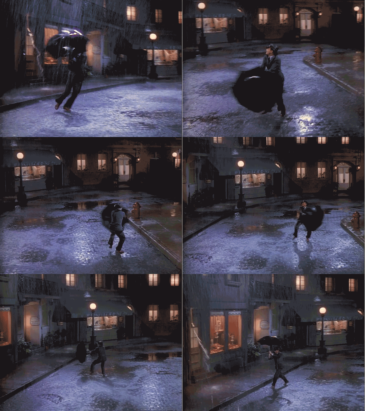
GIF of one of
Singin' in the Rain's most iconic shots
provides an opportunity to analyze the coordination between camera movement, dance
choreography, props, sets, and special effects to create a breathtaking affective moment
(see Figure 5).
But just as staring at a repeated word or phrase for long enough will cause meaning and
sense to start to break down, the repetition and abstraction of this GIF eventually
encourages a sense of disorientation, unfamiliarity, and strangeness that is familiar to
the realm of deformations, as Gene Kelly spins endlessly and breathlessly in the rain.
Thus choosing looped segments that promote such a sense of the strange can make new
deformed objects out of more conventional moments (see
Figure
7).
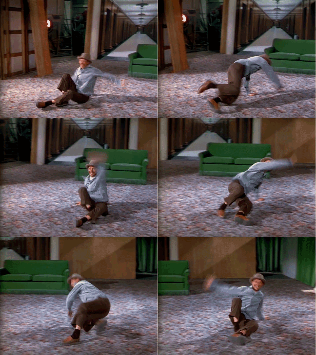
In the midst of his show stopping number “Make 'Em Laugh,”
Donald O'Connor's roll across the room is one of many entertaining moves that does,
indeed, make us laugh. As an endlessly repeating decontextualized GIF, it suggests
something more manic and disconcerting — perhaps an enchantment that O'Connor is doomed to
roll with an astonished grin for all eternity, or a curse on us the viewer to watch his
gleeful twirl for an equally long time. Other GIFs can capture a moment that is itself
already innately odd (see
Figure 8).
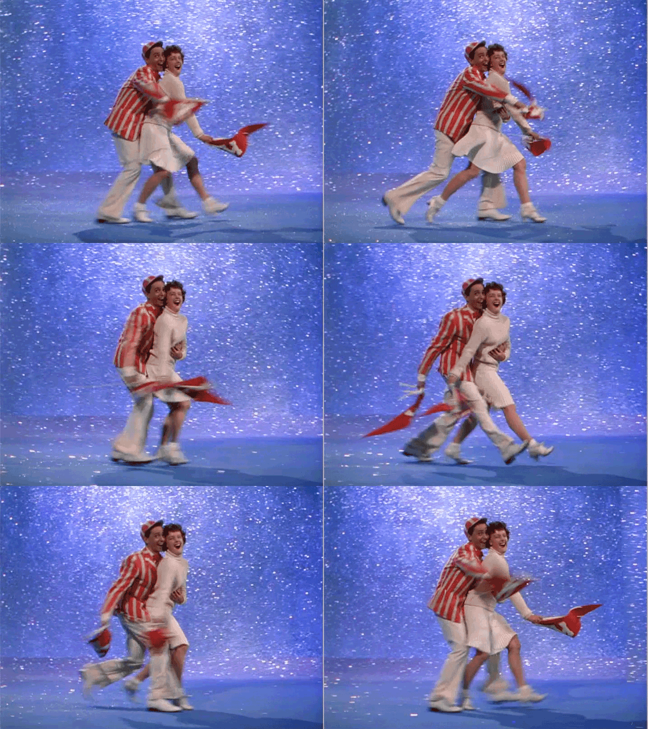
A tiny excerpt from “Beautiful Girl,” one of the film's most
idiosyncratic numbers, creates a GIF that evokes no narrative, performance, or character
resonances; instead, it just captures pure style and tone, poised to circulate in today's
natural habitat for GIFs: as an affective response on social media, disconnected from its
cinematic source.
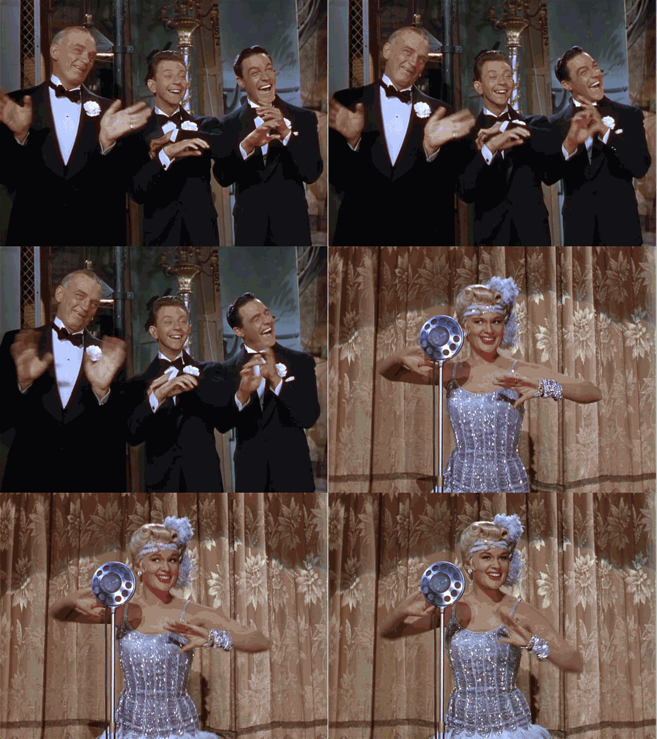
My personal favorite
Singin' GIF captures a moment of fake dance, as Don,
Cosmo, and Simpson mock Lena's attempt to perform a musical number (see
Figure 9). As the interchange between the two shots repeats
endlessly, the expressions feel more exaggerated, the mockery more pointed and severe. I
can imagine ways to exaggerate and further deform the image, but the effect remains
strange and off-putting even as the source material is left intact.
A single GIF can transform a moment by repetition and decontextualization, but combining
GIFs offers new deformative possibilities via spatial montage. Back in 2001, Lev Manovich
predicted that “broadband cinema” of the internet era would foreground
the multiplicity of frames and screens by juxtaposing images spatially as an alternative
to temporal montage [
Manovich 2001, 322–326]. More recently, Catherine
Grant has theorized the function of spatial montage in videographic criticism, exploring
how the meanings and signifiers coexist and resonate through juxtaposition via
split-screen designs [
Grant 2018b]. But applying spatial montage to GIFs
pushes away from signification and meaning, as the decontextualized looping images bounce
off one another to create affecting, engaging, and surprising compositions; as Jennifer
Malkowski has productively analyzed, such compositions are popular in fan communities in
the form of GIFsets, where users of sites like Tumblr create and curate carefully arranged
groupings of GIFs to express affective connections between looping motion sequences. As
Malkowski suggests, “Spatial montage displays multiple moving images
on screen at once, granting the work's maker new powers of artistic juxtaposition and
its viewer access to a broader and more complex visual field”
[
Malkowski 2017]. Thus we might imagine a GIFset as a site of deformative
possibility to create new ways to experience
Singin' in the Rain's
motion.
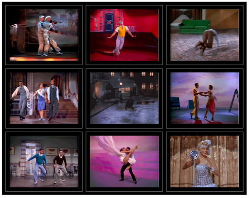
I created a number of GIFs of dancing loops from across the film, each designed to
approximate continuous motion (see
Figure 10). In arranging
them in a three-by-three GIFset, I focused on juxtaposing modes of motion that seemed to
interact in interesting ways, considering both camera movement and the choreographed
bodies of the performers. One of the interesting effects of the GIFset results from the
varying lengths of each GIF, creating a phase effect among the repetitions of the loops
that diverges over time. As the loops shift their sync, we can see unexpected resonances
between the motions in neighboring frames, making the viewing experience quite variable,
as spatial montage structures the productively arbitrary temporality.
Of course, GIFs extract moving images from the film, discarding the soundtrack. Using the
logic of the GIFset, I created a simulated GIFset within Adobe Premiere by arranging the
video in a grid and copying clips to mimic the looping effect, thus providing an
opportunity to add a soundtrack. Given the choreographic content of the GIFs, I excerpted,
looped, and layered one of Gene Kelly's “Gotta Dance” lines
from “Broadway Melody” to create what feels like a hypnotic, if
arhythmic, sonic collage to accompany the grid of dancers (see
Figure 11).
Following the GIFset logic to its most chaotic conclusion, I created another simulated
set of GIFs to loop both video and audio within a three-by-three grid. The opening to the
musical number “Beautiful Girl” is the film's most chaotic,
random, and arbitrary sequence, with snippets of technicolor dancing and singing to a
patchwork of early movie musical numbers, created in tribute to 1930s Busby Berkeley
musicals. I chose nine different visual moments and created a looped grid, allowing the
audio to loop in a cacophonous sonic overlay (see
Figure
12). By making the film's strangest moments even stranger, the effect is certainly
overwhelming and not necessarily pleasant, but seems to capture something of the
original's disorienting tone.
There are certainly other means to emphasize and deform motion beyond extracting
sequences into GIFs. Kevin Ferguson offers another instructive example in his video “Edge” (see
Figure 13).
Following from his summed frame work, Ferguson exported the frames of the musical number
“You Were Meant for Me” and the opening credit sequence at
twenty-four frames-per-second grouped into folders for each shot from the film. He then
experimented with ten different ImageJ algorithms to perform “edge
detection” operations on each set of stills, creating a variety of effects
that resemble hand-drawn animation and other abstractions that emphasized the edges of the
characters and set. Ferguson reassembled the video by placing the grouped still frames in
sequence on top of the soundtrack in a video editor, literally animating the
edge-abstracted images to reconstitute the film. The effect is a marvel of motion and
blank space, provoking thoughts on how we perceive and constitute movement via cinema,
while creating moments of expressive beauty hidden in the original film. Additionally,
knowing the underlying process helps us remember the materiality of moving cinematic
images as successive still frames, a digital transformation that evokes the analog
original.
Focusing on motion in a dance-centered film also raises questions about what movement in
a cinematic dance sequence entails. Certainly much of the beauty in
Singin' in the Rain's choreography involves the coordination of moving bodies
and moving cameras, as many of the GIFs highlight. But what if we force ourselves to focus
more on bodies, and specifically body parts in motion — what will we see differently? With
that question in mind, I deformed one of the film's most iconic dance numbers, the title
track, by masking the image to only include Gene Kelly's hands and feet (see
Figure 14).
As the extremities of Kelly's body, his hands and feet explore the staged space most
broadly, while eliminating his face and torso directs our attention to these abstracted
movements in rhythm to his disembodied voice. To me, the effect of the video is cartoony,
bringing out the animation inherent in dance, but in a more playful and almost inhuman way
than Ferguson's “Edge” video. While we watch these body parts
in motion, we see them as animated shapes on a black background, where the edges of the
mask become noticeable much like Ferguson emphasizes the edges of the dancers' bodies. I
find the captivating simplicity of his moving hands and feet to simultaneously capture and
deny the beauty of Kelly's mastery of cinematic dance.
#3: Shots
Returning to the fundamental elements of film, we can look at specific shots as another
type of raw material to create deformations. In my earlier essay, I suggested some
deformative possibilities tied to shots, including a videographic version of Nicholas
Rombes's “10/40/70” project [
Mittell 2019]
[
Rombes 2014]. Rombes's protocol juxtaposes three still frames from a
feature film, from the arbitrary 10, 40, and 70 minute marks, to see what meanings and
insights might emerge; my videographic version compiles the shots that occur at those
minute markers to create a short film composed of three arbitrary but chronological shots
(See
Figure 15).
The three shots do present an effective mini-narrative, focused on Don's romantic life
starting with the flashback scene of Don initially meeting Lena and her rebuffed attempt
to silently court him once he is promoted from stuntman to movie star. The next shot is
coincidentally the longest take in the entire film, as Don and Kathy escalate their
romance while walking across the studio lot and he assures her that he's not involved with
Lena. The sequence ends with a shot of Don gleefully dancing in the rain, celebrating his
joy over finding love with Kathy. While this brief deformation lacks the interesting
insights that some of the other videographic 10/40/70 examples I discussed in my earlier
essay, it does highlight how the combination of arbitrary shots can create meaning and
resonances.
A more holistic approach to deformation considers how the film in its entirety is
organized into shots. In Premiere, I segmented the entire film into its component 376
shots (splitting dissolves and wipes in the middle of the transition) to create a corpus
to experiment with. Although we don't typically think of a video editing platform like
Premiere as a database, it effectively is — subclips are actually just metadata entries
referencing the original video to indicate timecode in and out points, as well as any
other effects or transformations. Because Premiere can include some of this metadata in
its view of a folder of clips, it was easy to sort the 376 shots ascending by length with
a single click; then I gathered the clips into a sequence that re-organizes the entire
film by ascending length of shots (see
Figure 16).
The resulting edit forgoes narrative coherence for another organizing principle driven by
shot length, yielding some intriguing moments. The video certainly starts frenetically,
with fifty-nine shots in the first two minutes — many of these come from the “Beautiful Girl” number, the film's most disjointed, chaotic, and
quick-cut sequence. The early moments are often amusing, with massive tonal shifts and odd
juxtapositions, such as the audience reaction shots responding to random dance moves or
lines; at around 1:30, a number of shots from The Dancing Cavalier premiere
create a disjointed version of Lena's attempt to sing in front of an audience. As the
shots increase in length, some of the arbitrary juxtapositions become more interesting, as
with the cinematically reflexive sequence starting at 9:50, featuring shots of
Variety newspaper headlines, the closing “The
End” title, the opening credit of The Dueling Cavalier, and the MGM
lion, all intercut with random shots from the film lasting around seven seconds each. At
43:00, a sequence emerges with shots lasting around twenty-six seconds that sandwich two
moments from Kathy and Don's first tempestuous meeting around their final kiss, contrasted
with Don performing with the film's other two fictional romantic partners (Lena and the
unnamed dancer played by Cyd Charisse), and the film's final shot of the happy couple
looking at their own billboard for the film-within-a-film; while not narratively coherent,
these arbitrary juxtapositions driven by shot length create a more compelling set of
contrasts than the 10/40/70 sequence.
The full recut film is hard to watch except as a detached analyst looking for patterns,
as the feeling of random disjuncture overwhelms any sense of continuity. However, for some
reason this is by far my most-watched video on Vimeo with over 15,000 views as of February
2021, vastly exceeding full-fledged video essays that have been broadly disseminated and
shorter experiments that seem more poised to go viral. It's hard to identify what the
appeal of this deformative take on the entire film might be, but seemingly it has
attracted an audience — the one theory I can imagine is that people are stumbling upon it
while searching for an online version of the full film, although that does not explain how
the video registers an average of 20% of the 100 minutes viewed and more than 190
“finished” viewings.
[4]The biggest insight that I gained from this experiment comes toward the end of the video
— prior to sorting by shot length, I had assumed that the longest takes in
Singin' would be within dance numbers, as the moving camera would capture
the choreography without frequent editing.
[5]
However, only one of the nine longest shots to conclude this video is from a musical
number; the rest are lengthy dialogue sequences. The longest shot of almost two minutes,
as mentioned before, follows Don and Kathy through the studio lot and thus feels
choreographed without music, but the others (all longer than a minute) include Kathy
driving Don in her car, Don and Lena's red carpet interview at the start of the film, the
cast rehearsing the dialogue scene in
Dueling Cavalier, and numerous
discussions behind the scenes debating the film studio's next moves. I decided to capture
this insight by creating another deformation highlighting these nine longest takes in
tandem (see
Figure 17).
When arranged next to each other via spatial montage, organized by when they appear in
the film chronologically, we can see shared traits in the film's cinematography and
blocking, highlighting how movement is featured within many scenes even without dancing.
This grid highlights how
Singin' in the Rain functions as a
long-take film, with an average shot length of 16.4 seconds, a cutting rate comparable to
many filmmakers renowned for their long-take styles, such Max Ophüls, Stanley Kubrick, and
Michelangelo Antonioni.
[6] Few critics would place Stanley Donen and Gene Kelly in such company as
masters of a long-take aesthetic, as their films are best known for cinematic movement
more than duration. But as this experiment reveals,
Singin' is anchored by
many long-take shots and single-take scenes that run longer than the dance sequences it is
most renowned for, suggesting the film and broader genre may be due for a formalist
reappraisal.
#4: Speed
As the discussion of shot length suggests, timing is a central facet of film technique,
and thus a realm ripe for deformation. Since video editing platforms like Premiere can
easily change the duration of a video by speeding it up or slowing it down, this is a
useful tool for deforming footage. As I outlined in my 2019 essay, one way that speed can
deform a film is by creating an “equalized pulse” that remaps the time
of every shot to match the sequence's average shot length [
Mittell 2019]. In
that essay, I deformed a number of films and scenes this way to chart a range of outcomes;
here we can look at a number of different sequences from a single film whose equalized
pulses are suggestive.
We might start by watching the entire film equalized to its shot length of 16.4 seconds,
but this is a true endurance test (see
Figure 18). Many of
the moments are overwhelmingly strange, such as the opening sequence of the “Beautiful Girl” number starting at the thirty-three-minute mark,
where the montage of quick shots that runs just fifty seconds in the original film drags
out in super slow-motion over five minutes. Other segments provide compelling contrasts,
as the sequence starting at the thirty-one-minute mark: Don and Lena are shooting the
silent version of
Dueling Cavalier as Simpson runs in to announce the
transition to sound in hyperspeed. The film cuts to Lena speaking in super slow-motion,
distorting her already unacceptable voice before lingering on the dismayed reaction of the
male characters. Another interesting sequence is at the fifty-three-minute mark, as the
test screening deforms the audience members mocking the glitchy film, making their
reactions even more strange and unexpected than the failed screening itself. This
deformation can also redirect our attention, as at the forty-three-minute mark in the
lead-up to the “You Were Meant for Me” number — the longest
take in the film flies by, which draws our attention to the movement through the studio
space rather than the dialogue or performances. In the soundstage, some slow shots
highlight Kathy and Don's emotions as they launch into the song and romance, but the
sped-up song, compressing a four-minute number into a single minute, directs our attention
to the camera movement and blocking within the space, more than the subtleties of the song
and dance.
The equalized pulse approach yields the most interesting outcomes when applied to musical
numbers, where the tempo and rhythm of visual editing overrides those elements in the
music and dance. When each shot conforms to a single length, the music contracts or
expands to fill the equalized length, and thus creates strange and often compelling
moments of unintended oddity.
In my 2019 essay, I wrote about the equalized pulse version of “Broadway Melody,” where stark contrasts between long and short takes result in
radical juxtapositions, as with the opening few shots where the opening shot of Don's
singing sprints through at 387% speed, followed by a pan through the crowd at a glacial
12% speed (see
Figure 19). These strange contrasts highlight
the artificiality and lack of narrative coherence already present in this number.
A more typical musical number is the title track, which uses long takes with an average
shot length of twenty-nine seconds for the sequence (see
Figure
20). When equalized to this rate, the contrasts are less severe, but still
highlight how there is some editing variability in the original sequence — the famous shot
of Kelly twirling on the street gets drawn out to 35% speed, allowing us to linger on his
expressions and command of the space. This shot is followed by Kelly dancing along the
curb at 128% speed, highlighting the playful comedy of his joyful splashing. While this
deformed version is not particularly compelling on its own, it does allow us to see an
incredibly familiar sequence in a new light.
The “Make 'Em Laugh” number is driven by Donald O'Connor's
physical comedy and energetic performance. When equalized to the number's average shot
length of twenty seconds, each shot reveals something about the original, with sped up
shots capturing O'Connor's frantic energy, while the slower moments highlight his more
subtle facial expressions (see
Figure 21). But what none of
these equalized musical numbers do is create a clear rhythm through the equalized pulse
defined by the tempo of the shots — the average shot lengths are too long to convey such a
pulse through the cutting speed, an outcome that I've only found through very fast cut
sequences, as with the “Roxanne” number in
Moulin
Rouge!, as discussed in my 2019 essay.
Equalized pulse videos make the video track dominant within the sequence, as the visual
edits dictate the speed and pace of each deformation. As discussed with the summed frames
approach, sound does not conform as easily to manipulable units like frame or shot, as the
audio track is continuous and unbroken, and thus hard to quantify. One way that audio
might guide a similar equalization experiment would be to focus on the number of words
spoken or sung, and then equalize a sequence to a standard number of words per temporal
unit. How might such an audio-driven equalized pulse differ from one based on video
edits?
I performed such a comparison with “Make 'Em Laugh,” by
equalizing twenty-four words to the same pulse as the film's average shot length of 16.4
seconds — twenty-four words was an arbitrary number, but inspired by the film's
twenty-four frames per second rate. Thus I broke up the sequence into subclips by cutting
after every twenty-four words in the scene (using the caption track to help quantify
words), and then treating each subclip as a “shot” to be equalized. By
juxtaposing these two equalizations, where the speed of each subclip changes at the same
time every 16.4 seconds, we can contrast the relative rates of video editing and audio
speaking/singing in this number (see
Figure 22). Most
notably, the word rate is faster than average for most of the song, as every clip is
slowed down on the audio equalized pulse for the first three minutes of the video;
however, the final three shots compress the final 2:20 of the number into only fifty
seconds, with one dance-heavy clip playing at 619% in order to squeeze twenty-four words
into 16.4 seconds. While this experiment helps highlight how words are distributed
unequally in a musical number, ultimately the deformative impact is not significantly
different than the equalized pulse driven by visual editing.
Manipulating speed can be used to deform films in many ways beyond equalized pulses, as
changing a clip's speed is a noticeable and often playful deformation. Many deformative
possibilities are already widespread in the wilderness of online meme culture, where fans
mess with popular culture in transformative and imaginative ways; while such memes may not
be designed to lead to scholarly insight, like with GIFs, we can adopt such pre-existing
fan strategies to see what deformative possibilities might arise. One meme that I felt
could be aptly applied to videographic deformation is what might be called the
“but faster” video: a film or music video gets faster every time
something specific is said or happens onscreen. Allegedly started by a video called
“The Entire
Bee Movie but every time it says ‘bee’ it speeds up by
15%”, the trend has been applied broadly to many sources to create a range
of playful and often silly deformed videos [
Dahir 2016].
I applied this meme logic to “Broadway Melody,” but speeding
up by 10% every time somebody sang the word “dance.” The result is
frantic by the end, reaching 350% speed as Kelly and company flail to keep pace with the
manic music. The result is definitely more fun and goofy than deep or insightful (not that
there's anything wrong with fun and goofy), but at high-speeds, the video highlights the
different modes of dance embedded within this long number, as the slow and sultry segments
with Cyd Charisse feel almost normally paced compared to the frenetic group dances
throughout, even though the lengthy ballet segment is sped up to 300%. This video is
certainly among the more frivolous of the deformations I have made, but given that the
thirteen-minute “Broadway Melody” number is the one part of the
film that some viewers find too slow, this six-minute version might be more palatable as
an alternative.
#5: Space
Just as video editing can easily play with time, manipulating spatial relations can
create videographic deformations as well. Catherine Grant is a leader in this work,
especially in thinking about the role of spatial montage in videographic expression. I was
inspired by her video “Fated to be Mated: An Architectural
Promenade,” which deforms a Fred Astaire / Cyd Charisse dance number from the
film
Silk Stockings by “sawing [them] in half”
[
Grant 2018a].
Grant's video remakes the space of the dance sequence via a simple manipulation:
splitting the frame vertically and reducing the scale of the left half (see
Figure 24). She further deforms the sequence by slightly
slowing it down and replacing the original music with contemporary electronica, but the
core visual deformation of scale has the most notable impact — we see the dance space as
fractured and made strange, while the duo navigates the space by transforming their
relative scale. The most notable moments are when Astaire and Charisse are on opposite
sides of the split, thereby shrinking one of them until they swap sides to rescale
themselves, as at the four-minute mark. When I viewed this, I immediately began to apply
Grant's concept to
Singin' in the Rain (see
Figure 25).
I chose “Good Morning” to deform through Grant's scaled
approach because it was the dance number that most consistently matched her design, with
multiple dancers distributed horizontally across the frame in an interesting architectural
space. Because this trio required a triptych approach, I broke the frame into thirds and
scaled them proportionately to mimic Grant's effect. The resulting deformative video is
particularly satisfying when the three characters line up evenly into the scaled zones, as
at the three-minute mark, or when they cross between zones to grow and shrink, as at the
one-minute mark. The choreography places Kathy in the center for most of the number, with
the two men orbiting around her with more advanced dance moves (as Debbie Reynolds was a
novice dancer when cast in the film). Aptly Gene Kelly towers over his co-stars at the
largest scale for most of the number, as he was not only the film's star but also its
co-director and choreographer — and he was particularly unkind to Reynolds in rehearsing
and shooting this number, with harsh criticism of her dancing and a late-night shoot that
caused her feet to bleed [
Saunders 2016]. This scaled triptych calls
attention to the relative power of the performers in the frame in a way that maps the
behind-the-scenes struggles onto the effortless footage.
Grant's scaled approach makes onscreen spatial relations strange to create something new.
Another approach seeks to use deformative methods to reconstruct the space as it was
during the film's shoot. A version of this deformative method can be seen in Jeff Desom's
impressive “
Rear Window Timelapse”
[
Desom 2012]. Whereas Desom reconstructs that film's apartment building as a
compiled static image with embedded footage throughout the film's run, I am more
interested in simultaneously visualizing the film footage and camera movement to create an
original spatial reconstruction. I applied this method to “You Were
Meant for Me,” the musical number that takes place in a mostly empty soundstage
and with fairly simple choreography (but complex camera movement) through that space (see
Figure 26).
I find the effect quite startling, inverting our standard understanding of camera
movement and cinematic space. By moving the frame through the cinematic space as it
follows the dancers, it disrupts our perception of camera movement — the viewpoint feels
fixed with a variable frame, rather than our standard perception of a fixed frame with a
moving camera viewpoint. The frame moving through cinematic space directs our attention to
the soundstage more than the dancers, as we come to expect the sparse props to appear in
the same spot on the screen (which is also how I mapped the shots to reference points like
the ladder and fan). The choreography becomes about moving through the space and guiding
the frame, rather than the camera following the dancers.
Based on a number of people I have shared this video with, this spatial deformation is
challenging for most viewers to truly intuit that it is remapping the camera movement as a
shifting frame visualizing the soundstage. Thus I created a side-by-side version,
comparing the original footage with the moving frame deformation (see
Figure 27). Although this juxtaposition loses the disorienting
power of the standalone video, it does highlight the analytical dimensions of the
deformation, revealing the camera movement in ways that are hard to discern in the
original. While it is hard to imagine such a deformation working for most scenes, it is
well suited to reveal the spatial possibilities of the empty soundstage in this
number.
#6: Sound
Most of the deformations I've documented thus far prioritize the visual channel over
audio, whether via camera movement, editing pacing, or single frames. Largely this
emphasis stems from the difficulty in breaking the audio channel of a film into discrete
units that might be algorithmically manipulated; despite the fact that the production and
post-production of a film actually uses separate tracks for audio much more than video,
the final product provides only a sophisticated mix of audio elements that are challenging
to separate. The mixed audio track is easy to manipulate, as editing platforms offer
dozens of effects we might apply to the soundtrack, from equalization to reverb to
distortion. However in my experiments, such manipulations do little than create a sonic
mess without revealing any insights into the clips or creating a compelling aesthetic
object on its own. But I certainly believe that sound is the realm of deformation that
needs more expansion and development, and I offer two more experiments with the caveat
that these are far from exemplary of the wide-ranging possibilities of sonic deformation
that might be explored in the future.
Similar to the “but faster” meme, we can take inspiration from online
remix culture to deform films. One sound-driven remix protocol focuses on alphabetizing
footage by the words spoken and/or sung to create an algorithmic pattern that is both
predictable and arbitrary. An early example of this approach is
“Of Oz the
Wizard”, an alphabetized version of the entire
The Wizard of Oz
which Matt Bucy first made in 2004, but became an online sensation in 2016 [
VanDerWerff 2016]. While watching the entire film this way is an endurance
challenge, there are moments where the effect is truly impressive — for instance, the
section for W starting at the 1:31:00 mark charts through many iconic words
(“wicked,”
“witch,”
“wizard”) as well as common ones (“we,”
“with”) to create a mosaic of the film that has some coherence but also
reveals new rhythmic patterns and intriguing juxtapositions. Similar full-film effects can
be seen in
“ARST ARSW: Star Wars alphabetized”, as well
as smaller-scale alphabetized songs, such as
Toto's “Africa” or, because it's meme culture,
Smash Mouth's “All Star”.
I chose “Moses Supposes” as the number to alphabetize, as the
tongue-twisting song about wordplay seemed best suited to reorganize in a way that plays
with words (see
Figure 28). The effect is certainly playful,
as common short words like “a” and “his” blur into a
rapid-fire hard to discern sequence, especially because in the original song such words
are practically swallowed in the fast-paced patter rhythm; however, longer repeated words
like “erroneously” or “supposes” standout in
pleasurable sequences charting their different articulations in the song. To me, the
effect of this alphabetized video is to highlight how the words and their performance
create the playful tone of the number, deemphasizing the excellent choreography that more
obviously drives the energy of the original.
[7]Another model of audio-driven deformation is the
“Listen to
TV” project by Casey McCormick and Eric Powell, which takes advantage of
the layering possibilities of sound. McCormick and Powell take a full season of a
television series and simultaneously play the audio of all episodes at once, creating a
chaotic experience of simultaneity. While most of these sound collages foreground dialogue
and sound effects, musical moments shine through the chaos, as with the phased instances
of Iris DeMent's theme song “Let the Mystery Be” toward the
start of their deformation of
The Leftovers season two. For a comparatively
sparse sonic series like
Leftovers, many lines of dialogue or sound effects
stand out in this layered deformation, triggering memories for fans who know the season
well.
Seinfeld season nine offers a very different experience, as the sonic
layers are far messier, with the iconic bass riffs and audience laughter sufficiently
obscuring nearly all recognizable dialogue, until the twenty-three-minute mark when most
episodes end, but the extra-long series finale endures alone to be heard clearly.
A film lacks the multiple episodes of a television season to open up such layering
possibilities, but I considered the individual musical numbers as a comparable unit to an
episode to create a layered version from
Singin' (see
Figure 29). With fourteen discrete numbers (including multiple
versions of the title song) playing at once, we experience sonic chaos punctuated by some
sounds that stand out, such as the high-pitched singing in “All I Do
is Dream of You,” the loud repeated calls of “Moses”
at the one-minute mark, or periodic refrains of “Gotta Dance.”
The instrumentation can also become notable, when brass or drums burst through the chaos
to offer recognizable fanfares and beats. The sonic collage becomes more discernible as
each number ends — by the three-minute mark, only seven songs remain, allowing us to hear
more details from the performances, and creating more specific interplay between numbers.
By the four-minute mark, all songs have ended except “Broadway
Melody,” which I stopped at the next cadence to avoid another eight minutes of
that number playing solo.
While “Listen to TV” is an audio-only project, I wanted to
incorporate visuals into my layered musical number deformation, allowing the sound design
to reveal potential visual insights. Given that layering video is much more difficult than
audio, and my attempts to create layers of opacity resulted in simply an undistinguished
blur, I decided to create video “ribbons” of each number's visuals,
arranged chronologically across the frame. This approach reveals some of the dancing and
physical performance presented within each number, yet makes the individual sequences hard
to discern until adjacent numbers end to reveal more of each sequence. There are some fun
juxtapositions, as at 1:55 when Kathy and Don appear to be dancing together in adjoining
clips from “Good Morning” and “Singin' in
the Rain,” but in general the visual effect is less interesting than the sonic
collage.
The “Listen to TV” collages all start simultaneously, with the
episodes ending in a more staggered timing, an approach I mimicked for my layered numbers
deformation; however, I also made an “additive” version where the
fourteen numbers all end simultaneously instead, and thus appear in order of descending
length (see
Figure 30). The effect of this version is to
start with more comprehensible moments, emphasizing the interplay between “Broadway Melody” and “Beautiful Girl,”
until new layers emerge over the course of the video. At the one-minute mark, we start to
hear more from “Make 'Em Laugh” and “Good
Morning” before the sonic chaos becomes overwhelming. The closing seconds are
rewarding, as we hear how many numbers end with boisterous cadences out of the
polyrhythmic stew of the final minute. Neither of these two versions is
“correct,” but highlights how changing one variable or parameter in a
deformation can create another iteration that is potentially as impactful as the
original.
Conclusion:
This litany of experiments in deforming Singin' in the Rain
are not offered as a comprehensive list of what might be done with the film or any other
source text. I offer them each as small (or sometimes long) curiosities that might inspire
future experiments or provoke insights into a familiar film. In teaching and presenting
videographic criticism, I often suggest that one key impact of any successful videographic
piece is to help people see and hear a source film through the eyes and ears of the
critic, conveying a new perspective on a text. Deformative videographic work also allows
us to see and hear a familiar film in a new way, but one that reveals new perspectives to
both the critic and the audience. I did not perform any of these experiments with a clear
idea of how they might turn out, and I was usually surprised at what was revealed (or what
did not work at all). As critics, we too often approach a case study with our conclusions
already drawn, eager to apply existing theoretical paradigms or critical assumptions to a
new instance that proves our predetermined point. Deformative criticism is a reminder of
the joys of discovery, finding something distinct and refreshing even within the most
familiar film, breaking apart our critical preconceptions to point us toward new, strange
pathways. That seems like an apt mission for digital approaches to audiovisual
criticism.
Acknowledgements:
The author would like to thank Kevin Ferguson, Catherine Grant, Christian Keathley, Casey
McCormick, Ethan Murphy, Alan O'Leary, and Mike Zryd for their feedback and support of
this project.
Works Cited
Enns 2012 Enns, C. “Navigating
Algorithmic Editing: Algorithmic Editing as an Alternative Approach to Database
Cinema,”
Millennium Film Journal, 56 (2012): 66–72.
Ferguson 2016 Ferguson, K. “The
Slices of Cinema: Digital Surrealism as Research Strategy.”In C. Acland and E.
Hoyt (eds),
The Arclight Guidebook to Media History and the Digital
Humanities, Reframe Books, Sussex, UK (2016).
http://projectarclight.org/book/.
Keathley et al. 2019 Keathley, C., Mittell, J., and
Grant, C. “The Videographic Essay: Practice and Pedagogy”
(2019).
videographicessay.org.
Malkowski 2017 Malkowski, J. “Spatial Montage, in Miniature: Movie GIF Sets on Tumblr,” Society for Cinema and
Media Studies conference presentation, Chicago (2017).
Manovich 2001 Manovich, L. The
Language of New Media. The MIT Press, Cambridge (2001).
Ramsay 2011 Ramsay, S. Reading
Machines: Toward an Algorithmic Criticism. University of Illinois Press,
Champaign (2011).
Ray 1995 Ray, R. The Avant-Garde Finds
Andy Hardy. Harvard University Press, Cambridge (1995).
Rombes 2014 Rombes, N. 10/40/70:
Constraint as Liberation in the Era of Digital Film Theory. Zero Books
(2014).
Samuels and McGann 1999 Samuels, L. and McGann, J. “Deformance and Interpretation.”
New Literary History, 30:1 (1999): 25–56.


