DHQ: Digital Humanities Quarterly
2020
Volume 14 Number 3
2020 14.3  |  XMLPDFPrint

The Fold: Rethinking Interactivity in Data Visualization

Viktoria Brüggemann  <viktoria_dot_brueggemann_at_fh-potsdam_dot_de>, University of Applied Sciences Potsdam
Mark-Jan Bludau  <mark-jan_dot_bludau_at_fh-potsdam_dot_de>, University of Applied Sciences Potsdam
Marian Dörk  <marian_dot_doerk_at_fh-potsdam_dot_de>, University of Applied Sciences Potsdam

Abstract

We propose the philosophical notion of the fold as an evocative vocabulary for the design and critique of interactive data visualizations. An expanding range of application areas, such as digital art history and literary studies, illustrates the potential of data visualization for research and education in the humanities. Coinciding with the increasing currency of data as evidence in the humanities, this research addresses a growing interest in data visualization for visual analysis and argumentation. For example, cultural collection visualizations promise a range of possibilities for visual and interactive representations of digital cultural heritage, used both for free exploration and focused research. Based on the concept of the fold, prominently advanced by Gilles Deleuze, this paper outlines a critical framework that draws attention towards the complexity of the underlying data. The fold offers a way to analyze and conceptualize visualizations through the lens of three integrated operations: explication, implication, and complication. It is an opportunity to think of interactive visualizations as portals into coherent, elastic, and ultimately infinite information spaces. Accordingly, it rejects the separation between interactivity and visual encoding and draws attention to the transitions between multiple states of a visualization. We identify design patterns of the fold in data visualizations, devise a framework for the critical interpretation of interactivity in data visualization, and demonstrate the implications for the digital humanities.

Introduction

... its envelopments and developments, its implications and explications, are nonetheless particular movements that must be understood in a universal Unity ...  [Deleuze 2006, 25]

While questions of visual encoding – the way visual variables, such as position, size, shape, color, or density, are used to represent data in information visualizations [Bertin 1983] – have always been central to visualization research and design, there has been considerable interest in the role of interactivity and animation on engagement, insight, and comprehension [Shneiderman 1983] [Woods 1984] [Elmqvist et al. 2011]. However, when taken up in the humanities, there is arguably less attention devoted to the interactive capabilities of data visualization in contrast to the visual encoding that is employed. This may be due to the fact that there is limited guidance for designing or analyzing interactivity, especially for visualizations of complex information spaces. A lower prioritization of interactivity in visualization goes back to the, now quaint, visualization pipeline, that positions user input at the very last step [Card et al. 1999]. We argue that the main issue is the gap in the design process between devising visual encodings and integrating interactive capabilities. While this gap is often bridged through animated transitions, the resulting animations can be visually jarring [Chevalier et al. 2014] and could serve a range of possibly competing roles [Chevalier et al. 2016].
This is especially problematic when considering complex and multidimensional datasets, as of cultural collections [Windhager et al. 2018] and other cases from the field of the digital humanities. Although such collections are unquestionably suitable for digital methods, an implementation, both theoretically as well as practically, of the attributed qualities into rich and coherent data visualizations often falls short. It can be challenging to arrive at interactive visual representations that are meaningful and insightful, and enable a diverse set of user tasks from explorative engagement to focused analysis. Furthermore, visual information tends to be perceived as “true,” which has sparked a debate over the role of the humanities in the design and interpretation of visualizations, understanding data as interpretive and calling for more ambiguity in their graphical expression [Drucker 2011].
We propose the notion of the fold, advanced by French philosopher Gilles Deleuze [Deleuze 2006], as a new way of interpreting and creating interactive visualizations of complex information spaces. The fold sheds light on the complexity of the underlying data and offers a new perspective on knowledge systems and their representation. While written in dense philosophical prose, the concept of the fold and the associated operations explication, implication, and complication can serve as an illuminating lens on visual interfaces and their interactive capabilities. More specifically, we believe that the fold offers an evocative design and research vocabulary for the digital humanities that considers encoding and interaction aspects in unison. We specifically want to bridge the theoretical and practical threads of the digital humanities, which have been criticized for falling short in offering inclusive, critical, and research-driven concepts that can serve as a guideline for their practice [Risam 2015].
With this research, we transfer Deleuze’s notion of the fold to data visualization and derive three concrete qualities for visualization design and critique in the humanities: coherence, elasticity, and infinity. In a next step, we characterize the manifestation of the fold’s operations and qualities in a range of exemplary visualizations with the help of interpretive illustrations and concrete examples from digital humanities projects. Lastly, we formulate a critical framework consisting of principles and questions for the design and interpretation of interactive visualizations and discuss open questions for future work at the intersection of data visualization design and humanistic inquiry.

Related Work

This research is largely motivated by a recent surge of work on the visualization of cultural heritage data, for which numerous visualization approaches have already been proposed, yielding an abundance of visual interfaces and representation techniques [Windhager et al. 2018]. Shneiderman’s widely cited visual information seeking mantra “Overview first, zoom and filter, then details on demand” [Shneiderman 1996] may still hold, to a certain extent, but it has already been challenged by alternative approaches that aim for serendipitous discovery, generous views, open exploration, and bottom-up analysis [Dörk et al. 2011] [Whitelaw 2015] [Thudt et al. 2012] [van Ham and Perer 2009]. However, a departure from the primacy of the overview requires a careful reconsideration of the place for interactivity in data visualization. For instance, while a lot of effort is put into the design of online collections of museums, navigation oftentimes ends in impasses and the focus is set too much on single objects instead of relations and references [Kreiseler et al. 2017]. While casual users might benefit from such a reduced visual complexity, the enabling and integration of humanist inquiry through and into visualizations still proves to be challenging [Windhager et al. 2019]. We aim to continue this line of research and focus more closely on the role of interactivity in visualization of cultural heritage data.
To this end, a range of techniques and methods have been proposed. The visualization of complex datasets, among other, calls for the careful choice of visual variables and encodings [Bertin 1983] [Carpendale 2003], the dynamic arrangement of elements between display states [Woods 1984], and the interpretive comparison of data elements and properties to reveal relationships and differences [Gleicher 2018]. However, when working with high-dimensional data, the identification and interpretation of meaningful patterns and relationships can be a daunting enterprise. For this, dimensionality reduction has become an important method for the visual analysis of datasets containing multiple data dimensions and elements [Sacha et al. 2017]. Nevertheless, the resulting low-dimensional layouts can be difficult to interpret and imply a range of projection errors [Stahnke et al. 2016] [Wattenberg et al. 2016]. For dimensionality reduction to become more useful, novel interaction techniques need to be devised that support iterative and exploratory data analysis [Sacha et al. 2017].
The iterative analysis of data can be thought of as an ongoing information practice that exhibits the characteristics of “flow”, i.e., high levels of concentration, immersion, and motivation [Csikszentmihalyi 1990] [Pace 2004]. Relating this and other theories [Shneiderman 1983] [Woods 1984] to data visualization, the concept of fluid interaction puts forward a user experience during which people smoothly navigate through a visual interface, which supports an efficient and enjoyable sensemaking process [Elmqvist et al. 2011]. So far, an operationalization of such aspirational concepts in visualization design proves to be difficult, especially in the sense of making the animated display changes comprehensible [Chevalier et al. 2014]. While graphical animations which represent temporal change in data can be challenging to comprehend [Tversky et al. 2002], several studies show that animated transitions can support the perception of data visualizations and comprehend display changes [Bederson and Boltman 2003] [Heer and Robertson 2007]. However, the often used staggered animations are not generally beneficial for visually tracking the elements during display changes [Chevalier et al. 2014]. We are especially interested in not only making display changes perceptible but also how meaning can be encoded into the viewer-driven animations resulting from interactive use of a visualization.
In all this, we are guided by a growing critical awareness about graphical interfaces [Drucker 2011], data visualization [D’Ignazio and Klein 2016] [Dörk et al. 2013], and data themselves [D’Ignazio and Klein 2020] [Loukissas 2016]. Questions of how to include critical approaches and diverse voices into their projects [Risam 2015], as well as how to take an ethical approach to the creation and use of data visualizations [Hepworth and Church 2018] have concerned the digital humanities particularly. From a study of digital humanities visualizations, Parry found that most project descriptions and media coverage underlined the picturing and illustrating characteristic of visualizations [Parry 2019], while the interpretive analysis and critique of their performative materiality has largely remained an aspiration [Drucker 2013]. Instead, Parry calls for the use of enactment practices in data visualization, both in their conception and production as well as analysis and critique [Parry 2019]. With this work, we want to join these authors in their aspirations by conceptualizing the fold for data visualization, providing both a theoretical framework for critique as well as a metaphor for practical implementation.

The Fold

In the following, we briefly introduce Gilles Deleuze’s concept of the fold, in which he links Leibniz’ baroque idea of monadology to postmodernism [Deleuze 2006]. Specifically, we focus on transferring some of Deleuze’s thoughts on perception and information accumulation to the case of data visualization, drawing mainly from the first part of “The Fold” and abstracting vocabulary and concrete functional illustrations. Philosophy, in Deleuze’s sense, creates concepts, and concepts produce an orientation or direction for thinking [Colebrook 2002, 15]. In this spirit, we examine the fold’s operations, as proposed by Deleuze, to speculatively extend them into the realm of digital information spaces and devise tentative principles for interactivity in data visualization. The connection of Leibniz’ philosophical ideas to the fine arts and postmodernist thinking has already been pointed out by Deleuze himself, as well as others [Bredekamp 1988]. We aim to show how Deleuze’s ideas about the baroque concept of monadology, and his postmodern take on the fold, open up promising avenues for the design and interpretation of interactive visualizations.

Thinking through the Manifold

In “The Fold. Leibniz and the Baroque” (1988), Deleuze (1925-1995) refers back to Gottfried Wilhelm Leibniz’ (1646-1716) concept of monadology, which rejected a dualist ontology (i.e., separation of body and soul) and instead established the monad as the basic building block of the material world [Leibniz 1898]. Leibniz had also briefly introduced the metaphor of the fold as “a way to differentiate matter without introducing discontinuity” [Laerke 2010, 27]. Deleuze now reconstructs Leibniz’ philosophy as baroque metaphysics, an “allegory of the world” which in his sense contains the fold as an element of infinite iteration [Laerke 2010] to which postmodernism is deeply attached and from which it can benefit in terms of thinking the complex, or, with Deleuze’s metaphor, the manifold [Wagner 1995]. Deleuze proposes a new empiricism that is based on a theory of difference and multiplicity as fundamental forces [Freitas 2016, 225], stating that monadologic systems are composed of infinite folds, which consequently form the smallest unit of matter [Deleuze 2006, 6]. The monad is filled with folds on two levels: the “pleats of matter” and the “folds in the soul,” which are distinct and still continuously interwoven. This metaphor also refers to the human body and soul, making the distinction important for the understanding of the processes of information interpretation and accumulation: following Deleuze, the monad (or human) already holds all information, twisted into many folds. If it was confronted with a new question or information on the level of the pleats of matter, through the senses, the folds in the soul would automatically begin to twist and turn, after which the resulting answer or links to other information would suddenly become visible. The answer was already there, it was only hidden in the manifold twists of the soul.
While Deleuze’s treatment of the fold is rather extensive and, in parts, elusive, his description of the unfolding of information offers a useful vocabulary for the conceptualization of (digital) information spaces. The related notion of the monad has already been proposed as a unique perspective on social systems by Bruno Latour and colleagues [Latour et al. 2012]. For them, the monad usefully complicates the distinction between whole and part, a perspective that has been put forward as an iterative mode of making sense of relational information spaces [Dörk et al. 2014]. For Deleuze, this complication is concretely manifested in the fold. He proposes a division of the world into the “actual” and the “virtual,” which are mutually dependent and connected through folds, just as the monad is divided into pleats of matter and soul, but still continuously interwoven. Although Deleuze may not have meant “virtual” in the sense of “digital,” the concept of the fold holds a powerful metaphor for the structure and understanding of digital information spaces, in which only certain parts of the available information are perceptible at a time, while the whole information space remains invisibly present. Following Deleuze, the folds of information exist in the virtual world mostly, because they are potentially infinite and offer an unlimited range of capabilities. Still, everything within the monadologic system is connected, although not always ascertainable [Freitas 2016]. Furthermore, the processes of information accumulation and analysis are to some extent characterized by unpredictability, as the reasons for thought processes and actions stay hidden from the monad:

Because the world is in the monad, each monad includes every series of the states of the world; but, because the monad is for the world, no one clearly contains the ‘reason’ of the series of which they are all a result, and which remains outside of them, just like the principle of their accord.  [Deleuze 2006, 28]

Operations of the Fold

For Deleuze, the three operations “Explication–implication–complication” form the essential triad of the fold [Deleuze 2006, 25]. The first two, explication and implication, need to be understood as a pair of which one is reversing the other. Deleuze describes them as processes of envelopment and development, focusing subsequently on the monad as an inflection of the world. To make this process of folding and flexing more vivid, we have abstracted illustrations inspired by Deleuze’s own use of black-and-white drawings in “The Fold” (see Figure 1). Explication describes the process of unfolding, e.g., opening a book, dividing something into its subsections, or fanning out its multiple facets (see Figure 1, left). On the opposite, implication refers to the commonly known process of folding that reduces something in size and detail, e.g., closing an open book or folding a paper. Deleuze draws our attention closely to these processes within monadic systems: If something inside the monad is hidden through the process of implication, what is folded still comprises everything else, though this is not always perceivable with the human senses. Through the process of explication, hidden connections become visible again, but the (un)folded entity nevertheless possesses connections to all others. Unpredictable outcomes and new connections can occur during folding and unfolding, as a fold can generate the sudden juxtaposition of formerly opposite (and also opposing) points.
Figure 1. 
The operations of the fold illustrated: Explication & implication (left), and complication (right).
At the intersection of the fold and monadologic theory, Deleuze introduces complication as the third operation of the fold (see Figure 1, right). Here, he draws from medieval philosopher Nicholas of Cusa (1401-1464) to explain the all-embracing function of folds for the mind and the matter. For Cusa, everything that was outside the perceivable was divine simplicity, which he defined as a “true folding” of the opposite and contradictory, and named it “complicatio” [Gandillac 1953]. In this thought system, whenever something was inexplicable to humans, it was the “complicated” god that was able to explain things outside of causal connections and rational thought. Deleuze shifts the process of complication from the divine sphere as outside to the inside of human information processing via his theory of the fold. The operation of complication thus explains the process of information accumulation and connectedness of everything perceivable, while also addressing its arbitrariness. Because everything inside the monad is folded to infinity, every possibility already lies inside of it, yet, it cannot expose itself in its entirety at any moment. Surprising occurrences are thus not more than a “complicated” folding process, in which connections are rearranged and only a part of the connected universe becomes visible at a time.
The perpetual incompleteness of any knowledge is what makes this theory so relevant for information representation, which aims to communicate complex matters, but needs to make its omissions and reductions transparent. Folding processes can disclose and even simplify ‘complicated’ occurrences: the moment of collapsing an angle from 1 degree to 0 degree, when the eye can visually follow the angle turning into a line, describes this process best. After having observed the transition, the resulting line is not only a line but consists of two layers and could still be seen as an angle; it comprises multiple folds of information that we can only capture if we are able to follow and understand the operation of the fold.

Qualities of the Fold

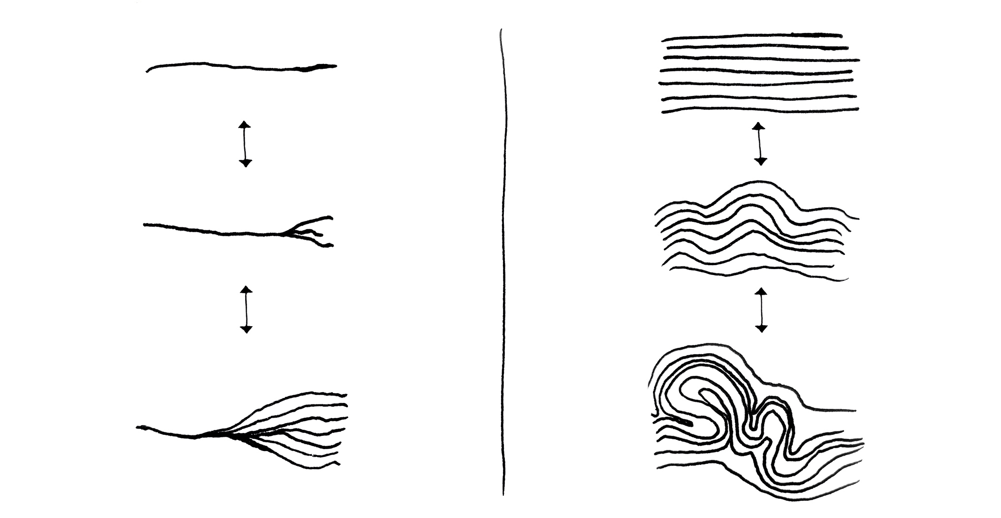
“... an elastic body still has cohering parts that form a fold, such that they are not separated into parts of parts but are rather divided to infinity in smaller and smaller folds that always retain a certain cohesion.”  [Deleuze 2006, 6]
In addition to the concrete operations of the fold, Deleuze’s opus constitutes a unique and global proposition about the form and function of information spaces. To relate the fold theory with visualization practice, we have abstracted three overarching qualities – coherence, elasticity, and infinity – that align the fold with interactive data visualizations in the context of humanistic inquiry.

Coherence

Instead of considering information ‘points’ as discrete objects, the fold expresses the coherent quality of monadologic systems that are defined by context and relations. Accordingly, the single data point in a visualization stands for more than one expression, it is part of a system and defined through its connections to other points of the network. As stated by Deleuze in the opening quote of this section, this quality multiplies itself infinitely: No matter how far the information space is passed through, each finding, output, or information point possesses a relation to the beginning of the journey and the whole universe. The quality of coherence thus includes outcomes and object pairings which might seem opposed, since every connection forms an everlasting part of the fold.

Elasticity

This quality captures the ongoing change in an information space, the twisting and turning of information and connections, with one impulse following another. With regard to thought processes, elasticity becomes apparent: Thoughts sometimes stretch and flow unconsciously and casually, sometimes quickly and targeted, but they are continuously changing their form and direction. The same principle should be applied to visualization elements: Through their ability to fold, individual elements and entire arrangements can assume multiple possible manifestations, are flexible in their position and appearance, but never lose the first principle of coherence. Elasticity thus describes a material quality that is situated between fluidity and hardness, i.e., neither lacking coherence nor being fully rigid.

Infinity

The fold surprises with its infinite possibilities; the outcomes of folding operations appear to be unlimited. Smaller and smaller threads can be unfolded in a visualization, or connections between elements can be found and followed in a multitude of possible combinations. This does not imply that the actions and events in information spaces are not also repeatable or retraceable, but rather that folding operations are never final or completed. The same holds true for the underlying datasets that may never be sufficiently comprehensive to represent an artefact or collection. There are always further data perspectives that could, in theory, be invoked for interpretation. The quality of infinity is especially connected with the operation of complication and reminds us that comprehensive information spaces might seem structured and transparent at first glance, but are highly dependent on the perspective of the viewer and a multitude of data dimensions. Because the fold offers (potentially) infinite possibilities of twisting and turning, folding processes remain unpredictable and serendipitous [Leong et al. 2011] [Thudt et al. 2012]. If we accept the (partly) unpredictable folds of large information spaces by learning to follow their implication, explication, or complication, we can come to a deeper understanding of our own thought processes and actions, and see the connectedness of every single point that came before and comes after.

The Fold in Interactive Visualizations

In the context of information visualization, interactivity has been largely viewed through the lens of users tasks and intents [Yi et al. 2007], distinctly separate from the visual representation of data and animated transitions between views. In Deleuze’s description of information processing lies an opportunity to conceptualize visualizations in a novel framework that rejects the separation between interactivity and visual encoding, just as the monad rejects the dualistic distinction between body and soul. We aim at highlighting an encompassing practice of visualization for the digital humanities, which have to find visual representations for their collections and datasets, while on the other hand conceptualizing interactivity with tasks as casual exploration or deep analysis in mind. While various visualization techniques already refer to “folds” or “folding” in their project descriptions or prototypes [e.g., Bach et al. 2016, Dörk et al. 2014, Riehmann et al. 2018, Zhao et al. 2014], we will demonstrate that current visualization practice actually provides a variety of interaction patterns that align with the principles of the fold and can serve as an inspiration for digital humanities scholars. Accordingly, with this research, we do not present new visualization techniques, but explore a new way to conceptualize interactivity in data visualization.
Designing visualizations along the fold means to understand information spaces as elastic, coherent, and potentially infinite systems. Instead of focusing on static snapshots of visualizations, which would favor their visual encoding, the fold sheds more light on the “in-between” states of folding processes, emphasizing the transitions between visualization states as meaningful views that need to be considered throughout the entire design process. In a design study, we have already described this process by means of a book collection from the 19th century, focusing on a set of functions which enable what we call “scalable exploration” [Bludau et al. 2020]. With this work, we want to widen the focus of the design framework to questions of perception, interpretation, and critique with the help of Deleuze’s philosophy. Data and the resulting representations in data visualization can be seen as folds, reminding us that any perspective can only represent one possible version of reality, while containing infinite other possibilities to perceive a phenomenon. This is especially relevant for visualization practices in the digital humanities, which aim at implementing inherently humanist research questions into their visual interfaces and have spiked discussions on the problem that data are never neutral [D’Ignazio and Klein 2020] [Drucker 2011] [Loukissas 2016].
This section presents examples of folding operations in data visualizations through abstracted illustrations and will subsequently demonstrate how the fold’s qualities can form the basis of a critical framework for their design and analysis. We reference existing visualization examples, which have inspired us in the creation of the illustrations and encourage readers to visit them to gain a deeper understanding of the various mechanisms of the fold.
Figure 2. 
Examples of explication (top to bottom) and implication (in reverse): a) Exposing nested nodes in a network graph increases the detailed neighborhood of the selected node. b) Stretching a selected area of a streamgraph in order to increase detail leads to compression of the unselected areas. c) Selection of an item in a tree graph unveils additional subbranches by providing new room through compression of the remaining branches.

Studying Visualizations through Fold Operations

Arguably, explication and implication as the first two operations of the fold are common mechanisms in data visualizations, implementing the fold in the sense of increasing or decreasing detail, aggregating or separating, clustering or dispersing, etc. In particular, semantic zoom [Perlin and Fox 1993] already supports the operations of the fold by allowing different degrees of granularity while preserving the overall context. Figure 2 illustrates explication and implication for three typical visualization techniques:
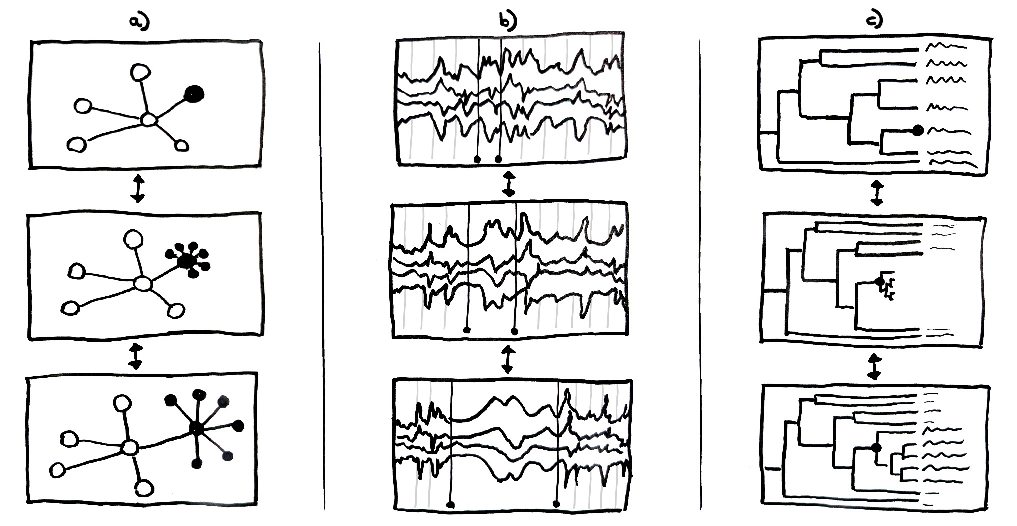
  • a) An interactive mechanism common in network visualizations is selecting a node in a graph to trigger an explication, which “unfolds” into multiple sub-items and thus provides a more granular view on a selection [e.g., Morris 2018]. Network graphs like this are popular in the digital humanities, for instance when visualizing relationships between authors as in this visualization of Johann Wolfgang von Goethe’s social network: https://www.deutsche-biographie.de/graph?id=sfz53095 [Historische Kommission and Bayerische Staatsbibliothek 2010]. On the other side, implication describes the process of reducing a set of items into a collapsed item leading to the reduction of the overall visual complexity.
  • b) The explication in a temporal streamgraph stretches an area of interest to display more detail, while compressing the rest of the visualization, similar to the mechanics of an accordion. Focus+Context like accordion drawing or a fish-eye technique is oftentimes used to provide a detailed view on a specific area of interest within a visualization while preserving its context [e.g., Baur et al. 2012, Cuenca et al. 2018, Morawa et al. 2014, Riehmann et al. 2018, Slack et al. 2005]. As one of the main focus of interest, timeline visualizations have been put into practice with this kind of compression technique, as in the “Touch the Time” project (https://www.uni-weimar.de/projekte/vr-scratch/videos/TTT.mp4) [Riehmann et al. 2018].
  • c) The visualization of hierarchical data demonstrates a combination of the two previous mechanisms: Through selection of a tree branch, both the number of elements and the level of detail can be increased, while at the same time the branches that are not selected get compressed to provide sufficient space for the newly unfolded subbranches [e.g., Slack et al. 2005]. Relating to humanistic data, one case study is an expandable word tree that enables new ways of text exploration by giving the possibility to move along sequences of words through expansion and reduction of following or preceding words [Wattenberg and Viégas 2008]. Using such a word tree, it is, for instance, possible to gradually unfold all possible sentences that start with the name “Alice” in an interactive word tree version of the book Alice in Wonderland: https://www.jasondavies.com/wordtree/?source=alice-in-wonderland.txt [Davies n.d.]
Figure 3. 
Examples of complication: a) Folding of a timeline based on similarity between data points. b) Use of multidimensional reduction techniques in combination with encoded glyphs for gradual addition of more dimensions in two-dimensional displays. c) Switching between egocentric and noncentric total states of a node-link network graph.
In contrast to explication and implication, which correspond to established interaction techniques, the operation of complication introduces a conceptual approach to high-dimensional data visualization that is relatively seldom considered. Dimensionality reductions and force-directed layouts can be misleading, error-prone, or difficult to grasp, yet, the gradual build-up of a multidimensional visualization can be viewed as a continuous complication (see Figure 3):
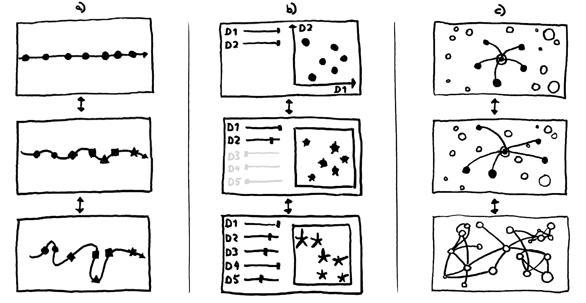
  • a) A linear timeline arranges events solely on the basis of their temporal succession (top). The gradual inclusion of additional event data constitutes a complication, in that further aspects are introduced that differentiate and relate the items (from middle to bottom): The straight line is folded into a curve that positions similar events closer together, using, for example, multidimensional scaling, as in the Time Curves technique (https://aviz.fr/~bbach/timecurves) [Bach et al. 2016].
  • b) The two-dimensional visualization of a dataset as a scatterplot (top) can be gradually complicated by the introduction of flower-like glyphs encoding multiple dimensions per element [e.g., Kammer et al. 2018, Stefaner et al. 2014] and by similarity-based positioning. With sliders on the left, each dimension’s influence on the layout can be adjusted [e.g., Goldenberg 2017, Stefaner et al. 2014] (middle and bottom). As an example, such a similarity-based visualization of a country map, calculated through the t-SNE algorithm, lets the user choose between the various factors influencing the layout: https://projects.interacta.io/country-tsne [Rokotyan et al. 2019]]. Furthermore, this project offers a great example of disclosing its mechanisms through a narrative layer which leads visitors through the process under the title “Understanding the data”.
  • c) An egocentric network centered around one node (top) can be a starting point [van Ham and Perer 2009] to gradually expand the analysis from a partial to a comprehensive perspective. The complication dissolves the egocentric perspective towards a full view of the network in which the layout is influenced by all nodes and all links become visible (bottom). Similarly, another common approach is the reversed switch from global to egocentric views [e.g., Ortiz 2013]. In the project “Six degrees of Francis Bacon” (http://www.sixdegreesoffrancisbacon.com) [Warren et al. n.d.], it is possible to change the view from a global, forced-directed network graph that is useful to see general patterns and the general network structure, to an egocentric view. Here, the related nodes are arranged on two rings around a selection, based on their degree of separation, making it easier to differentiate between direct and indirect relations.
Contrary to visualization techniques that separate dimensions into multiple coordinated views or enforce an abrupt display change, complication suggests traceable transitions between successive visualization states, which gradually integrate additional data aspects into the same visualization. To think of multidimensional data visualizations as dynamic processes of data complications instead of a static image of reality can help identify the various factors influencing the visual representation and make interactive functions more comprehensible. For instance, a “complicated” timeline which positions similar data points next to each other, forming a curve while allowing users to follow the process of bending, sparks questions about the linearity of timelines per se and the underlying structure and dimensions of the dataset.

Towards a Critical Framework

Considering the examples above, the fold’s operations help to identify the interactive mechanisms of a visualization and examine their role in transforming the appearance and arrangement of visual elements. Furthermore, the three operations can be used to spot the lack of interactive capabilities or conceive dynamic behaviors for visualizations being created. Here the fold does not only offer principles for the design of and interactions with visualizations, but also enables us to think about the potential and challenges of humanistic data. Building on Deleuze’s writing and related visualization research [e.g., Elmqvist et al. 2011], we now formulate tentative design principles and questions, thereby following the operations of the fold but especially relating its newly defined qualities to the critical enquiry of data visualizations.

Consistent Coupling

The fold’s coherence manifests itself in the deep contextualization and connectedness of all elements. In order to realize this high degree of coherence in interactive visualizations, the visual encoding and interactive features need to be consistently coupled across all views. Coherence means, for example, that one information point stands in relation to every other point within the visualization, and the context of those relations is both visually and interactively represented. For example, in cultural heritage collections, artifacts might be related to each other through many different explicit (e.g., same author) or implicit (e.g., sharing a subject) relations over a multitude of possible data dimensions (e.g., attributes, visual similarity, temporal sequences). Integration of coherence in visualization is not only dependent on abstract relations but mainly visible in the form of visual cues and linkages that reveal how elements are connected and invite the viewer to follow them.
Question 1: How are the connections between data elements, visual encodings, and interactive features exposed?
Furthermore, the quality of coherence is particularly promoted by consistent design decisions across the entire visualization, regardless of its dynamic state. As a person interacts with the visualization, the coupling of visual representation and interactivity consistently holds. Similarly, the behaviors of interaction techniques function consistently across all views. Visual variables, such as color, shape or position, that are added to encode additional dimensions should not stand in conflict with existing encodings. Humanities scholars conceptualizing visualizations should therefore pay attention to different states of the visualization (e.g., overview – detail), which interactive functions can be used at which states, and watch out for the application of them throughout a visitor’s journey – for instance when applying filters to a dataset and changing to a different zoom position afterwards.
Question 2: How consistent are visual encodings and interactive techniques across all views, throughout multiple continuous states?
When reducing many points into a single point, elements should not be removed, but be folded while preserving the respective relation to the remaining elements. The implication or explication does not only influence a discrete element but also has an effect on the whole visualization, indicating the overall coherence of the information space. When visual features are reduced or when elements are collapsed, the design of the respective transitions should be meaningful and consistent. Similarly, elements being added should appear from logical positions in the interface.
Question 3: Do the arrival and departure of elements in the display convey the concept of object permanence?

Constrained Fluidity

A high degree of elasticity means that elements are flexibly embedded into a complex visual appearance and arrangement and that they are able to change their shape and leave their position to appear elsewhere. They are not static and can show themselves anew repeatedly – and, also in unforeseen representations. For example, objects in visualizations of cultural collections can have multiple relations to each other but are often assigned a static position in web-based interfaces. Instead, it could be helpful to include flexible positions and to consider a range of visual representations, moving between abstract shapes to more concrete images of an object. However, the fold is neither erratic nor random. The changes carried out through folding operations should be comprehensible and meaningful.
Question 4: To which degree are fluidity and rigidness balanced so that the elements and arrangements accommodate all possible values and relations in a dataset?
The spectrum of dynamic changes to individual elements and entire arrangements needs to be carefully considered. To do this it is paramount to view visual encodings not as static mappings between data dimensions and visual variables, but as complex sequences modulated by the fold’s operations. Accordingly, like a blooming flower, the additional data dimensions in Figure 3 b) are already comprised in the data points and their revelation demonstrates their elasticity.
Question 5: Are the elements and arrangements designed with regard to their dynamic behaviors, i.e., their intermediate states?
Humanistic data is oftentimes shaped by various forms of uncertainty, subjectivity, and ambiguity [Drucker 2011]. Nevertheless, since such data properties are difficult to address in visualizations [Hullman 2019] and might significantly increase complexity, they are oftentimes omitted completely in visualizations. The elasticity of elements might help to reveal such data properties through folding operations on demand for specific elements. Thus it is possible to critically analyze the datasets beforehand, but even more so during the visualization process. It should be tested whether a visualization shows what researchers expected to see from the dataset or whether it can reveal new qualities in the data through new views and interactive functions.
Question 6: Does the representation of the data through the visualization constrain interpretive qualities of the data, such as uncertainty or ambiguity, that could be dissolved through interactivity and elasticity of the encoding?

Linked Perspectives

The quality of infinity relates to a multitude of possible representations of data, the insights they may evoke, and circular or open-ended navigation mechanisms. Specific combinations of visual form and interactive functionality in a visualization can evoke new, surprising, and inspiring expressions of a dataset and a variety of possibly unexpected insights, surprises, and serendipitous discoveries. The quality of infinity can be observed, for example, in Figure 3 b) through the seemingly infinite combination possibilities within the weightings of the multiple dimensions.
Question 7: Do all visual elements in the interface afford interactivity to transform the view and generate new insights?
An interactive visualization is never complete, but always in progress. If a data visualization could be thought of as a densely connected network of linked perspectives, at any given point in the network of possible visualization states, users ideally should never be led to dead-ends. For instance, unfolding detail in Figure 2 b) and c) will always lead to an impression of other information while preserving the context and therefore allowing for open-ended interactions without the need to resort to the browser’s back-button.
Question 8: How is the incompleteness of views embraced and endless traversal of the data encouraged?

Discussion

Arguably, a lot of thought during the design process goes into the visual representation of a visualization, i.e., the mapping from various data dimensions to a limited number of visual variables, whereas interaction techniques and animated transitions are oftentimes only an afterthought, sometimes even used as a last fix to solve issues of a visual encoding. Similarly, the interpretation of data visualizations is almost exclusively focused on the visual representation – the rules of turning data qualities into graphical elements – often disregarding the dynamic interplay between display parameters and interactive capabilities. With the fold we put forward an approach that emphasizes a need for simultaneous and coordinated consideration of interaction and representation in data visualization. In the process, we identified the connections between visual encoding and interactivity as crucial for the implementation of the folding operations and emphasized them in the critical framework, arguing for a close consideration of visual appearance and its dynamic behavior.
However, prototyping interfaces may in parts still be restricted by static forms of prototyping techniques, a lack of suitable tools, or a massive amount of data. Additionally, thinking of representation and interaction in all states of a visualization in unison with the intention to achieve meaningful transitions may turn out to demand significant conceptual, technical, and intellectual effort. While realistically seeing the complexity that the fold brings to visualization practice in the digital humanities, we believe that its notion can have a profound effect on the way we think about data, and even in its smallest implementation can contribute to more profound and purposeful visualizations.
Proposing the use of the fold and its operations to approach a gap in the development of data visualization, we recommend the consideration of the qualities coherence, elasticity, and infinity as fruitful starting points for both creation and critique. Nevertheless, these qualities only describe an ideal environment for the fold. In practice, their degree of implementation might always be partially limited. While we have provided a first framework for their implementation in digital humanities projects and research, we are aware that the applied methods are highly dependent on the actual data and project setting. Furthermore, the interpretation of data visualization remains deeply subjective. Especially machine-generated arrangements, for instance, based on similarity, might need a high amount of testing and editing, or even a narrative layer, to arrive at comprehensible, yet “complicated” visualizations in the sense of the fold. Additionally, we would like to see more research into the perception and necessities of different user groups in digital humanities visualizations.
Although this research mainly focused on the implementation of the fold through a new perspective on the design and interpretation of visualizations, we also see the potential of the fold when it comes to their very foundation: data. Thinking of Deleuze’s infinite folds, the common approach to data as “given” [Drucker 2011], implicitly perceived as objective and fixed, could also be understood as one folded impression of reality. We believe that the fold offers a unique perspective for digital humanities scholars to translate their datasets into interactive visualizations along various meaningful views, which can generate new insights for their research and help them in conveying it to the public. This perspective becomes especially relevant if we take a look at more recent developments concerning critical perspectives on the power and rhetoric of data and their visualization [D’Ignazio and Klein 2020] [Dörk et al. 2013] [Hullman and Diakopoulos 2011]. Here, we are specifically calling for a close consideration of theoretical concepts and a practical collaboration between data visualization research and the digital humanities to rethink the relationship between representation and interactivity in data visualization.

Conclusion

As data visualization continues to expand its relevance in the digital humanities, there is a growing need to come to terms with interactivity as one of its most fundamental aspects. While the challenges of cultural heritage data and the complexity of their implementation into dynamic visualizations has gained critical attention, the prospects of interaction techniques to this end are not discussed as intensely. With this research, we proposed the notion of the fold as a productive way to jointly consider interaction and encoding in data visualization. While generally understood as an essential component of data visualization, interactivity is often treated in separation from the visual encoding and as a second step in the design process, when all decisions about the visual variables have already been made. This relegation of interactivity is perpetuated in the critical interpretation of data visualization that is similarly focused on the visual encoding and lacks the vocabulary to make sense of the provided interactive capabilities. Drawing from Deleuze’s writing on the fold, we formulated a critical framework for interactive data visualization consisting of operations, qualities, and questions for their design and interpretation. In this context, we do not only hope to encourage consideration of folding operations for the visualization of data, but especially see the importance of understanding information spaces and the data themselves as a manifold space. In order to treat interfaces as subject to critique and interpretation [Drucker 2011] [Sengers and Gaver 2006], the lens of the fold provides a useful thinking tool for a humanistic approach to data visualization.
To investigate the viability of the fold for the critical consideration of existing visualizations, we abstracted new, explanatory illustrations from various visualization examples. It was our aim to examine in which functions the fold was already manifested in data visualization practice. During this process, we noticed that a considerable number of the visualization techniques exhibited the characteristics of the fold, while certain aspects are still underdeveloped and could be explored in future research and design. While the pair of implication and explication can be seen in numerous visualization examples, we see a necessity and, through the notion of the fold, an opportunity for designing visualizations that offer insightful complications, more specifically through meaningful transitions. This is particularly important when visualizing digital cultural heritage data, where multidimensional and multifaceted collections or datasets offer intriguing opportunities for the joint design of interactive exploration and visual representation. Based on the operations and qualities of the fold, we have formulated a critical framework as an invitation to jointly consider the interactive capabilities and visual representations of data in visualization techniques in the digital humanities. Coherence, elasticity, and infinity are valuable qualities for the design of interactive visualizations that can trigger unexpected and surprising insights – the raison d’être of data visualization.

Acknowledgements

We would like to thank Linda Freyberg, Sascha Freyberg, Rabea Kleymann, Francesca Morini, Arran Ridley, Jonas Rogge, and Fidel Thomet for their comments, advice, and feedback along the way. Furthermore, many thanks to the reviewers of Digital Humanities Quarterly for their valuable feedback and thoughtful suggestions. Special thanks to Bruno Latour for the personal encouragement to peruse Deleuze's writing on monads and folds.

Works Cited

Bach et al. 2016 Bach, Benjamin, Conglei Shi, Nicolas Heulot, Tara Madhyastha, Tom Grabowski, and Pierre Dragicevic. “Time Curves: Folding Time to Visualize Patterns of Temporal Evolution in Data”. IEEE Transactions on Visualization and Computer Graphics, vol. 22, no. 1, 2016, pp. 559–68.
Baur et al. 2012 Baur, Dominikus, Bongshin Lee, and Sheelagh Carpendale. “TouchWave: Kinetic Multi-touch Manipulation for Hierarchical Stacked Graphs”. Proceedings of the 2012 ACM International Conference on Interactive Tabletops and Surfaces, ACM, 2012, pp. 255–64.
Bederson and Boltman 2003 Bederson, Benjamin B., and Angela Boltman. “Does Animation Help Users Build Mental Maps of Spatial Information?” The Craft of Information Visualization: Readings and Reflections, edited by Benjamin B. Bederson and Ben Shneiderman, Morgan Kaufmann, 2003, pp. 87–94.
Bertin 1983 Bertin, Jacques. Semiology of Graphics: Diagrams, Networks, Maps, University of Wisconsin Press, 1983.
Bludau et al. 2020 Bludau, Mark-Jan, Viktoria Brüggemann, Anna Busch, and Marian Dörk. “Reading Traces: Scalable Exploration in Elastic Visualizations of Cultural Heritage Data”. Computer Graphics Forum, vol. 39, no.3, 2020, pp. 77–87. https://diglib.eg.org/bitstream/handle/10.1111/cgf13964/v39i3pp077-087.pdf.
Bredekamp 1988 Bredekamp, Horst. “Leibniz’ Gewebe: Strumpfband, Falte, Leinwand”. Die Logik der Bilder, edited by Michael Töteberg and Wim Wenders, Verl. d. Autoren, 1988, pp. 233–38.
Card et al. 1999 Card, Stuart K., Jock D. Mackinlay, and Ben Shneiderman. Using Vision to Think, Kaufmann Publishers Inc., 1999.
Carpendale 2003 Carpendale, Sheelagh. Considering Visual Variables as a Basis for Information Visualisation, Department of Computer science, University of Calgary, 2003.
Chevalier et al. 2014 Chevalier, Fanny, Pierre Dragicevic, and Steven Franconeri. “The Not-so-Staggering Effect of Staggered Animations on Visual Tracking”. IEEE Transactions on Visualization and Computer Graphics, vol. 20, no. 12, 2014, pp. 2241–50.
Chevalier et al. 2016 Chevalier, Fanny, Nathalie Henry Riche, Catherine Plaisant, Amira Chalbi, and Christophe Hurter. “Animations 25 Years Later: New Roles and Opportunities”. Proceedings of the International Working Conference on Advanced Visual Interfaces. ACM, 2016, pp. 280–87.
Colebrook 2002 Colebrook, Claire. Gilles Deleuze, Routledge Critical Thinkers, 2002.
Csikszentmihalyi 1990 Csikszentmihalyi, Mihaly. Flow: The Psychology of Optimal Experience, HarperPerennial, 1990.
Cuenca et al. 2018 Cuenca, Erick, Arnaud Sallaberry, Florence Y. Wang, and Pascal Poncelet. “Multistream: A Multiresolution Streamgraph Approach to Explore Hierarchical Time Series”. IEEE Transactions on Visualization and Computer Graphics, vol. 24, no. 12, 2018, pp. 3160–3173.
Davies n.d. Davies, Jason. “Word Tree”, [online], n.d. Accessed 12 Jun. 2020. https://www.jasondavies.com/wordtree/.
Deleuze 2006 Deleuze, Gilles. The Fold: Leibniz and the Baroque, translated by Tom Conley, Continuum, 2006.
Drucker 2011 Drucker, Johanna. “Humanities Approaches to Graphical Display”. Digital Humanities Quarterly, vol. 5, no. 1, 2011. http://www.digitalhumanities.org/dhq/vol/5/1/000091/000091.html.
Drucker 2013 Drucker, Johanna. “Performative Materiality and Theoretical Approaches to Interface”. Digital Humanities Quarterly, vol. 7, no. 1, 2013. http://www.digitalhumanities.org/dhq/vol/7/1/000143/000143.html.
Dörk et al. 2011 Dörk, Marian, Sheelagh Carpendale, and Carey Williamson. “The Information Flaneur: A Fresh Look at Information Seeking”. Proceedings of the SIGCHI Conference on Human Factors in Computing Systems. ACM, 2011, pp. 1215–24.
Dörk et al. 2013 Dörk, Marian, Patrick Feng, Christopher Collins, and Sheelagh Carpendale. “Critical InfoVis: Exploring the Politics of Visualization”. alt.chi 2013: Extended Abstracts of the SIGCHI Conference on Human Factors in Computing Systems. ACM, 2013, pp. 2189–98.
Dörk et al. 2014 Dörk, Marian, Rob Comber, and Martyn Dade-Robertson. “Monadic Exploration: Seeing the Whole Through Its Parts”. Proceedings of the 32nd Annual ACM Conference on Human Factors in Computing Systems. ACM, 2014, pp. 1535–44.
D’Ignazio and Klein 2016 D’Ignazio, Catherine, and Lauren F. Klein. “Feminist Data Visualization”. VIS4DH: Workshop on Visualization for the Digital Humanities, 2016.
D’Ignazio and Klein 2020 D’Ignazio, Catherine, and Lauren F. Klein. Data Feminism, MIT Press, 2020.
Elmqvist et al. 2011 Elmqvist, Niklas, Andrew Vande Moere, Hans-Christian Jetter, Daniel Cernea, Harald Reiterer, and T. J. Jankun-Kelly. “Fluid Interaction for Information Visualization”. Information Visualization, vol. 10, no. 4, 2011, pp. 327–40.
Freitas 2016 Freitas, Elizabeth de. “The New Empiricism of the Fractal Fold”. Cultural Studies ↔ Critical Methodologies, vol. 16, no. 2, 2016, pp. 224–34.
Gandillac 1953 Gandillac, Maurice de. Nikolaus von Cues: Studien zu seiner Philosophie und philosophischen Weltanschauung, Schwann, 1953.
Gleicher 2018 Gleicher, Michael. “Considerations for Visualizing Comparison”. IEEE Transactions on Visualization and Computer Graphics, vol. 24, no. 1, 2018, pp. 413–23.
Goldenberg 2017 Goldenberg, Russell. “Craft Beer – So Hot Right now. But what City is the Microbrew Capital of the US?”, [online], 2017, accessed 10 Jun. 2020. https://pudding.cool/2017/04/beer/.
Heer and Robertson 2007 Heer, Jeffrey, and George G. Robertson. “Animated Transitions in Statistical Data Graphics”. IEEE Transactions on Visualization and Computer Graphics, vol. 13, no. 6, 2007, pp. 1240–47.
Hepworth and Church 2018 Hepworth, Katherine, and Christopher Church. “Racism in the Machine: Visualization Ethics in Digital Humanities Projects”. Digital Humanities Quarterly, vol. 12, no. 4, 2018. http://www.digitalhumanities.org/dhq/vol/12/4/000408/000408.html.
Historische Kommission and Bayerische Staatsbibliothek 2010 Historische Kommission and Bayerische Staatsbibliothek. “Deutsche Biographie”, [online], 2010, accessed 22 May 2020. https://www.deutsche-biographie.de.
Hullman 2019 Hullman, Jessica. “Why Authors Don't Visualize Uncertainty”. IEEE Transactions on Visualization and Computer Graphics, vol. 26, no. 1, 2019, pp.133–39.
Hullman and Diakopoulos 2011 Hullman, Jessica, and Nick Diakopoulos. “Visualization Rhetoric: Framing Effects in Narrative Visualization”. IEEE Transactions on Visualization and Computer Graphics, vol. 17, no. 12, 2011, pp. 2231–40.
Kammer et al. 2018 Kammer, Dietrich, Mandy Keck, Thomas Gründer, and Rainer Groh. “Big Data Landscapes: Improving the Visualization of Machine Learning-based Clustering Algorithms”. Proceedings of the 2018 International Conference on Advanced Visual Interfaces. ACM, 2018, p. 66.
Kreiseler et al. 2017 Kreiseler, Sarah, Viktoria Brüggemann, and Marian Dörk. “Tracing Exploratory Modes in Digital Collections of Museum Web Sites Using Reverse Information Architecture”. First Monday, vol. 22, no. 4, 2017. https://firstmonday.org/ojs/index.php/fm/article/view/6984/6090.
Laerke 2010 Laerke, Mogens. “Four Things Deleuze Learned from Leibniz”. Deleuze and the Fold, edited by Sjoerd van Tuinen and Niamh McDonnell, Palgrave Macmillan, 2010, pp. 25–45.
Latour et al. 2012 Latour, Bruno, Pablo Jensen, Tommaso Venturini, Sébastian Grauwin, and Dominique Bouiller. “The Whole is Always Smaller than its Parts ‐ a Digital Test of Gabriel Tardes' Monads”. British Journal of Sociology, vol. 63, no. 4, 2012, pp. 590–615.
Leibniz 1898 Leibniz, Gottfried. Monadology, translated by Robert Latta, Clarendon Press, 1898.
Leong et al. 2011 Leong, Tuck Wah, Richard Harper, and Tim Regan. “Nudging towards Serendipity: A Case with Personal Digital Photos”. Proceedings of the 25th BCS Conference on Human-Computer Interaction. British Computer Society, 2011, pp. 385–94.
Loukissas 2016 Loukissas, Yanni Alexander. “Taking Big Data apart: Local Readings of Composite Media Collections”. Information, Communication & Society, vol. 20, no. 5, 2016, pp. 651–664.
Morawa et al. 2014 Morawa, Robert, Tom Horak, Ulrike Kister, Annett Mitschick, and Raimund Dachselt. “Combining Timeline and Graph Visualization”. Proceedings of the Ninth ACM International Conference on Interactive Tabletops and Surfaces, ACM, 2014, pp. 345–50.
Morris 2018 Morris, Jeff. “Introducing Neo4j Bloom: Graph Data Visualization for Everyone”, [online], 2018, accessed 12 Jun. 2020. https://neo4j.com/blog/introducing-neo4j-bloom-graph-data-visualization-for-everyone/.
Ortiz 2013 Ortiz, Santiago. “Newk - Twitter Conversations”, [online], 2013, accessed 22 May 2020. http://moebio.com/newk/twitter.
Pace 2004 Pace, Steven. “A Grounded Theory of the Flow Experiences of Web Users”. International Journal of Human-Computer Studies, vol. 60, no. 3, 2004, pp. 327–63.
Parry 2019 Parry, Kyle. “Reading for Enactment: A Performative Approach to Digital Scholarship and Data Visualization”. Debates in the Digital Humanities, edited by Matthew K. Gold and Lauren F. Klein, University of Minnesota Press, 2019. https://dhdebates.gc.cuny.edu/read/untitled-f2acf72c-a469-49d8-be35-67f9ac1e3a60/section/bd5a43c1-bbfe-4c5c-8c0d-c3db1776eb99#ch13.
Perlin and Fox 1993 Perlin, Ken, and David Fox. “Pad: An Alternative Approach to the Computer Interface”. SIGGRAPH '93: Proceedings of the 20th annual conference on Computer graphics and interactive techniques. ACM, 1993, pp. 57–64.
Riehmann et al. 2018 Riehmann, Patrick, Joshua Reibert, Jens Opolka, and Bernd Froehlich. “Touch the Time: Touch-Centered Interaction Paradigms for Time-Oriented Data”. EuroVis 2018 - Short Papers, edited by Jimmy Johansson et al., The Eurographics Association, 2018, pp. 113–17.
Risam 2015 Risam, Roopika. “Beyond the Margins: Intersectionality and the Digital Humanities”. Digital Humanities Quarterly, vol. 9, no. 2, 2015. http://digitalhumanities.org:8081/dhq/vol/9/2/000208/000208.html.
Rokotyan et al. 2019 Rokotyan, Nikita, Olya Stukova, and Dasha Kolmakova. “An Alternative Data-Driven Country Map”, [online], 2019, accessed 22 May 2020. https://projects.interacta.io/country-tsne.
Sacha et al. 2017 Sacha, Dominik, Leishi Zhang, Michael Sedlmair, John A. Lee, Jaakko Peltonen, Daniel Weiskopf, Stephen C. North, and Daniel A. Keim. “Visual Interaction with Dimensionality Reduction: A Structured Literature Analysis”. IEEE Transactions on Visualization and Computer Graphics, vol. 23, no. 1, 2017, pp. 241–50.
Sengers and Gaver 2006 Sengers, Phoebe, and Bill Gaver. “Staying Open to Interpretation: Engaging Multiple Meanings in Design and Evaluation”. DIS '06: Proceedings of the Conference on Designing Interactive Systems. ACM, 2006, pp. 99–108.
Shneiderman 1983 Shneiderman, Ben. “Direct Manipulation. A Step Beyond Programming Languages”. IEEE Transactions on Computers, vol. 16, no. 8, 1983, pp. 57–69.
Shneiderman 1996 Shneiderman, Ben. “The Eyes Have It: A Task by Data Type Taxonomy for Information Visualizations”. Proceedings / IEEE Symposium on Visual Languages, Sep. 3 - 6, 1996, Boulder, Colorado. IEEE Computer Society Press, 1996, pp. 336–43.
Slack et al. 2005 Slack, James, Kristian Hildebrand, and Tamara Munzner. “PRISAD: A Partitioned Rendering Infrastructure for Scalable Accordion Drawing”. IEEE Symposium on Information Visualization, 2005, pp. 41–48.
Stahnke et al. 2016 Stahnke, Julian, Marian Dörk, Boris Müller, and Andreas Thom. “Probing Projections: Interaction Techniques for Interpreting Arrangements and Errors of Dimensionality Reductions”. IEEE Transactions on Visualization and Computer Graphics, vol. 22, no. 1, 2016, pp. 629–38.
Stefaner et al. 2014 Stefaner, Moritz, Frank Rausch, Jonas Leist, Marcus Paeschke, Dominikus Baur, Timm Kekeritz. “OECDBetterLifeIndex.org”, [online], 2014, accessed 12 Jun. 2020. http://www.oecdbetterlifeindex.org/.
Thudt et al. 2012 Thudt, Alice, Uta Hinrichs, and Sheelagh Carpendale. “The Bohemian Bookshelf”. Proceedings of the SIGCHI Conference on Human Factors in Computing Systems, edited by Joseph A. Konstan. ACM, 2012, p. 1461.
Tversky et al. 2002 Tversky, Barbara, Julie B. Morrison, and Mireille Betrancourt. “Animation: Can it Facilitate?” Human Computer Studies, vol. 57, no. 4, 2002, pp. 247–62.
Wagner 1995 Wagner, Thomas. “Die Falten des Geistes: Barock werden mit Gilles Deleuze”. Frankfurter Allgemeine Zeitung, vol. 1995, Nr. 283, 5 Dec. 1995.
Warren et al. n.d. Warren, Christopher, Daniel Shore, Jessica Otis, Scott Weingart, and John Ladd. “Six Degrees of Francis Bacon”, [online], n.d, accessed 22 May 2020. http://www.sixdegreesoffrancisbacon.com
Wattenberg and Viégas 2008 Wattenberg, Martin, and Fernanda Viégas. “The Word Tree, an Interactive Visual Concordance”. IEEE Transactions on Visualization and Computer Graphics, vol. 14, no. 6, 2008, pp. 1221–1228.
Wattenberg et al. 2016 Wattenberg, Martin, Fernanda Viégas, and Ian Johnson. “How to Use t-SNE Effectively”. Distill, 2016. https://distill.pub/2016/misread-tsne/.
Whitelaw 2015 Whitelaw, Mitchell. “Generous Interfaces for Digital Cultural Collections”. Digital Humanities Quarterly, vol. 9, no. 1, 2015. http://www.digitalhumanities.org/dhq/vol/9/1/000205/000205.html.
Windhager et al. 2018 Windhager, Florian, Paolo Federico, Günther Schreder, Katrin Glinka, Marian Dörk, Silvia Miksch, and Eva Mayr. “Visualization of Cultural Heritage Collection Data: State of the Art and Future Challenges”. IEEE Transactions on Visualization and Computer Graphics, 2018, pp. 2311–2330.
Windhager et al. 2019 Windhager, Florian, Saminu Salisu, Günther Schreder, and Eva Mayr. “Uncertainty of What and for Whom - And Does Anyone Care? Propositions for Cultural Collection Visualization”. 4th IEEE Workshop on Visualization for the Digital Humanities (VIS4DH), 2019.
Woods 1984 Woods, Daniel D. “Visual Momentum: A Concept to Improve the Cognitive Coupling of Person and Computer”. International Journal of Man-Machine Studies, vol. 21, no. 3, 1984, pp. 229–44.
Yi et al. 2007 Yi, Ji Soo, Youn ah Kang, John T. Stasko, and Julie A. Jacko. “Toward a Deeper Understanding of the Role of Interaction in Information Visualization”. IEEE Transactions on Visualization and Computer Graphics, vol. 13, no. 6, pp. 1224–1231.
Zhao et al. 2014 Zhao, Jian, Nan Cao, Zhen Wen, Yale Song, Yu-ru Lin, and Christopher Collins. “#FluxFlow: Visual Analysis of Anomalous Information Spreading on Social Media”. IEEE Transactions on Visualization and Computer Graphics, vol. 20, no. 12, 2014, pp. 1773–82.
van Ham and Perer 2009 van Ham, Frank, and Adam Perer. “‘Search, Show Context, Expand on Demand’: Supporting Large Graph Exploration with Degree-of-Interest”. IEEE Transactions on Visualization and Computer Graphics, vol. 15, no. 6, 2009, pp. 953–60.
2020 14.3  |  XMLPDFPrint