Abstract
Typography, the arrangement and use of type, permeates our visual landscape, from
printed pages and digital interfaces to physical environments and interactive
experience. Those who study and work in the digital humanities are called upon
to make typographic choices everyday, yet few have any training in how to
effectively design with type. Over the past several years, I have been involved
in several initiatives that seek to help educate digital humanities scholars,
technologists and students about the value of information design, including
typography. This paper will discuss these experiences and some guiding
principles for helping a digital humanities audience understand the basic
principles of typography and apply them to their projects and research.
Introduction
While digital tools allow digital humanities scholars and publics to analyze and
display information in new ways, a focus on the interface and information design
of these tools is often overlooked. Design education models are often
preoccupied with examining teaching methods for educating future professional
designers [
Pat 2013], while ignoring how to introduce design
principles to those outside of traditional design disciplines, including the
digital humanities. From word-processing and blog theme customization to data
visualization and interface design, those engaged with digital humanities
research and teaching activities interact with the visual formatting of
text-based information in a variety of contexts. Based on my current research
into the role of visual communication and information design in the digital
humanities, many digital humanities practitioners, who do not have a formal
training in design, are called upon to make typographic choices for their
projects, yet do not have a solid understanding about how to make these
decisions. This paper will discuss some basic principles of typography as well
as the approaches I have taken when teaching these principles in a workshop
environment for digital humanities audiences. I will discuss some of the
challenges, as well as opportunities, of providing a basic awareness of
typography and its significance to design practices in the digital
humanities.
The role of design in the digital humanities
Digital humanists must become, at the very least, familiar with basic design
principles and the breadth of practices, ranging from interface design and
typographic design, to data visualization and information architecture [
Burdick et al. 2012]. Tools such as Omeka, Tableau or Mapbox help
democratize visual presentation while providing existing templates, color
palettes, and typographic styles that limit the amount of information design
choices one needs to make. Are designated designers even necessary?
Prior to my engagement with the digital humanities, my creative research focused
on future implications for typography in digital environments. I was introduced
to the digital humanities by a colleague in theatre history who needed an
interface designer to collaborate on a web-based historical timeline tool. After
what felt like a crash course in current digital humanities practices and
discourse, I attended a THATCamp in 2012 and offered a session entitled, “Where are all the artists and designers?” (
http://amypapaelias.com/thatcampne2012/wherearealltheartists.html).
In Summer 2013, I participated in One Week One Tool (
http://oneweekonetool.org/), an
NEH-funded Institute for Advanced Topics in the Digital Humanities, hosted at
the Roy Rosenzweig Center for History and New Media at George Mason University
that brought together twelve participants from diverse fields to create a
digital humanities tool in 5 days. As the sole graphic designer on the team, it
was clear that working with a designer helped many of the humanities-based
participants understand the value design can bring to digital projects [
Croxall 2013]. Designers and design principles can play a positive
role within the context of digital humanities scholarship and public projects,
yet participation and knowledge is limited.
Why is typography important?
Historical descriptions of “good” typography tend to describe
it as “invisible”
[
Warde 1955]. Like many designed experiences, we often don’t notice what works until
we notice something that glaringly doesn’t. The way type is arranged and
information is organized impacts audience comprehension and engagement, both in
print and in digital forms. Within the field of information design, typography
functions as a visual system for organizing and structuring text-based content
[
Apfelbaum and Cezzar 2014].
Humanists have embraced a variety of digital tools and their interfaces and
outputs without questioning their forms and values through the humanist's
critical lens [
Drucker 2015]. The division of labor between the
author / publisher has traditionally separated these tasks: research and writing
and publishing and distribution. With the possibilities of self-publishing
digital projects, the division between writing-designing-disseminating becomes
blurred. Digital humanities research and public projects rely on a host of tools
and applications that allow for some customization but most practitioners put
little emphasis on the basic principles of typographic design. We may assume
that the typographic choices already set forth within these tools and
applications are satisfactory without considering better alternatives. We may
accept that the typography of digital scholarship projects is sufficient to the
user’s experience without understanding basic typographic principles.
Several years before the rise of web font services (Typekit or Google Fonts),
Oliver Reichenstein, designer and founder of Information Architects, wrote a
popular essay entitled, “Web Design is 95%
Typography”
[
Reichenstein 2006]. In the essay, he concurs with web designer
Cameron Moll that text on the web should be treated as “a user interface”
[
Moll 2006], and that information designers are doing the work of traditional
typographers (setting type in preparation for a printing job), but perhaps
without the proper knowledge or training. Ten years later, and despite the great
wave of browser support for web fonts, responsive design [
Marcotte 2011] and countless resources for typography on the web,
the implementation of typographic principles within digital scholarship remains
limited. Good typography helps give form to an argument, and an awareness of
typographic principles applied to digital environments is paramount.
As an example, Tableau, a data visualization software platform used by many
digital humanities scholars and students, commissioned a custom typeface that is
utilized in a variety of visualization contexts, from tables and bar charts to
maps and timelines. “Without having to think about
it, our users should create legible, meaningful text that informs and
expands on the visual expression of their data”
[
Pettiross 2016]. By commissioning a typeface designed for the specific contexts of a data
visualization platform, Tableau is making typography a priority in its visual
design.
Scholarly publications and journals have always maintained a level of design and
typographic neutrality in order to, perhaps intentionally, distinguish
themselves from more popular or commercial venues [
Waller 1999].
Consider the differences in reading experience between this journal (
Digital Humanities Quarterly) and
The Atlantic or
Wired. What does the
difference in tone imply about the importance of teaching and understanding
information design within the context of the digital humanities? If typography
does exist to honor content [
Bringhurst 2004], humanities scholars
should be concerned with how information is visually presented in digital
environments for a wide range of audiences.
Typography for [digital] humanists workshop
In February 2016, I offered a free workshop, “Typography for
[digital] Humanists,” through NYC DH Week 2016. The title of this
workshop was inspired by the book,
Typography for
Lawyers, by Matthew Butterick [
Butterick 2015]. Both a
lawyer and a type designer, Butterick’s book is a no-nonsense field guide for a
profession that is intimately involved in document typesetting with little
concern, historically, for best practices. The workshop was held at the Fordham
Graduate Center in Manhattan and attracted 15 participants. Workshop attendees
included librarians, humanities graduate students, instructional technologists
and web developers, with a wide range of technical skill levels and personal
goals. With only 2 hours, the workshop was divided into four parts:
- Typeface selection in digital projects
- Basic typographic principles
- Discussion and analysis of examples
- Overview of typography tools and demonstration
Following is a detailed discussion on these four sections of the
workshop.
Workshop Part #1. Typeface selection in digital projects
Choose a good type family, one with extensive character support and a
variety of styles gives you design flexibility.
We have more typefaces available for use in digital projects than ever
before. Selecting a typeface can feel like a daunting task, whether limited
to our font menus or searching distributors or foundries. When choosing a
typeface for a specific project, we want to make sure we are choosing fonts
that have a full character set with necessary accents, punctuation and
numerals, including extended language support. While it is popular to
criticize Comic Sans for its overuse and playful, childish feel, it is a
useful example for discussing how to begin talking about the visual tone we
are trying to set with our typeface selection. In the workshop, I ask
attendees to pick a typeface like they are choosing an outfit: what’s the
occasion? How are you feeling? What is the weather like? An appropriate
typeface choice is relative to the content. Next, I go over some basic type
classifications (including serif, sans, decorative, script, etc.), which can
help when searching for typefaces. Body text, display text, UI text, and
tabular data are each different kinds of content where certain typefaces may
work better than others [
Brown 2018]. Typefaces with obvious,
visual personality (like Comic Sans) generally only work for very specific
situations and are not the best choice when the reader is trying to absorb
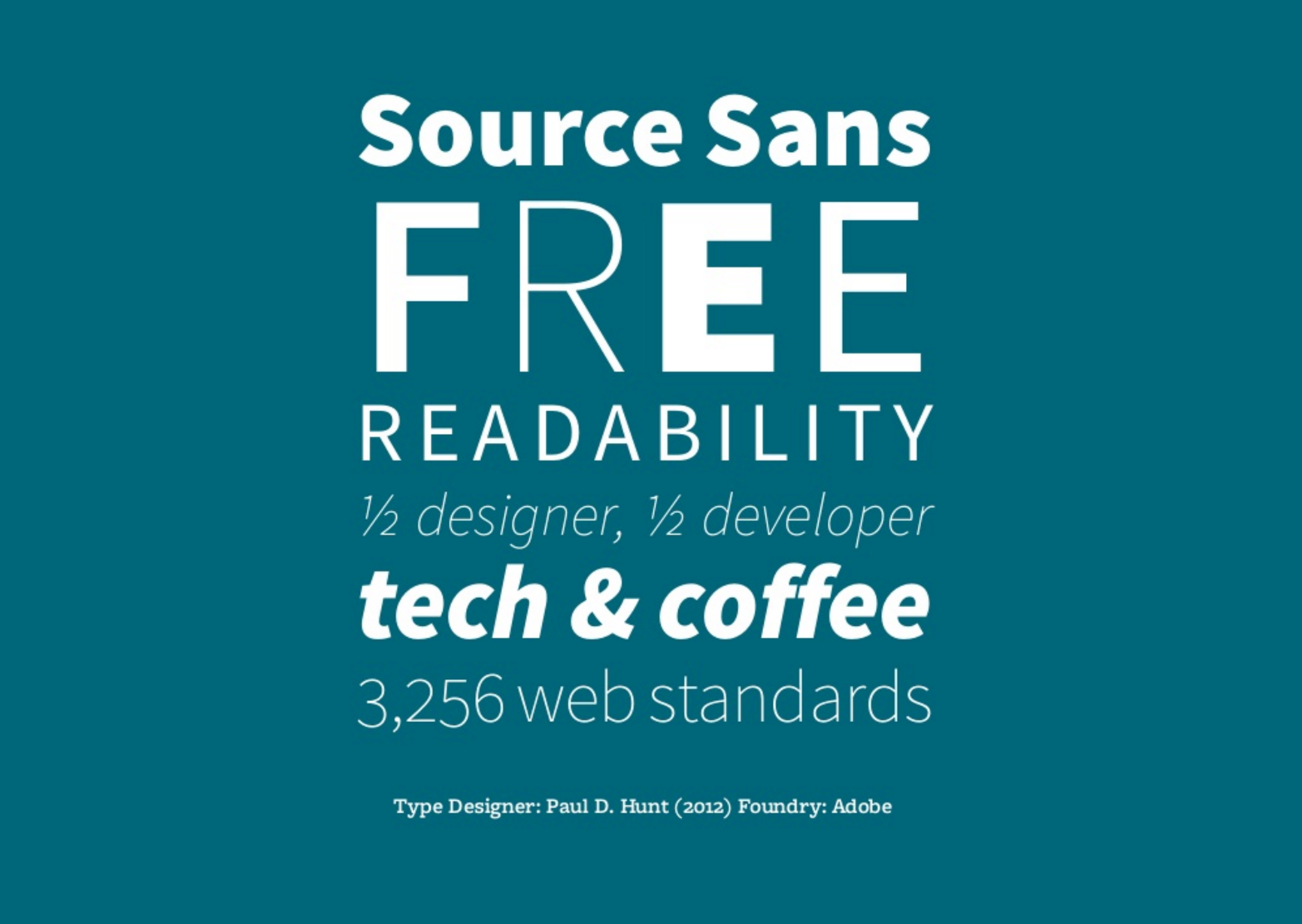
complex information. I give an example of Source Sans by Paul J. Hunt,
Adobe’s first open source typeface. Source Sans is a large type family with
many different styles (from very light to very heavy and italic of all of
these weights). I use Source Sans in a lively type specimen I created, to
show that even a simple, sans-serif typeface can feel playful but still
related by using multiple weights from the same type family.
Workshop Part #2. Basic typographic principles
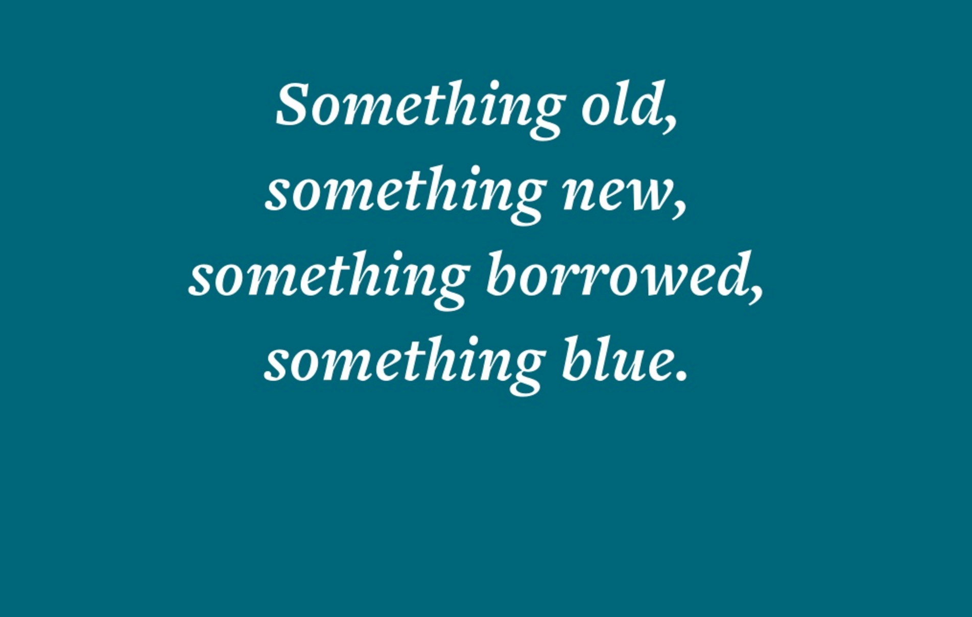
Contrast [in size, weight and style] creates hierarchy. To demonstrate this,
I show the attendees a phrase set in one typeface in one weight. In the
example, the hierarchy of visual information is even. The same style is used
throughout (it’s all italic), the same weight of the typeface and the same
size. In some cases, we are striving for an even reading experience (think
long paragraphs of text). However, what happens when we take that same
phrase and incorporate contrast, in size, weight and style?
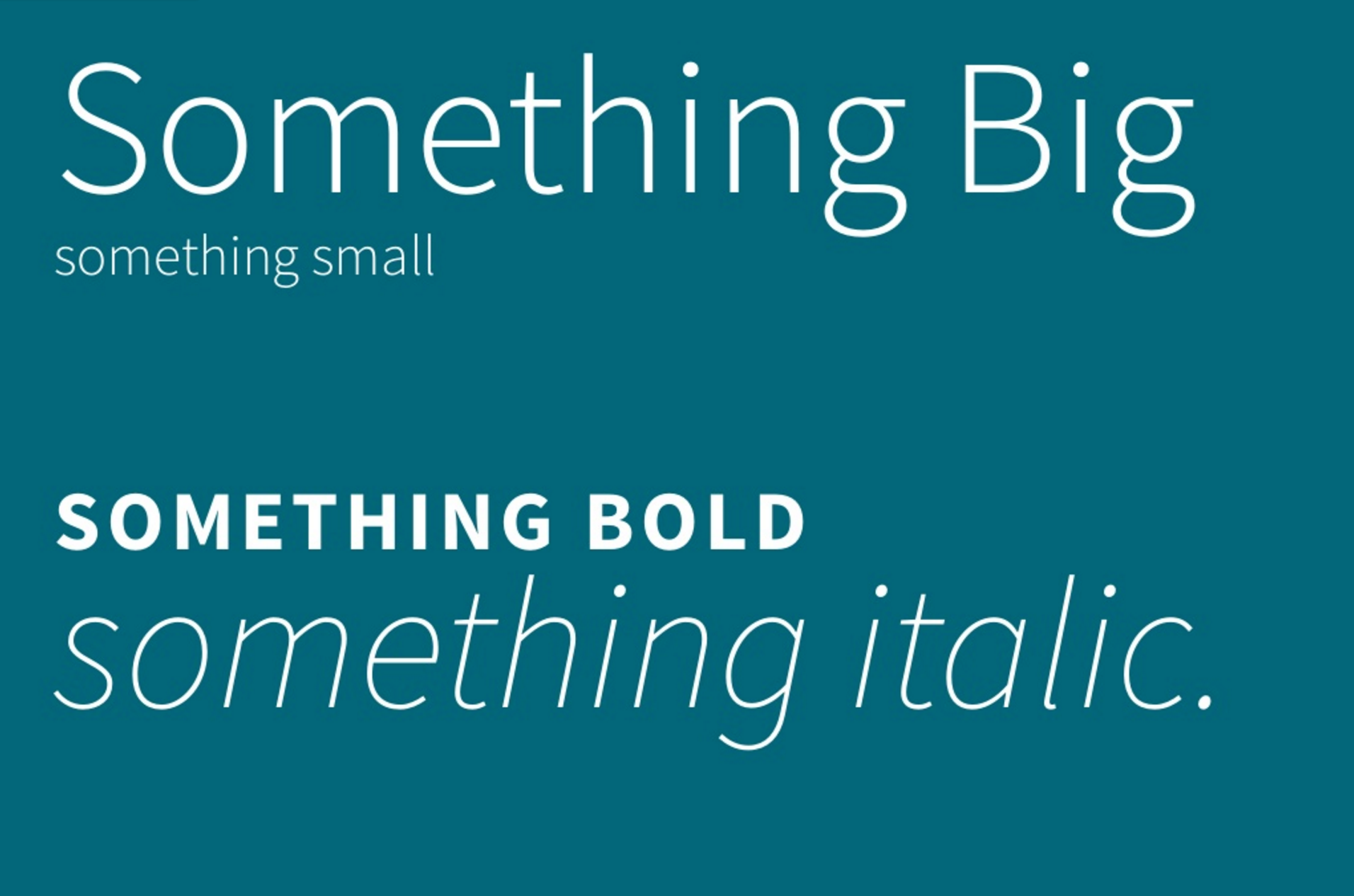
In the next example, we can see how a shift in size or weight creates a sense
of visual hierarchy, placing emphasis in specific places. I also remind
participants that this is still the typeface we looked at previously, Source
Sans. In digital projects, levels of visual hierarchy are absolutely crucial
to the display of complex information, especially on the web. Hierarchy is
already built into our web-based projects (HTML tags <p>, <h1>,
<a>) and style sheets allow us to customize these elements through
contrast of weight, size and style of type.
Negative space is a term that helps describe the absence of content or
“white space” that plays a vital role in readability and visual
interest. It is a natural inclination to want to “fill the
page” with content but in fact, our eyes and brains appreciate
it when there are ample amounts of margins and negative space to give a
visual pause when needed.
Here, I show an example of a paragraph of text that is taking up the entire
width of the screen. There is negative space between the lines of text, but
it is quite monotonous and doesn’t do much to give a needed visual pause as
we are reading. I then show the same paragraph, this time presenting the
text with a shorter line length and more uneven negative space on the page.
There is now less space between the line, so that most of the negative space
is relegated to the right side of the screen. Even though it is
approximately the same amount of space, it is far more dynamic and easier to
read. I also show how I divided the space using a very simple three column
grid. A grid is a powerful and fairly simple way to organize information.
Establishing grid guidelines helps make decisions that will make your
content easier to read.
Typographic details, including the conventions of typesetting punctuation,
spacing, and alignment, are important for longer reading experiences. These
rules and details are considered by professional designers and create a
reading experience that is controlled and comfortable, without much thought
or consideration by the reader. Many times, a professional designer makes
typographic decisions not only on specific, dictated rules, but on what
feels right for the situation. Typography, while dictated by some
fundamental rules, is still contextual, subjective and interpretive.
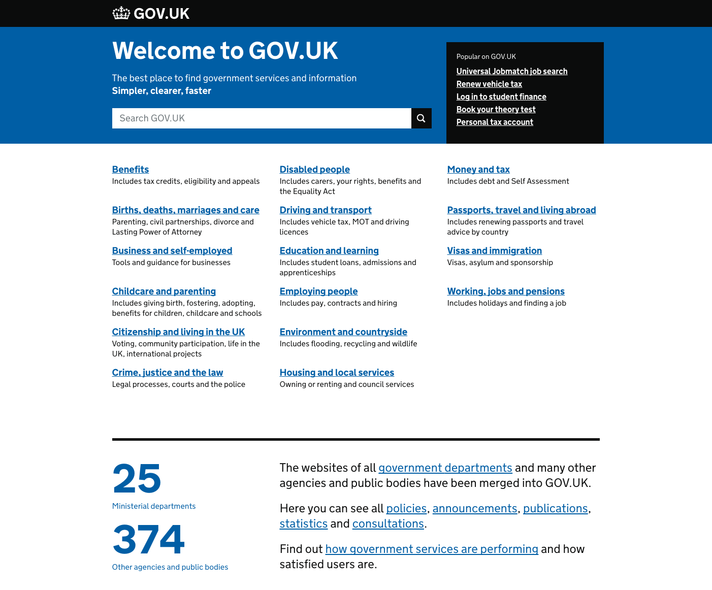
Workshop Part #3. Discussion and Analysis
Analyzing a web interface and describing the visual hierarchy can help one
gain an understanding of typographic principles. We practiced this with
several examples of website home pages for non-profit and public agencies to
review some of the discussed principles. I asked the participants to
consider the following open-ended questions when looking at the examples:
- In this example, how is hierarchy
created?
- In this example, what feeling is the type
conveying?
- In this example, how is negative space being
utilized?
For example, we reviewed Audubon.org. First, we analyzed the number of type
treatments we found on the homepage. Although the page initially looks quite
simple (a menu, a large full window image, a caption), we discovered that
there are over 10 different typographic treatments on that one screen. We
discussed how the size, color, typeface selection, alignment and spacing of
each treatment affects one another and how deliberate these decisions are in
order to make the page feel “simple”. The more
information we add (scrolling down on the site, we discover paragraphs,
columns, maps, and other content), the more we begin to identify the
relationships between each of these decisions regarding hierarchy, typeface
selection, contrast and negative space. The ability to explain not only
whether something works but why it works, is a skill that can be cultivated
through practice and exposure. These questions help frame a valuable
discussion on identifying successful typographic principles in practice.
Workshop Part #4. Typography tools and demonstrations
At the end of the workshop, I present some current resources and digital
tools for experimenting with typography on the web. Participants were able
to practice basic principles of typographic hierarchy through contrasts of
weight and styles, within the browser. TypeCast is a web-based tool that
allows the user to test typefaces in the browser. For the purposes of this
workshop, it worked as a simple way to experiment with typographic hierarchy
in context. As of 2018, TypeCast, while still available online, is no longer
being supported. This remains a challenge of teaching with free, online
tools: maintenance and long-term availability of the tool can shift
overnight. A longer workshop with more time for setting up HTML pages and
CSS stylesheets would allow for more experimentation with web fonts in
context.
Workshop approaches and reflection
In reflecting upon the workshop, several approaches were successful in teaching
general concepts. Critiques of existing projects allowed participants to
practice the concepts discussed in the workshop related to typeface selection
and principles of contrast and hierarchy. Introducing and briefly experimenting
with tools and techniques during the workshop helped solidify understanding.
Because the workshop was offered to a wide range of people and skill sets, it
was important to leave time for individual and small group discussions. Prepared
examples of organizations, books and web resources were provided to
participants. Workshop slides were made publicly available on SlideShare so that
anyone can have access to these resources:
http://www.slideshare.net/AmyPapaelias/typography-for-digital-humanists.
Although I originally intended to focus on design and formal principles of
typography, many attendees were interested in discussing concerns related to
professional practice, type use and implementation. For example, type licensing,
especially for educational or research contexts with limited budgets, can feel
quite complicated and came up in our discussions. As with any digital product,
it is important for users to read the end user license agreement if purchasing a
font from a foundry or distributor. Attendees were also interested in talking
about how to find design collaborators on campus. Creating collaborative
projects with design faculty and students has challenges and rewards. This
requires time and planning, and clear expectations for all responsibilities, in
order to develop successful collaborations. Questions arose about digital labor
and fair compensation for work being done by students. A longer or separate
workshop topic dealing with professional and practical concerns would be
suitable for the audiences.
Conclusion
When introducing basic typography principles to audiences beyond designers, we
must consider the range of practitioners who engage in information design
activities: researchers, scholars, developers and professionals. Short workshops
on typography for digital humanities audiences can provide a general overview of
best practices and demonstrate the value of typography as an important part of
creating a visually engaging experience in digital projects. Web-based tools
allow participants to experiment and test some basic principles related to
typeface selection, hierarchy of information and visual contrast. Exposure to
the complexity of typographic choices may encourage digital humanities scholars
to include trained designers as collaborators earlier on in project development.
Longer workshops, with time for discussion on professional practice and
licensing, would ultimately benefit digital humanities researchers and
professionals who seek ways to embed typographic best practices into their
projects.
Works Cited
Apfelbaum and Cezzar 2014 Apfelbaum, Sue and
Juliette Cezzar. Designing the Editorial Experience: A
Primer for Print, Web, and Mobile. Beverly, MA: Rockport Publishers,
2014.
Bringhurst 2004 Bringhurst, Robert. The Elements of Typographic Style. Point Roberts, WA:
Hartley & Marks, 2004.
Brown 2018 Brown, Tim. Flexible Typesetting. New York: A Book Apart, 2018.
Burdick et al. 2012 Anne Burdick et al., Digital_Humanities, Cambridge, Cambridge MA: The MIT
Press, 2012.
Butterick 2015 Butterick, Matthew. Typography for Lawyers. O'Connors, Houston:
2015.
Croxall 2013 Croxall, Brian. “Day 5 of OWOT: We Did It! (Can We Do It Again? Please??).” Brian
Croxall RSS. N.p., 2013. Web. 26 Sept. 2016.
Drucker 2015 Drucker, Johanna. “Graphical Approaches to the Digital Humanities.”
A New Companion to Digital Humanities Schreibman/A New
Companion to Digital Humanities (2015): 238-50.
Marcotte 2011 Marcotte, Ethan. Responsive Web Design. New York: A Book Apart,
2011.
Moll 2006 Moll, Cameron. “Nine
Skills That Separate Good and Great Designers.” ~ Authentic Boredom.
N.p., n.d. Web. 26 Sept. 2016.
Pat 2013 Pat, Chun-wo. “Typography & Information Design: Reflections and Critiques.”
Parsons Journal for Information Mapping. Parsons Institute for Information
Mapping, 2013. Web. 23 Sept. 2016.
Pettiross 2016 Pettiross, Jeff. “Tableau 10 Includes a New Typeface Designed for Data.”
Tableau.com/about/blog. N.p., 2016.
Web. 14 Nov. 2016.
Reichenstein 2006 Reichenstein, Oliver.
“Web Design Is 95% Typography.” IA News. N.p.,
n.d. Web. 26 Sept. 2016.
Waller 1999 Waller, Robert. “Making Connections: Typography, Layout and Language.” AAAI Technical
Report FS-99-04, 1999.
Warde 1955 Warde, Beatrice. The Crystal Goblet: sixteen essays on Typography, London: Sylvan
Press, 1955.
