DHQ: Digital Humanities Quarterly
2018
Volume 12 Number 4
2018 12.4  |  XMLPDFPrint

Creative Data Literacy: A Constructionist Approach to Teaching Information Visualization

Rahul Bhargava <rahulb_at_media_dot_mit_dot_edu >, Massachusetts Institute of Technology

Abstract

Data visualization has rapidly become a standard approach to interrogating and understanding the world around us in domains that extend beyond the technical and scientific to arts, communications and services. In business settings the Data Scientist has become a recognized and valued role [Davenport and Patil 2012]. Journalism has re-oriented itself around data-driven storytelling as a potential saviour for an industry in peril [Howard 2014]. Governments are moving to more data-driven decision making, publishing open data portals and pondering visualization as an opportunity for citizen participation [Gurstein 2011]. This journal itself has numerous examples that use visualization tools and techniques within the digital humanities as a tool for exploration [Roberts-Smith et al. 2013] [Hoyt, Ponto, and Roy 2014] [Forlini, Hinrichs, and Moynihan 2016].

This boom in attention has led large new populations of learners into the field. Formal educational settings have rushed to create new approaches and introductions to this content, but often they fall back on traditional approaches to things such as scientific charting and graphing [Webber et al. 2014] [Calzada and Marzal 2013]. Many view data visualization as a new technology, which runs the risks of replicating old approaches without acknowledging the unique affordances and domains that data visualization relies upon. Data visualization is not simply another technology to integrate into education. It is visual argument and persuasion, far more closely associated with rhetoric and writing than spreadsheets [Zer-Aviv 2014].

In this paper we present novel approaches to learning technologies and activities, focused on novice learners entering the field of data driven storytelling. We begin with a deeper dive into the problems we see with introducing new learners into a field characterized by inequality, continue with a discussion of approaches for introducing technologies to education, and summarize the inspirational pedagogies we build on. We then offer some design principles and three activities as examples of the concept of creative data literacy. We assert that creative approaches grounded in constructionist educational theories are necessary to empower non-technical learners to be able to tell stories and argue for change with data.

Introduction

Data visualization has rapidly become a standard approach to interrogating and understanding the world around us in domains that extend beyond the technical and scientific to arts, communications and services.  In business settings, the Data Scientist has become a recognized and valued role [Davenport and Patil 2012].  Journalism has re-oriented itself around data-driven storytelling as a potential savior for an industry in peril [Howard 2014]. Governments are moving to data-driven decision making, publishing open data portals and pondering visualization as an opportunity for citizen participation [Gurstein 2011]. This journal itself has numerous examples that use visualization tools and techniques within the digital humanities as a tool for exploration [Roberts-Smith et al. 2013] [Hoyt, Ponto, and Roy 2014] [Forlini, Hinrichs, and Moynihan 2016].
This boom in attention has led new populations of learners into the field. Formal educational settings have rushed to create new approaches and introductions to this content, but often they fall back on traditional approaches to things such as scientific charting and graphing [Webber et al. 2014] [Calzada and Marzal 2013]. Many view data visualization as a new technology, which runs the risks of replicating old approaches without acknowledging the unique affordances and domains that data visualization relies upon. Data visualization is not simply another technology to integrate into education. It is visual argument and persuasion, more closely associated with rhetoric and writing than software code [Zer-Aviv 2014].
In this paper we present novel approaches to learning technologies and activities, focused on novice learners entering the field of data driven storytelling. We begin with a deeper dive into the problems we see with introducing new learners into a field characterized by inequality, continue with a discussion of approaches for introducing technologies to education, and summarize the inspirational pedagogies we build on. We then offer some design principles and three activities as examples of the concept of creative data literacy. We assert that creative approaches grounded in constructionist educational theories are necessary to empower non-technical learners to be able to tell stories and argue for change with data.

Motivations

A key challenge within the rise of data has been the unequal distribution of data literacy.  When those in positions of power use a new discourse (i.e. data) to engage in their cultural practices, those that are influenced and don't speak this discourse are actively excluded from collaborative construction. This creates data inequality, between those that “speak data” and those that do not [Bhargava 2014], which we outline in more detail in this section.
Research by communications scholars and social scientists supports the idea that despite the grand hype around “Big Data” and the knowledge revolution it will create [Mayer-Schönberger and Cukier 2013], there is profound inequality in who is benefitting from the storage, collection and analysis of data and who is not  [Andrejevic 2014] [Boyd and Crawford 2012] [Tufekci 2014]. Collectively, these authors argue that data has become a currency of power. Decisions of public import, ranging from which products to market, to which prisoners to parole, to which city buildings to inspect, are increasingly being made by automated systems sifting through large amounts of data [Pasquale 2015]. As a result, knowing how to collect, find, analyze, and communicate with data is of increasing importance in society. And yet ownership of data is largely centralized, mostly collected and stored by corporations and governments [Naylor 2016]. Critically, the technical knowledge of how to work effectively with data is in the hands of a small class of specialists. People are far more likely to be discriminated against with data or surveilled with data than they are to use data for their own civic ends [O’Neil 2016]. This has implications on how people do social science [Crawford et al. 2014] [Sandvig et al. 2014] [Welles 2014], practice law [Pasquale 2015], produce policy [Goldsmith and Crawford 2014], govern the city [Jacobs et al 2016] and create the news [Diakopoulos 2015] [Kirchner 2016], to cite just some of the proliferating work in this space.
While the scholarship of Critical Data Studies [Dalton, Taylor, and Thatcher 2016] has focused on algorithmic transparency, data discrimination and privacy concerns, there has been comparatively less effort on issues of equity in terms of who has access to the computing power and know-how to be able to make sense of data and how they come to acquire and deploy that knowledge. Mark Andrejevic has termed this the “Big Data Divide”  [Andrejevic 2014] and boyd and Crawford have referred to data-haves and have-nots [Boyd and Crawford 2012]. Crawford has written eloquently on “Artificial Intelligence's White Guy Problem”  [Crawford 2016]. Certainly, the fact that there are equity and inclusion issues in data science is not surprising given the persistence of digital inequality [DiMaggio et al. 2001] and the lack of women and minorities in STEM fields [Neuhauser 2015]. Cultivating data literacy in a more diverse population is therefore clearly part of any solution or mitigating strategy for data inequality.
However, teaching data literacy to computer scientists and statisticians is a different proposition than teaching data literacy to non-technical, adult newcomers such as humanities scholars, journalists, educators, artists and non-profit staff. Both authors are educators that introduce data visualization and storytelling to people that desire to learn new skills but do not come from technical backgrounds. These include students in the humanities in graduate and undergraduate settings, non-profit staff trying to become more data-centric in their work, government officials striving to make data-driven decisions, and communicators such as journalists, artists and educators. What makes these audiences similar is that they self-identify more with words than with numbers, they are often wary of technologies, and feel a lack of confidence when working with data and looking at visualizations [Kennedy et al. 2016]. For these reasons, we assert that teaching information analysis and design to learners without technical backgrounds requires a set of alternate approaches.

Creative Data Literacy

In prior work, we drew from prior work in numeracy, statistical literacy and information literacy to define data literacy as “the ability to read, work with, analyze and argue with data as part of a broader process of inquiry into the world”  [D’Ignazio and Bhargava 2016]. Popular press has argued for broad data literacy education [Harris 2012] [Maycotte 2014]. Workshops for nonprofits and activists throughout the world are introducing tools and practices that can help learners use data to advocate for social change [Tygel and Kirsch 2015] [Tactical Tech Collective 2014]. However, there is a lack of consistent and appropriate approaches for helping novices learn to “speak data”  [Bhargava 2014].  Some approach the topic from a math- and statistics-centric point of view [Webber et al. 2014]. Some build custom tools to support intentionally designed activities based on strong pedagogical imperatives [Williams et al. 2015]. Still others have brought together diverse communities of interested parties to build documentation, trainings, and other shared resources in an effort to grow the “open data movement”  [Gray, Chambers, and Bounegru 2012]. Where many of these efforts fall short is on the relegation of data literacy to a set of technical skills such as reading charts and making graphs rather than connecting those skills to broader concepts of critical engagement, social transformation and empowerment.
Reflecting on the background, contexts, and settings of the learners that we work with drives us to offer more creative and engaging introductions related to data storytelling and data visualization. This work can draw from long histories of more creative and empowering approaches to learning. Here we trace a short lineage of the constructionist approach to education pioneered by Seymour Papert, inflected by the popular education of Paulo Freire. A constructionist approach helps ground the introduction of new technologies and concepts into learning settings without displacing all of the focus onto the technology itself.

Pedagogical Underpinnings

There are a number of concrete pedagogical theories that educators interested in creative data literacy can draw from for inspiration. Each suggests a set of principles to follow, based on an epistemological theory. What follows is a very short introduction to the key elements we draw from a variety of now-classic approaches to learning.
The Progressivist approach offers education as a pathway for individuals to become engaged in the social construction of a society. In the U.S., John Dewey was a lead figure in the establishment of this approach to education. Their goal was to give a learner “command of himself”  [Dewey 1987]. Dewey argues against the learner as an empty vessel; focusing on the child as an active participant in their educational process. He viewed school as the primary mechanism for social progress - “the only sure method of social reconstruction”  [Dewey 1987].
Jean Piaget fleshes out the process by which this type of learning occurs, via his concepts of “assimilation” and “accommodation”  [Piaget 1952]. This work describes how new information and experiences are either assimilated into a learner’s existing theories, or how the new information causes the learner to change her theories to accommodate the new information. This approach values the student as a collaborative learner in educational settings, helping respect their individual experiences and context.
Lev Vygotsky, coming from the field of psychology, put this type of learning within a larger context with his discussion of the social construction of knowledge. He argues that speech is intricately tied to learning through the development of awareness. This “thinking out loud” is in fact how we learn; and requires a social context to occur. His “Zone of Proximal Development” (ZPD) is his suggestion for the optimal context within which such speech and cognitive development occurs [Vygotsky 1980]. One creates the ZPD by connecting a learner with a well-informed expert to closely work together; thereby allowing a learner that is about to master a concept to move beyond their level of development. The emphasis on interaction in the learning setting and learning as a social process is a key contribution of Vygotsky's work for us. This emphasis on social practices for learning is also a central component to new literacy studies [Street 2003], increasingly used as multimodal model for literacy in the digital humanities.
Paulo Freire's approach to “popular education” rethinks these approaches from a frame of learning as liberation [Freire 2000]. He argues that education has historically been used as a tool of oppression, and we need to change it into a tool of re-humanization. In parallel, for the educator he offers a path of re-examination and self-questioning. Freire builds on Dewey's criticism of the idea of learners as empty vessels, leading to a concept of critical pedagogy. This frames learners as active agents in their learning contexts, empowering them to rebuild themselves through education. For Freire, a primary path to social change is the building up of critical strategies.
bell hooks builds on Freire's critical pedagogy and draws from feminist theory to articulate an approach to teaching that actively fosters learners' ability to challenge an unjust status quo. For hooks as well as Freire, education may either be used to reproduce the current status quo or to empower people to work together for a more equitable, socially just world. hooks advocates that education should be “the practice of freedom” by which she means the ability to transgress and challenge existing conditions. hooks introduces dimensions of race, gender and class into critical pedagogy and argues that teachers should engender critical awareness and engagement in their students [hooks 1994].
Building on Piaget and Vygotsky's work, Seymour Papert's concept of “constructionism” offered that constructing “out loud” with objects or ideas lets us think about the active embodiments of our learning [Papert 1994]. His approach revolves around the idea that optimal learning occurs when people are designing and making theories and objects that are meaningful to them or their peers — you learn by doing the task with your peers. This creates opportunities to build knowledge out loud. Like others, this pedagogy values the learner as a rich individual full of experiences, knowledge, and ideas that can be engaged to introduce them to new material. Papert’s intellectual descendants have created a variety of approaches to draw from, including design principles for building software for learners [Resnick and Silverman 2005] [Harel 1988] and guidelines for creating activities to introduce those tools [Resnick and Rosenbaum 2013].
A constructionist approach offers us support for multiple ways of learning. The constructionist acknowledges that there are many paths for many learners, and supports the learner in their path-finding endeavors. Support is found for this idea by connecting constructionism to feminist theories of knowledge, arguing against things like the superiority of scientific abstract thought [Turkle and Papert 1992]http://web.media.mit.edu/~ascii/papers/turkle_papert_1990.pdf.

Deploying Technologies for Learning

How are new technologies, methods and tools adapted into existing learning situations? It is worth reflecting on questions of adoption - how new technologies either design for a current learning paradigm or seek to circumvent or disrupt it. Technologies reflect the social and cultural context of their creation. When a technology enters an educational situation, such as a school, it is reshaped and reformed in the image of that setting. This can lead to modes of use that the creators of that technology never intended, and perhaps even in opposition to the modes of use they did intend. Technology developers can respond to this “schooling” of technology in a variety of ways. Three approaches that merit more discussion include:
  • Conformity: designing for the dominant paradigm
  • Institutionalism: embedding pedagogy into the technology
  • Insurrectionism: attempting to disrupt the dominant paradigm
The easiest approach is conformity; namely designing for the dominant paradigm.  This approach acknowledges and respects the power of educators and administrators in deciding what role technology should be allowed to play in their school setting.  It pushes the role of the technology developer to the side, suggesting that their interests and motivations are secondary to that of the educational institution.  This acquiescence also lends itself to the school recreating existing power structures and pedagogical paradigms within the technology, as it seeks to perpetuate itself and its systems (as any existing organization does).  In software, this is known as “Conway's law”; the idea that “organizations which design systems... are constrained to produce designs which are copies of the communication structures of these organizations”  [Conway 1968].  For example: If the school uses worksheets to document infractions, the educational tool ends up using worksheets to introduce students to its features. We offer “Hour of Code” as an illustrative current example.  This movement, and the code.org website that supports it, uses traditional models of education in an effort to introduce millions of children across America to software coding.  Students are brought in groups to computer labs and libraries, introduced to the code.org website, and offered an hour to go through activities on the computer step by step, introducing them to the basics of coding [Wilson and Cameron 2015]. This introduces new concepts within the mechanisms and norms of the existing school settings.
The insurrectionist approach is more radical; using educational technology to “disrupt” the existing paradigms of the intended destination.  This can create an adversarial nature between the developers of said technology and those in control of the education setting where they intend their tools to be used. This can be described as a question of working within the system versus working around the system.  An illustrative example here is the One Laptop Per Child project (OLPC).  They attempted to engineer around the “schooling” of an educational technology by deploying it without a standard roll-out, based on iterative early design to gauge student engagement [Hourcade et al. 2009]. Ultimately this approach was written off by most as a failure, based on metrics of logistical success [Shah 2011][1] or standardized testing outcomes [Keating 2009][2]. That debate on the merit of those metrics continues in both academic and development circles, because the program leaders argue that the pedagogical impacts of the project have been profoundly felt and impact educational technologies and technologists to this day.
Conformity, institutionalism, insurrectionism can all serve as models for any educator looking to innovate on pedagogy for the technology-driven topic of data visualization. One must pick a path, eyes open to the challenges and opportunities of each.

Principles for a Constructionist Approach to Data Visualization

Melding these pedagogies, and deciding on an approach to introducing technologies to support learning data visualization, leads to foundational approaches we take. In general, we take an institutionalist approach to operationalizing constructionist theory for the purposes of teaching data visualization.  We take this approach based on our current roles within the world of higher education, our belief in the power of individual teachers to transform institutional learning environments, and the opportunity provided by existing educational structures to get in front of large numbers of learners. The three principles we draw from the constructionist education are Project-based learning, Hands-on learning and Peer learning. In this section, we define, explain and give examples of each principle in turn as well as relate the principle more specifically to the domain of data literacy and visualization.

Project-based learning (tied to the learner interests)

Project-based learning is a model that organizes learning around projects, which can be defined as “complex tasks, based on challenging questions or problems, that involve students in design, problem-solving, decision making, or investigative activities; give students the opportunity to work relatively autonomously over extended periods of time; and culminate in realistic products or presentations”  [Thomas 2000]. Project-based learning builds on the constructivist and constructionist ideas that learning is something that is actively built by learners rather than transmitted linearly from teacher to student - what [Freire 2000] called the “banking model” of education. In project-based learning, projects help students encounter the central problems and questions of a discipline, involve students in a constructive investigation, and are student-driven and realistic [Thomas 2000].
What does a project-based learning approach look like for data analysis and information visualization? First, project-based learning is inquiry driven so the first step of project-based pedagogy with data is helping students to understand what kinds of questions can be answered (or at least partially answered) with data and whether the data one needs has been collected in the first place. Determining which institutions may have collected such data (and why) involves creative political thinking as well as savvy information retrieval skills. Once learners understand what kinds of questions may be answered with data, a project-based learning approach grounded in Freire's model of popular education guides them to ask questions that have meaning for themselves and their communities. While many tutorials teach with datasets such as car performance metrics or server logs, these are data for which most new learners do not have a rich context of lived experience. If learners can bring their own context and lived experience to the table, this will enable them to ask better questions, draw a richer picture of the data's limitations and perhaps even challenge the data collection practices. Rather than focusing the majority of attention on the “right” and “wrong” visual tactics to create polished data visualizations, taking a project-based learning approach focuses more attention on the exploring and analysis stages of the process. This involves helping learners ask better questions about the data, spot missing or bad data, and understand the limitations of what they may and may not be able to conclude from any given data set. Finally, a project-based learning approach to information visualization scaffolds learners through the whole data analysis and visualization pipeline rather than using different datasets and subjects at each stage. In this way, the process becomes iterative, rather than idealized and procedural, and the learners may return to prior stages as they encounter hurdles or identify better questions to ask.

Hands-on learning (embodied)

Hands-on learning emphasizes the experiential nature of learning over the transmission (or “banking”) model of education where an instructor talks to a room of students who sit quietly and listen. Doing and making with the active participation of one's hands and body is central to this approach, articulated well by Progressive Era educators [Dewey 1987] [Montessori 2013]. For Dewey, learning was not about the passive reception of knowledge which exists a priori out in the world but about “active learning” that engages the learner's hands and five senses in the construction of knowledge. Building off of Vygotsky's “thinking out loud” approach described above, Papert shifts the focus from verbalizing thoughts to creating “objects to think with”  [Papert 1980]. In particular, Papert showed how learning about computational thinking - the seemingly abstract digital processes of personal computers and robots - could be grounded in making concrete representations and tangible objects. Externalizing the learning process through embodied creation aids in learners' constructing their own knowledge about the world [Ackermann 2004].
Creating situations for hands-on learning may seem to be a challenge for information design, whose outputs one most often sees in two dimensions on screens.  Increasingly, however, educators and artists are experimenting with ways to “visceralize”, “physicalize” [Huron et al. 2014] [Willett and Huron 2016] [Perovich] [DataPhys wiki 2016] [Bhargava 2016] and otherwise make data tangible, embodied and felt. While creative information displays such as these may not be the end goal of a particular pedagogical process, showing these examples can expand learners' thinking about what constitutes information design and what possible outputs of a data analysis process may look like. There are also a number of ways that hands-on learning can be incorporated into the process (rather than the product) of data analysis. Warm-up exercises, introduced at the beginning of the learning process, might include making data sculptures from a simple data set or doing a group critique of a large printed infographic. Hands-on learning at this stage of the process helps to build confidence for non-technical learners and create a low barrier to entry for technical subject matter, essential for later learning [Zimmerman 2000]. In later parts of the data analysis process, collaborative sketching and low-fidelity paper prototyping can be extremely important methods to focus learners on the story they want to tell with data rather than on the mechanics of operating a particular software program or writing working code [O’Hear 2016]. The sculptures, sketches, and paper prototypes constitute “objects to think with” that help learners simultaneously see and reflect on their data analysis process, as well as test it out with others, in order to take the next step.

Peer learning

Constructivist approaches to education believe that learning is grounded in experience [Dewey 1938] and human experience, according to psychologists such as Vygotsky, is rooted in a social context with sustained relationships. This points towards incorporating peer learning into educational situations so that learners may work together on meaningful problem-solving activities, negotiating their learning through language. Peer learning can be defined as the acquisition of knowledge through active helping and supporting among status equals or matched companions [Topping 2005]. Because this type of learning requires peers to verbalize concepts, a form of simultaneously teaching oneself and another, this helps embody and crystallize thought into language [Vygotsky 1980]. Peer learning connects back to both project-based learning and hands-on learning because the basic premise is that people learn better through collaborative, meaningful problem-solving activities than through listening to an expert or working through exercises alone.

Our Pedagogy in Practice

We have put this pedagogy into practice in a number of ways, in a variety of contexts, and with diverse learners.  This section describes three specific activities and discusses how they are motivated by the pedagogy and approach to using technology in educational settings as described above.

Just-in-Time Experts

Working with data involves piecing together a patchwork quilt of tools.  The sheer number of tools to choose from has made it impossible to introduce even the most important of them all to students. The co-authors of this paper have, in separate work, logged more than 500 free or freemium tools designed for non-technical users to collect and analyze data or create data visualizations. More critically, there isn't well-established criteria for helping students understand how and when to piece together this quilt.  To address this challenge we look to peer learning approaches.
In our undergraduate and graduate courses at MIT and Emerson College, respectively, we have students write reviews of tools for each other as a way to distribute expertise in the classroom.  We created a website called NetStories[3] with reviews of online tools for working with data, where the reviews are crowdsourced as assignments to the participants in our classes.  In parallel, we maintain an informal list of any tool for working with data that may or may not have yet been reviewed. In class, we have learners pick the top 3 tools they are interested to learn, and then assign each person one tool to learn and write a review about. Often these are tools that we, as the instructors, have never used. The audience for each review is other learners, including other teachers.  We have each student present the tool they reviewed for 5 minutes in class, allowing for broader awareness across the class. For the duration of the course, students are then considered the class “expert” in that tool and the instructor refers other students to them if they need to use it in their final projects.
Another example involves having students teach tools to each other to establish criteria for assessing when and how to use them in appropriate ways.  As an example, Bhargava uses this technique to introduce his undergraduate and graduate students to useful tools for mapping.  He assigned half the class a tutorial that introduced them to CARTO, and assigned the other half a tutorial for mapping in Tableau Public.[4]  Each group was assigned the task of analyzing the same dataset geographically using the tool specified.  In the subsequent class the groups were paired across tools; each pair comprised of one person that learned CARTO and one that learned Tableau.  They were then given 15 minutes each to introduce the other to what they made, how they had done it, and why that tool might be useful.  The activity concluded with reflections about the comparative advantages, affordances, and limitations of each tool.  
Whereas the Just-in-Time experts examples, above, were for undergraduate and graduate college students, we typically run the WordCounter Sketch a Story activity[5] in more ad-hoc, one-time workshops for digital humanists, journalists, nonprofit and government workers. The activity introduces learners to basic concepts of quantitative text analysis. Learners often approach text as qualitative data, unaware of the potential for quantitative analysis of text that computational approaches provide. Counting words is a fundamental strategy of most computational text processing, including more complex techniques such as machine learning and topic modeling.
To introduce the tool and the activity we discuss motivations for quantitative text analysis and try to give domain-specific examples. In the humanities, for example, scholars are looking to computational methods for alternate kinds of insights into large bodies of text, which is often referred to as “distant reading”  [Moretti 2013]. In journalism, news organizations are increasingly under pressure to make sense of large document dumps like the Panama Papers or the WikiLeaks diplomatic cables. This is text at a scale which would be impossible for a single person to read and must be treated quantitatively for the sheer reason of scale. And in government, cities are increasingly gathering citizen ideas and comments in qualitative form and need a way to start to draw out patterns. For the WordCounter activity, we introduce the idea of analyzing music lyrics quantitatively and show several inspirational examples of prior work that analyzes music lyrics, including the Rap Research Lab and “Spotimap”.
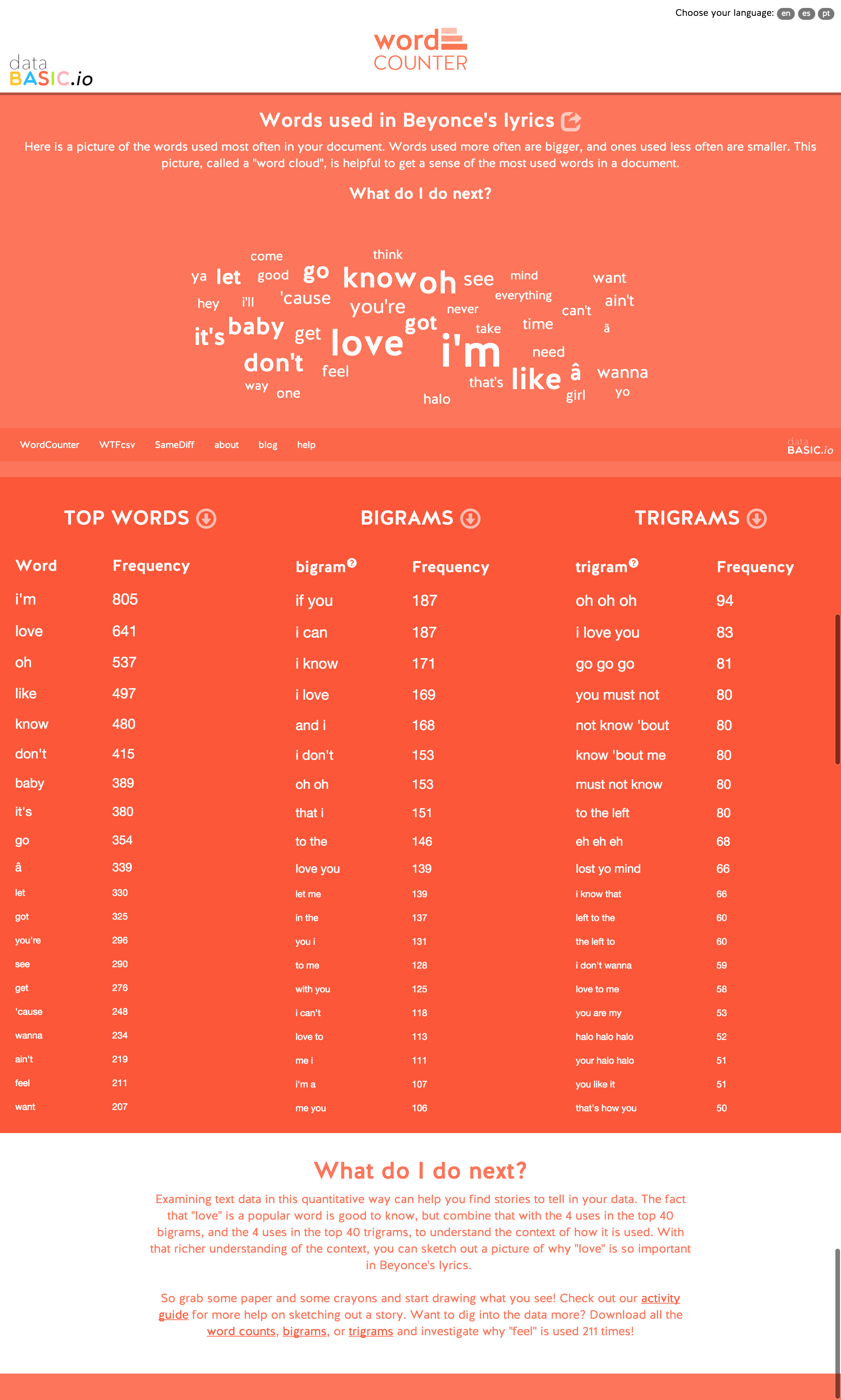
Figure 1. 
The WordCounter results page, showing an analysis of Beyonce's lyrics
Once we have explained the motivations, we demo the tool for just five minutes. WordCounter is a simple web application in which users can paste a block of text or upload a plain text file. The back-end server uses open source libraries to count the words, bigrams (two-word phrases) and trigrams (three-word phrases) in the uploaded text. After submitting their corpus, the user sees tables listing the most frequently used words, bigrams, and trigrams along with an option to download a CSV file (Figure 1). WordCounter can operate on sample data we have included, text the learner pastes in, a file the learner uploads, or text from a website URL the learner pastes in.  It includes two advanced options - toggles for case sensitivity and the removal of common words (“stopwords”).
Working in groups of three, learners have fifteen minutes to decide which lyrics to run through WordCounter in order to find a “story” to tell with the results. The sample data for the tool includes lyrical corpora for a variety of popular musical artists in English, Spanish and Portuguese (including Beyoncé, Elvis Presley, Maná, Legião Urbana, etc.). Each team uses crayons and large pads of paper to create a sketch of a visual presentation of their story to share with peers for feedback. The visual outputs resemble those seen in [Wolf 2015]. In our courses, the class then spends 10-15 minutes discussing the stories and using them as a jumping off point for further discussion of text mining and text analysis concepts.
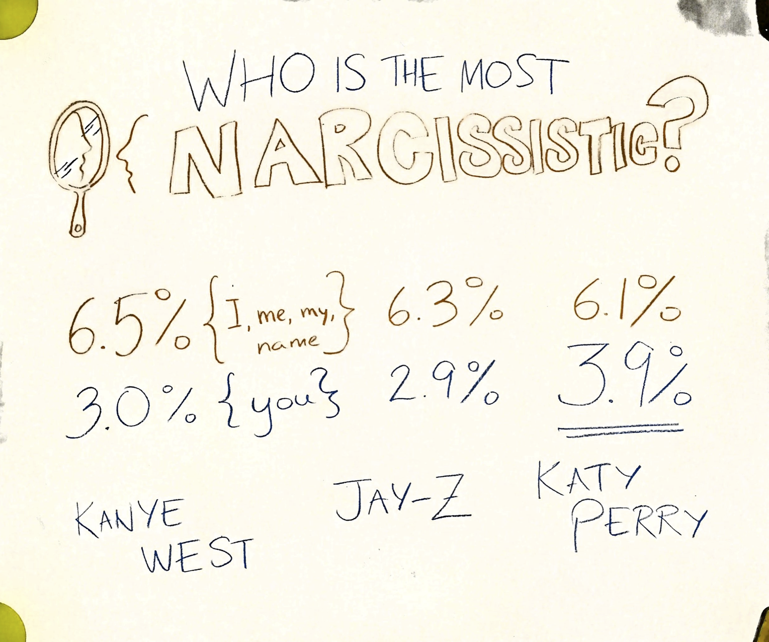
Figure 2. 
A sketch created by students comparing how narcissistic 3 artists are
While the activity is short, the focus on finding a “story” is a prompt for learners to use the tool, interpret and filter the results using prior knowledge of musical artists, and translate their organizing concept into visual language. The activity constitutes a simple model for a project-based learning approach to data visualization in a low-stakes environment with fun subject matter. Peer groups of three learners work together to negotiate each stage of the process, including selecting relevant data, suggesting focus ideas, and developing visual representations with color, hand-drawn icons and pictures. Translating the “story” into visual language is a key part of the hands-on learning aspect of this activity. Learners often start to make key visual design decisions, such as using color keys to represent data about individual artists, using familiar icons to represent concepts such as “love”, and using size and shape to denote differential quantities. How novices use visual mappings and narratives in these types of data-driven sketches is an active area of study in the information visualization field [Walny, Huron, and Carpendale 2015]. In the post-activity shareback, facilitators work to highlight these emerging design decisions and point out how they lead to more intentional and systematic strategies for visual information design. Simple, short activities can embody all three principles of project-based learning, hands-on learning and peer learning.

Creating a Narrative Storybook

Our second example is related to constructing strong narratives in explanatory visualizations.  Our hands-on activity guides students through telling their data-driven story in storybook form, to flesh out the narrative structure and the key “plot points”.[6]
While introducing the idea of telling stories with visualizations, educators often break them into two buckets - exploratory or explanatory [Iliinksy and Steele 2011].  Exploratory visualizations provide some interface, visual or interactive, to manipulate the data being shown.  They allow the user to explore the data and find a story of their own.  Explanatory visualizations use data to tell a strong and clear story through the use of visual mapping and graphical symbols. They rely on narrative structure to convey the story of the data to the reader; built through time, physical space, or both.
Explanatory visualizations that strive to tell a story need strong narrative structure.  We find students often critique this aspect of examples we discuss.  These critiques open lively discussions, but don't provide a space for students to practice the art of stitching together a narrative.  To allow this, we offer the storybook activity as a playground where students can explore their story's narrative, without worry about the details of the visual mappings or symbolical glossary they will build on.
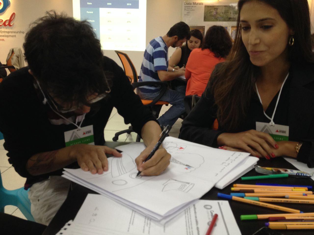
The activity works best once a group of learners has started to narrow in on the main story they hope to tell. We often use this in classroom settings after a group of students has picked a dataset they will be working with and analyzed it to find a particular narrative that they find engaging. Learners are asked to bring their current story in the form of a template that says “the data say _______, we want to tell that story because _______”.  We then give each group a large piece of paper and a pair of scissors.  We then lead them through a classic technique of folding that paper, with one small cut, into a small book with 3 two-page spreads, a front cover, and a back cover. Once the paper is in book form, each group is instructed to write “once upon a time…” on the cover and “the end” on the back.  The rest of the pages are available for them to sketch out their story in a form similar to a children's storybook, using large graphics and story text.  We offer crayons or thick markers as the implements to write with, to both suggest the playful approach and keep the visuals they choose to include at low fidelity.
Figure 3. 
Participants at a workshop sketching their storybook
This activity lets participants focus in on the backbone of their story to make sure it is strong and clear.  It doesn't argue against nuance and detailed story-telling, but rather provides the skeleton from which to hang the details from.  If their story can't be reduced to this simple form, then their narrative needs further iteration.  As with the WordCounter sketching exercise, this activity gets learners off the screen and back into a space they might be more familiar with - namely crayons and paper. The “story-time” we host at the end, where each group reads their story to the rest of the class, offers a context for the kind of social construction of knowledge that Vygotsky discusses.  The storybook artifact itself is a classic “thing to think with” from a Constructionist point of view; an embodiment of the learning process that can be passed around, discussed, and iterated upon until a final polished data visualization is created.  In addition, it brings a simple element of fun into learning settings in a way that makes sense.  This isn't fun for fun's sake, but rather fun that is had while doing the precise activity that is being learned.

Other Creative Processes and Outputs

To truly rethink approaches to teaching data visualization, one must take a step back and reconsider what “visualization” implies, who it includes, and who it excludes.  The term itself has become loaded - evoking mental pictures of strong, well designed graphics that depict some data-driven image of truth. This mythology of the all-knowing “data visualization”, occasionally propagated by designers themselves [McCandless 2010], can be broken down by renaming it as an information presentation.  This recasting is both non-intimidating and welcoming.  Most of our audiences are intimidated by data, but feel comfortable with information.  Few work on visualization, but most give presentations.  We choose our words carefully in workshop and classroom settings to be more inclusive.
Similarly, the materiality and media used to create data visualizations can be questioned to move beyond technological fetishism.  Technological expertise need not be a barrier to creating data visualizations, if one calls them simple visual presentations of information.  This opens a door to using paper printouts of data tables and pie charts with a community group to collaboratively design a mural, for example. Working together with community groups, Bhargava has painted 10 such murals around the world [Bhargava 2016].  Similarly, one can look to classic low-tech media from novel sources such as kindergarten to offer a data “sculpture” activity that allows learners to sketch their data-driven stories with pipe-cleaners, googly eyes, and other such craft materials.  These types of creative invitations align more closely with the pedagogy we described earlier. They specifically follow a constructionist approach to “building out loud”, and borrow Freire's approach to starting with materials that are familiar to and owned by the learner. While data literacy does not end with pompons and googly eyes, these can function as a productive starting point to get more people in the door (and to make the door a little larger).

Conclusion

In this paper we have outlined creative approaches to teaching data analysis and visualization to adult learners from non-technical backgrounds, including digital humanists, journalists, government officials, non-profit staff, and artists. Data is a currency of power but the technical know-how to make meaning with data is distributed unequally in contemporary Western society. Our pedagogical strategies are grounded in learning theories out of the tradition of constructivist education, which view the learner as an active participant in constructing new knowledge and applying it in productive ways to transform their social reality. We assert that data literacy for these audiences should be taught with creative, social strategies over solo exercises and rote learning. Appraches that emerge from the constructivist perspective include project-based learning, hands-on learning and peer learning. We describe examples of how these may be productively applied to learning about data analysis and visualization. These are just a few examples of what we hope is an expanding repertoire of constructionist approaches to building data literacy at scale.
That said, we consider this work preliminary. Much work remains to be done in clarifying and standardizing the definition of data literacy, especially in relation to a shifting field of technological developments and visual communication practices. What should data literacy look like for non-technical learners, who will not go on to be data scientists, but who will need to communicate with data in their professional lives? Finally, there is room for inquiry into how to best measure and evaluate the learning that is taking place for non-technical adult learners. That said, this paper argues that the best way forward is through engaging learners where they are with hands-on creative activities that build their capacity. Without such invitations any efforts to work with novices will fall into a techno-centric focus on software skills acquisition, which has little chance of connecting learners to the opportunity of data to help them achieve their goals. This is a critical research agenda for those in the digital humanities space, who have a history and practice of working on precisely this concern.

Works Cited

Ackermann 2004 Ackermann, E.K., 2004. Constructing Knowledge and Transforming the World. In M. Tokoro & L. Steels, eds. A learning zone of one’s own: Sharing representations and flow in collaborative learning environments. Amsterdam, Berlin, Oxford, Tokyo, Washington, DC: IOS Press, pp. 15–37.
Agalianos, Noss, and Whitty 2001 Agalianos, A., Noss, R. & Whitty, G., 2001. vLogo in mainstream schools: the struggle over the soul of an educational innovation. British Journal of Sociology of Education, 22(4), pp. 479–500.
Andrejevic 2014 Andrejevic, M., 2014. The big data divide. International Journal of Communication, 8, pp. 1673–1689. Available at: http://ijoc.org/index.php/ijoc/article/view/2161.
Berret and Phillips 2016 Berret, C. & Phillips, C., 2016. Teaching Data and Computational Journalism, Available at: https://www.gitbook.com/book/columbiajournalism/teaching-data-computational-journalism/details.
Bhargava 2014 Bhargava, R., 2014. Speaking Data. Data Therapy. Available at: https://datatherapy.org/2014/07/09/speaking-data/ [Accessed November 15, 2016].
Bhargava 2016 Bhargava, R. et al., 2016. Data {Murals}: {Using} the {Arts} to {Build} {Data} {Literacy}. Journal of Community Informatics, 12. Available at: http://ci-journal.net/index.php/ciej.
Bhargava and D'Ignazio 2015 Bhargava, R. & D'Ignazio, C., 2015. Designing Tools and Activities for Data Literacy Learners. I Data Literacy Workshop.
Bhargava et al. 2015 Bhargava, R. et al., 2015. Beyond Data Literacy: Reinventing Community Engagement and Empowerment in the Age of Data. Data-Pop Alliance, (September). Available at: http://datapopalliance.org/wp-content/uploads/2015/11/Beyond-Data-Literacy-2015.pdf.
Boyd and Crawford 2012 Boyd, D.M. & Crawford, K., 2012. Critical Questions for Big Data. Communication & Society, 15(5), pp.662–679.
Calzada and Marzal 2013 Calzada, P.J. & Marzal, M.Á., 2013. Incorporating Data Literacy into Information Literacy Programs: Core Competencies and Contents. Libri, 63(2), pp.123–134. Available at: http://www.degruyter.com/view/j/libr.2013.63.issue-2/libri-2013-0010/libri-2013-0010.xml [Accessed April 3, 2016].
Cockburn and Williams 2001 Cockburn, A. & Williams, L., 2001. The Costs and Benefits of Pair Programming. Extreme Programming Examined, pp.223–243. Available at: http://dl.acm.org/citation.cfm?id=377517.377531.
Conway 1968 Conway, M.E., 1968. How do committees invent? Datamation, 14, pp. 28–31. Available at: http://libproxy.mit.edu/login?url=https://search.ebscohost.com/login.aspx?direct=true&AuthType=cookie,sso,ip,uid&db=bpr&AN=518990226&site=eds-live.
Crawford 2016 Crawford, K., 2016. Artificial Intelligence’s White Guy Problem. The New York Times. Available at: http://www.nytimes.com/2016/06/26/opinion/sunday/artificial-intelligences-white-guy-problem.html [Accessed September 12, 2016].
Crawford et al. 2014 Crawford, K., Miltner, K. & Gray, M.L., 2014. Critiquing Big Data: Politics, Ethics, Epistemology. International Journal of Communication, 8, pp.1 663–1672. Available at: http://ijoc.org/index.php/ijoc/article/view/2167/1164
Dalton, Taylor, and Thatcher 2016 Dalton, C.M., Taylor, L. & Thatcher, J., 2016. Critical Data Studies: A Dialog on Data and Space, Rochester, NY. Available at: http://papers.ssrn.com/abstract=2761166 [Accessed September 12, 2016].
DataPhys wiki 2016 Data Physicalization Wiki contributors, 'Data Physicalization', Data Physicalization Wiki, 30 April 2021, 12:25 UTC, dataphys.org [Accessed 21 July 2022] (Note: citation added post publication by DHQ Editors)
Davenport and Patil 2012 Davenport, T. & Patil, D.J., 2012. Data Scientist: The Sexiest Job of the 21st Century. Available at: https://hbr.org/2012/10/data-scientist-the-sexiest-job-of-the-21st-century [Accessed May 14, 2015].
Dewey 1938 Dewey, J., 1938. Experience and Education, Collier Books.
Dewey 1987 Dewey, J., 1987. My Pedagogic Creed. School Journal, 54, pp. 77–80. Available at: http://dewey.pragmatism.org/creed.htm.
DiMaggio et al. 2001 DiMaggio, P., Hargittai, E. & others, 2001. From the “digital divide” to “digital inequality”: Studying Internet use as penetration increases. Princeton: Center for Arts and Cultural Policy Studies, Woodrow Wilson School, Princeton University, 4(1), pp.2–4. Available at: http://www.princeton.edu/~artspol/workpap/WP15 - DiMaggio+Hargittai.pdf [Accessed September 12, 2016].
Diakopoulos 2015 Diakopoulos, N., 2015. Algorithmic Accountability: Journalistic investigation of computational power structures. Digital Journalism, 3(3), pp. 1–18. Available at: http://www.tandfonline.com/doi/abs/10.1080/21670811.2014.976411 [Accessed September 12, 2016].
D’Ignazio and Bhargava 2016 D’Ignazio, C. & Bhargava, R., 2016. Databasic: Tools and Activities for Data Literacy Learners. Journal of Community Informatics, 12. Available at: http://ci-journal.net/index.php/ciej.
Emerson and TT Collective 2013 Emerson, J. & Tactical Technology Collective, 2013. Visualizing information for advocacy, Bangalore [India: Tactical Technology Collective.
Forlini, Hinrichs, and Moynihan 2016 Forlini, S., Hinrichs, U. & Moynihan, B., 2016. The Stuff of Science Fiction: An Experiment in Literary History. Digital Humanities Quarterly, 10(1).
Freire 2000 Freire, P., 2000. Pedagogy of the Oppressed, Bloomsbury Publishing.
Goldsmith and Crawford 2014 Goldsmith, S. & Crawford, S., 2014. The responsive city: Engaging communities through data-smart governance, John Wiley & Sons. Available at: http://books.google.com/books?hl=en&lr=&id=ttRLBAAAQBAJ&oi=fnd&pg=PA203&dq=info:aSm-_3OsV-MJ:scholar.google.com&ots=TEz8OIQdgJ&sig=3FjAjGOlXvTZRuqiTmfQvoDsoqY [Accessed September 12, 2016].
Gordon and Mihailidis 2016 Gordon, E. & Mihailidis, P. eds., 2016. Civic Media : Technology , Design , Practice, MIT Press.
Gray, Chambers, and Bounegru 2012 Gray, J.J., Chambers, L. & Bounegru, L., 2012. The Data Journalism Handbook 1 edition. Sebastopol, CA: O’Reilly Media, Inc.
Gurstein 2011 Gurstein, M.B., 2011. Open data: Empowering the empowered or effective data use for everyone? First Monday, 16(2). Available at: http://firstmonday.org/ojs/index.php/fm/article/view/3316 [Accessed July 16, 2014].
Harel 1988 Harel, I.R., 1988. Software design for learning : children’s construction of meaning for fractions and LOGO programming.
Harris 2012 Harris, J., 2012. Data Is Useless Without the Skills to Analyze It. Harvard Business Review. Available at: https://hbr.org/2012/09/data-is-useless-without-the-skills [Accessed May 14, 2015].
hooks 1994 hooks, bell, 1994. Teaching to transgress : education as the practice of freedom, New York: Routledge.
Hourcade et al. 2009 Hourcade, J.P. et al., 2009. Early OLPC experiences in a rural uruguayan school. Mobile Technology for Children, pp. 225–243.
Howard 2014 Howard, A., 2014. The Art and Science of Data-Driven Journalism. Tow Centre for Digital Journalism - a Tow/Knight Report. Available at: http://towcenter.org/the-art-and-science-of-data-driven-journalism/.
Hoyt, Ponto, and Roy 2014 Hoyt, E., Ponto, K. & Roy, C., 2014. Visualizing and Analyzing the Hollywood Screenplay with ScripThreads. Digital Humanities Quarterly, 8(4).
Huron et al. 2014 Huron, S. et al., 2014. Constructive visualization. In ACM, pp. 433–442. Available at: http://dl.acm.org/citation.cfm?id=2598566 [Accessed May 12, 2015].
Iliinksy and Steele 2011 Iliinksy, N. & Steele, J., 2011. Designing Data Visualizations, O’Reilly Media.
Jacobs et al 2016 Jacobs, J.M., Cairns, S. and Strebel, I., 2016. “Materialising vision: Performing a high-rise view.” In Visuality/Materiality (pp. 147-166). Routledge.
Keating 2009 Keating, J., 2009. Why did One Laptop Per Child fail? Foreign Policy. Available at: https://foreignpolicy.com/2009/09/09/why-did-one-laptop-per-child-fail/.
Kennedy et al. 2016 Kennedy, H. et al., 2016. Engaging with (big) data visualizations: Factors that affect engagement and resulting new definitions of effectiveness. First Monday, 21(11). Available at: http://firstmonday.org/ojs/index.php/fm/article/view/6389.
Kirchner 2016 Kirchner Surya Mattu, J.L.L.J.A., 2016. Machine Bias: There’s Software Used Across the Country to Predict Future Criminals. And it’s Biased Against Blacks. ProPublica. Available at: https://www.propublica.org/article/machine-bias-risk-assessments-in-criminal-sentencing [Accessed September 12, 2016].
Letouzé et al. 2015 Letouzé, E. et al., 2015. Beyond Data Literacy: Reinventing Community Engagement and Empowerment in the Age of Data.
Maycotte 2014 Maycotte, H.O., 2014. Data Literacy -- What It Is And Why None of Us Have It. Forbes. Available at: http://www.forbes.com/sites/homaycotte/2014/10/28/data-literacy-what-it-is-and-why-none-of-us-have-it/ [Accessed May 14, 2015].
Mayer-Schönberger and Cukier 2013 Mayer-Schönberger, V. & Cukier, K., 2013. Big Data: A Revolution That Will Transform How We Live, Work, and Think, Houghton Mifflin Harcourt.
McCandless 2010 McCandless, D., The beauty of data visualization | TED Talk | TED.com. 2010. Available at: http://www.ted.com/talks/david_mccandless_the_beauty_of_data_visualization.
Montessori 2013 Montessori, M., 2013. The montessori method, Transaction publishers.
Moretti 2013 Moretti, Franco. Distant reading. Verso Books, 2013.
Murnane 2010 Murnane, J.S., 2010. And They Were Thinking? Basic, Logo, Personality and Pedagogy. International Federation for Information Processing, pp.112–123.
Naylor 2016 Naylor, B., 2016. Data Brokers: Companies Are Buying, Sharing Your Online Info. What You Can You Do About It? All Tech Considered : NPR. Available at: http://www.npr.org/sections/alltechconsidered/2016/07/11/485571291/firms-are-buying-sharing-your-online-info-what-can-you-do-about-it.
Neuhauser 2015 Neuhauser, A., 2015. 2015 STEM Index Shows Gender, Racial Gaps Widen. US News & World Report. Available at: https://www.usnews.com/news/stem-index/articles/2015/06/29/gender-racial-gaps-widen-in-stem-fields.
O’Hear 2016 O’Hear, B., 2016. Paper Prototyping. Medium.com. Available at: https://blog.revelate.de/paper-prototyping-d53fafc71b78#.21ek6q4uh.
O’Neil 2016 O’Neil, C., 2016. Weapons of math destruction : how big data increases inequality and threatens democracy, New York : Crown.
Papert 1980 Papert, S., 1980. Mindstorms: children, computers, and powerful ideas, New York: Basic Books.
Papert 1994 Papert, S., 1994. The Children’s Machine: Rethinking School In The Age Of The Computer Revised ed., Basic Books.
Pasquale 2015 Pasquale, F., 2015. The black box society : the secret algorithms that control money and information.
Patil 2012 Patil, T.H.D.J., 2012. Data Scientist: The Sexiest Job of the 21st Century. Available at: https://hbr.org/2012/10/data-scientist-the-sexiest-job-of-the-21st-century [Accessed May 14, 2015].
Perovich Perovich, L., 2014. Laura {Perovich}. Big Bar Chart in Laura Perovich’s Portfolio. Available at: http://www.lauraperovich.com/projects/bigbarchart.html [Accessed July 28, 2016]
Piaget 1952 Piaget, J., 1952. The origins of intelligence in children., New York: International Universities Press.
Porter et al. 2013 Porter, L. et al., 2013. Success in Introductory Programming: What Works? Communications of the ACM, 56(8), pp. 25–28. Available at: https://proxy.tamuc.edu:2048/login?url=http://search.ebscohost.com/login.aspx?direct=true&db=bth&AN=89594060&site=eds-live.
Resnick and Rosenbaum 2013 Resnick, M. & Rosenbaum, E., 2013. Designing for Tinkerability. Design, Make, Play: Growing the next generation of STEM innovators, pp. 163–181.
Resnick and Silverman 2005 Resnick, M. & Silverman, B., 2005. Some Reflections on Designing Construction Kits for Kids. Proceeding of the 2005 conference on Interaction design and children (IDC ’05), pp. 117–122. Available at: http://dl.acm.org/citation.cfm?id=1109540.1109556.
Roberts-Smith et al. 2013 Roberts-Smith, J. et al., 2013. Visualizing Theatrical Text: From Watching the Script to the Simulated Environment for Theatre (SET). Digital Humanities Quarterly, 7(3).
Sandvig et al. 2014 Sandvig, C. et al., 2014. Auditing algorithms: Research methods for detecting discrimination on internet platforms. Data and Discrimination: Converting Critical Concerns into Productive Inquiry. Available at: https://pdfs.semanticscholar.org/b722/7cbd34766655dea10d0437ab10df3a127396.pdf [Accessed September 12, 2016].
Shah 2011 Shah, M., 2011. A Blurry Vision: Reconsidering the Failure of the One Laptop Per Child Initiative. WR 150, no. 3. Available at: http://www.bu.edu/writingprogram/journal/past-issues/issue-3/shah/
Slater and Garcia 2016 Slater, D. & Garcia, M., 2016. The Methodologies of Data Literacy. School Of Data Blog. Available at: http://schoolofdata.org/2016/01/14/research-results-part-2-the-methodologies-of-data-literacy/.
Street 2003 Street, B., 2003. What’s “new” in New Literacy Studies?: Critical approaches to literacy in theory and practice. Current Issues in Comparative Education, 5(2), pp. 77–91.
Tactical Tech Collective 2014 Collective, T.T., 2014. Visualizing Information for Advocacy Second. The Netherlands: Tactical Technology Collective.
Thomas 2000 Thomas, J.W., 2000. A Review of Research on Project-Based Learning. The Autodesk Foundation, pp. 1–45. Available at: http://www.bobpearlman.org/BestPractices/PBL_Research.pdf.
Topping 2005 Topping, K.J., 2005. Trends in Peer Learning. Educational Psychology, 25(6), pp. 631–645.
Tufekci 2014 Tufekci, Z., 2014. Engineering the public: Big data, surveillance and computational politics. First Monday, 19(7), pp. 1–38.
Turkle and Papert 1992 Turkle, S. & Papert, S., 1992. Epistemological Pluralism and the Revaluation of the Concrete. Journal of Mathematical Behavior, 11(1), pp. 3-33.
Tygel and Kirsch 2015 Tygel, A. & Kirsch, R., 2015. Contributions of Paulo Freire for a critical data literacy. Proceedings of Web Science 2015 Workshop on Data Literacy. Available at: http://www.researchgate.net/profile/Alan_Tygel/publication/278524333_Contributions_of_Paulo_Freire_for_a_critical_data_literacy/links/5581469d08aea3d7096e6a31.pdf [Accessed July 23, 2015].
Voakes, Beam, and Ogan 2003 Voakes, P.S., Beam, R.A. & Ogan, C., 2003. The Impact of Technological Change on Journalism Education: A Survey of Faculty and Administrators. Journalism and Mass Communication Educator, 57(4), pp. 318–34.
Vygotsky 1980 Vygotsky, L., 1980. Mind in society: The development of higher psychological processes, Harvard University Press.
Walny, Huron, and Carpendale 2015 Walny, J., Huron, S. & Carpendale, S., 2015. An Exploratory Study of Data Sketching for Visual Representation. Computer Graphics Forum, 34(3), pp. 231–240.
Webber et al. 2014 Webber, H. et al., 2014. The graph choice chart. The Science Teacher, 81(8), pp. 37–44.
Welles 2014 Welles, B.F., 2014. On minorities and outliers: {The} case for making {Big} {Data} small. Big Data & Society, 1(1), pp. 1–2. Available at: http://bds.sagepub.com/content/1/1/2053951714540613 [Accessed April 25, 2015]
Willett and Huron 2016 Willett, W. & Huron, S., 2016. A Constructive Classroom Exercise for Teaching InfoVis. In IEEE VIS. Available at: http://vgl.cs.usfca.edu/pdvw/2016/abstracts/Willett.pdf.
Williams et al. 2015 Williams, S. et al., 2015. City Digits: Local Lotto: Developing Youth Data Literacy by Investigating the Lottery | Journal of Digital and Media Literacy. Journal of Digital and Media Literacy, 2(2). Available at: http://www.jodml.org/2014/12/15/city-digits-local-lotto-developing-youth-data-literacy-by-investigating-the-lottery/ [Accessed March 19, 2015].
Wilson and Cameron 2015 Wilson, C. & Cameron, 2015. Hour of code---a record year for computer science. ACM Inroads, 6(1), pp. 22–22. Available at: http://dl.acm.org/citation.cfm?doid=2735450.2723168 [Accessed November 14, 2016].
Wolf 2015 Wolff, Annika and Kortuem, Gerd (2015). “Visualising energy: teaching data literacy in schools.” In: Sencity 2, 08 Sep 2015, Osaka.
Zer-Aviv 2014 Zer-Aviv, M., 2014. Disinformation Visualization: How to lie with datavis. Visualizing Information for Advocacy. Available at: https://visualisingadvocacy.org/node/643.html.
Zimmerman 2000 Zimmerman, B. J., 2000. Attaining self-regulation: A social cognitive perspective. In M. Boekaerts, P. Pintrich & M. Zeidner (Eds.), Handbook of self-regulation, pp. 13–39. San Diego, CA: Academic Press.

2018 12.4  |  XMLPDFPrint