Abstract
This paper examines the potentialities of networked browsing, a form of
faceted searching that visualizes digital archives in the form of a force-directed
network graph. Using BigDIVA.org as an example of networked browsing, this paper
presents the results of a small usability study that compared how participants (N = 8) engaged with BigDIVA’s networked browsing in comparison
to use of a search engine such as Google. In doing so, we situate our study within
performative conceptualizations of human-computer interfaces [Drucker 2013] in order to explore the potential becomings when human and
nonhuman machinic component are entangled together. Based on the observations from
our usability study, we argue that networked browsing is suggestive of Whitelaw’s
(2015) “generous interfacing” that emphasizes browsing as
a tool for exploring relationships between nodes in archives, as well as
Shneiderman’s (1996) “joyous experience” for interfacing
with the web.
Introduction
Conducting a search query through Google or scholarly archives is a performance. It
requires curation of key terms or phrases from memory, fingered articulation upon a
keyboard, recall from the database, selection and then uptake from a list of results.
This ubiquitous everyday performance, while providing information access and
retrieval across the world, is nonetheless a narrowly defined operation in which a
given search query is matched to a given resource. As Mitchell Whitelaw (2015)
argues, the process of browsing limits a user to understanding and exploring the
scores of information available online. If an online archive is analogous to a
museum, then Whitelaw argues that starting with a search query is the equivalent to
being told to wait at the entrance to the Louvre until you explicitly request to see
the Mona Lisa. Citing Ben Shneiderman’s two-decade-old appeal to make information
exploration a “joyous experience”
[
Shneiderman 1996] as well as Johanna Drucker’s (2013) call for the humanities to take a central
role in such endeavors, [
Whitelaw 2015] outlines the numerous
possibilities for online archives and databases to design “generous interfaces” in order to allow users to explore relationships
between nodes of information across the web. This paper examines BigDIVA (short for
Big Data Infrastructure Visualization Application) as one such instantiation of a
“generous interface” that invokes performative
materiality for an online database cataloguing archives in the Advanced Research
Consortium (ARC).
BigDIVA
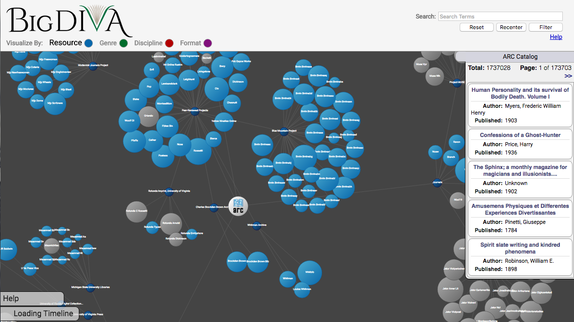
[1] is a database that visualizes the ARC catalog
[2] through an interactive force-directed graph in which network
nodes represent specific catalogued archives, collections, or resources (see
Figure 1). Its name invokes the concept of Big Data, and
as such provides users with visualization of the
entire ARC catalog,
while search queries either narrow or shrink the webbed catalog. This paper argues
that searching and browsing online archives through a networked visualization
interface (henceforth
networked browsing) allows users to explore and
interpret relations between archived sources (nodes) and to perform contingent
in-the-moment search queries outside of the search box. In this sense, networked
browsing prioritizes play and meaning-making that is co-constituted with the
distributed materiality of the database itself. This turns traditional browsing
performances on their heads and downplays the human-centered process that directs a
subject from search query to resource, and instead directs the subject(s) to explore
and infer relationships between the human user, the machinic components of the
interface, and the networked points that make up the archived subjects.
This paper will explore two questions that situate BigDIVA within ongoing discussions
of interfaces (see [
Drucker 2013]; [
Whitelaw 2015]; and
[
Schofield et al. 2015] from this journal), performative materialism, and
digital archives: First,
how do human participants use BigDIVA in
comparison to a more traditional browser interface such as Google? In the
simplest terms, networked browsing disrupts the expectations of traditional web
browsing. As such, these disruptions will necessarily manifest behaviorally (i.e.,
facial gestures, mouse clicks, vocalizations) and temporally (i.e., time spent on
each search task). Such distinctions in usage may suggest how new users might
interact with BigDIVA’s interface as well as networked browsing. Second,
how does usage of BigDIVA’s interface (as well as self-reports of
usage) afford and evidence generous interfacing or archival liveness? While
design choices may be theoretically grounded, those choices may not always be
transparent to the intended users and thus the interface still risks becoming
functionally fixed. Thus, we intend to explore how users' experiences — as well as
perceptions of their experiences — of BigDIVA may explicitly reflect interfacing that
is theoretically grounded in the notion of performative materiality, wherein various
bodies and distributed components meet at the point of the interface to perform a
search.
This paper will proceed with a background discussion concerning performative
materiality and interfaces, the technical background concerning networked browsing
and BigDIVA, results from the usability study, and lastly a discussion and conclusion
section.
Performative Materiality and Joyous Interfacing
A performative conception of human and machine interfacing places the utmost
importance on what subjects are doing in a given assemblage, and how their actions
co-constitute one another. Questions are more concerned with what a subject does,
rather than what it is [
Drucker 2013]. Karen Barad argues that
The move toward performative alternatives to
representationalism shifts the focus from questions of correspondence between
descriptions and reality (e.g., do they mirror nature or culture?) to matters
of practices/doings/actions.
[Barad 2003, 802]
This move away from representationalism (i.e., concern with what subjects are)
is an effort to grant and explore the agency of subjects that are otherwise agentless
through practices that seek understandings of definitions and boundaries. For
example, a representationalist understanding would render a BigDIVA user’s keyboard
as an input apparatus that is acted upon by human agents. While not necessarily
inaccurate, this definition is necessarily based upon a priori knowledge of the
keyboard (i.e., how it
has been used), and subsequently obscures its
infinite range of potentialities (i.e., how it
could be used). However,
as argued by [
Kittler 1999], keyboards, which were originally designed
as writing devices for the blind, were not necessarily intended as primary input
devices for computers. The agentive trajectory of components in a cybernetic
assemblage are thus not pre-determined. Interfaces are therefore an exemplary site to
explore such cybernetic performances since multiple bodies constituting multiple
agencies and materialities meet at the point of interface.
Barad argues that in casting aside representational concerns about “inherent boundaries and properties,” bodies are instead
“material-discursive phenomena” that engage in unique
performances that create meaning through their performances [
Barad 2003, 823]. She elaborates that “‘Human’ bodies are not inherently different from
‘nonhuman’ ones. What constitutes the ‘human’ (and the
‘nonhuman’) is not a fixed or pregiven notion, but nor is it a
free-floating ideality”
[
Barad 2003, 823]. In this way, what a subject does in constellation with other subjects is what
continually configures and reconfigures the notion of that subject. In Barad’s
framework, which she terms
agential realism, meaning is made in the
spaces in which these bodies come to meet together, which she calls
intra-activity.
Barad’s framework, which draws attention to how meaning is made through bodies
performing together, is crucial for digital media scholars in order to understand
that when humans and technology intra-act that the range of potential meanings,
realities, and uses are not predetermined. Drawing on groundbreaking principles of
quantum physics, particularly the philosophy-physics of Niels Bohr, Barad uses the
term
apparatus to describe the site of human and nonhuman bodies coming
together:
apparatuses are not mere static arrangements in the world, but
rather apparatuses are dynamic (re)configurings of the world, specific agential
practices/intra-actions/performances through which specific exclusionary
boundaries are enacted.
[Barad 2003, 816]
Whether a factory floor, scientific instrument, or a typewriter keyboard, when
humans act with any apparatus they — together — create new potential meanings.
Barad’s framework therefore reminds us that understanding and studying digital media
apparatuses requires attention to how they are made meaningful
through
use.
To return to our previous question: how does a performative materiality reveal the
material-discursive phenomena at play within the interface? First, it is worth noting
that Johanna Drucker (2013) argues that the interface should be conceptualized as a
space rather than a
thing, specifically, “a space of affordances and possibilities structured into
organization for use”
[
Drucker 2013, ¶31]. Thinking of an interface in terms of a space therefore entangles more than
just the machinic components, but enfolds the multiple bodies and agencies that
organize around possibilities of use. Alexander Galloway (2012) has similarly argued
that an interface, like that of a computer, “is a process or active threshold mediating between two
states”
[
Galloway 2012, 23], and thus an
effect of the meeting of bodies. Understanding an
interface as a
space and an
effect of the meeting between
bodies therefore requires attention to the numerous distributed components — on both
sides of the threshold — that meet at the point of interface, from the human user to
the device to the networked archive.
Drucker (2013), drawing upon JeanFrançois Blanchette, argues that all of these
components that meet in digital media interfaces are complex cybernetic assemblages
that constitutes a
distributed materiality in which multiple components
are “locked into relations with each other that are governed by
their material design and constraints in ways that have an effect on the costs
and efficient operation of the system”
[
Drucker 2013, ¶6]. Such an assemblage’s operation (i.e.,
performance)
might be most evident at the point of interface, but Drucker argues that the various
components that are “locked into” that performance may be
distributed at points quite distant from the point of interface. This is not so
surprising considering that ergonomic design traditions for complex computer
interfaces frequently encourage concealment of the elaborate distributed components
that make up the machine [
Harwood 2011], as well as how they often draw
upon adjacent cultural metaphors (e.g., the computer “desktop”).
In the case of a website, then, the distributed components include the computer
screen, the mouse, the site interface, the network that connects the computer to the
site, the server that hosts the site, the cooling system that prevents the servers
from overheating, etc. With so many components locked together in play, Drucker
argues that “[e]very person produces a work as an individual experience,
according to their disposition and capacity”
[
Drucker 2013, ¶22]. This performance may thus occur at various points of distribution in
contributing to what [
Schofield et al. 2015] termed
archival
liveness. In this way, an empirical investigation of the unique
reconfigurations at play when a human accesses a website requires attention to
multiple agentive components.
Between Barad’s conceptualization of the apparatus, which emphasizes meaning-making
through intra-activity, and Drucker’s conceptualization of the interface, which
emphasizes cybernetic assemblages as a space that enfolds a distributed materiality,
it is possible to understand the potentialities of human interaction with digital
media through attention to use. As we hope to demonstrate in this paper,
observing these interactions by concentrating on use may allow for observation of how
the bodies (human and distributed nonhuman components) performatively materialize one
another, specifically by concentrating observation on the point of contact — the
interface. In the case of BigDIVA, we specifically wish to understand how a shift in
the design of an online browsing interface engenders new performances and
understandings of the components on either side of the interface. In the following
section, we detail how the design of online browsing interfaces, as well as attempts
to understand the usability of these interfaces, have thus far
contributed to understanding these relationships in terms of performative
materialities.
Web Browsing, Interfaces, and Usability
In this section we provide background into discussions about the application of
design principles to web browsing and online interfaces — much of which comes from
fields such as design, human-computer interaction (HCI), and user experience (UX). We
additionally make an attempt to couch this material within the contexts of ongoing
discussions in the digital humanities about how to understand how individuals
experience and use digital media within DH contexts, as well as the
application of theory in these contexts. While these discussions certainly draw upon
the aforementioned disciplines, similarly as we do, our primary intention in
discussing them in the first place is to bring to the fore the tension between
understandings of use and usability across various
disciplines.
Designing Data Types
In 1996, Brian Shneiderman made a plea to designers that “information exploration should be a joyous
experience”
[
Shneiderman 1996, 336]. Noting the rising demand for information-seeking online services in the
days before Google’s ubiquity, Shneiderman argued that as online archives expanded
that the “visual presentation” as well as “direct-manipulation” of information would be critical for
users to be able to deliberately sort through the slew of search results without
experiencing cognitive overload. The “visual
presentation” of different types of data would therefore be critical to
managing user experience, and Shneiderman outlined several data types in order to
aide how designers conceptualized the user’s relationship between data and
directly manipulating this data. His taxonomy included data that he considered
1-dimensional (e.g., textual data), 2-dimensional (e.g. maps), 3-dimensional
(e.g., “real-world” objects like the human body), temporal
(e.g., timelines), multi-dimensional (e.g., combination of multiple data types),
treed (e.g., hierarchical tree-structured data), and networked (e.g., network
visualizations that show relationships between data)
[3]
[
Shneiderman 1996, 337]. Shneiderman (1996) insisted that
accommodating several data types simultaneously would be necessary to design
information search interfaces, and further suggested that the goals and interests
of users conducting searches would likely affect the use of
visualization/manipulation tools such as filtering [
Shneiderman 1996, 339].
In the last two decades, much of Shneiderman’s taxonomy is highly visible in
various iterations of web-based browsing applications and design literature,
particularly dynamic queries which are frequently represented as faceted
searching. Fagan (2010) noted that contemporary instantiations of faceted search
tools aimed to represent data types and provide tools for users to narrow
information search results. A typical example might start with a single search
term, and then facet by the type or resource, the date range, or even availability
of digitized copies (see
Figure
2 for an example of faceted search). After examining numerous studies
that empirically investigated faceted searching, Fagan (2010) reported on a bevy
of benefits to faceted search, perhaps most notably that faceted search may
contribute to users finding a greater amount of relevant results as well as
creating mental navigation structures and specifically benefits user’s ability to
search within specific time-frames or by specific authors [
Fagan 2010, 62–63].
Xiao et al. (2009) demonstrated that successfully navigating and interacting with
an online search tool, such as Yahoo.com, on a mobile device stresses the
importance of
limiting the available visual real estate by stacking
blocks of space horizontally, and limiting the amount of text simultaneously
visible on-screen. Faceted search interfaces, as shown in
Figure 2, represent significant
obstacles to such challenges from a visual perspective. While designers and
scholars have explored mobile-specific interfaces for faceted search, the
challenges outlined by [
Xiao et al. 2009] are pervasive. For example, [
Schneider, Scherp, and Hunz 2013] finds that certain modifications, such as presenting
facets in a list or a grid, might significantly improve usability but not
necessarily user enjoyability of the search experience. Incorporating lessons from
[
Shneiderman 1996] and [
Xiao et al. 2009], [
Kleinen, Scherp, and Staab 2014] designed a custom mobile application that combined text
and visuals to conduct faceted search tasks, so that a user might begin by
entering or selecting text based on prior knowledge, and then selecting the next
facet through a map with geographically specific “points of interest.” In
this way, at each point of faceting the user is presented with a different
dimensionality of the interface so that they may go from map, to list, to detailed
visual, to detailed text. Such an example of faceted searching that incorporates
multidimensional data, Kleinen et al. argue, may yield more enjoyable search
experiences.
Regardless of the device, it is apparent that online activities like web-browsing
and searching are unique performances that are configured with the apparatus that
user and site interface through (as well as how that interface is reconfigured
with the apparatus). These usability studies further reveal representations and
visualizations of dimensions of faceted searching may inhibit or encourage
alternate forms of exploration. In particular, an undercurrent of the studies
reported in [
Fagan 2010] as well as [
Schneider, Scherp, and Hunz 2013]
is that faceted search interfaces are intended to guide users to specific
information based on
a priori knowledge or data
type dimensions. Kleinen et al. (2014) caution that as online data types, sources,
devices, and interfaces increase in size and complexity faceted search interfaces
will need to accommodate an “a-priori
unknown number of data categories
and data instances”
[
Kleinen, Scherp, and Staab 2014, 57, emphasis ours]. Therefore, the concern is not simply a matter of device- and screen-size,
but rather, a concern of the relationship between what the user wants — in terms
of inquiry and affect — and what the archive wants — in terms of liveness and data
dimensionality.
Use and Usability in DH
Our study is not the first within the digital humanities to draw upon the idea of
usability and to consider user experience in ways similar to the studies described
in the previous section. For example, [
Gibbs and Owens 2012] incorporated a
series of virtual panels, much like a focus group, to discuss online tools with
historians, and [
Warwick 2012] incorporated a usability study to
observe novice and expert users of an online archeological database. While both of
these studies used methods familiar to UX studies, an emphasis on users with
specific background knowledge, expertise, and scholarly practices (i.e.,
historians or archeologists) suggests greater consideration for
use
and
users in addition to
usability.
Since the DH ethos values both the evolution of traditional research practices
from humanities scholars as well as knowledge production in humanities classrooms,
it is reasonable that DH scholars seeking better understanding and improved
designs of digital media are concerned with a wider context than that of the
interface. Burkick & Willis (2011) have argued that 21
st-century literacy practices are
design practices, which
transforms digital scholarship and knowledge production into a process of thinking
through designing. This
user-oriented approach “takes into account not only how an application is used but
also the kinds of subject positions, world-views, and models it
affords”
[
Burdick and Willis 2011, 550]. User-oriented designs would account for Gibbs & Owens’s (2012)
recommendation that DH tools be designed more holistically for the needs of
humanities scholars and students, specifically tools that are “more transitory than revolutionary”
[
Gibbs and Owens 2012, ¶35].
Warrick (2012) has additionally argued that studying users in context is key to
understanding how scholars and students of varying expertise use digital tools and
media as part of their broader scholarly practices. This encourages
use in addition to
usability, and attention to what
users (i.e., scholars)
want and how they might engage in practice
with digital tools — regardless of usability [
Kemman and Kleppe 2014]. By
focusing on the user in context, Kemman & Kleppe (2014) argue that
observations will inform design, which may then result in a feedback loop between
design and use. This user-centered design process requires iterative attention to
use in context, such as through extended and longitudinal usability studies [
Warwick 2012].
While this surely requires an extended discussion on its own, it is worth noting
that the tension between a
user and
use for DH scholars
and
usability from UX approaches are not mutually exclusive, and, as
suggested by [
Warwick 2012], the two can inform one another.
Software and methods intended for usability studies, which may include screen
capture, log-file data, and even front-facing cameras to capture facial
expressions, may well yield rich and well-rounded understandings of
use as well as
usability. In our study of BigDIVA, we
therefore sought to further understand how new ways of visualizing and
encountering data types may serve as a “transitory” practice
for humanities scholars, and our use of a usability study may be seen as an
intervention to elicit not only potential understandings of how users initially
use BigDIVA, but also how they may perceive its potential use in their own
practices. In the following section we provide details of BigDIVA’s configuration.
Networked Browsing and BigDIVA
In Shneiderman’s (1996) taxonomy of data types, network data accounts for
relationships between and among items in an online archive. The configuration of
these relationships, or
network topologies, are commonly visualized
through force-directed graphs in which items are nodes and lines connect related
nodes [
Galloway and Thacker 2007]. Shneiderman cautions that network
representations risk overwhelming complexity (particularly as archives access large
amounts of items), as can be seen in attempts to document the topology of the
internet. However, he does suggest that network representation may allow users the
opportunity to find the shortest routes between nodes in order to establish mental
representations of relationships between items and clusters of items.
BigDIVA operationalizes faceted searching through presenting a model of the network
through one of four user-defined facets: resource, genre, discipline, and format. While resource is the primary representation
by default, users can choose to begin with one of the other three. This is
accomplished without extensive revision to the existing schema because the ARC
catalog is a fairly shallow example of faceted search, with its categories largely
existing as sister nodes under a central tree. The tool takes advantage of this
functionality to create ad-hoc trees based on the user’s defined needs and ARC
catalog schema.
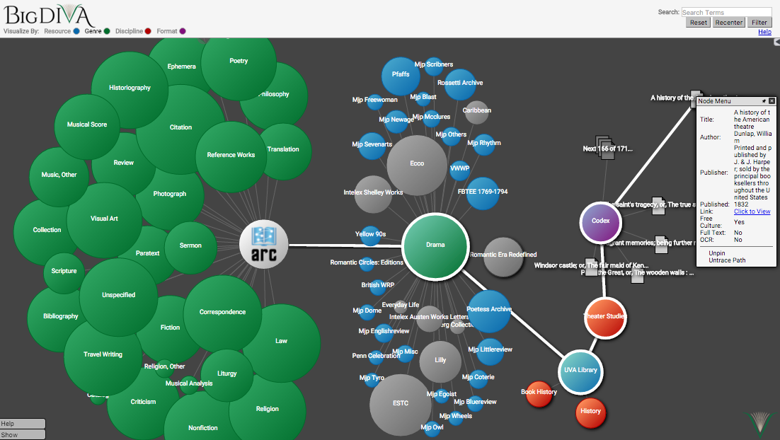
Once a user has selected their initial facet, they are then presented with a group of
sub-nodes that consist of the various recognized categories in the schema. For
example, a user that selects Genre as their initial limitation
will be presented with sub-nodes with categories such as Law, Scripture, and Drama.
From there, they can select the desired category, whereupon they are presented with
the total number of items under that category in a sidebar and the ability to refine
further based on either the remaining categories or the individual records. This
refinement can be narrowed further by repeating the process with the newly-refined
category until all four aspects of the site have been selected upon.
Regardless of the level at which they are selected, the individual resources provide
a truncated version of the catalog information and, most importantly, a link for the
user to go to that resource, which will then appear in a new window. At the same
time, the user can see the entire path between their initial category and the
individual item, maintaining a visual representation of the mental model they were
operating under while making that selection. Furthermore, they can select different
nodes and combinations of categories to visualize multiple mental pathways at the
same time, a functionality that is not possible in most faceted search systems. In
all instances, the nodes are color-coded to help the user to understand at a glance
what selections have been made, while unavailable choices are greyed out. This
maintains both the full picture of the ARC catalog while simultaneously foregrounding
those items that are of most import to the researcher. Finally, because the ARC
catalog deals with historical objects, a timeline is provided at the bottom of the
workspace, which allows a user who works in a particular period to view only those
items of interest within that period.
Since BigDIVA therefore allows users to manipulate the data visualizations through
multiple means simultaneously, i.e., the user-defined facets, a timeline, as well as
more direct manipulation of the network nodes, it may afford a unique browsing
experience. While simply overlaying multiple types of interactive data is not alone a
cure-all, the combination of a networked graph of the entire catalogue, combined with
the ability to expand the network graph through faceting based on category as well as
time-line may serve as complementary tasks. However, the inclusion of a standard
search bar as a way to filter out archival items from the network visual may serve as
a source of confusion since one is a standard search feature while the other is not.
In other words, a key aspect of understanding BigDIVA’s usability as well as the
experiences of users will be the perceived relationship between these starkly
different data types, in Shneiderman’s terms.
BigDIVA Usability Study
In order to take first steps to understand the potential uses and experiences that
BigDIVA’s networked browsing has to offer, we designed a usability study intended to
compare networked browsing with more traditional web browsing. In doing so, we hoped
to observe not only whether individuals could successfully use BigDIVA as a search
tool without any training, but also how BigDIVA’s networked browsing engaged
individuals in unique acts of online information searching. In short, we sought to
understand BigDIVA’s operational usability, but also the potential user
experience it may engender. Our resulting study design therefore compared search
tasks using Google and BigDIVA, tracked the timing patterns for each task as well as
input-related actions, and elicited self-reported perceptions by first-time users.
The study design will be briefly discussed below, followed by discussion of our
results.
Study Design
This study was conducted entirely within a labspace designed specifically for
usability studies in the library of a Mid-Atlantic U.S.-based university. This lab
was outfitted with a desktop computer running Morae software
[4], designed for computer-based usability testing, and a Logitech C920 webcam
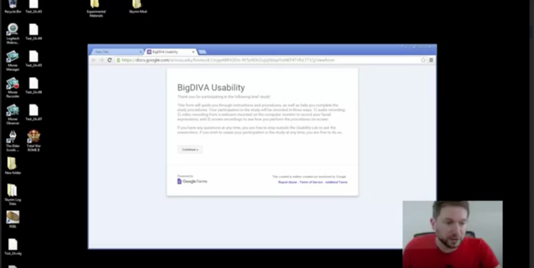
with stereo microphones. Morae was able to simultaneously record on-screen video
(including highlighting of cursor actions), audio-video footage from the webcam,
and log-file data from the keyboard, mouse, and onscreen applications. The
resulting recording (see
Figure 3 below) could then
be viewed and analyzed with Morae software.
Participants were guided through the study tasks through a Google Forms file that
provided instructions for, as well as logged performance of, each task. First,
participants were asked to complete a brief pre-study questionnaire to self-report
expertise with generic information search, as well as fields of expertise. Next,
participants were guided through three search tasks that required using Google to
find a famous work by William Blake, a relief etching by William Blake, and an
etching of Blake’s “Milton: a Poem.” These three tasks
in particular were intended for participants to find increasingly specialized
information and to use Google’s faceting feature for searching via dimensions such
as Image, Web, or Video. Following these three tasks, participants were then
required to use BigDIVA to identify collections with large results for “William
Blake,” an individual result from this search, meta-data from a specific
result for Blake’s “Night Thoughts,” and an example
search result that contains the text string “chastity.” It should be noted
that all of the search tasks are listed in the Appendix, and that the BigDIVA
search tasks were intentionally longer simply to observe users interacting with
BigDIVA for longer. Following the search tasks, the first author engaged the
participants in a brief follow-up interview to solicit self-reported experiences
with BigDIVA.
Results
Participants (N = 13) were recruited from networks
connected to a Mid-Atlantic university in order to engage participants that were
likely familiar with web-based archival search tools beyond Google. All
participants were currently enrolled in graduate coursework or had completed
graduate coursework, and were from a variety of fields and academic positions
including tenured professors, graduate teaching/research assistants, library &
information scientists, industry workers, and one individual currently between
jobs. A small group of participants (N = 5) piloted the
study design during the spring of 2015, which led to subsequent adjustments to the
study’s task design (i.e., particular phrasing of task instructions, and
streamlining of the Google Forms interface). The remaining participants (N = 8) engaged in the study between late 2015 and early
2016, and will make up the primary participant pool to be discussed throughout the
remainder of this paper.
Analysis was conducted using Morae Manager to code and extract data, and
visualizations were produced in R Studio [
RStudio Team 2015]. Participant
usability sessions were analyzed according to three dimensions: Time On Tasks
(TOT), Actions Within Tasks (AWT), and Log-File data (primarily Mouse and cursor
actions). TOT data was primarily continuous, i.e., based upon duration of time a
participant spent on each individual task, whereas AWT and Log File data were
discrete, i.e., a specific type of action that occurred at a specific moment of
time.
Table 1 below outlines each specific dimension
along with its corresponding codes.
|
Time on Tasks
|
Actions Within Tasks
|
Log File
|
|
Google Tasks:
BigDIVA Tasks: - Task 2_1a
- Task 2_1b
- Task 2_2a
- Task 2_2b
- Task 2_3a
- Task 2_3b
- Task 2_4
|
SEARCH: enters or modifies a
search query in the search bar
OPENSRESULT: clicks on an
individual result
NODEPLAY: Highlights,
pins,
or moves around a node
FACETS: uses faceting after a
search query has been entered
DIMENSIONSWITCH: facets
prior to a
search query has
been entered
ENTERSTASK: enters or
modifies
an answer for a search
task
QUITS: abandons the search
task,
typically marked by
entering “Not found” or such
into the
answer for a search task
CHEATS: uses an alternative
method to
complete a search task
(e.g., prior knowledge, another
search
engine)
CTRLF: uses the Control+F
search function within a
page
|
Mouse Actions:
Cursor Actions: - Right click
- Left click
- Double left click
Keystroke Actions: - Alphanumeric keys
- Functions keys
|
Table 1.
Dimensions of Analysis
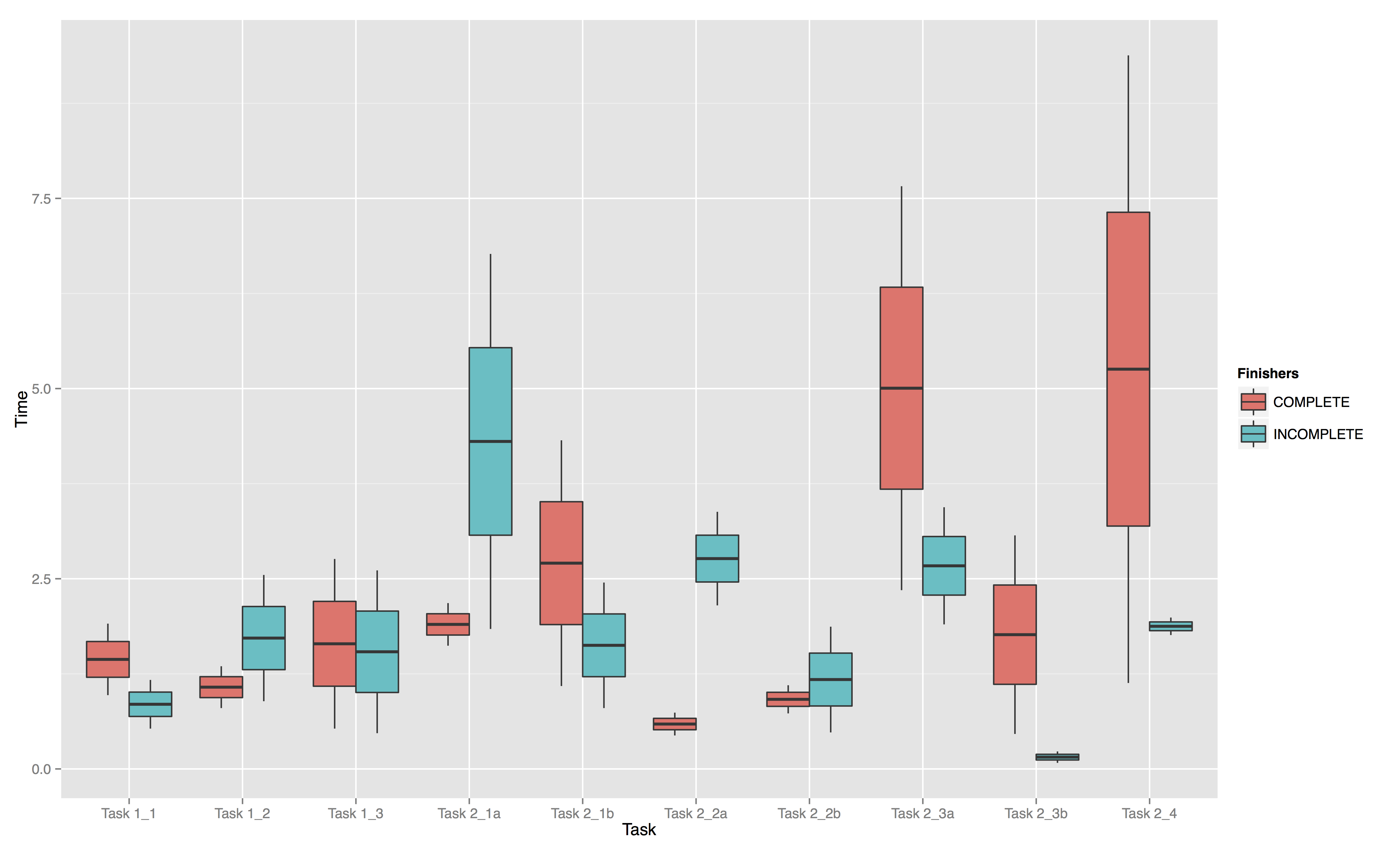
Participants spent a total of 30.51 minutes on the three Google tasks, and 144.78
minutes on the seven BigDIVA tasks (see
Table 2 for
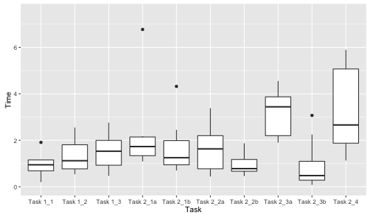
breakdown of TOT). When looking at TOT for each individual task, as shown in
Figure 4 below, we can see that, while in many cases
the TOT for BigDIVA tasks varied within the same range as the Google tasks, the
BigDIVA tasks witnessed greater variability in terms of TOT. In particular, the
two BigDIVA tasks that required the most specific information (Task 2_3a and
Task2_4) generally took the longest. A paired samples
t-test comparing participants’ mean TOT for Google and BigDIVA tasks
demonstrated that mean TOT for BigDIVA was significantly longer (
t (6) = -2.85,
p = .029).
|
Task
|
Total TOT (min)
|
Mean TOT (min)
|
Median TOT (min)
|
|
1_1
|
7.59 |
0.95 |
0.95 |
|
1_2
|
10.64 |
1.33 |
1.12 |
|
1_3
|
12.28 |
1.54 |
1.53 |
|
All Google Tasks
|
30.51
|
1.27
|
1.11
|
|
2_1a
|
18.18 |
2.27 |
1.73 |
|
2_1b
|
22.68 |
2.84 |
1.39 |
|
2_2a
|
26.08 |
3.26 |
1.89 |
|
2_2b
|
7.60 |
0.95 |
0.78 |
|
2_3a
|
29.69 |
3.71 |
3.57 |
|
2_3b
|
7.60 |
0.95 |
0.48 |
|
2_4
|
32.95 |
4.12 |
3.53 |
|
All BigDIVA Tasks
|
144.78
|
2.59
|
1.80
|
Table 2.
TOT for all tasks
Since all participants self-assessed themselves as “Very Good” or
“Excellent” Google-users, it is certainly reasonable that they would need
to spend less time on the Google search tasks. Directly comparing aggregate TOT
for Google and BigDIVA tasks does not account for time necessary to adapt to an
unfamiliar search tool; therefore, understanding the value of aggregating TOT
across tasks and search platforms requires more nuance. For example, based on
comparison of TOT for BigDIVA tasks only, it becomes apparent that following the
first BigDIVA task (Task 2_1a), some participants appeared to become more
time-efficient (particularly for Task 2_2b and 2_3b), which suggests that they
overcame a learning curve and adjusted to aspects of networked browsing. Further,
some participants that exhibited similar difficulties with search tasks
(particularly Task 2_3a-b and 2_4) spent more time on each task. For example,
participant B06 and B08 were both unable to complete these three tasks for similar
reasons (as will be discussed below), but B06 spent much longer (5.66 minutes on
all three tasks) than B08 (3.74 minutes on all three tasks). This suggests that
successful or unsuccessful adaptation to BigDIVA is not necessarily dependent on
how much time a user spends on task.
In order to look deeper than TOT data, the AWT data is able to provide more
fine-grained comparisons of what participants did for each task with the time
allotted.
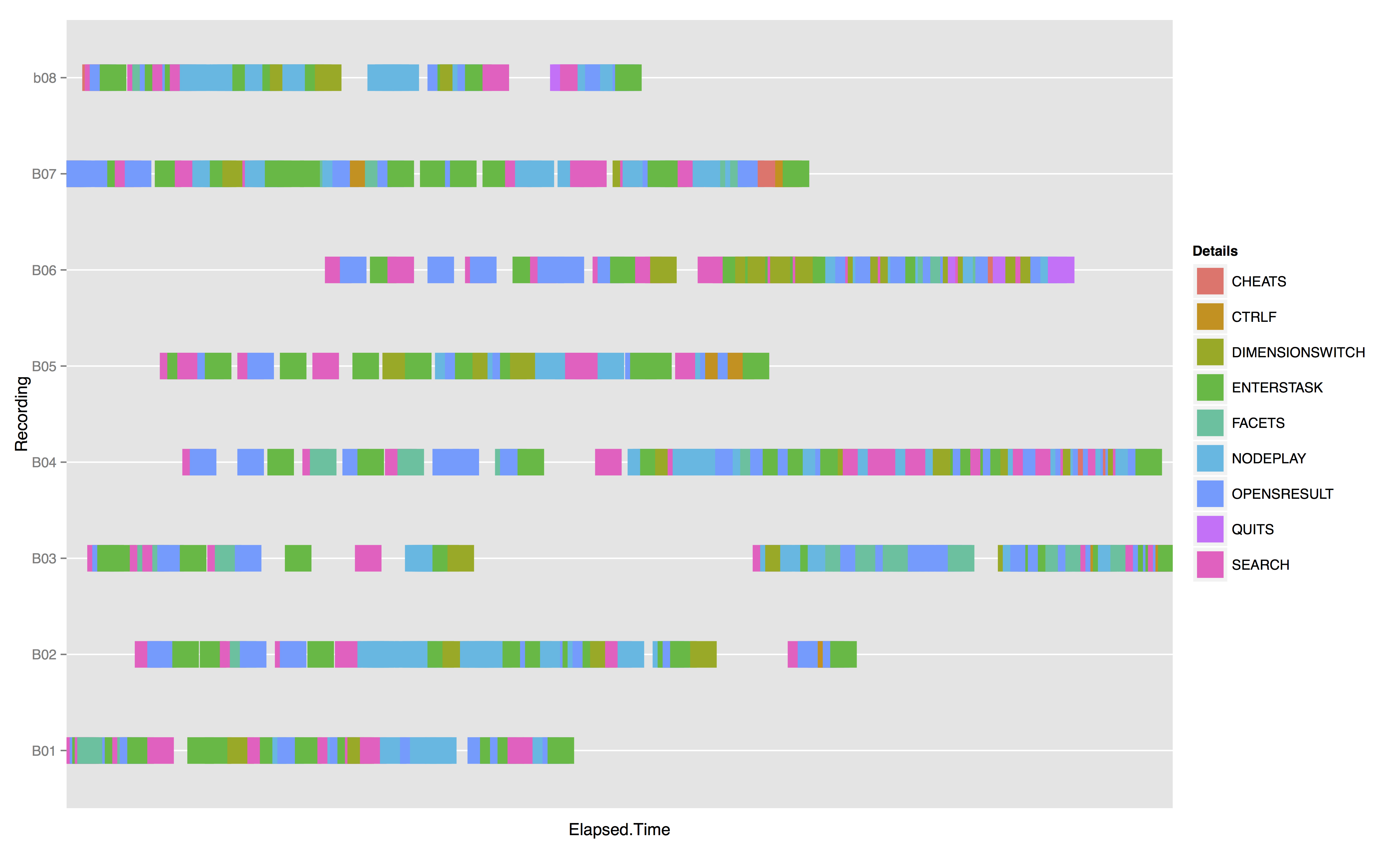
Figure 5 provides a timeline for each
participant colored for any occurrence of an AWT action type. This provides a
window into the interplay and sequencing between multiple action types over the
course of the entire study, and shows that a typical action sequence for Google
tasks involved entering a search query, adjusting for search dimension (i.e.,
Image, News, Scholarly), opening a result (maybe two), and then eventually
entering an answer for the task. For BigDIVA, these sequences were more complex as
participants were required to explore and manipulate interface elements they were
previously unfamiliar with. Interestingly, at first glance of BigDIVA’s
force-directed network, all participants found the search bar and entered a query
in a matter of seconds. However, once a search query was entered, participants
variably played with the network nodes, switched dimensions (e.g.,
Genre or
Format), enlarged the
screens, faceted, etc. In other words, the sequence from search query to facet to
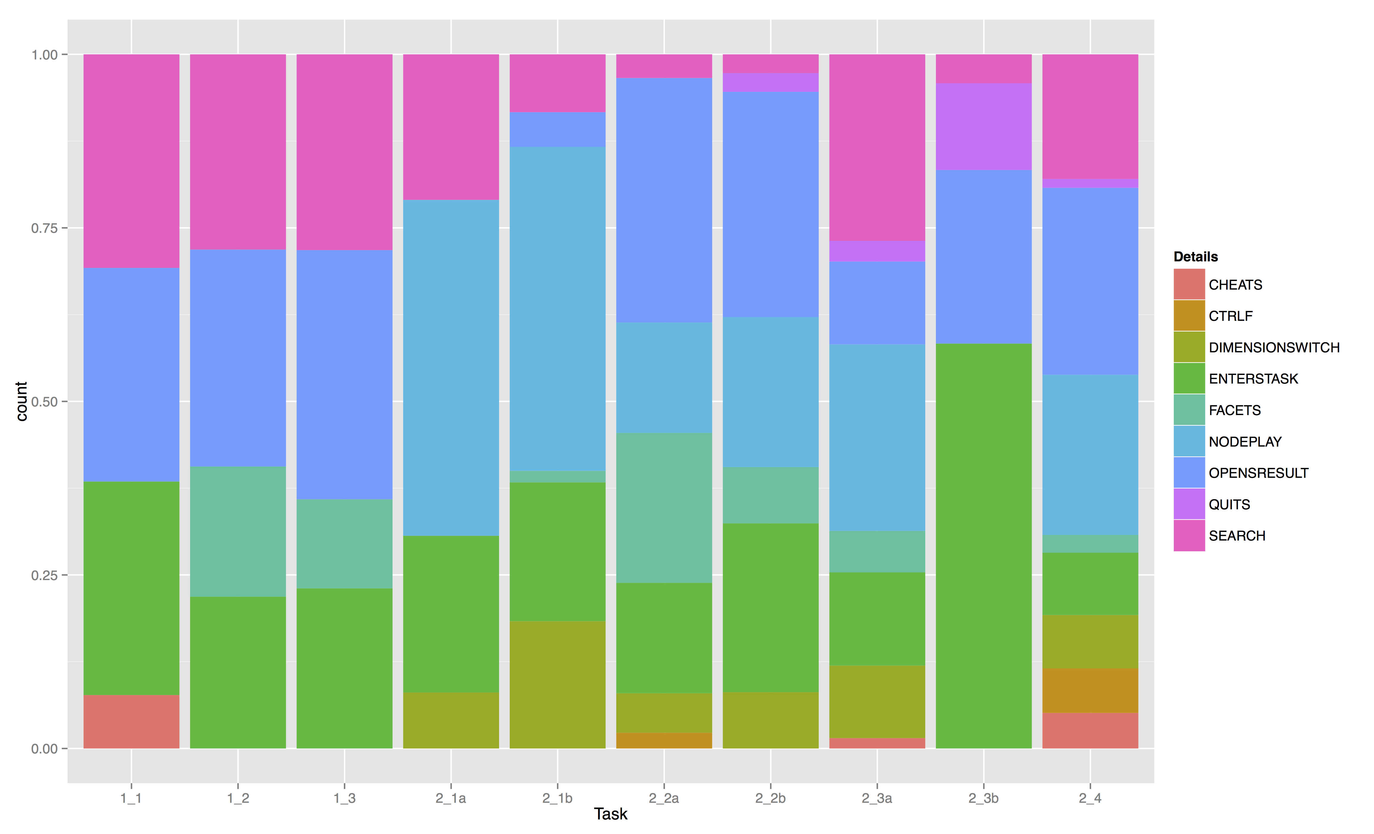
search result was broken. Entering or modifying the search query makes up a much
smaller portion of AWT actions for BigDIVA tasks (with the exception of Tasks 2_3a
and 2_4), while experimenting and playing with the faceting features and the nodes
were much more frequent. The greater frequency of these action types suggests that
participants’ unfamiliarity with BigDIVA — specifically the aspects of networked
browsing — are likely indicative of a sense of fascination and playfulness, or
even confusion and frustration, with these features in order to understand their
function. The novelty of these features may have encouraged participants to spend
time playing with these features in order to better understand them, which may
explain how some participants spent less time for later tasks.
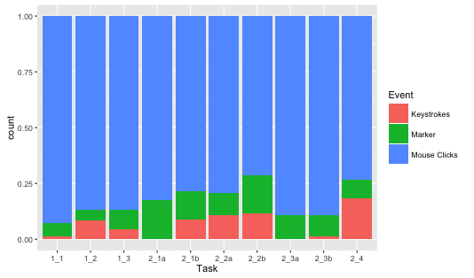
Log-File actions additionally present a complex picture. While Mouse and cursor
actions dominate input actions during the Google tasks, the first four BigDIVA
tasks witnessed a steady decrease in mouse action as participants engaged with the
keyboard and various other AWT action types more frequently. While Tasks 2_3a-b
appear to revert to Google-like behavior, the frequency of mouse and cursor
actions glaringly decreases for the BigDIVA tasks, despite the fact that BigDIVA’s
functionality is primarily dependent on the cursor (with the exception of the
search bar).
Lastly, since not all participants were able to complete every search task, it is
worth looking more closely at those participants and what their actions were.
Furthermore, in order to have a comparison of these Non-Finisher participants to
those that did, we made a subgroup of the two Non-Finishers (B06 and B08) and two
Finishers (B01 and B04). This sub-group was determined by developing a rudimentary
scoring system for each task in which participants received 1 point for completing
the task as designed, 0.5 points for completing the task not as designed, and 0
points for not completing the task at all. After rating all participants, B06 and
B08 scored the lowest, while B01 and B04 scored the highest.
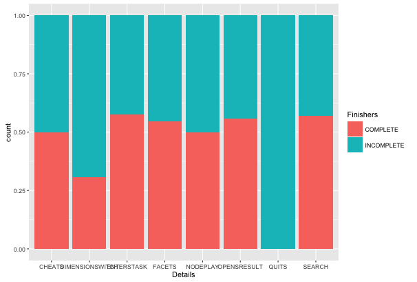
In terms of AWT action types,
Figure 8 demonstrates
both groups overall were not strikingly different. Besides the action type QUIT,
both the Finishers and Non-Finishers engaged in similar distribution of AWTs as
the Finishers. The primary distinction is for the action type DIMENSIONSWITCH, as
the Finishers switched dimensions in BigDIVA more than half as much as the
Non-Finishers. After looking more closely at when and how these participants
switched dimensions, it was observed that both groups had developed distinct
understandings of this feature’s function: the Finishers would switch dimensions
and then enter a search query, whereas the Non-Finishers would enter a search
query and then switch dimensions. While a seemingly inconsequential distinction in
Google, this sequence of action in BigDIVA is the difference between filtering
results based on a search query and resetting the force-directed network
visualization of the archive to another dimension. Thus, when the Non-Finishers
entered a search query, and then switched dimensions, they effectively negated
their query and reset the visualization to view all archive content — albeit in a
different dimension. In other words, the Non-Finishers were very likely unable to
finish all of the BigDIVA tasks because they had failed to adjust to this specific
feature of BigDIVA’s functionality, and instead appeared to transfer their
understanding of this functionality directly from Google.
Furthermore, when comparing TOT data for the Finishers and Non-Finishers, the
Non-Finishers appear to take more time in general to adjust to BigDIVA search
tasks. Indeed, by Task 2_3a, the Non-Finishers demonstrated so much difficulty in
using BigDIVA in order to complete each search task that they appeared more
inclined to abandon the tasks rather than adjust their understanding of the
functionality; whereas the Finishers — who had done a better job of understanding
the functionality — were willing to spend more time in order to complete the
tasks.
Self-Reports
While audio-video data captured from the webcam does coordinate on-screen actions
with affective reaction as gauged by facial expression, it is beyond the scope of
this current study to adequately or appropriately surmise how using BigDIVA
resulted in participants’ affective reactions. After all, since BigDIVA was new to
the participants while Google was used daily, some manner of novelty effect would
be expected. Further, since BigDIVA did require some manner of learning curve (and
at least two participants experienced delays due to server interruptions), such
analysis would likely have been biased towards affects such as frustration or
confusion [
D’Mello and Graesser 2012]. Nevertheless, at first glance of BigDIVA’s
network visualization all users did display unique momentary reactions. For
example, B04 noticeably smiled, B01 appeared surprised, B02 exclaimed quietly to
himself “What,” and B08’s brow furrowed. In other
words, the novelty of networked browsing appeared to induce affectations — perhaps
even “joyous” in some cases — that in and of itself may
offer participants hope of a new manner of searching.
Indeed, based on the self-report questionnaire following the search tasks,
participants were largely in agreement about the potentialities of networked
browsing. While many elaborated on early frustrations with the new functionalities
of the search tools, or the initial learning curve, all participants remarked
about BigDIVA’s ability to establish an understanding of the relationship between
the collections and their individual archive sources. In particular, three common
themes were apparent from the participants’ self-reports: that the novelty of
BigDIVA’s networked browsing was either “fun” or “interesting,” that BigDIVA could be most useful for
specialized archives or use in scholarly settings, and that the networked
visualizations may be pedagogically valuable for demonstrating relationships
between scholarly sources (see
Table 3 below).
Another unique theme expressed by participants related to the nature of web-based
search queries altogether. In particular, while participants noted that after a
brief adjustment period they were able to successfully search and find specific
information using BigDIVA, that they would still use a more typical visualization
such as Google — even if networked browsing were an option with Google.
Participants justified this preference with the fact that a text-based list of
results still might be simpler and quicker if the user already knows what they are
looking for; whereas networked browsing would be preferable if the user was not
certain what they were looking for. In other words, networked browsing would be
more suitable for exploring the contents of an archive without a predisposition
for specific results.
|
Networked Visualization Features
|
- “Different colors for visualizing resource,
genre, and so on is neat — this would be helpful if someone is
looking for a specific source”
- “Fun to play with!”
- “Very interesting to get to see the number of
results as well as the networks and communities”
- “Good for kids who are used to visual
interfaces”
- “The instant landscaping of sources that could
be explored was unique”
|
|
Scholarly Usage
|
- “Provides a quicker way to filter scholarly
data like in a library database. It really helps to see the source
of information”
- “Help for interdisciplinary searches if you're
not entirely certain of what you’re looking for, and if you're
interested in intersections in disciplines”
- “It helps you realize the results might pertain
to the critic or scholar, not the author”
- “Great tool to explore topics I'm already
familiar with”
- “Very good for research in the humanities that
involves multimedia formats”
- “Could be good for academic searches but also
government records and medical research in order to organize
specific types of data”
|
|
Pedagogical Usage
|
- “Interesting as a pedagogical tool for getting
students to see connections between sources”
- “Good for younger kids who are used to visual
interfaces — it would be great at capturing the attention of those
audiences”
- “it would be good to show to students who
really don’t understand too much about searching”
|
|
Everyday Use
|
- “If I was trying to get a better conceptual
understanding of relationships between sources”
- “Probably to explore topics I’m already
familiar with”
- “mainly to see connections with locations of
sources, as well as prioritization. It would be great for really
digging”
- “I wish that Google’s Image Search would have
this sort of node quality”
|
Table 3.
Transcriptions of participant self-reports
Discussion
This study set out to explore how networked browsing allows subjects to explore and
interpret relations between archived resources. Our guiding research questions were:
how do participants use BigDIVA in comparison to a more
traditional browser interface such as Google, and how does
BigDIVA’s interface afford and evidence generous interfacing or archival
liveness? While our small and preliminary usability study certainly does not
exhaustively answer either of these questions, we are left with valuable evidence
that point towards the potential range of experiences and materialities that
networked browsing has to offer.
In response to our first research question, the BigDIVA usability study provided
evidence of how the process of searching with BigDIVA compares to a more traditional
search tool like Google. According to our analysis of users’ input-related actions,
we observed that despite the fact that BigDIVA employs traditional faceted search
functionality (albeit with networked visualization) participants experienced browsing
differently for Google and BigDIVA. Participants took significantly longer to
complete BigDIVA tasks, in some cases were unable to complete certain tasks, and in
some cases attempted to transfer functionalities from Google. Additionally,
participants generally used the search bar less, the mouse and cursor less, and the
faceting features more when completing BigDIVA tasks compared to Google tasks. It was
therefore apparent that, perhaps because of the comparative study design, when
participants shifted from using Google to BigDIVA that they experienced a
performative disruption. The spike in mouse clicks for the first BigDIVA task, which
subsequently leveled out for participants, exemplified the learning curve or
adaptation to the distinctive performances engendered by networked browsing.
Analysis of input actions or completion of search tasks on their own, while key
components in understanding the cybernetic assemblage, do not tell the whole story of
how — in Barad’s and Drucker’s terms — a human intra-acting with the distributed
machinic components is made discursively meaningful. Self-reports of users’
experiences and perceptions regarding BigDIVA therefore revealed the most surprising
observations and indications of what it is like to perform networked browsing.
Participants described their initial impressions of networked browsing as “fun,”
“interesting,” or “different” —
regardless of their success or failure in the search tasks. They additionally
reflected on the potential scholarly and pedagogical applications, and yet, most
surprising, participants remained skeptical of networked browsing’s usefulness for
everyday web browsing (i.e., in place of typical search interfaces like Google);
however, numerous participants suggested it would be more fitting functionality for
finite archives (i.e., such as the ARC catalog).
That participants generally reported such positive experiences and perceptions of
BigDIVA, in spite of its more specialized use, is a promising indication that
networked browsing may indeed engender Shneiderman’s (1996) “joyous experience” for interfacing with the web. Indeed, such experiences
are difficult to observe by examining input-related actions alone and without facial
recognition software to analyze affect. In future study, we therefore intend to place
greater emphasis on how users experience networked browsing with an eye
toward longitudinal designs and repeated self-report measures in addition to analyses
more common in usability research. These observations follow Warrick’s (2012)
suggestions for the combined use of log-file data to track input and output actions
in addition to more traditional ethnographic methods, such as interviews and
longitudinal participant observation, in order to examine usability and use of new
tools in the digital humanities. If our study observed even an inkling of how new
users performatively intra-acted and engaged in meaning-making with BigDIVA, then
more prolonged and iterative observations would be able to richly observe use in
context.
Limitations and Future Research
Of course, as implied already, our study was not without its limitations. In
addition to a small sample size, we wish to emphasize that the comparative design
of our study is one such limitation, because, as participants self-reported,
BigDIVA prioritized a different kind of browsing than Google. Finding information
in BigDIVA did not require a scavenger hunt amongst a hierarchical text-based list
that required prior knowledge encoded in the form of a query. Instead, BigDIVA
made information available without a search query, thus begging participants to
visually untangle and play with the networked catalog. Our study design admittedly
prioritized specific search tasks in order to target use of specific features as
well as to allow easy comparison to search tasks in Google. Open-ended tasks or
longitudinal observation, per [
Warwick 2012], would therefore be
well-suited alternatives.
At the same time, comparative methods are still valuable for design and
experiential considerations of these interfaces. After all, if networked browsing
indeed affords unique performative understandings and meaning-making experiences
compared to other operationalizations of faceted search functions, then more
detailed comparative studies could reveal the distinctions in those processes,
particularly comparing similar scholarly faceted search tools such as a university
library database. As suggested above, such a comparative study would do well to
not solely rely on input-based behavioral measures that privilege the machine
components of the interface, and instead privilege the human components in the
interface by observing affect, metacognitive processes, as well as self-report
measures to emphasize users’ perceptions of their experiences. In particular, such
methods could potentially parse out the distinction between users’ understanding
of search functionality from archive architecture, as well as how, in their own
terms, they may find joy in their browsing experiences.
Conclusion
Based on the observations from our study, networked browsing may indeed be
suggestive of Whitelaw’s (2015) “generous interfacing”
that emphasizes browsing as a tool for exploring relationships between nodes in
archives. The possibilities for exploration and play are evidenced not only in how
archives may be accessed and searched for specific scholarly aims, but also for
configuring new relational understandings of the distributed materiality of an
archive itself. In other words, networked browsing may help users conceptualize
archives as agential or living material bodies. In doing so, searching through an
archive is no longer a linear act of retrieval, but perhaps an exploratory and
contingent act of meaning-making.
Of course, our study’s observations and what they suggest only yield more questions
about networked browsing, faceted search functions, and generous interfacing. As
mentioned above, further research design would do well to observe how individuals
might use BigDIVA over a longer span of time, involve more open-ended tasks, and
involve multidimensional analysis. In particular, future research should question
what could users learn or discover with BigDIVA when simply given time and freedom to
experiment with networked browsing and explore the archive? Would they come to a more
detailed understanding of its components (i.e., collections, individual resources,
faceting structures)? Would they become more fluent with the interface’s
functionality? Such questions, which we see as central to the study of
knowledge-production in the digital humanities, would require attention to
usability of digital tools as well as a well-rounded and holistic
model of who a digital user is and how they engage in use.
Appendix
BigDIVA Usability Study Procedures
I: Preliminary Questionnaire: - What is your current degree level?
- What is your current academic or professional position?
- What would you consider your “field”?
- How frequently do you use Google or another search engine to look up
casual information?
- How would you rate your skill level at using search engines?
- Can you explain the difference between these search queries: macaroni
and cheese, macaroni AND cheese?
- For academic or scholarly research, how do you begin to search for
resources and materials?
II: Google Search Tasks: - What is one of William Blake's famous works? [GENERAL QUERY]
- Find an example of a relief etching by William Blake. Provide the URL
of the image [FACETING, RESOURCE META-INFORMATION]
- Search for an etching from William Blake's “Milton
a Poem”. [FACETING, QUERY MODIFICATION, SORTING RESULTS]
III: BigDIVA Search Tasks: - A) Using BigDIVA, search for WILLIAM BLAKE. What are the names of a
collection that appear to have the most results? B) What about when you
visualize by Genre instead of Resource? [GENERAL QUERY, FACETING]
- A) What is an individual result from one of these collections? B) What
about a still image or a manuscript? [FACETING, SORTING RESULTS]
- A) Search for WILLIAM BLAKE again visualizing for Resource, and find
the Blake Archive node. What is the publication year of Night Thoughts,
copy 1 (object 28)? B) What is the first line from object 28? [FACETING,
RESOURCE META-INFORMATION]
- Search for “chastity” and find one individual result that
contains that search term in the primary source text [QUERY MODIFICATION,
RESOURCE ASSESSMENT, SORTING RESULTS]
IV: Follow-Up Interview: - What were your general impressions of BigDIVA?
- What were your experiences finding an individual result in BigDIVA
compared to Google?
- What was new or unique about BigDIVA?
- What was easy to adjust to?
- What was difficult to adjust to?
- What do you think the BigDIVA search visualization is particularly
good for? What is it bad for?
- If Google or another popular search engine offered the option to do
search visualization like BigDIVA, would you use it? Why or why
not?
|
Works Cited
Barad 2003 Barad, K. 2003. “Posthumanist Performativity: Toward an Understanding of How Matter Comes to
Matter”. Journal of Women in Culture and
Society, 28, 801-831.
Burdick and Willis 2011 Burdick, A., & Willis, H.
2011. “Digital Learning, Digital Scholarship and Design
Thinking.”
Design Studies, 32, 546-56.
Drucker 2013 Drucker, J. 2013. “Performative Materiality and Theoretical Approaches to Interface”. Digital Humanities Quarterly, 7(1).
Dunne et al. 2015 Dunne, C., Ross, S.I., Shneiderman,
B., & Martino, M. 2015. “Readability metric feedback for
aiding node-link visualization designers”. IBM Journal
of Research & Development, 59, 1-16.
D’Mello and Graesser 2012 D’Mello, S. K., &
Graesser, A. C. 2012. “Dynamics of affective states during
complex learning”. Learning and Instruction,
22, 145-157.
Fagan 2010 Fagan, J.C. 2010. “Usability Studies of Faceted Browsing: A Literature Review”. Information Technology and Libraries, 29, 58-66.
Galloway 2012 Galloway, A.R. 2012. The Interface Effect. Malden, MA: Polity.
Galloway and Thacker 2007 Galloway, A.R., &
Thacker, E. (2007). The Exploit: A Theory of Networks.
Minneapolis, MN: University of Minnesota Press.
Harwood 2011 Harwood, John. 2011. The interface: IBM and the transformation of corporate design,
1945-1976. Minneapolis, MN: University of Minnesota Press.
Henry, Bezerianos, and Fekete 2008 Henry, N.,
Bezerianos, A., & Fekete, J.D. 2008. “Improving the
Readability of Clustered Social Networks using Node Duplication”. IEEE Transactions on Visualization and Computer Graphics,
14, 1317-1324.
Kemman and Kleppe 2014 Kemman, M., & Kleppe, M.
2015. “User Required? On the Value of User Research in the
Digital Humanities.” Selected Papers from the CLARIN 2014 Conference,
October 24-25, 2014, Soesterberg, The Netherlands, 63–74.
http://www.ep.liu.se/ecp_article/in.
Kittler 1999 Kittler, F. 1999. “Typewriter”. In Gramophone, film, typewriter.
(G. Winthrop-Young and M. Wutz, Trans.). Stanford, CA: Stanford University Press.
(Original work published in 1986).
Kleinen, Scherp, and Staab 2014 Kleinen, A., Scherp,
A., & Staab, S. 2014. “Interactive facete”d search and
exploration of open social media data on a touchscreen mobile phone. Multimedia Tools Applied, 71, 39–60.
RStudio Team 2015 RStudio Team (2015). RStudio:
Integrated Development for R. RStudio, Inc., Boston, MA. URL
http://www.rstudio.com.
Ren, Sarvas, and Cali 2010 Ren, K., Sarvas, R., &
Cali, J. 2010. “Interactive search and browsing interface for
large-scale visual repositories”. Multimedia Tools
Applied, 49, 513–528.
Schneider, Scherp, and Hunz 2013 Schneider, M.,
Scherp, A., & Hunz, J. 2013. “A comparative user study of
faceted search in large data hierarchies on mobile devices”. Proceedings of the 12th International Conference on Mobile and
Ubiquitous Multimedia, 1-10.
Schofield et al. 2015 Schofield, T., Kirk, D.,
Amaral, T., Dörk, M., Whitelaw, M., Schofield, G., & Ploetz, T. 2015. “Archival Liveness: Designing with Collections Before and During
Cataloguing and Digitization”. Digital Humanities
Quarterly, 9(3).
Shneiderman 1996 Shneiderman, B. 1996. “The Eyes Have It: A Task by Data Type Taxonomy for Information
Visualizations”. Proceedings 1996 IEEE Symposium on
Visual Languages, 336-343.
Warwick 2012 Warwick, C. 2012. “Studying users in digital humanities.” In Warwick, C., Terras, M. and
Nyhan, J. (Eds.), Digital Humanities in Practice. Facet
Publishing, London, pp. 1–21.
Whitelaw 2015 Whitelaw, M. 2015. “Generous Interfaces for Digital Cultural Collections”. Digital Humanities Quarterly, 9(1).
Xiao et al. 2009 Xiao, X., Luo, Q., Hong, D., Fu, H.,
Xie, X., & Ma, W.Y. 2009. “Browsing on Small Displays by
Transforming Web Pages into Hierarchically Structured Subpages”. ACM Transactions on the Web, 3, 1-36.


