DHQ: Digital Humanities Quarterly
2017
Volume 11 Number 3
2017 11.3  |  XMLPDFPrint

Media Visualization of Book Cover Images: Exploring Differences among Bestsellers in Different Countries

Wooseob Jeong <wjeong1_at_emporia_dot_edu>, Emporia State University

Abstract

Interest in the role of book cover images in readers’ reading experience and book marketing has been long-standing. This study attempts to compare book covers from different countries with a media visualization tool called ImagePlot. The top 100 bestselling books from 13 Amazon.com’s international sites were identified and their cover images were downloaded. Using ImagePlot, median values of brightness, hue and saturation for each image in the data set were extracted and analyzed. Along with one-way ANOVA tests and the resulting graphs from SPSS, ImagePlot outputs show differences in these graphical properties of bestsellers’ cover images in different countries. From the outputs, with all the book cover images displayed on a single canvas (screen), hidden patterns emerged and findings were clearly confirmed. This study makes a contribution by providing connection between research interests in book cover images and media visualization techniques for further research.

Introduction

Contrary to the real meaning of the English idiom, “Don’t judge a book by its cover,” research interest in book covers has been steady ranging from the personal book selection process to the marketing of trade books. For example, there is an edited scholarly monograph titled Judging a Book by Its Cover [Matthews & Moody 2007] discussing book covers’ important roles. At Goodreads.com, which is a general forum of readers, more than 400 lists related to book covers have been generated by its users, which indicates readers’ long-standing interests in the topic. In fact, the importance of cover images was clearly identified from the late 19th century, although 1930’s Penguin Books’ paper revolution is generally considered as the beginning of the interest in book covers [McCleery 2007]. Since the 19th century, book bindings were commonly decorated on their covers or dust jackets to reflect the content of the book, which is a modern development [Pearson 2013] and around the same time, the growing interests in children’s book publishing started to emphasize the importance of book covers to attract the readers’ eye and to promote the books for sales [Immel 2013].
Despite active research activities on book covers, however, most studies are based on individual book cover images, often with different cover images of a single title over time and in different countries. A new method called media visualization can help to overcome this limitation, allowing researchers to explore various properties of images in a collection or to compare among multiple image collections.
This study compares book covers from different countries using media visualization methods to explore characteristics of individual image groups and differences, if any, among the different image groups.

Literature Review

Visualization of Image Collection for Effective Image Retrieval

There have been numerous research projects aimed at providing useful tools for visualization of large image collections for both retrieval and exploration purposes. Two approaches are noticeable in the existing literature on visualization of image collections: user interaction and semantics.
In terms of interactive approaches, Nguyen and Worring (2005, 2008) tested their interactive system with 10,000 Corel images with emphasis on overview, visibility and structure preservation [Nguyen & Worring 2005] [Nguyen & Worring 2008]. Bruneau, Picarougne and Gelgon (2010) proposed an interactive system which allows feedback on the clustering process [Bruneau et al. 2010]. Zheng, Gomi and Itoh (2014) proposed “ImageCube” designed for the browsing of image collections associated with multidimensional datasets. With 15 participants, they tested the interactive system with an automobile catalog dataset published on the Web [Zheng et al. 2014]. Worring, Rooji and Rijn (2007) created a prototype that visualizes the network of images by graph-based representations and found that the nearest neighbor network can have a positive effect on the interaction effort [Worring et al. 2007]. Yang et al. (2006) proposed a scalable semantic image browser which allows interactive visual exploration [Yang et al. 2006]. Fan et al. (2009) introduced “JustClick”, an interactive system, to enable personalized image recommendation via exploratory search from large-scale collections of Flickr images [Fan et al. 2009]. Their experiments on large-scale image collections (1.5 billion Flickr images) with diverse semantics (4000 image topics) have obtained very positive results. Camargo, Caicedo and Gonzalez (2013) proposed a framework for the construction of an image collection exploration system based on kernel methods with mathematically strong basis of image representation, summarization, visualization and interaction [Carmargo et al. 2013]. Gao et al. (2009) developed an interactive system to filter junk images from keyword-based Google Images search results by mixture of kernels to generate more accurate image clustering [Gao et al. 2009]. Janecek and Pu (2003) implemented a prototype of an interactive “focus + context” visualization which integrates WordNet to utilize relevant semantic information such as metadata and ontologies [Janecek & Pu 2003].
In terms of semantic approaches, many of the literatures cited above were based on textual information of images as well as graphical properties of images [Fan et al. 2009] [Carmargo et al. 2013] [Yang et al. 2006] [Gao et al. 2009] [Janecek & Pu 2003].

Media Visualization

Media visualization is different from information visualization. According to Manovich (2014), information visualization shows the metadata about the media, while media visualization shows the actual data [Manovich 2014]. If standard information visualization translates data into pictures, media visualization translate pictures into pictures. Media visualization offers one solution to a fundamental question of digital humanities — how to bring together macro and micro, distant reading and close reading — “reading” the actual artifacts and “reading” larger patterns abstracted - from very large sets of these artifacts? [Manovich 2014].
Manovich has been one of the leading researchers in media visualization. His lab developed a visualization tool called ImagePlot by creating many custom macros, based on imageJ software which was developed and distributed freely by the National Institutes of Health (NIH). Manovich succinctly summarizes the value of media visualization in the following:

Step away, and you can see larger patterns across a whole data collection. Step closer, and you can study the details of individual images.  [Manovich 2014]

These techniques are aimed at scholars working in a number of disciplines including art, art history, film and media studies, who need to analyze large image collections in their work, which led to a new interdisciplinary field called Cultural Analytics [Yamaoka et al. 2011]. As an exemplary study, Manovich, Douglass and Zepel (2012) downloaded one million scanned manga pages from a web site and visualized the whole data by ImagePlot to explore the characteristics of particular manga collections [Manovich et al. 2012].

Importance of Book Cover Image

Cover Images in Book Marketing and Promotion

Cover art and blurbs are the No. 7 reason for buying a book, according to reports from the National Endowment for the Arts [Greco et al. 2013]. Matthews and Moody (2007) compiled chapters about the role of book covers in marketing and other aspects into a monograph [Matthews & Moody 2007]. Yampbell (2005) examined 5 covers over 10 years for Weetzie Bat by Francesca Lia Block and concluded that publishers are altering the paratext, particulary covers, spines, and sizes, to charm teen readers [Yampbell 2005]. Regina Sierra Carter (2012) examined different versions of cover images of YA (Young Adults) books about minority or mixed-race characters and concluded that appropriate cover art is necessary because it helps to match the inside story to the story the cover portrays [Carter 2012]. As seen in the example of a Portuguese translated version of Shariff’s book, altering book cover images without the author’s knowledge can be frustrating [Shariff 20913]. Croker (2012) suggested that if publishing and authorial populations were involved in more conscious collaboration like Lewis Carroll, the paratext could contribute to the enhancement of the reading experience [Croker 2012]. After examining the text and images of The Beat Goes On book jacket, Goldsmith, Gross and Carruth (2012) found that although the information on the jacket conveys a strong and accurate sense of the narrative, still the front and back covers do not mention the disease, which may make the subject matter less clear [Goldsmith et al. 2012].

Cover Images in Book Selection Process

For decades in the past, the role of cover images in readers’ book selection has been actively studied and the majority of studies have focused on younger readers from elementary and middle schools. Reutzel and Gali (1998) observed 18 elementary school children for their book selection behaviors and found that looking at the cover is one of the common book selection elements in children’s book selection processes [Reutzel & Gali 1998]. Based on interviews with 36 children (grades one through four), Carter (1988) found that structural elements, including cover information (title and picture) had much more influence on children’s book selection than any other schema used by children to choose reading material [Carter 1988]. Wendelin and Zinck (1983) conducted a survey with responses from 688 fifth through eighth grade students and found that factors such as the description of a book on the book jacket or back cover and the content of the first page apparently weigh heavily in the decisions to read or not to read a book [Hawkins Wendelin & Zinck 1983]. However, still 8% said they choose a book by the picture on the cover in the first place. Kragler and Nolley (1996) observed that 23% of the 17 fourth grade students in a class said they chose a book based on its physical characteristics such as a good-looking book cover, while 27% chose a book because others in the class had read it or told them it was a good book [Kragler & Nolley 1996].
In a study with 96 first-through fifth-grade students on the ICDL (International Children’s Digital Library), Reuter (2007) found that 39.6% said cover images influenced their book selection [Reuter 2007]. Mohr (2006) interviewed 122 first graders and found 25% indicated “topic” as primary element that influenced their book selection process, while only 7% preferred “front cover” [Mohr 2006]. Moss and Hendershot (2002) conducted a two-year ethnographic case study with 48 sixth graders for their nonfiction trade book selection for reading [Moss & Hendershot 2002]. 48% reported that visual aspects of the text influenced their book choices, whether a picture on the cover or photographs inside the book. Swartz and Hendricks (2000) conducted a book selection process study with 31 middle school students with special needs [Swartz & Hendricks 2000]. 15 of the 31 students said they picked a book because of the pictures on the cover or illustrations in the book. From a study with 25 eighth graders, Rinehart, Gerlach and Wisell (1998) found that these adolescent readers were able to draw important clues from BOB (back-of-the-book) summaries, titles and cover illustrations, although more emphasis is on BOB rather than cover illustrations [Rinehart et al. 1998]. Based on anonymous observation methods, Cunningham (2011) conducted studies on how children find books for leisure reading at bookstores and public libraries and confirmed that the primary basis for the “good/not good” decision is the appearance of the cover [Cunningham 2011].
The role of cover images in book selection has been studied for the adult population as well. Spiller (1980) found 27% of public library users, mostly adults in the survey with 500 respondents, thought that the visual impact of the cover design influenced them to pick up the book in the first instance, although the cover alone would not afford enough information [Spiller 1980]. Researchers at the University of Waikato in New Zealand studied their college students’ browsing and book selection process and found the cover images play an important role [Vanderschantz et al. 2011] [Timpany et al. 2012] [Hinze et al. 2012] [Cunningham et al. 2013]. Vanderschantz and Timpany (2013) examined a sample of 840 books from their university library’s collection for their physical properties of the cover (use of a dust jacket, type of binding) and the contents of the cover (background color, most predominant color, the imagery used and the use of typography), based on the Library of Congress Classification System [Vanderschantz & Timpany 2013]. They concluded that understanding of the design parameters and their variations across different subject areas can assist with accurately conveying the content of a book to the reader, as the initial impression of the outside of a book can have an effect on whether the reader delves further into the content.

Purpose of Study

The purpose of this study is, utilizing a media visualization method by ImagePlot, to find if there is any difference in brightness, hue and saturation of cover images of bestseller books from different countries and to identify any patterns among the differences and if so, what the characteristics of the differences may be.

Methdology

Data Collection

In mid-April 2014, from Amazon.com’s 13 international sites, the cover images of the top 100 bestsellers were collected. The 13 international sites include: Australia, Brazil, Canada, China, France, Germany, India, Italy, Japan, Mexico, Spain, United Kingdom and United States. A few books did not display their cover images. Table 1 shows the number of images in each country’s data set with each country’s country code. Some images have white borders around actual cover images or “Look Inside!” icons, but due to time constraints, those images were not cropped, but used in the data process as they were.
Country Number of Images Country Number of Images
Australia (AU) 100 Italy (IT) 100
Brazil (BR) 100 Japan (JP) 94
Canada (CA) 100 Mexico (MX) 100
China (CN) 100 Spain (ES) 99
France (FR) 100 United Kingdom (UK) 100
Germany (DE) 100 United States (US) 99
India (IN) 99
Table 1. 
Number of Images by Country

Data Processing

The collected images were saved in a designated folder for each country. By “ImageMeasure” macro, median values of hue, brightness and saturation for each image were extracted and saved in a corresponding data file for each country. For the overall visualization and analysis, all the images regardless of their country origins, were collected in a separate folder. Their hue, brightness and saturation values were measured again and saved into another data file. In this file, the Internet country code was assigned for each data entry.

Visualization Tool - ImagePlot

ImagePlot was developed by Manovich and his lab colleagues with various macros. It is primarily based on ImageJ software developed by and freely distributed from NIH. With the ImageMeasure.txt macro, median values of brightness, hue and saturation of each image in the data set was automatically obtained. Brightness Median is the median of grey scale values for the pixels in an image, Saturation Median is the median of saturation, which means purity of color, for each pixel in an image, and Hue Median is the median of color values of all pixels in an image.
In ImagePlot, all the values measured are converted into 0-255 scale (ImagePlot Documentation). For brightness measurements, color images are internally converted to greyscale using this formula: gray=(red+green+blue)/3. If an image is pure black, Brightness_Median will be 0; if an image is pure white, it will be 255. Low Saturation_Median value indicates that image colors are mostly desaturated; a high value indicates that most colors are close to being pure (very saturated). The 0-255 scale may lead to some confusion particularly for hue values since hue values are normally represented as degree of a circle, 0 to 360, from yellow to red, with green, blue and purple in the middle. Therefore, when the hue values are represented in a linear form, such as X-axis or Y-axis, the interpretation requires extra caution.

Data Analysis

For the overall image collection, 3 sets of visualization outputs were rendered by ImagePlot: brightness by country, hue by country and saturation by country. For the differences among countries, one-way ANOVA analysis was conducted with means and standard deviations (stdev) of the measured median values of brightness, hue and saturation. Bar graphs of the result were generated by the SPSS software. For combined analysis, 3 sets of bivariate graphs were generated for each country’s collection by ImagePlot: brightness vs. hue, brightness vs. saturation and saturation vs. hue. The output bivariate graphs were compared among countries for further analysis.

Results

Differences in brightness, hue and saturation by countries (ANOVA)

A one-way ANOVA test was conducted by SPSS with the median values and standard deviation values of each image for its brightness, hue and saturation. The results showed that both the median values and the standard deviations are significantly different statistically (p<.05) among countries for all three of the properties.
Graphical displays of the results can provide more intuitive observation. For example, a graph based on the mean values for each country shows how bright or dark the books from a country are in general. However, it may not show how much different each group’s images are in brightness. In that sense, a graph based on standard deviations is useful. Figures 1, 2, and 3 show the graphical displays of means and standard deviations for brightness, hue and saturation respectively. The X-axis means each country represented by its Internet country domain name.

Brightness by Country

Figure 1 shows that while the book cover images from Australia and Brazil have relatively dark (low value in brightness) colors, they have a wide range of brightness (larger standard deviation). Meanwhile, Chinese books are the brightest among countries with the most homogeneous level of brightness (the smallest in standard deviation). Japanese books are quite bright as well, but with modest variation.
Figure 1. 
Brightness by Country (mean vs. stdev)

Hue by Country

For hue values, a line graph can display different color tones in general among countries. For example, as seen in the first graph in Figure 2, the books from the United Kingdom use much higher value of hue than those from China. However, since hue is based on 360-degree circular measurements for RGB (red, green and blue) values, the mean value may not have intuitive indicators. Rather, the standard deviation values may have more useful information. For example, from the second graph in Figure 2, it is reasonable to conclude that books from United Kingdom, United States, Spain, India, Italy, France and Germany have more consistent or homogeneous color schemes than others.
Figure 2. 
Hue by Country (mean vs. standard deviation)

Saturation by Country

Figure 3 shows that the majority of the books in the data do not have highly saturated colors. Chinese, Japanese and Australian books have the least saturated colors, while French, Indian, British and American books have the most saturated colors. Chinese and Mexican books have the largest standard deviations in saturation, while Italian, British and American books have the least.
Figure 3. 
Saturation by Country (mean vs. stdev)

Differences in brightness, hue and saturation by countries (Media Visualization)

While the graphics based on the means of median values show some useful information, still a bigger picture needs to be examined for a full description of the differences, and the outputs from ImagePlot provides more in-depth, but still easy to identify, representation of the book cover images among countries. It is also worthwhile to remember that the values for hue are not numeric because red, green and blue color are arbitrarily assigned to 0, 120 and 240 in a 360-degree color wheel and then later 0-255 into ImagePlot data file.
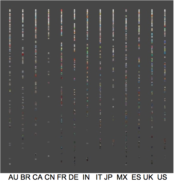
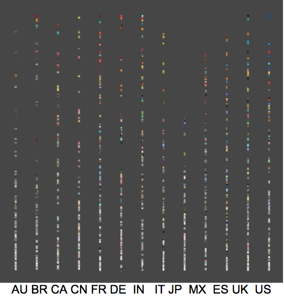
The three graphs in Figures 4, 5, and 6 show the different brightness, hue and saturation of each book cover image from the data by country respectively. All the books in the data set were represented on the individual graph, with actual images of the covers with the size of 50 by 50 pixels. The X-axis shows each country represented by its Internet country domain name, and the Y-axis shows brightness, hue and saturation on a scale of 0-255. For brightness and saturation, the lower the Y value, the darker or the less saturated each image is. For hue, Y values represent, from lower to higher, yellow, green, blue, purple, red colors.
In this method, since all the actual book cover images are displayed on a graph, it is easy to identify patterns throughout the whole data. For example, Chinese and Japanese books do not have many dark images on their covers and French, German, Indian and British books have more red/purple colors on their covers. Most book covers do not have highly saturated colors, but Japanese books distinctively do not have highly saturated colors on their covers. It also seems that books from Brazil and Germany use either highly saturated colors or lowly saturated colors, not middle range saturated colors.
Figure 4. 
Brightness by Country
Figure 5. 
Hue by Country
Figure 6. 
Saturation by Country

Bivariate Analysis (Media Visualization)

Polar vs. Non-polar display

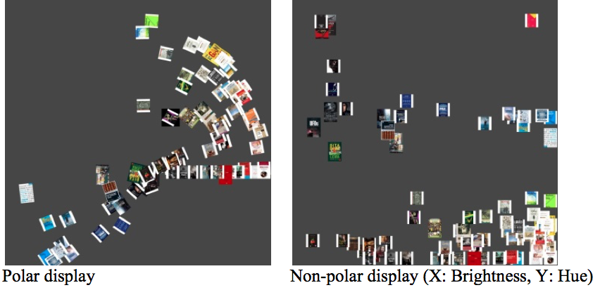
There are two options for visualization in ImagePlot, polar vs. non-polar. Since ImagePlot converted all the values into 0-255 scale regardless of their natural scale (for example, 0-360 for hue), each option has its advantages and disadvantages. The polar option seems fancier than the non-polar one, but the difficulty of interpretation depends on which variables are used. For example, in Figure 7, it is more intuitive to use the polar display because hue (red, green and blue colors) is easily identified in counterclockwise direction from the right side while the center represents darker and the periphery represents brighter colors. However, in Figure 8, since neither saturation nor brightness involves a circular data point, a polar display option has little value. Rather, a simple x-y coordinate can deliver easier interpretation, in this case, X-axis for brightness and Y-axis for saturation. In general, a non-polar display is easier to understand, while a polar display may have an advantage if hue is involved.
Figure 7. 
Brightness vs. Hue for Brazilian Bestsellers
Figure 8. 
Brightness vs. Saturation for Canadian Bestsellers

Brightness vs. Hue

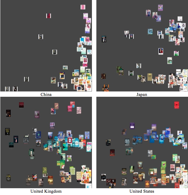
Figure 9 shows four ImagePlot outputs for brightness and hue in the image data sets from four countries, China, Japan, United Kingdom and United States. X-axis is for brightness, the higher the value, the brighter the image, and Y-axis for hue, from lower value to higher, representing yellow, green, blue, purple and red. These outputs show that Chinese and Japanese book covers are mostly brightest and less colorful, while British and American book covers are not only various in color but also diverse in brightness.
Figure 9. 
Brightness (X-axis) vs. Hue (Y-axis)

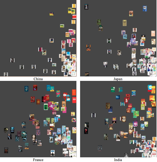
Brightness vs. Saturation

Figure 10 shows four ImagePlot outputs for brightness and saturation in the image data sets from four countries, China, Japan, France and India. X-axis is for brightness, the higher the value, the brighter the image, and Y-axis for saturation, the higher the value, the more saturated. In terms of brightness, French and Indian books have more dark colors on their covers than Chinese and Japanese books. They also have more saturated colors on their covers than Chinese and Japanese books, meaning Chinese and Japanese book cover images have more white, black or gray elements in their colors.
Figure 10. 
Brightness (X-axis) vs. Saturation (Y-axis)

Saturation vs. Hue

From the previous sections on Brightness vs. Hue and Brightness vs. Saturation, it is clear that Chinese and Japanese books distinctively have brighter and less saturated colors. In this section of Hue vs. Saturation, rather subtle distinctions are explored without Chinese or Japanese books.
Figure 11. 
Saturation (X-axis) vs. Hue (Y-axis)
Figure 11 shows four ImagePlot outputs for hue and saturation in the image data sets from four countries, Germany, Italy, Mexico and Spain. X-axis is for saturation and Y-axis for hue. From these graphs, it is reasonable to conclude that German and Italian books have more red/purple colors on their covers than Mexican and Spanish books (more blue colors on Mexican and Spanish book covers as well), while Mexican and Spanish books have more saturated colors relatively than German and Italian books.

Discussion

Differences among countries and cultures

In the previous section, ANOVA tests and their graphical outputs along with the media visualizations by ImagePlot showed that there are clear differences among the cover images of bestselling books in different countries, in terms of their brightness, hue and saturation values. The differences are clear enough to allow us to draw a cautious but reasonable generalization regarding cultural difference in book cover images. For example, between East Asian culture and Anglo-American culture, there are distinctive differences in brightness, hue and saturation. East Asian book covers tend to have brighter colors, fewer red/purple colors, and fewer saturated colors than Anglo-American books covers. These differences may reflect different consumer preferences in book cover images, which gives a good insight for global book translation business. In other words, when publishers translate Anglo-American books into East Asian languages, they may have to consider changing their book covers to have brighter and less colorful images. The opposite suggestion should be made for the other direction of translation, for example, translation of Chinese or Japanese books into English.

Possibility of combining book selection process and media visualization

Since book cover images have been proven to be an important element in readers’ book selection, it is natural to devise visualization tools for the book selection process. For example, Thudt, Hinrichs and Carpendale (2012) developed an interactive visualization system to allow serendipitous book discoveries by providing cover images based on various metadata including keywords, publication and content dates, length and author names [Thudt et al. 2012]. In their system, the cover color circle focuses on this aesthetic quality of books by providing an overview of cover colors as they occur in the book selection. With more refined and richer metadata such as users’ preference and their searching or reading history, this kind of approach can generate more sophisticated interactive book selection or book recommendation systems.

Potentials of media visualization in information science

Information science has a long and strong tradition of information visualization such as bibliometrics and social network analysis. Media visualization can enrich this tradition by enabling more cultural and historical artifacts data to be analyzed with flexible graphical analysis technique. Since media visualization allows direct display of images of artifacts or still shots of video, with all the data displayed on a big canvas (screen), it can reveal unknown patterns, which may not be visible if we only use a small number of cases [Manovich et al. 2012]. The patterns can be identified by time, by geographical locations or other variables. Numerous digital collections of cultural heritage have been developed and available worldwide in the past several decades. Media visualization tools can make a significant contribution in research on those collections via easy-to-use analysis techniques.

Study limitation and future research direction

Unlike Manovich and his colleagues’ massive study with 1 million manga pages [Manovich et al. 2012], this study used only 100 images per each country. It would be more desirable if a much larger data set is used. Including more countries would be better as well, particularly if cultural differences are pursued. Even if changing cover images when translated into other languages or countries is common, in many cases the original cover images are used in multiple countries. It would be interesting to see how much the result may differ, if only unique cover images are included. However, if time is considered as a variable, it is also necessary to consider the fact that even in the same country a book may change its cover images numerous times for marketing purposes.
As mentioned before, some cover images have their white borders but the borders were not removed due to time limits for this manuscript. The white borders and “Look Inside!” icons may influence the measurement of brightness, hue or saturation values of each image, although the overall impact on the final data analysis is thought to be minimal, considering the fact that only median values are included in the analysis.
Expansion of this study into other image collections is natural. For example, jacket images of music CD or DVD collections can be easily analyzed by the same technique used in this study. The analysis can be conducted in multiple ways including by time or location.

Conclusion

In their qualitative content analysis with 69 finalist titles for the 2010 Governor General’s Literary Awards, Pecoskie and Desrochers (2013) suggested that peritextual information, including items on book covers, can provide great values to the areas of readers’ advisory and research [Pecoskie & Desrochers 2013]. Media visualization may reveal valuable patterns and findings, often hidden, for further understanding of peritextual information’s role in reading experiences and marketing. It is believed that this study makes a contribution by providing connection between research interests in book cover images and media visualization technique for further investigation. In practical application aspects, it also contributes in the book business, particularly in the area of translation and marketing of books in different countries with different cover images.

Works Cited

Beheshti & Large 2013 Beheshti, J., & Large, J. A. (Eds.). (2013). The information behavior of a new generation: children and teens in the 21st century. Rowman & Littlefield.
Berry 2012 Berry, D. M. (Ed.). (2012). Understanding digital humanities. Palgrave Macmillan.
Bruneau et al. 2010 Bruneau, P., Picarougne, F., & Gelgon, M. (2010). “Interactive unsupervised classification and visualization for browsing an image collection.” Pattern Recognition, 43(2), 485-493.
Carmargo et al. 2013 Camargo, J. E., Caicedo, J. C., & Gonzalez, F. A. (2013).“ A kernel-based framework for image collection exploration.” Journal of Visual Languages & Computing, 24(1), 53-67.
Carter 1988 Carter, M. A. (1988). “How children choose books: Implications for helping develop readers.” Ohio Reading Teacher, 22, 15-21.
Carter 2012 Carter, R. S. (2012). “YA literature: the inside and cover story.” YALSA’s third annual Young Adult Literature Symposium, November 2-4, St. Louis. http://www.yalsa.ala.org/jrlya/2013/04/ya-literature-the-inside-and-cover-story/
Croker 2012 Croker, B. (2012). “The vestibule of the text: exploration of paratext.” In Aundreta, C. F. and Pattenden, F. (Eds) Exploring visual literacy inside, outside and through the frame. Inter-Disciplinary Press, United Kingdom.
Cunningham 2011 Cunningham, S. J. (2011). “Children in the physical collection: Implications for the digital library.” Proceedings of the American Society for Information Science and Technology, 48(1), 1-10.
Cunningham et al. 2013 Cunningham, S. J., Alqurashi, H., Hinze, A., Vanderschantz, N., Timpany, C., & Heese, R. (2013). “Browsing and book selection in the physical library shelves.” Working Paper Series: 02/2013
Fan et al. 2009 Fan, J., Keim, D. A., Gao, Y., Luo, H., & Li, Z. (2009). “JustClick: Personalized image recommendation via exploratory search from large-scale Flickr images.” Circuits and Systems for Video Technology, IEEE Transactions on, 19(2), 273-288.
Gao et al. 2009 Gao, Y., Peng, J., Luo, H., Keim, D. A., & Fan, J. (2009). “An interactive approach for filtering out junk images from keyword-based Google search results.” Circuits and Systems for Video Technology, IEEE Transactions on, 19(12), 1851-1865.
Goldsmith et al. 2012 Goldsmith, A. Y., Gross, M., & Carruth, D. (2012). “The Cover Story: What the Book Jacket of Adele Minchin’s Young Adult Novel, The Beat Goes On, Communicates about HIV/AIDS.” http://www.yalsa.ala.org/jrlya/2012/04/the-cover-story-what-the-book-jacket-of-adele-minchins-young-adult-novel-the-beat-goes-on-communicates-about-hivaids/
Greco et al. 2013 Greco, A. N., Milliot, J., & Wharton, R. M. (2013). The book publishing industry. Routledge.
Hawkins Wendelin & Zinck 1983 Hawkins Wendelin, K., & Zinck, R. (1983). “How students make book choices.” Reading horizons, 23(2), 2.
Hinze et al. 2012 Hinze, A., McKay, D., Vanderschantz, N., Timpany, C., & Cunningham, S. J. (2012, June). “Book selection behavior in the physical library: implications for ebook collections.” In Proceedings of the 12th ACM/IEEE-CS joint conference on Digital Libraries (pp. 305-314). ACM.
ImagePlot Documentation ImagePlot Documentation. Retrieved from http://lab.softwarestudies.com/p/imageplot.html
Immel 2013 Immel, A. (2013). “Children’s Books.” In Suarez, M. F., & Woudhuysen, H. R. (Eds.). The Book: A Global History, 220-230
Janecek & Pu 2003 Janecek, P., & Pu, P. (2003, January). “Searching with semantics: An interactive visualization technique for exploring an annotated image collection.” In On The Move to Meaningful Internet Systems 2003: OTM 2003 Workshops (pp. 185-196). Springer Berlin Heidelberg.
Kragler & Nolley 1996 Kragler, S., & Nolley, C. (1996). “Student choices: Book selection strategies of fourth graders.” Reading Horizons, 36(4), 5.
Manovich 2014 Manovich, L. (2014). “Visualization Methods for Media Studies.” in Vernallis, Carol, Amy Herzog, and John Richardson, eds. The Oxford Handbook of Sound and Image in Digital Media. Oxford University Press, 2014.
Manovich et al. 2012 Manovich, L., Douglass, J., & Zepel, T. (2012). “How to compare one million images?,” 249-278. In Berry, D. M. (Ed.) Understanding digital humanities.
Matthews & Moody 2007 Matthews, N., & Moody, N. (Eds.). (2007). Judging a book by its cover: fans, publishers, designers, and the marketing of fiction. Ashgate Publishing, Ltd..
McCleery 2007 McCleery, A. (2007) “The paperback revolution: Tauchnitz, Albatross and Penguin,” 3-17. In Matthews, N., & Moody, N. (Eds.). Judging a book by its cover: fans, publishers, designers, and the marketing of fiction.
Mohr 2006 Mohr, K. A. (2006). “Children's choices for recreational reading: A three-part investigation of selection preferences, rationales, and processes.” Journal of Literacy Research, 38(1), 81-104.
Moss & Hendershot 2002 Moss, B., & Hendershot, J. (2002). “Exploring sixth graders' selection of nonfiction trade books.” The Reading Teacher, 6-17.
Nguyen & Worring 2005 Nguyen, G., & Worring, M. (2005). “Similarity based visualization of image collections.” Int’l Worksh. on Audio-Visual Content and Information Visualization in Digital Libraries.
Nguyen & Worring 2008 Nguyen, G. P., & Worring, M. (2008). “Interactive access to large image collections using similarity-based visualization.” Journal of Visual Languages & Computing, 19(2), 203-224.
Pearson 2013 Pearson, D. (2013). “Bookbinding.” In Suarez, M. F., & Woudhuysen, H. R. (Eds.). The Book: A Global History, 245-257
Pecoskie & Desrochers 2013 Pecoskie, J. J., & Desrochers, N. (2013). “Hiding in plain sight: Paratextual utterances as tools for information-related research and practice.” Library & Information Science Research, 35(3), 232-240.
Reuter 2007 Reuter, K. (2007). “Assessing aesthetic relevance: Children's book selection in a digital library.” Journal of the American Society for Information Science and Technology, 58(12), 1745-1763.
Reutzel & Gali 1998 Reutzel, D. R., & Gali, K. (1998). “The art of children's book selection: A labyrinth unexplored.” Reading Psychology: An International Quarterly, 19(1), 3-50.
Rinehart et al. 1998 Rinehart, S. D., Gerlach, J. M., Wisell, D. L., & Welker, W. A. (1998). “Would I like to read this book?: Eighth graders’ use of book cover clues to help choose recreational reading.” Literacy Research and Instruction, 37(4), 263-280.
Shariff 20913 Shariff, S. (2013). “Defining the line on cyber-bullying: how youth encounter and distribute demeaning information.” 195-211. In Beheshti, J. and Large, A. Eds. (2013). The information behavior of a new generation: children and teens in the 21st century. Scarecrow Press, Lanham.
Spiller 1980 Spiller, D. (1980). “The provision of fiction for public libraries.” Journal of Librarianship and Information Science, 12(4), 238-266.
Suarez & Woudhuysen 2013 Suarez, M. F., & Woudhuysen, H. R. (Eds.). (2013). The Book: A Global History. Oxford University Press.
Swartz & Hendricks 2000 Swartz, M. K., & Hendricks, C. G. (2000). “Factors that influence the book selection process of students with special needs.” Journal of Adolescent & Adult Literacy, 608-618.
Thudt et al. 2012 Thudt, A., Hinrichs, U., & Carpendale, S. (2012, May). “The bohemian bookshelf: supporting serendipitous book discoveries through information visualization.” In Proceedings of the SIGCHI Conference on Human Factors in Computing Systems (pp. 1461-1470). ACM.
Timpany et al. 2012 Timpany, C., Alqurashi, H., Hinze, A., Cunningham, S. J., & Vanderschantz, N. (2012). “Shared browsing and book selection in an academic library.” Working Paper Series: 05/2012
Vanderschantz & Timpany 2013 Vanderschantz, N., & Timpany, C. (2013). “Who says you can't judge a book by its cover?.” International Journal Of the Book, 10(4). 1-17.
Vanderschantz et al. 2011 Vanderschantz, N., Hinze, A., Cunningham, S. J., Timpany, C. & McKay, D. (2011). “How to take a book off the shelf: Learning about ebooks from using a physical library.” In Proceedings of OZCHI 2011, Workshops Programme, Nov 28 & 29, Canberra, Australia. CHISIG.
Vernallis et al. 2014 Vernallis, C., Herzog, A., & Richardson, J. (Eds.). (2014). The Oxford Handbook of Sound and Image in Digital Media. Oxford University Press.
Worring et al. 2007 Worring, M., de Rooij, O., & van Rijn, T. (2007, September). “Browsing visual collections using graphs.” In Proceedings of the international workshop on Workshop on multimedia information retrieval (pp. 307-312). ACM.
Yamaoka et al. 2011 Yamaoka, S., Manovich, L., Douglass, J., & Kuester, F. (2011). “Cultural analytics in large-scale visualization environments.” Computer, 44(12): 39-48.
Yampbell 2005 Yampbell, C. (2005). “Judging a book by its cover: Publishing trends in young adult literature.” The Lion and the Unicorn, 29(3), 348-372.
Yang et al. 2006 Yang, J., Fan, J., Hubball, D., Gao, Y., Luo, H., Ribarsky, W., & Ward, M. (2006, October). “Semantic image browser: Bridging information visualization with automated intelligent image analysis.” In Visual Analytics Science And Technology, 2006 IEEE Symposium On (pp. 191-198). IEEE.
Zheng et al. 2014 Zheng, Y., Gomi, A., & Itoh, T. (2014). “ImageCube: An Image Browser Featuring a Multi-Dimensional Data Visualization.” Natural Science Report, Ochanomizu University, 64(2): 21-32.
2017 11.3  |  XMLPDFPrint