There are quite a number of fruitful digital humanities approaches to cinema and
media studies, which vary widely from aesthetic techniques of visualizing color and
form within shots to data-driven metrics approaches analyzing editing patterns.
Despite their methodological differences, what all these approaches have in common
is the reduction of the complex film or television text — image, sound, editing,
production history, reception, paratext — to a more limited set of manageable
variables: color palette, scripted dialogue, average shot length, budgets, box
office results, or social media presence. While any digital humanities project
requires the reduction of a complex set of textual elements to a smaller set of
abstracted variables, cinema and media studies poses a special challenge to the
digital humanist since film and television objects are composed of disparate
elements that are as challenging to reconcile as they are to pull apart. That is, it
is relatively easy to separate an image from its soundtrack and then do something
like time the length of shots, but such a method obscures for the digital humanist
the otherwise intractable complexities of film and television texts. While projects
that perform textual analysis of a set of screenplays, or that map the relationships
between actors and industrial figures, or that compare cutting rates across time
periods all acknowledge the limitations of their approaches, they nonetheless
reinforce the sense of film and television as a dis-integrated medium whose
constituent parts can be analyzed discretely.
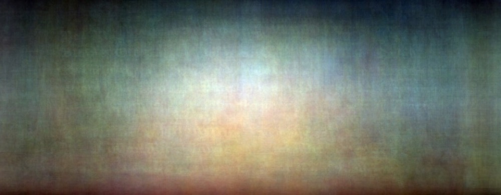
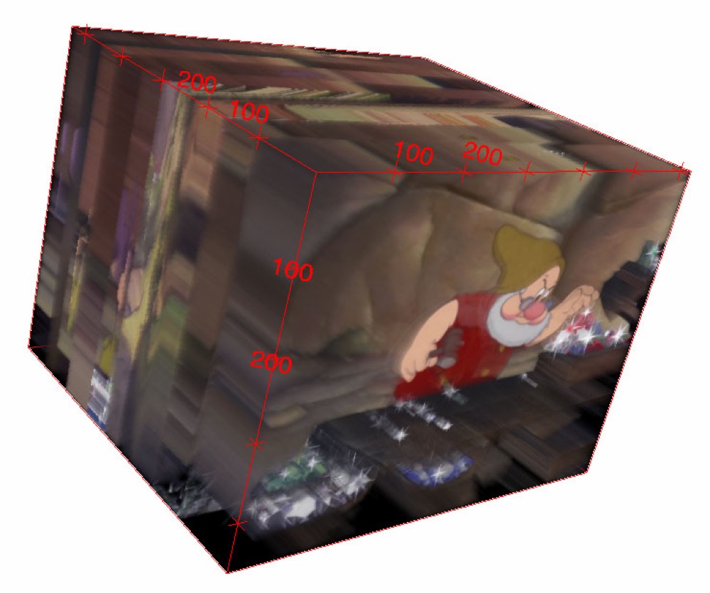
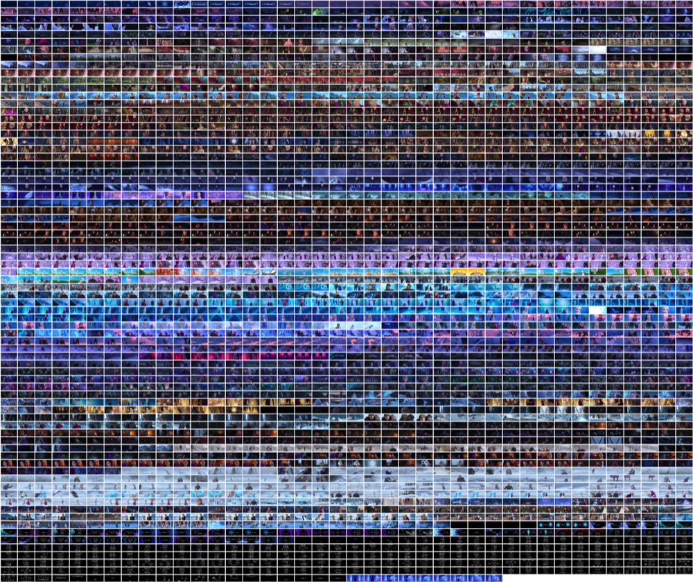
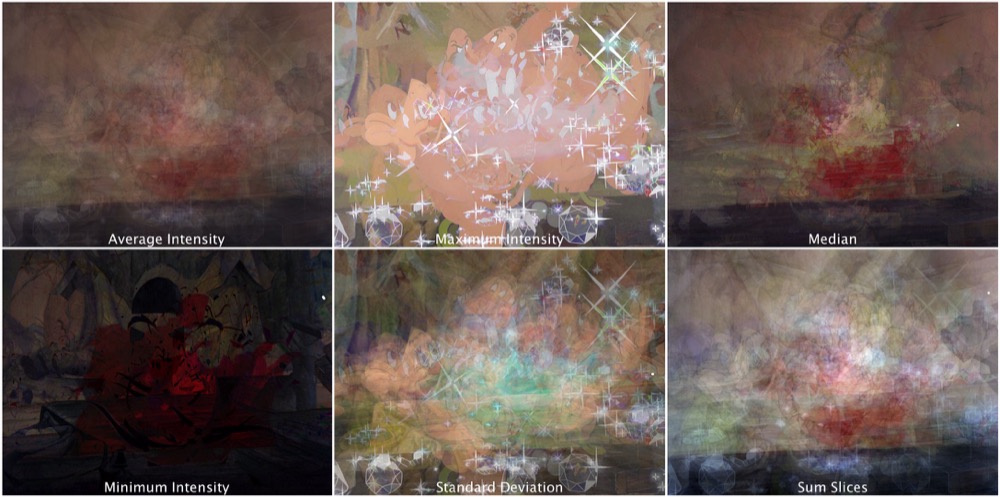
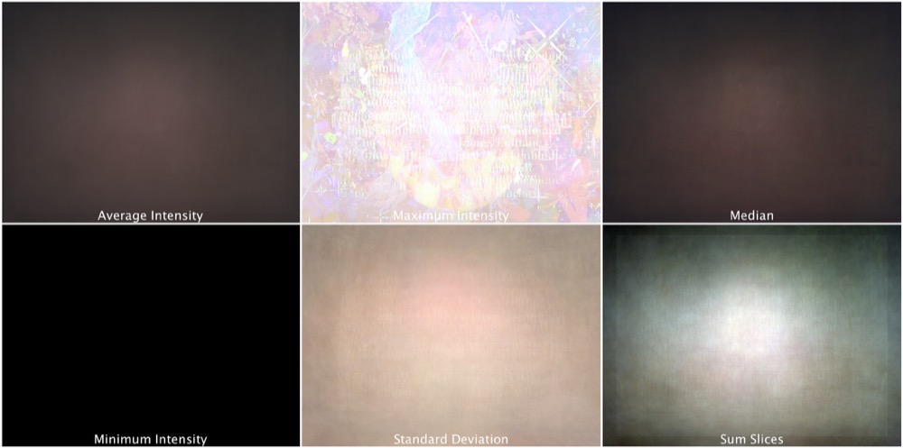
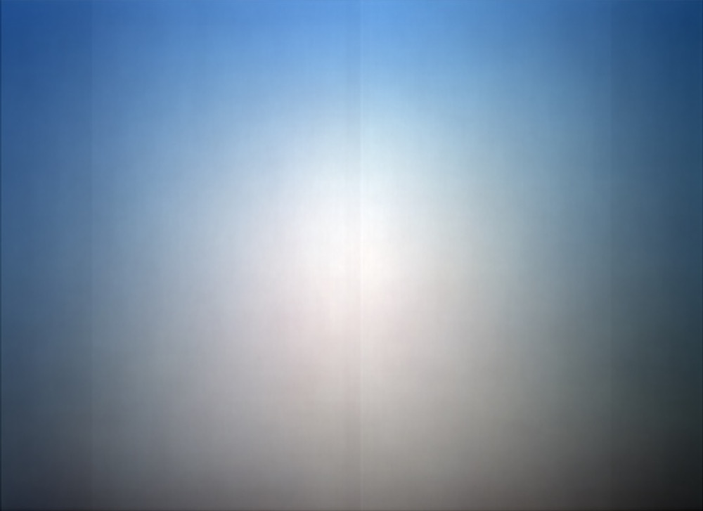
Here, I describe my method and theory for creating and interpreting “summed frame
z-projections” of films. In this process, I compress the visual field of a
film into a single image in order to compare a corpus of summed frames and create
new avenues of scholarly research. I call this technique “digital surrealism,”
since it creates images by means of an automatic process which reveals otherwise
unconscious information about film texts. While the resulting images on their own
are aesthetically pleasing, a comparative analysis of a corpus of summed images can
generate new analytical modes for digital humanists who work with image analysis,
raising new, comparative, second-order questions that come out of this
digitally-aided abstraction.
What is a Sum?
What does it mean to “sum” a film, to “add it up”? Cinema is excessive:
there is too much, either along the diachronic or synchronic axes, for viewers
to be able to process the moving image without recourse to a science like
mathematics or an art like theory. While most audiences and reviewers would not
think specifically of math while watching a narrative film (outside of box
office results), mathematical metaphors abound in discussions of film. For
instance, contemporary reviews often “sum up” movies, resulting in an image
of cinema as having unlike component parts that need to be added together in
order to make sense: the acting was good, the dialogue worse, the soundtrack
better. An informal search of the film critic Roger Ebert’s website (
http://www.rogerebert.com/) finds
seventy-four uses of the phrase “doesn’t add up” to describe the failures
of movies under review. Even the director Sergei Eisenstein, in famously
explaining how hieroglyphics inform his theory of montage, resorts to math: “the point is that [the
combination] of two hieroglyphs of the simplest series is to be regarded
not as their sum, but as their product”
[
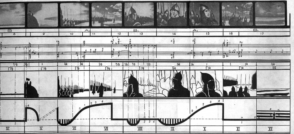
Eisenstein 1949, 29–30]. Rejecting simple addition for complex multiplication, for Eisenstein
cinema comes partly from the world of numbers: shots proportioned, framings
balanced (or not), and all aspects directly measurable, as in his well-known
audiovisual notation of a scene from his film
Alexander
Nevsky (1938).
While my summed images erase montage and the possibility of two specific images
colliding to produce a third dialectical meaning, they do democratize the film’s
images in a way that is impossible to imagine while watching, collapsing with a
grander equation the important and unimportant, the major and minor, the dark
and bright. In these images, all that is left is the trace of the filmmaker’s
intentions; even a master like Eisenstein is unable to direct the viewer’s
attention to anything other than the sum of everything photographed, intentional
or accidental. While collapsing the film text to a single frame might initially
strike some as overly reductive, this process magnifies a cinematic experience
that is otherwise entirely unnoticeable: the pure, cumulative effect of duration
on our eyes and brains without the distraction of narrative or image.
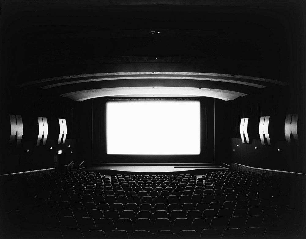
Photographer Hiroshi Sugimoto, known for Theaters,
a series of long-exposure photographs of movie theaters lit only by the light
reflected off the screen, is also interested in trying to capture the time of a
whole film in a single image. Conceptually my work is similar to his, but his
process results in black-and-white images with luminous, blank screens, whereas
mine reveal color, shading, and depth. Last, I point to artists Jason Salavon
and Jim Campbell, who independently worked with statistical processes and
averaging in the late 1990s and 2000s on collections of yearbook photos, Playboy centerfolds, Dutch paintings, novel pages, and
films. My use of digital surrealism as a media studies research strategy is thus
is conversation with an artistic tradition of visual analysis of groups of
images.
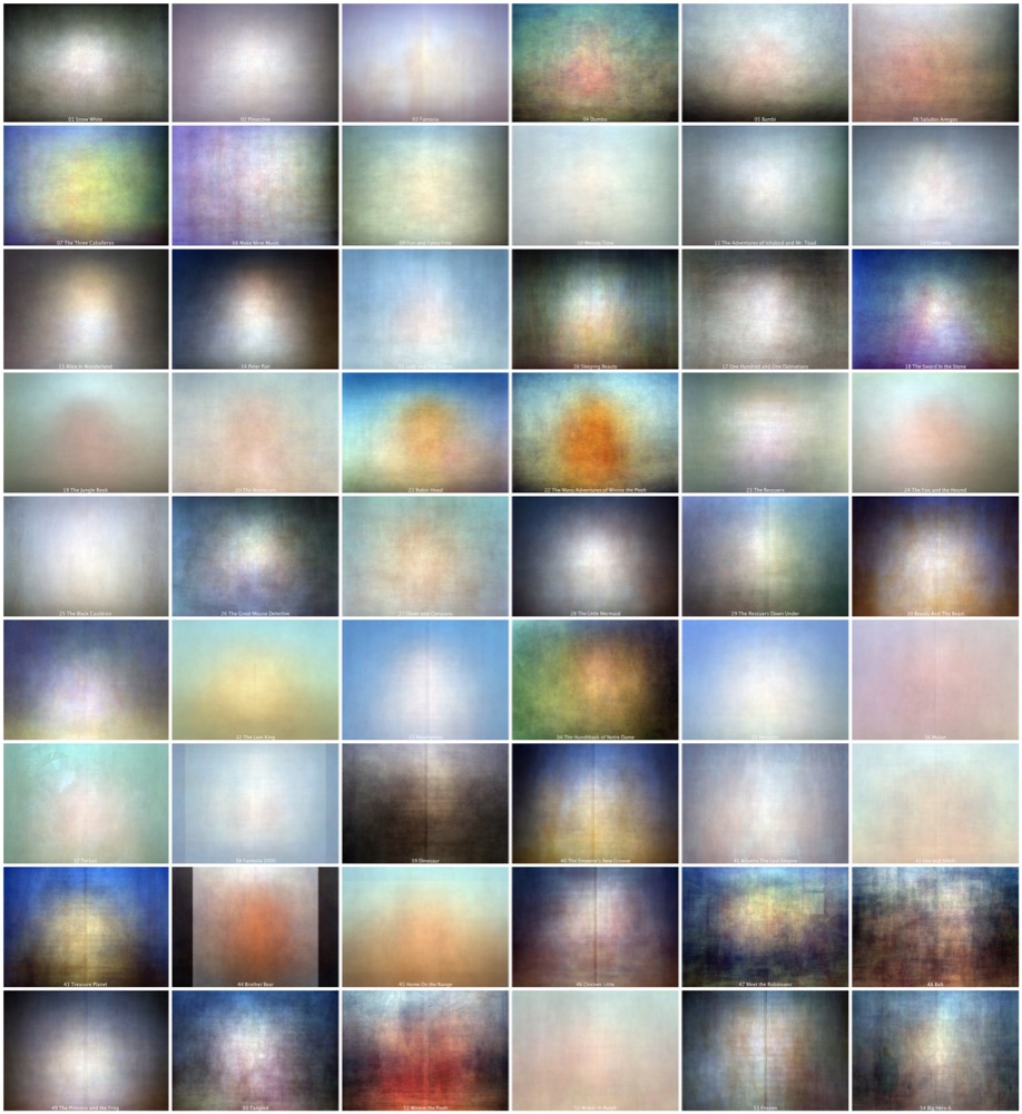
Here are the fifty-five sums of Walt Disney animation I created. For the sake of
visual comparison, I have scaled all of these images to the Academy aspect ratio
of 1.375:1, although obviously the films were initially released in a variety of
aspect ratios.
[7] They are presented in chronological order from
upper left to lower right in eleven rows of five columns, and for the sake of
reference I have included the film’s number along with the title here and in the
text below (thus, 21
Robin Hood can readily be
found at the beginning of row five). The images are labeled here, but for
individual high resolution images without captions see
https://www.flickr.com/photos/a2050/albums/72157661482387425.
At first glance, these images seem remarkably similar, despite being produced in
a wide range of styles, techniques, and years. As a form of scholarship or
criticism, then, we would begin simply by comparing and contrasting our
transformed films, articulating the final effect and questioning what
differences in production might have resulted in the subtle differences in the
final result. Thus, glancing at the corpus, one aspect readers will likely
notice immediately is the strong symmetry of these images. The majority of them
feature a lighter, horizontally central shape on a differently-hued background
with a varying degree of darker shaded vignetting in the corners. For example,
22 The Many Adventures of Winnie the Pooh has a
very recognizably Pooh-shaped blob smack in the center of a sky blue background
and darkened corners and bottom. Likewise, 14 Peter
Pan has a glowing off-white central shape that falls off into blue
hues on the left and brown ones on the right, with strong vignetting in the
corners and along the top of the image. Forty-three Treasure Island shows a very distinct yellow central shape
surrounded by deep blue with darker magenta in the lower corners. But of the
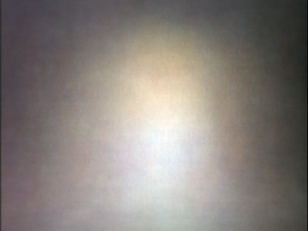
symmetrical center shapes, 13 Alice in Wonderland
is the most remarkable: rather than the triangular pale blobbiness of the
others, the central shape here indistinctly shows both Alice’s straw hair and
faint blue dress below.
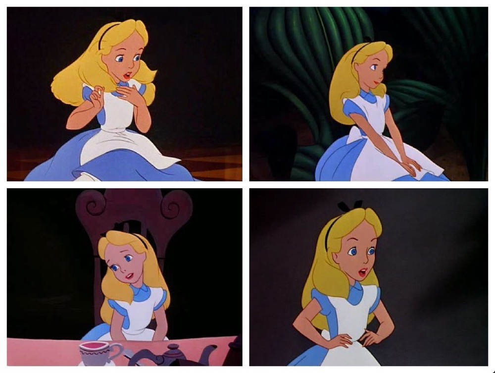
This becomes even more pronounced when increasing the contrast and saturation of
the image, but it is also evident in the numerous medium shots of Alice from the
film, which show how often she is isolated on a dark background.
Thus, contrasting this summed frame with the edge-to-edge evenness of something
like 36 Mulan, one initial possibility is to use
summed frames to gain information about framing choices or emphasis on specific
characters. For example, we could conclude that Alice in
Wonderland is the Disney film that most consistently frames the
titular character, and that it does so to an unusual degree compared to the
other films (and to almost all of the other non-Disney films I have analyzed).
This is not something that viewers could have intuited across the entire corpus,
while this digital surreal method visually quantifies that information for us.
For example, while not as legible as Alice, 03 Fantasia
also has a more clearly-defined central shape than the other summed
frames. But here, the sharper definition of the shape is obviously due to the
repeated shots of the Master of Ceremonies Deems Taylor and the conductor
Leopold Stokowski, either of Taylor directly addressing the audience or
Stokowski with his back turned preparing to lead the orchestra.
This is an unusual exception to the norm for these summed images, whose shapes
are oval at best but often simply indiscernible. Fascinatingly, one other film
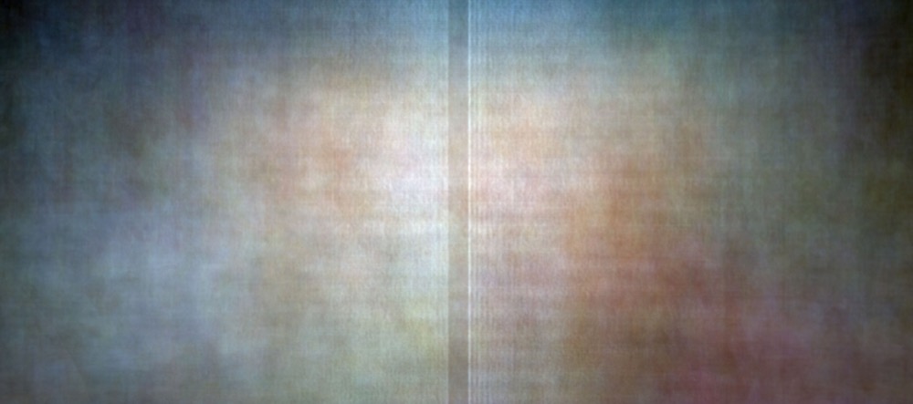
also serves as an exception to the blobby central trend: 53 Frozen has two faint central shapes rather than only one.
While clearly one of Disney’s “Princess Pantheon” films featuring a central
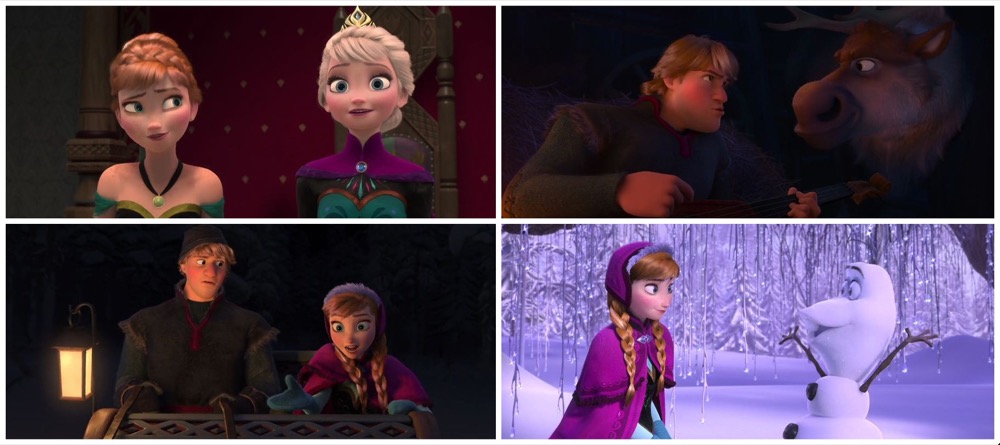
female protagonist, Frozen visually breaks with the
others by using a preponderance of two-shots motivated by the fact that it
revolves around the relationship between two orphaned sisters, a queen and a
princess. While other Disney films have used wider aspect ratios, Frozen’s rather wide 2.24:1 aspect ratio easily allows
for shots where both protagonists are framed in closeup. This is also true of
two-shots among other groupings of characters.
While in some respects this is an effect of Disney’s ability to know that today
they would be able to successfully release a home video in widescreen format and
not have to crop it as with widescreen films in the earlier days of hated
letterboxing and square televisions, it is also evidence of Frozen’s strategy to visualize interactions between characters
without relying on over-the-shoulder shots or needing to centrally frame
speaking characters. In this way, the summed z-projection technique can quickly
allow for larger intuitive comparisons of how films position main characters on
screen, whether emphasizing single characters, duos, or groups. In the case of
Frozen, we see clear evidence of an unusual
(for Disney) choice to frame two characters in closeup for extended periods of
time.
The other noticeable similarity among many of these summed frames is vignetting,
a darkening of the periphery of an image caused by insufficient
light.
[8] Vignetting is most pronounced in 14
Peter Pan, 28
The Little
Mermaid, 29
Beauty and the Beast, and
49
The Princess and the Frog. Compare those four
images to 10
Melody Time, 33
Pocahontas, 35
Hercules, or 36
Mulan, which all have a central shape but a background
that runs seamlessly to the edges without significant darkening. I attribute
this difference both to the conventional wisdom of the cinematic dominant, that
moviegoers’ attention can be drawn to the most important subject by making it
the best lit, and that the four unvignetted films take place primarily outdoors,
while those with vignettes occur inside or in darker, secluded locations.
Pocahontas and
Hercules
are nearly identical in this respect, and their sky-blue backgrounds are
obviously evident in the summed frame, compared to the relatively shadowed and
clouded undersea kingdom of
The Little Mermaid or
the forest and castle interiors of
Beauty and the
Beast. Vignetting is traditionally considered a problem in
photography, with the ideal photograph showing a consistent range of tones all
the way to the edge. Obviously, animated films need not suffer from this optical
problem, and so many of the images that display strong vignetting do so
intentionally in an attempt to imitate a vignetted “historical” look or to
illustrate how a scene is artificially lit and to direct the spectator’s
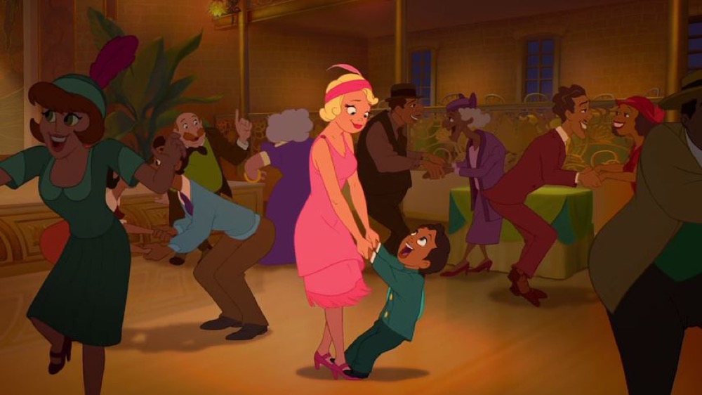
attention to the privileged center of the frame. An example from
The Princess and the Frog shows this common strategy,
where the central characters in this shot are brightly lit while the background
dancers and setting are increasingly (and unrealistically) darker as we move to
the edges.
While vignetting is also apparent in summed frames of live-action films,
particularly those not shot primarily on evenly-lit studio sets, animated films
that feature vignetting even more consciously perform this photographic flaw for
aesthetic reasons. Comparing the degree and type of vignetting in summed frames
can offer insight into both the lighting style of live-action films and the
imitation of real-world lighting in animated films. While there might be set
photographs or lighting notes for live-action films, clues about overall
lighting strategies in cel-animated films must be deduced from methods like
digital image analysis.
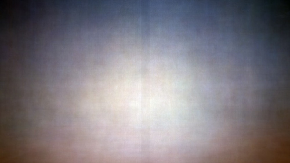
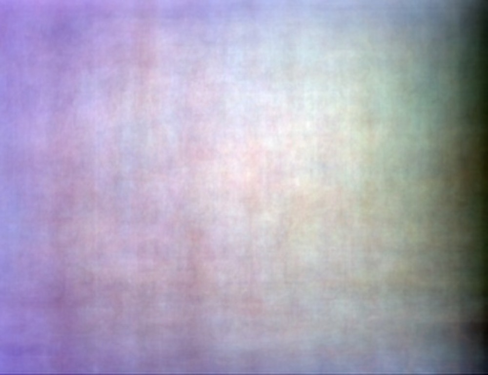
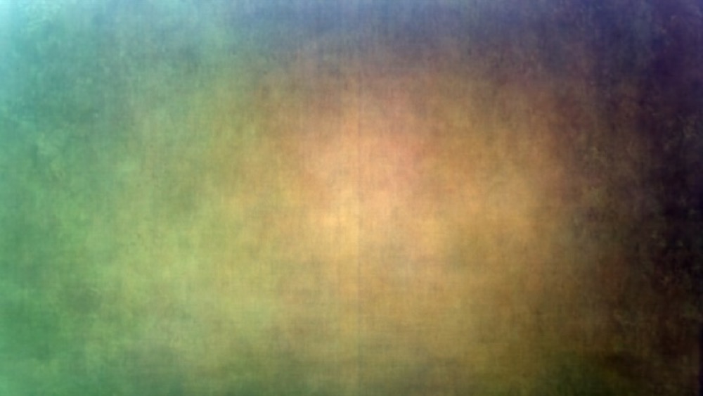
Looking at the vignetted symmetry of so many of these images, 08 Make Mine Music stands out as an anomaly: is the dark
gradient on the right side of the frame an example of something unusual about
the film’s visual strategy, or is it just an error in transferring the film
print to a home video release?
This image does not display vignetting, nor does it display a prominent central
shape or even a symmetrical background: the image is unbalanced with a
predominance of magenta hues on the left side and greenish ones on the right.
Looking at the constituent frames, it appears that there is indeed a slight
visible darkening error covering the right side of the digital copy, but that
there are also frames like Figure 20 that are noticeably intentionally darker on
the right.
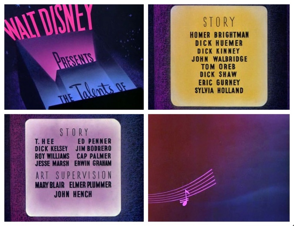
While much of the film features its characters in symmetrically centered
compositions, the animation emphasizes vibrant gradient backgrounds, established
in the title credits, that places characters in long shot on flat, brightly
colored, and changing backgrounds. Thus, compared to the rest of the corpus, the
Make Mine Music summed frame stands out due to
its gradient color shift. Readers familiar with the film will also point to the
fact that it is an anthology film composed of ten segments visualizing the
interplay between animation and classical and popular music (Debussy, Prokofiev,
Donizetti, Benny Goodman, The Andrews Sisters). Thus, the greater variety of
animation styles, characters, and settings clearly shows up in the rich mottled
image. Using the summed z-projection technique can easily reveal outlier films,
those that depart for different reasons from maintaining a dominant,
conventional style.
Scanning the other summed frames for similarly mottled images, readers might
mistakenly assume that 34 The Hunchback of Notre
Dame is also an anthology film since its summed z-projection
likewise has an unusually uneven composition and unbalanced colors.
Much of the film takes place at night and there are numerous frames where the
right side of the image is indeed completely black, so we can rule out a film
transfer error. Many sequences take place in candlelight and there is a
climactic fiery battle (as well as the orange and brown credits), so the warm
red tones make sense, but what of the green dominating the left?
I think there is a rather intuitive explanation that our digital surrealist
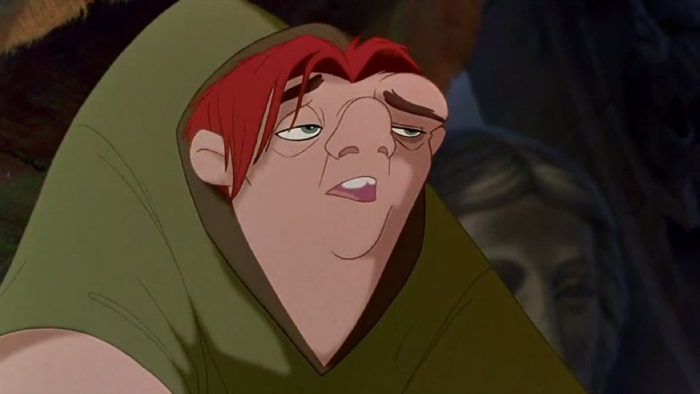
method confirms: throughout the film, Quasimodo wears a drab green tunic, and
since he himself is asymmetrical, with a hump on his right side, his
characteristic features are best portrayed when he occupies the left of the
frame facing frame right (see Figure 25).
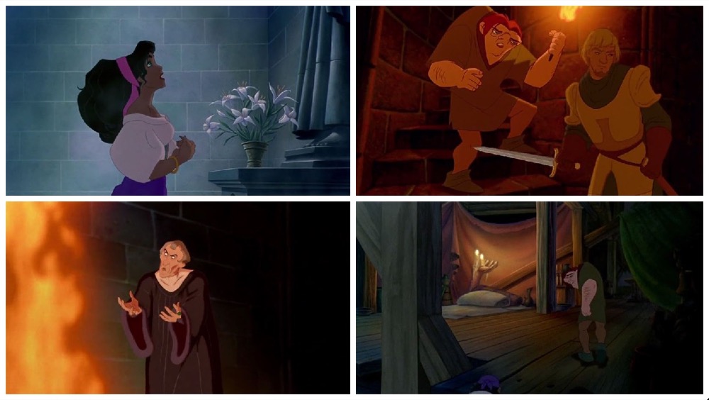
Closer investigation of the film’s slices shows asymmetry is a visual theme
throughout — for instance, Esmerelda wears only one hoop earring in her left ear
with a hair scarf dangling on the right and a thicket of bracelets on her left
arm offset by a lone bracelet on her right wrist — and the summed image supports
this strikingly by showing how often Quasimodo’s back and hump occupies the left
third of the frame, even as his face is centered. While we would expect
anthology films unintentionally to appear unbalanced given the varying range of
source material, we can see clearly in the summed image from The Hunchback of Notre Dame how carefully the
animators worked to create a dominant visual asymmetry for framing Quasimodo and
how this is a wholly unique strategy in the Disney corpus. Since Disney’s
typical visual strategy is almost entirely conservative, framing characters
centrally or following the rule of thirds, we can see just how unique The Hunchback of Notre Dame is visually, crowding its
protagonist’s unruly body to the side. In this way, inspecting the summed frames
and accounting for unexpected details allows researchers to pursue new questions
from empirical evidence or visually confirm an intuitive hunch.
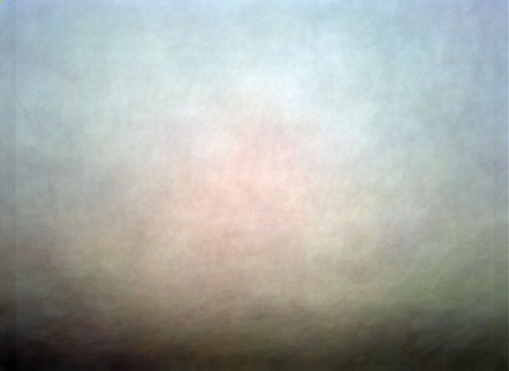
Another common shape is apparent in many but not all of these images: the horizon
or ground line. It is most visible, for example, in 05 Bambi, 22 The Many Adventures of Winnie the
Pooh, 43 Treasure Planet, 45Home on the Range, and 51 Winnie
the Pooh, although readers will see faint examples in other films.
Of these, Bambi’s darkened lower portion is the
most pronounced, especially contrasted with the brightness of the center of the
image and the lack of vignetting in the two upper corners.
The dark lower portion in this film is not due to vignetting or lighting effects,
but mainly because the film has more long shots of characters that include the
forest floor than it has medium or closeup shots of characters that do not show
the ground. This makes some sense for a film like Bambi, focused on placing a young character in his woodland
environment and detailing his interactions with smaller, ground-dwelling forest
creatures. And yet, the forest floor in Bambi is
not particularly black, and the film often captures a downward-looking
perspective so that the forest floor occupies much of the frame, not just the
bottom ribbon.
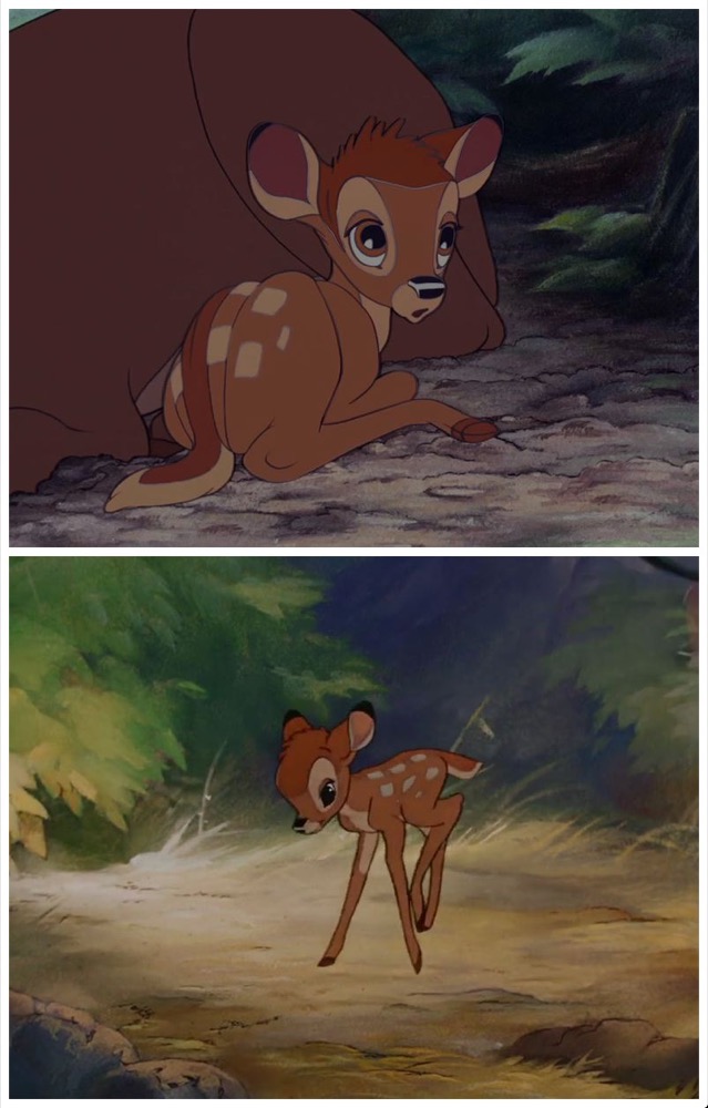
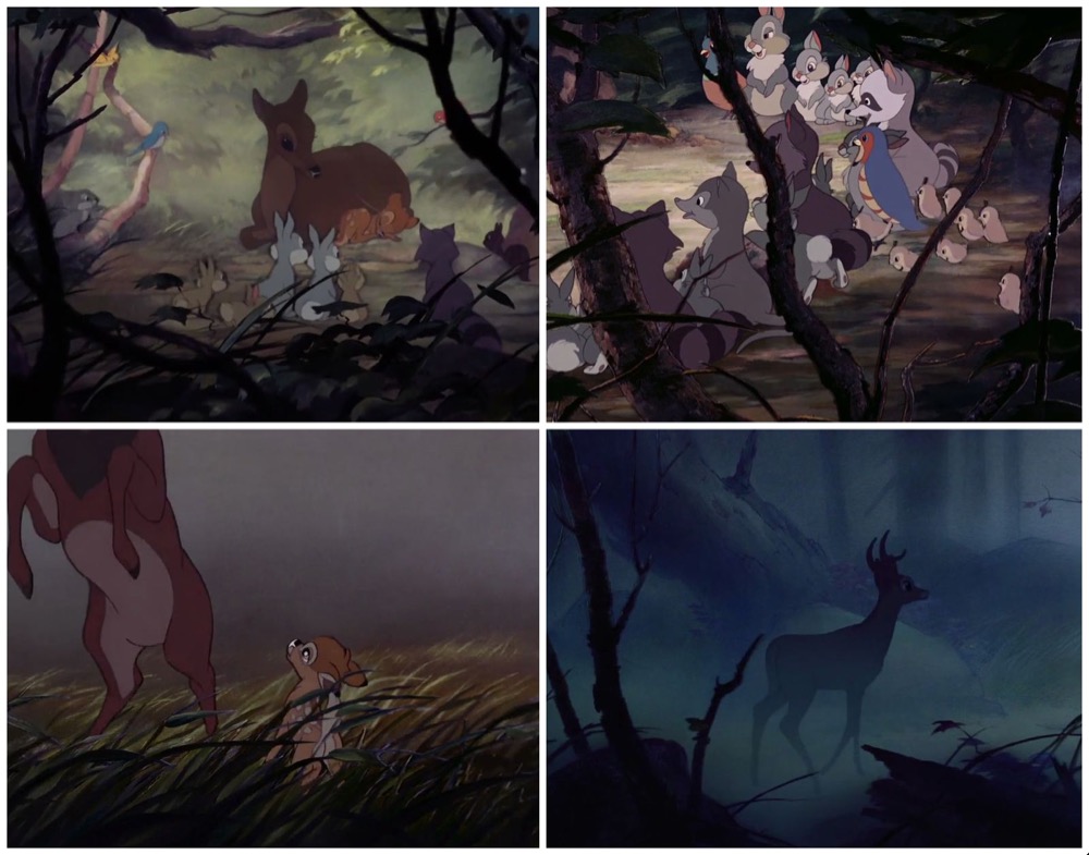
Closer investigation better explains the dark bottom portion: the animators often
occluded the foreground of the frame with brush, tree limbs, or other natural
objects (see Figure 28).
This is not only an excellent strategy to the problem of creating a perceived
sense of depth in flat animation (so that including specific foreground shapes
sets off the central characters from other visual planes), but it also generates
a voyeuristic effect to make it seem as if viewers are peering through
underbrush to watch Bambi’s life unfold. With this example, we can readily see
that the spectator’s psychological distance from the non-human protagonist is
encoded in the summed image, again offering a way to produce empirical visual
evidence to support an intuitive argument.
A similar strategy is at work in another film focusing on non-human forest
characters, 22 The Many Adventures of Winnie the
Pooh.
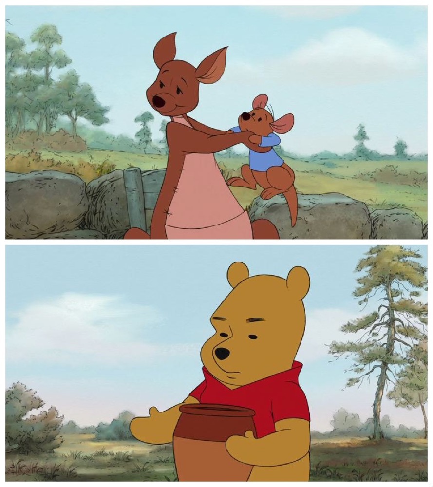
The animation here is much flatter, but as with 05 Bambi, the animators create many downward-facing shots and include
darker objects in the foreground of the frame to provide spatial depth cues.
Disney’s second Pooh movie, 51 Winnie the Pooh,
offers an interesting comparison since both films are about the same characters
and animated in a very similar way.
Here, however, there is a noticeable thick, darker ground line about a third from
the bottom of the image, obscured by the central blob shape. It’s difficult to
see why Winnie the Pooh’s summed image looks so
different from The Many Adventures of Winnie the
Pooh, but I speculate that Winnie the
Pooh has more shots that are level, revealing more of the sky and
making the forest less wooded, and that its foreground objects are not darkened
so that the overall image is evenly bright (see Figure 32.
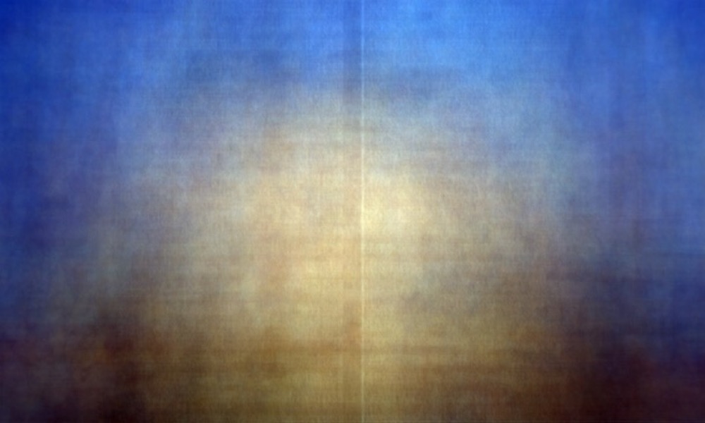
The retro-future 43 Treasure Planet has a much more
dazzling, dense, and vibrant animation style that appears in the summed
image.
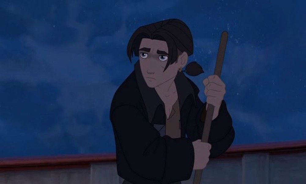
But here I think we see less of a horizon line and more evidence of the fact that
much of the film takes place on a horizonless spectacular flying ship and that
our novice hero is often shown against the brown wood of the gunwale with blue
sky in upper two-thirds (see Figure 34).
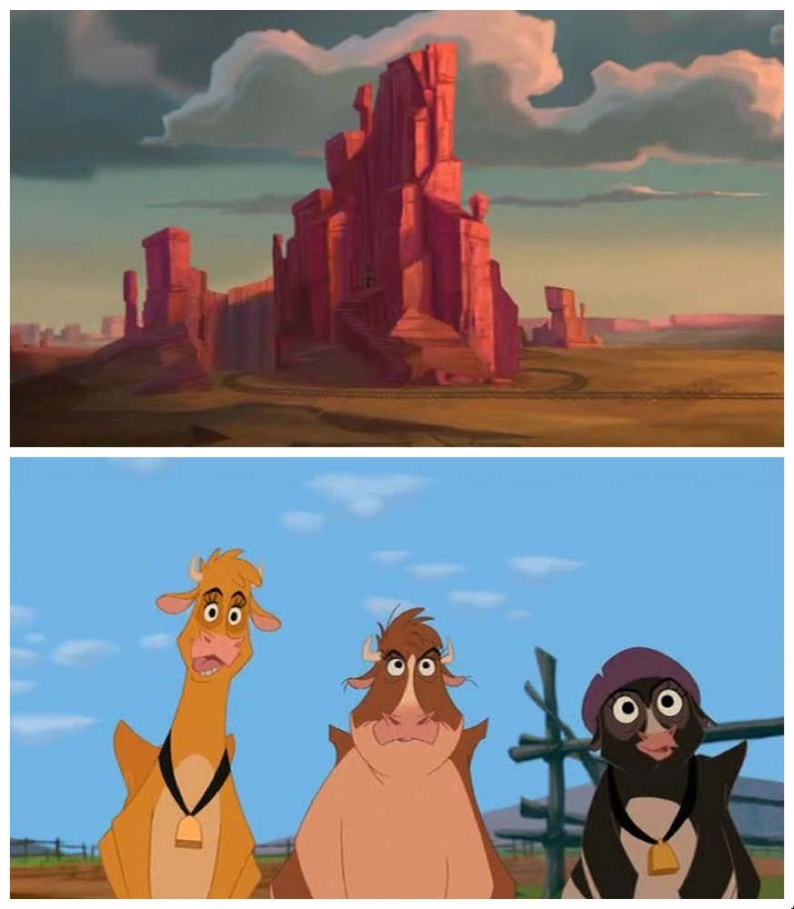
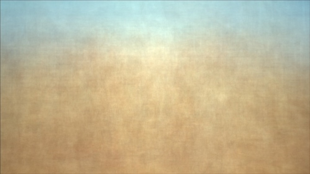
The defining blue sky is also apparent in 45 Home on the
Range, which has a much different kind of horizon line, defined less
by the foreground and more by the skyline. Home on the
Range is a western, evoking the Monument Valley locations of John
Ford’s films, and we can clearly see how often the three cow heroines are drawn
in bright exterior shots.
Home on the Range most resembles 32
The Lion King in that the dominant presence of the
blue sky clearly defines the film’s majestic outdoor location. Both of these
films’ images are remarkably similar to a summed image that I produced for an
initial exploration of this project using a corpus of fifty western films: John
Ford’s
The Searchers (1956) [
Ferguson 2015b].
Many of the Disney films feature blue hues, but only a handful like Home on the Range and The Lion
King contrast the blue sky with a different-hued lower two-thirds
(for example, consider how 33 Pocahontas and 35
Hercules are almost all blue). In doing so, we
can see how much less defined the central shape is in these, instead showing how
the characters in films set in grand exterior locations disappear into their
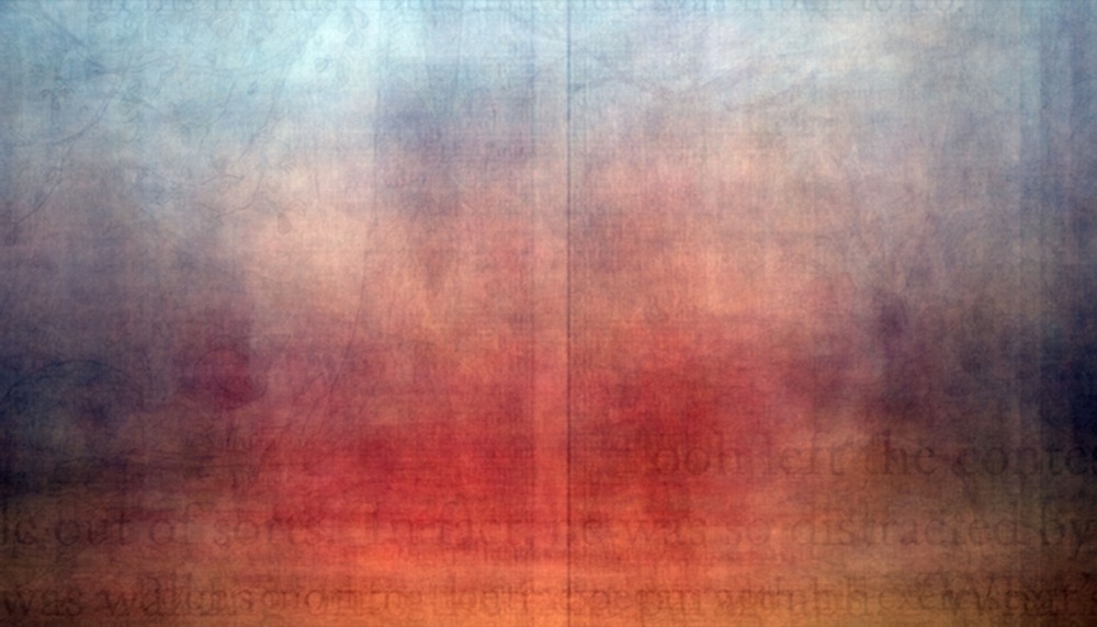
surroundings or are balanced with numerous extreme long shots.
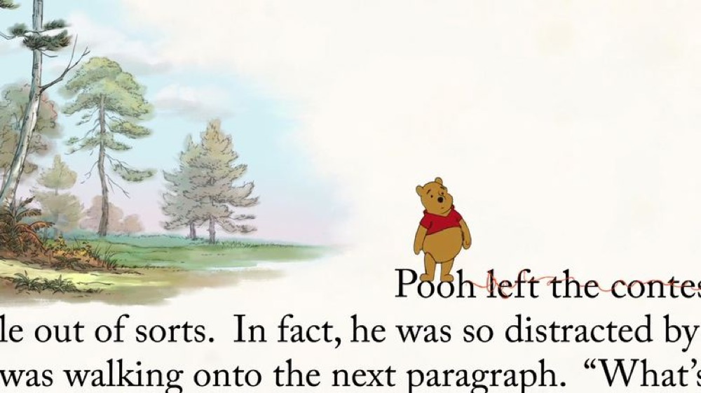
Fifty-one Winnie the Pooh, mentioned above (Figure
31), also brings us to the final noticeable shape to discuss in these summed
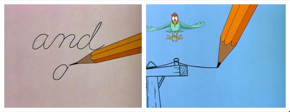
frames: textual elements that remain on the screen and “burn” their way
into the summed image. Winnie the Pooh illustrates
the first version of this: in the lower right quadrant we can make out the
letters “ooh left the conte,” which
indeed turn up in eleven of the slices used (0.59% of the total frames).
While much more indeterminate, we can also barely make out nondescript characters
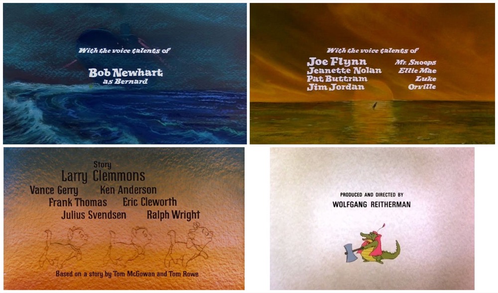
in the center of 23 The Rescuers and 21 Robin Hood. These two films do not have as much
meta-textual play with writing as Winnie the Pooh,
but what they do have in common is that they illustrate the second way that text
appears in the summed images, namely, as title or closing credits. In the case
of The Rescuers and Robin
Hood, the fashion at the time was to list production credits at the
beginning of the film rather than the end, and so the credits remain on the
screen long enough to be amplified in the summed image; for instance, in the
case of The Rescuers, the phrase “With the voice talents of” remains for 16
slices (0.72% of summed frames) while the cast list changes. Interestingly, a
film with the same credit sequence strategy, 20 The
Aristocats, does not visibly display text in the summed image,
perhaps because the text is in black but on a darker background and thus less
distinct (see Figure 39).
In 51 Winnie the Pooh we also see a second way that
production credits affect the summed image, where a very long list of names
scrolls continually over either a static or moving background. Winnie the Pooh has well over 400 names listed in its
closing credits in addition to song credits and other information; textual
credits appear on 246 of the 1859 frames I generated, or a little more than 13%
of the film. This shows up in the summed image as two varying width columns
starkly separated by a thin stripe.
This effect is noticeable as early as 28
The Little
Mermaid, and has become more pronounced as credits become longer (I
calculate the closing credits occupy 5.26% of
The Little
Mermaid versus 9.63% of Disney’s recent film 54
Big Hero 6).
[9]
Like many, 51 Winnie the Pooh’s credits take place
over a moving and constantly varying background, but readers will no doubt be
able to identify the fewer films with extensive credits that scroll over a
relatively unchanging background. The most obvious of these are 25 The Black Cauldron, 37 Tarzan, and 54 Big Hero 6. In each of
these, a particularly prominent shape is evident: The Black
Cauldron’s manuscript borders, Tarzan’s
tropical rainforest leaves, or Big Hero 6’s
floating dirigibles.
Twenty-six The Great Mouse Detective has a slightly
fainter but still visible image, since it adopts the common strategy of
beginning the closing credits over a scenic establishing shot before switching
to a black background to display secondary credits.
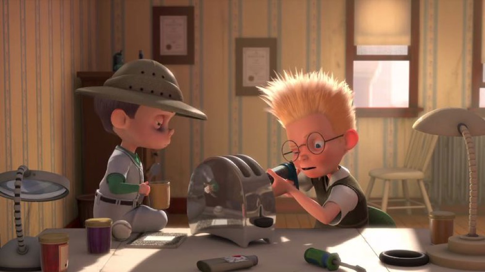
Careful readers might also wonder about 47 Meet the
Robinsons, which appears to have a window-shaped square in the upper
right quadrant; however, we discover the credits are a scroll over a solid black
background.
In this unusual case, investigation reveals that the window shape is from a scene
early in the film, with a shot of our inventor hero inventing.
In this scene, there is one cutaway, and then we return to the same camera setup
for a total of 39 slices or 1.4% of the film’s length. Further experimentation
is required, but this figure gives some suggestion that there is a threshold for
particular objects to appear in static shots and that the placement and
brightness of those objects is important (for instance, other unmoving aspects
of the shot such as the wallpaper or framed diplomas are not as prominent). Is
this then the longest camera setup in the Disney corpus? Or just the
brightest?
While aesthetically I find the summed images more attractive without the closing
credits, they are a striking reminder of how much longer the narrative film’s
paratext has become due to the greater number of credited contributors. I also
find something compelling about the strong central vertical line in images like
46 Chicken Little and 53 Frozen, which call to mind Abstract Expressionist painter Barnett
Newman’s “zip” paintings.
In a 1970 interview with filmmaker Emile de Antonio, Newman describes his zips as
a way to unite the parts of his painting and, in a phrase relevant to cinema,
speculates on his thought process in creating them: “I suppose I thought of them as
streaks of light”
[
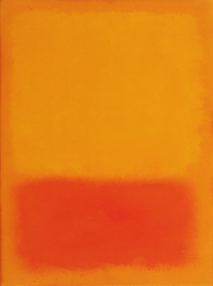
O’Neill and Newman 1992, 306]. Mark Rothko, another well-known Abstract Expressionist painter whose
work these summed images call to mind, also describes his paintings as having “their own inner light and if
there is too much light [in the museum], the color in the picture is
washed out and a distortion of their look occurs”
[
Breslin 1993, 412].
Art critic Clement Greenberg championed Rothko’s work as part of a “color field” tradition, which used
uninflected color to collapse traditional differences between figure and ground.
The summed images I produced achieve in related ways this effect, but are built
out of some of the most figural images available. I think the summed
z-projections evoke the tradition of Rothko and Newman’s work with color, but on
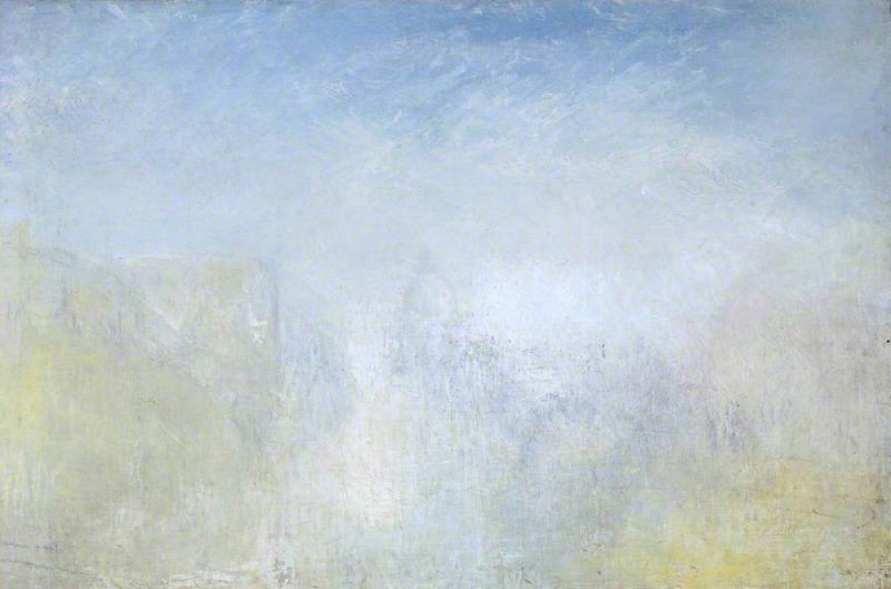
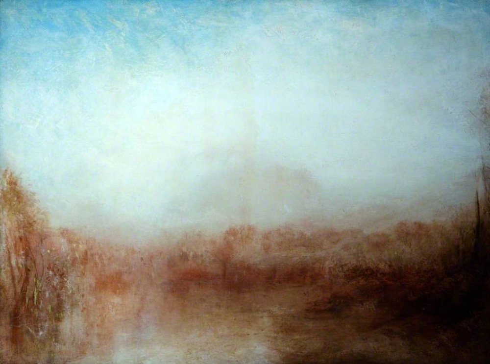
another version of a similar project, Kevin Oleary pointed out to me how similar
these summed images are to an earlier tradition — the paintings of English
Romanticist J. M. W. Turner, such as his later work Venice
with the Salute (c.1840-5) or Landscape
(c.1840–c.1845).
So far I have focused on the shapes of these images, but with Turner and the
Color Field painters in mind I want to turn to a brief analysis of the color of
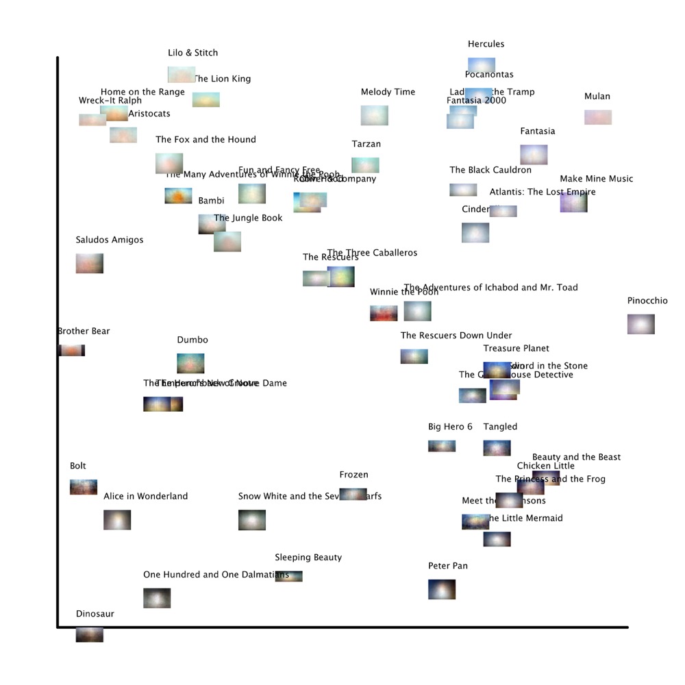
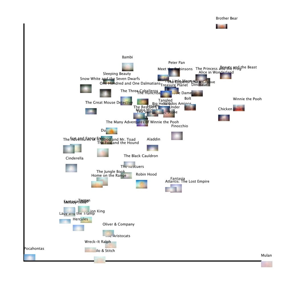
these images. Below are two simple graphs of all the summed frames created using
ImageJ’s ImagePlot macro, plotted first by median hue on the x-axis and median
brightness on the y-axis, and then by standard deviation hue on the x-axis with
standard deviation brightness on the y-axis. This allows us to more analytically
compare the summed frames. We thus expect to see a horizontal distribution of
images in the rainbow spectrum of hues (i.e., from red on the left through green
in the middle to violet on the right), with brighter images moving upwards.
While sourcing and creating digital copies of these texts from DVDs, I
discovered that older, softer prints often resulted in lighter summed
z-projections. I also question how accurately color was reproduced in
transferring older films to home video format, particularly whether or not the
color was balanced properly and whether the proper color saturation was achieved
(and to that matter, who would be the authority on the “proper” color of an
eighty-year-old print and what it means to speak of a film’s projected
brightness, which comes down to the age and brand of the light bulbs in the
projectors which originally screened these films). So we should be careful not
to read too much into our results when comparing films to each other, although
we can immediately see patterns and outliers of interest.
Looking at the first graph of median values allows us to spot some clusters of
similarly hued films: the airy blue in the upper right corner that I have
discussed, but also the surprising similarity in the upper left between comic
western 45 Home on the Range and the video game
world of 52 Wreck-It Ralph, whose long outdoors
sequences in desert-like Sugar Rush Kingdom influenced the hue. The majority of
the films are clearly within the blue register, in a tall stack ascending from
14 Peter Pan to 35 Hercules, but there is also quite a bit of variance in hue that
covers the spectrum almost completely. 02 Pinocchio, whose image looks rather plain and flat, is
uniquely the most violet-hued, even more so than the brighter 36 Mulan which has clearer areas of purple. Many pairs of
films are practically on top of each other, such as 40 The
Emperor’s New Groove and 34 The Hunchback of
Notre Dame, 21 Robin Hood and 27 Oliver & Company, and 18 The
Sword in the Stone and 31 Aladdin;
remarkably, each of these pairings were separated by at least five other
releases, suggesting that while the summed frames can be surprisingly similar
this is not necessarily due to the same animators or production methods (for
instance, The Sword in the Stone and Aladdin are nearly identical and yet were made nearly
thirty years apart). This visual evidence of hue and brightness would suggest
further archival research to examine how consciously Disney animators wanted to
distinguish their use of color from other films.
Plotting by standard deviation, rather than median values, allows us to quickly
see some outliers: 33 Pocahontas, 36 Mulan, and 44 Brother
Bear. Brother Bear shifts aspect ratios
from 1.75:1 to 2.35:1, so the first 28.7% of the film has black side pillarboxes
which make it deviate predictably in terms of both hue and brightness. Excluding
Brother Bear, the next film with the most
deviation in brightness is 05 Bambi, which confirms
what I suggested earlier about the strangeness of the dark bottom line versus
the lightness of the top of the frame. Curiously, Pocahontas and Mulan, two of Disney’s
three films about ethnic women, are both nearly equal in terms of brightness but
completely opposite in terms of hue; that is, compared to the other films,
Mulan displays much more deviation in the hues
that make up its summed image, but very little deviation in its brightness (the
third, 42 Lilo and Stitch, is differently hued but
is also one of the least bright films). Mulan bears
even more deviation than 51 Winnie the Pooh; this
is difficult for one to tell at first given Mulan’s
even brightness compared to Winnie the Pooh’s
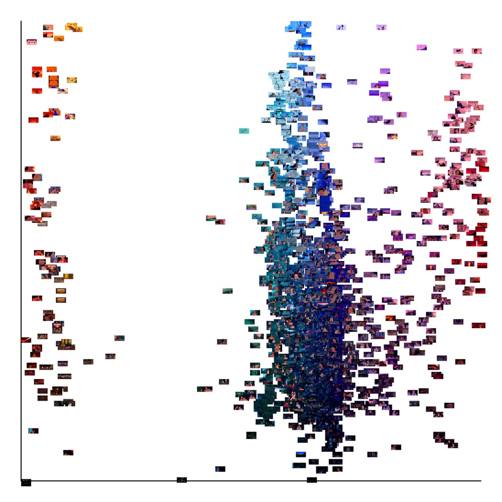
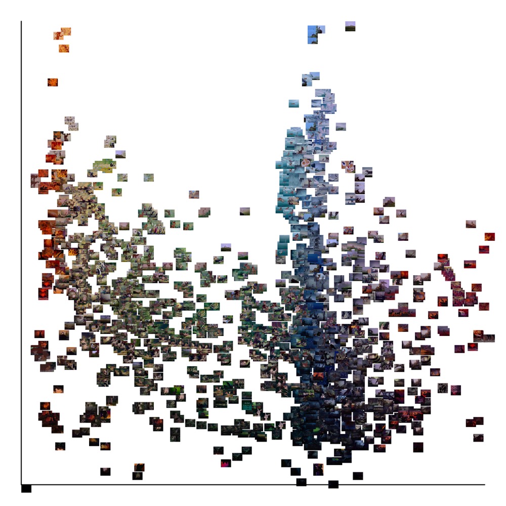
varied brightness. But just as we did with the summed z-projections, we can also
create graphs of median hue and brightness for each individual film using our
folder of slices. Here are three, plotting as I did before median hue on the
x-axis and median brightness on the y-axis, illustrating how the brightness and
hue of Mulan, Pocahontas, and Bambi’s individual
slices do and do not contribute to the overall summed effect.
From these visual thumbprints or “style spaces,”
[10] we can quickly confirm our earlier results and see that
Bambi’s frames are much more frequently
distributed at the darker bottom of the graph than the other films, and that
Pocahontas’s are very much concentrated in one
band while
Mulan has a wider range. While I will
not discuss them in depth here, examining such plots for each individual film
allows researchers to compare signatures and see how internally consistent the
films are:
Mulan’s summed image makes it look
almost entirely violet, but we see that a good percentage of the film is
actually red–orange hued. This can be a crucial tool for digital humanities
approaches to film and media studies, particularly in terms of quantifying the
consistency of a film’s visual style or the historical shifts in a production
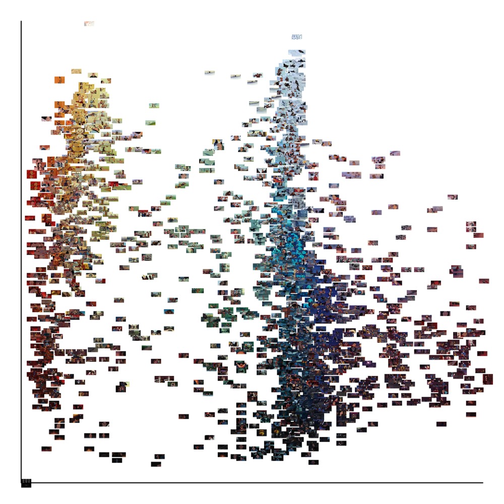
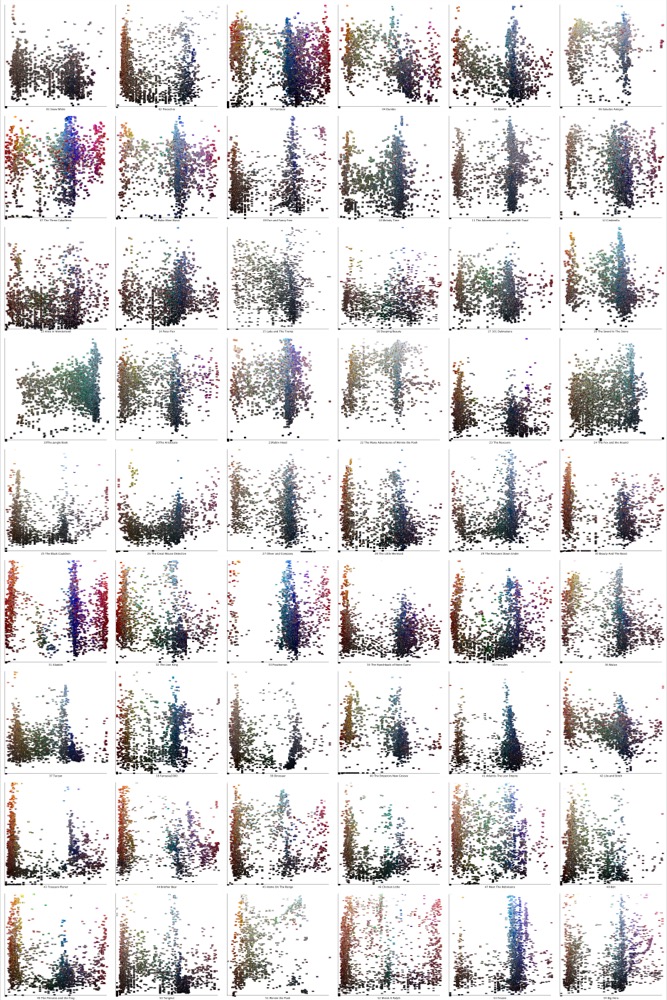
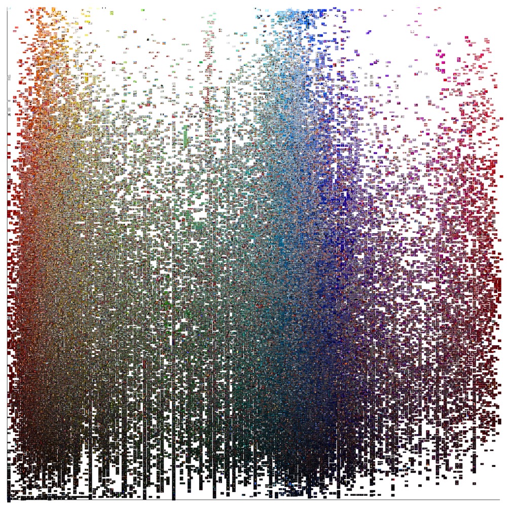
studio’s filmic look. Here are two such visualizations of the style signatures
of all fifty-five films, first a montage plotting the median hue and brightness
for each film, followed by a combined image plotting the median hue and
brightness for every slice used in this project. The first montage shows how
individual films’ varying hue and brightness create a unique signature; the
second shows the combined hue and brightness of the entire Disney corpus,
offering an unprecedented macro-view of all of their films.
Contexts
I conclude by putting these summed frames into a larger context. As futuristic or
speculative as this work might seem, it is in fact very much in line with
mid-twentieth-century formalist theories of literature that sought to treat the
text not as the inspired culmination of an author’s intellectual genius, but as
an objective structure open to grounded analysis. In addition to contemporary
digital humanists and experimental media artists, I am also inspired by what
readers will no doubt recognize as a rather old-fashioned line of thought:
“the structuralist activity”
described by Roland Barthes in 1963, from which even he had moved on by 1970’s
S/Z. Barthes begins his essay by rejecting
categorizations of “structuralism” as a school, movement, or even a set of
vocabulary, and instead proposes that we understand structuralism more simply as
an activity, a labor experienced by both artists and critics. In this
formulation, the structuralist critical activity has as its goal to
reconstruct an “object” in such a way as to manifest thereby the rules of
functioning (the “functions”) of this object. Structure is therefore
actually a
simulacrum of the object, but a directed,
interested simulacrum, since the imitated object makes
something appear which remained invisible or, if one prefers, unintelligible in
the natural object [
Barthes 1972, 214–215].
To show how an object works is to reconstruct that object, to make a copy of that
object that reveals something hidden or illegible in the original. Thus for
Barthes, the structuralist activity of imitation requires an emphasis on
technique over mere analysis: this activity is real, tangible labor that
reconceives art and analysis as a paired activity, rather than seeing criticism
as merely the lofty, disinterested contemplation of a work. Likewise, my project
does not intend to offer a definitive solution to a digitally-aided analysis of
cinema, but rather to provoke inquiry into how meaning is possible and how
different meanings arise from different means. These summed frame z-projections
quite literally “make something appear which
remained . . . unintelligible” before, and the researcher’s task is
to discover in what way these simulations of films are “interested”
simulacra.
Barthes’s proto-digital humanist approach foregrounds specific meaning-making
techniques of dissection and articulation over the scrutiny of works thought to
be previously endowed with meaning, and thus it offers a direction for critical
analysis particularly appropriate for the digital humanities. While they may
prefer to avoid something as unfashionable as structuralism or semiotics,
digital humanists would do well to reconsider the framework introduced in
Barthes’s essay. Indeed, Franco Moretti’s lauded work on “distant reading” is in many ways a rewrite
and amplification of Barthes; for example, in
Graphs, Maps,
Trees, Moretti proposes that we adopt a method whereby we “
reduce the text to a
few elements, and
abstract them from the narrative flow,
and construct a new,
artificial object”
[
Moretti 2005, 53] (italicized in original). These steps of reduction, abstraction, and
artificial construction are identical to Barthes’s dissection, articulation, and
fabrication of meaning. Stephen Ramsay’s “screwmeneutics” also invokes Barthes,
particularly the well-known distinction between the readerly and the writerly
text, which Ramsay connects to two modes of using a library: when a person
searches a library for bits of information, she invites texts to be readerly in
order to be passively consumed, whereas when a person browses a library, “just screwing around,” she
hopes to encounter writerly texts that might offer “an invitation to community,
relationship, and play”
[
Ramsay 2014, 119]. Last, Lisa Samuels and Jerome McGann have made a well-known argument for
“deformance” which argues that “
all interpretation is a function of the poem’s
systemic intelligibility” and that we should set aside the
idea that humanities work applies an interpretation
to a text and
instead work to discover a text’s system by performing actions on it that render
it strange but reveal something organic (italicized in original) [
Samuels and McGann 1999, 40].
Finally, I connect these examples to an older tradition of surrealist engagement
with cinema. Film scholar Robert B. Ray calls Barthes “the most obvious heir to the Surrealist concern” with the
fragment and summarizes Barthes’s modus
operandi: “if the movies’ relentless unrolling
prevents your noticing anything except narratively underlined details,
the only response is to stop the film”
[
Ray 2001, 100]. Unspooling a reel on a film editing table, pausing a VCR, stepping
frames back and forth on a DVD, converting a movie into a folder of jpegs on a
laptop: all of these ways to stop the film’s emphatic focus on narrative allow
for renewed pursuit of an abandoned trajectory of surrealist investigation. But
whereas the Surrealists and Barthes were limited to working with modernist
technologies such as the camera, photograph, or typewriter, the digital humanist
can take advantage of more sophisticated computer-aided methods of stopping
cinema.
Alongside Barthes’s desire to “stop the
film,” surrealism offers a way to consider the stopped film’s
metaphoric unconscious. That is, I want to move beyond the initial step of using
digital tools to pause, enlarge, slow down, or re-edit film texts, and towards a
second step of using digital tools to modify the film text in a way that reveals
its otherwise unintelligible facets. The surrealists in the 1920s, influenced by
Freud’s theory of dreams, privileged the unconscious as a more genuine site of
creativity and followed his lead in developing strategies to access this hidden
part of the mind, emphasizing in particular “automatic” techniques to
shortcut conscious perception and decision-making. Similarly, in my project of
digital surrealism, I attempt a computer-based form of automatism, a
screwmeneutical, playful, digital surrealist method that extracts what we might
metaphorically imagine as a film’s “unconscious” visual field without
conscious intervention.
I have given examples here of how summed frame z-projections can open up inquiry
around composition, framing, lighting, and color, allowing researchers to gain
new information about framing choices or emphasis on specific characters or
groups of characters, to offer insight into both the lighting style of
live-action films and the imitation of real-world lighting in animated films, to
easily reveal outlier films in a corpus, to visualize static shots or repeated
camera setups, and in general to either pursue new questions from empirical
evidence or visually confirm an intuitive hunch. Future work could extend this
method to other corpora of national, historical, or genre films, generating new
claims and questions about connections between corpora. This method also lends
itself easily to television or other moving image texts, as well as other
collections of images such as comic book pages, poetry collections, photographs,
or newspapers.
By pursuing a novel digital surrealist technique that shortcuts expectations for
analysis of the visual image, I hope to encourage broader digital humanist use
of the “interested simulacra” as a site for productive research that is
both study and invention. While I move back and forth between summed images and
the text itself, this is not to reestablish the text’s meaning-endowed
authority, but to show the iterative process of making meaning, which requires
speculation, experimentation, and art. Barthes further defines the “
interested simulacrum” that
underlines his method: “the simulacrum is intellect added
to object, and this addition has an anthropological value, in that it is
man himself, his history, his situation, his freedom, and the very
resistance which nature offers to his mind”
[
Barthes 1972, 215]. The anthropological value of summed film frames speaks very clearly to
the contemporary challenges of using a digital humanities approach towards film
and media studies: this project is in palpable ways a product of my history as a
film obsessive, my situation as a developing scholar in a new field, my freedom
to acquire and manipulate digital film, and the constant resistance I experience
over the value of this project in its ability to contribute to the scholarly
field. For the traditional film scholar, the anthropological value of these
images poses a (hopefully liberating) threat to older methods of searching for
narrative meaning in the cinema. For the digital humanist, these summed film
frames show the resistance both of nature and of our technology, forcing us to
confront again the possibility that our faith in the computer’s excellence at
producing rational evidence is a flatness we must leaven with a touch of
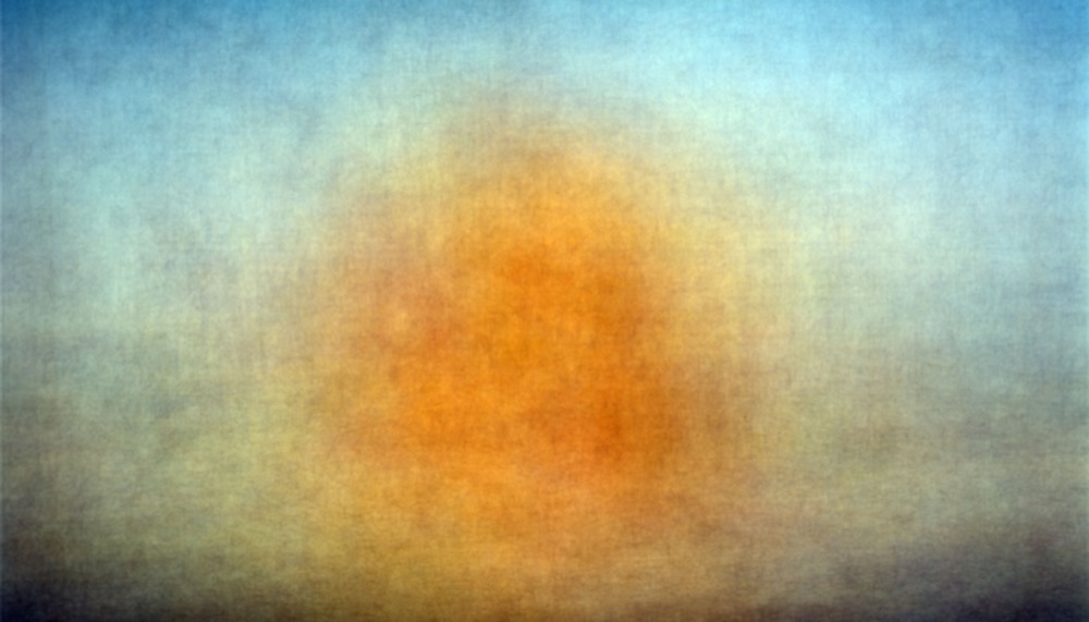
surrealist play. To that end, I conclude with a final image that remains, to me,
most fruitfully illegible: the sum of all of the summed z-projections, the sum
of 135,000 slices of Walt Disney Animation Studios.


