Abstract
Recent State of the Union addresses have included a number of new visual
elements, including a running slide show and interactive social media cards.
This paper poses a method for collecting and analyzing these new visual elements
and incorporating the results of that study into the study of presidential
Rhetoric. This article will: (1) situate the enhanced State of the Union within
the study of presidential rhetoric, (2) combine aspects of close and distant
reading for critique of the address, (3) provide the results of the approach to
distant reading taken here, and (4) discuss the implications of the analysis of
this particular visual program as they afford future annual addresses different
opportunities, and constraints.
Introduction
Viewership for the State of the Union was down near the end of the Obama
Presidency. In January 2015, only 31.7 million Americans, distributed across
thirteen networks, viewed the speech, down substantially from previous years
[
De Morales 2015]. There are many reasonable explanations for
the decrease in viewership. More television channels existed in 2015 than did in
1980, people had something else to watch. Times were relatively good, there was
no pressing national crisis calling for a major speech. President Obama had
entered the twilight period of his presidency, after the second midterm and with
the 2016 presidential election cycle already beginning, the prospects for major
policy developments were low. Given low interest, new technologies, and dull
times, the number remaining so high could be read as a success rather than a
failure. Mitigating factors aside, the idea that the State of the Union is
obsolete or that low viewership is indicative of a crisis of political will is
still is a magnet for clicks. There were news stories to be written. Proactively
adapting to the idea of a changing audience, the administration added elements
to the State of the Union - in 2011 a running visual program beside the image of
the president, and in 2015 a waterfall of slides appearing beneath the
president. In the days after the State of the Union the president went out of
his way to do interviews with non-traditional media figures or “Youtube
stars” rather than traditional journalists. Reaching out to
alternative media suggests that the administration was aware that attention was
shifting and that new channels for distribution call for new modes of
presentation.
From a traditional communication or mass communication viewpoint, the practice of
developing texts for possible audiences has been described with a number of
different vocabularies: from discovering the available means of persuasion, to
affective modulation, to the cannon of delivery. Making messages work, or at
least trying to make them work, is a central concern of communication research.
In the context of the State of the Union, this first meant the inclusion of a
new “enhanced” visual program, and more recently the
inclusion of a second visual program with different, interactive affordances.
These new dimensions of interaction seemingly provided a public, half a million
people, with access to a dimension of the experience of the speech that was
distinct from that of viewing on a traditional television screen. The State of
the Union is, after all, a planned media event. The timing, ordering,
composition, and affordance (for interactive elements) are elements that should
topics for analysis. It should not be surprising that there is a clear intention
behind the design of the composition.
This article proposes a novel strategy for reading the procession of images that
accompanied the State of the Union and the ways in which the procession of those
elements frames the user interface and the media event of the speech. In order
to read the images presented with the State of the Union, image stacks will be
constructed from those images that were placed below and beside the State of the
Union. These images will then be “read” using computer
software, producing traditional frequency counts and plots of information about
the images themselves. These plots, stacks, and sequences will be used as a part
of a strategy of distant reading for the interface of the State of the Union as
provided by the White House. This analysis makes two important contributions:
first it provides a method for characterizing the attributes of an user
interface as it changes throughout a user encounter, second, this reading
juxtaposes different optical and visual strategies for engaging viewers around a
public speech. In constructing this approach, this article will: (1) situate the
enhanced State of the Union within the study of presidential rhetoric, (2)
combine aspects of close and distant reading for critique of the address, (3)
provide the results of the approach to distant reading taken here, and (4)
discuss the implications of the analysis of this particular visual program as
they afford future annual addresses different opportunities, and constraints.
States of the Union
The State of the Union is a curious institution, with changing historical norms
of delivery and reception over the life of the republic. The State of the Union
in the late twentieth and early twenty-first century was a televised media
event. Before the speech was delivered by the president in person, and when the
direct address of the public was not possible, the text of the address was a
major topic of discussion, calling for a prompt response in kind. The State of
the Union is intimately tied to the temporality of it’s circulation. The history
of the State of the Union Address is a fascinating topic that exceeds the scope
of this article. Rather than providing an incomplete history, this review will
emphasize some of the touchstones of the social functions of the address and how
some of those references were already unstable before the enhanced State of the
Union.
In the early days of the United States, speeches by the president were almost
always addressed to congress, rather than the public. In his seminal work on the
presidency, Jeffrey Tullis examines these documents through a reading (which
included both qualitative and quantitative elements) of the styles and subjects
addressed — nineteenth century presidents addressed the congress, twentieth
century presidents addressed the people [
Tullis 1987, 138].
Annual messages, the nineteenth century version of the State of the Union
address, were carefully constructed, but were ultimately a deliberative document
in the early years of the republic [
Tullis 1987, 55]. The
president in this formulation is a partner in deliberation with congress, not an
enemy to be defeated or a sycophant to be placated. The waves of discussion
created by the address and the implications of it function as a “second
constitution” that provides energy and movement to a stagnant body
of constitutional relationships [
Tullis 1987, 18]. Increased
access to communication and the direct address of the public are a mixed
blessing for any system of governance. On one hand, more democratic access to
technology might include more voices, more quickly in deliberation. On the other
hand, these unprofessional communicators would not abide by the stabilizing
norms of journalists and politicians, a major concern of in the development of
founding documents for the United States was the risk of demagoguery which would
be fed by looser norms [
Tullis 1987, 27]. There is no
intrinsic element of communication systems that requires that they evolve in
ways that enhance democracy, if anything the risk flows toward the creation of
systems that are less democratic, less diverse, and more self-serving for
powerful actors than those that came before. Tullis argues that the challenges
of modern communication systems neither eliminate the intentions of the authors
of the Constitution and the Federalist papers nor simplistically call for a
return to those texts as reflecting some transcendental truth [
Tullis 1987, 22].
It is of interest to note that both Washington and Adams delivered their
addresses in person; the nineteenth century norm of the president delivering
written remarks began during the Jefferson administration, as ostensibly the
performance of the speaker might affect the trajectory of deliberation [
Tullis 1987, 56]. Andrew Johnson opted for direct address of
the public, the political implications of which were at the heart of the matter
of his impeachment for improper public speech [
Tullis 1987, 91]. An exception which informs the rule. The turn of the twentieth century
marked a transition point, with Teddy Roosevelt working to build the confidence
of the public and Robert Taft simply providing lists of legislative priorities
[
Tullis 1987, 118]. Woodrow Wilson’s presidency marked a
dramatic change in the role of the president as making a popular argument for a
change in the allocation of power and constitutional meaning [
Tullis 1987, 125]. From Wilson on, the president directly
addressed the public with a relatively similar sort of address predicated on a
list of policy priorities, which as time went on included additional epideictic
features such like the inclusion of inspirational guests of the president.
Kathleen Hall Jamieson and Karlyn Kohrs Campbell argue that, “Through public meditation, assessment, and policy
recommendations, State of the Union addresses sustain the
presidency”
[
Campbell and Jamieson 2008, 15]. The topics of such a speech are not those of a given moment, but
generally a rumination on values and issues of sustained interest. The State of
the Union interrupts the flow of Congressional attention. Even if Congress was
loathe to adopt the policy proposals made by the president, in their antipathy,
rejection, and refutation they acknowledge the symbolic role of the president as
the leader and the rhetorical force of the address. The State of the Union
speech serves as an occasion for the public to be reminded of the symbolic
function of the president. Vanessa Beasley argued that the symbolic position of
the president constrains the possibilities for the president as much as it
enables the president to frame issues of national identity, or as Beasley simply
puts it, “presidential rhetoric is situated”
[
Beasely 2011, 155]. It should be apparent that there are values that a president can not
express from the subject position of the president, and values that the
president must ostensibly espouse. Ritualistically the occasion of speaking
provides the sort of ongoing engagement with the idea of
“peoplehood”
[
Beasely 2011, 10]. Television changed the ways in which
presidents were received by the public, which also changed with the television
of the time period. Keith Erikson argued that the visual politics of the
presidency in the twentieth century emphasized the careful modulation of the
aesthetic presentation of the president and the scene. The modulation of affect
by presidents is highly contextual, with observers likely differing on
interpretations – presidents must exercise care to avoid a heavy hand. It is not
simply that publics are duped by the illusion of the president, but that they
tend to prefer presidents who are good at appearing presidential, thus debunking
presidential performance as mere stage craft is counter productive [
Erickson 2000, 155].
In a 2010 essay, Beasley described the peculiar context of the George W. Bush
presidency where the model of the rhetorical presidency was supplanted by the
model of the unitary executive. The distinction between the rhetorical and the
unitary executive model does not hinge on the executive speaking less, but in a
shift in the ways that the executive speaks. Instead of going public to secure
permission to act, the unitary executive acts seemingly autonomously of the
other branches. The executive in this model informs the other branches about
what has been done, it does not seek approval. Beasley offers a research agenda
for the development of new case studies about unitary executives or to find
other texts where the president frames public opinion [
Beasely 2010, 31]. Even if shifts in presidential communication may have
complicated the vision of the rhetorical presidency across speeches, the State
of the Union remains a regular, ritual speech. If the president goes public once
a year, that particular speech may be more important than before. These models
may also call for further elaboration for understanding the actions of a
seemingly rhetorical president (Obama) in a discursive context where antagonism
has replaced agonism. Even in the context of a less than cooperative public
sphere Obama is a rhetorical president, which would call for sustained attention
to the kinds of new audiences that the president would cultivate given the
paucity of traditional audiences to persuade. Another way to think of this,
Obama as a rhetorical president replaced Bush as a unitary executive, rebuilding
the norms of the rhetorical presidency takes work when they have been corroded,
and they may require entirely new modes of persuasion and communication.
This new position for a president interacting with a fragmented public as a
digital presidency is outlined by Jessica Kurr. Kurr’s position on the enhanced
State of the Union supposes that the address comes as an extension of prior
changes in the speech such as Roosevelt’s fireside chats [
Kurr 2015, 155]. The upshot of the enhanced address is the possibility of a more
multiple reception and retransmission of the address, this new rhetorical
presidency is fashioned along multiple iterative events, rather than a single
legitimating moment. James Alexander McVey argues that the enhanced visual
program reenergizes the program of neoliberal reformism through renewed
attention with a novel mode of presentation. Of the visual strategies emphasized
by McVey is the differential use of serif and sans-serif fonts for representing
political futurity in the 2011 Enhanced State of the Union [
McVey 2015, 18]. At time same, McVey points out the
individual site of affect is a site of possibility and contestation. I would
suggest further that we should be careful not to assume that all novelty is tied
to neoliberalism, after all it seems likely that resistance to neoliberal
governance will likely be passionate, creative, and fresh. This is an important
turn in the analysis of the digital presidency - where Tullis had noted the
change from paper to in-person delivery, and Erikson emphasized the staging of
the television screen, Kurr and McVey reveal the conditions by which these new
modes of address might face critique. The approach taken to the 2015 Enhanced
State of the Union attempts to produce graphical depictions of a multiplicity of
factors tied to the presentation of the speech over time, from the inclusion of
sharable features to the depiction of individual slide images.
An important approach to studying the addresses of presidents has been close
reading. Discursive critique has been relatively slowly taken up in the study of
presidential rhetoric. Beasley lists a number of reasons for the relatively
traditional sort of reading strategies employed in the study of presidential
rhetoric: post-structuralism is at odds with a study of invention, presidential
scholars study limited sorts of effects, and perhaps most of all that the
approach would be incompatible with a strong theory of presidential agency [
Beasely 2010, 156]. If the actions of the president are an
effect of the circulation of discourse, there may be no rhetor left to study.
Instead of viewing the constrains of context as an obstacle to studying the
impact of the president, the ways that the president might work around those
constants, or in the case of popular presidents change public values and
preferences are of significant interest. Models that emphasize the president
speaking an address rather than the presidencies address speaking through body
of the executive both tend to reach similar insights and the more simplistic
models have the benefit of parsimony. The sort of study that one would make of
the State of the Union is not of the effects of the speech per se, but of the
construction of the speech itself. This approach to reading owes much to Michael
Leff and GP Mohrman’s seminal article on the Lincoln’s Cooper Union address [
Leff and Mohrmann 1974]. In reading the specific moves in the address, Leff and
Mohrman can reposition Lincoln as an orator as operating toward the end of
winning the nomination, rather than keeping a fragile state together. They can
read Lincoln the candidate as himself, rather than as a retroactive version of
Lincoln the president. This interpretation challenges the simplistic story of
Lincoln on the basis of the speech itself, no additional historical, economic,
or para-textual investigation needed. Gronbeck situates the extension of
presidential rhetoric in the age of secondary orality as an extension of the
persuasive activity of the president [
Gronbeck 1996]. This
penchant for the analysis of the use of secondary orality itself calls for a
closer attention to the ways in which those performances function.
A major critique of close reading has been that the method could become
“self-justifying,” rhetorical reading techniques applied
for their own sake, rather than for the sake of the text, provides cover to
other reasons for the selection or effectivity of texts, namely power [
Warnick 1992]. Warnick’s argument that close reading and critical
rhetoric are distinct paradigms is important in situating the approach of this
article. Close reading is not referred to in this section to advocate for a
return to the idea of the speech alone, but to situate the kinds of approaches
that have been used with presidential texts. The argument is also well taken
that without some external selection criteria the penchant for textual reading
strategies to become self-indulgent is quite real. It is to this end that this
article situates the analysis of the presidential interface in rhetoric rather
than as an object of curiosity alone. Distant reading has been subject to a
number of the same criticisms as too many projects have yet to connect with
ongoing scholarly debates or are willing to pretend to be a transparent window
onto reality, as if that reality was not already socially constructed [
English 2013]. Charts and graphs provide an imprimatur of
mathematical authority even when the visualizations produced are nonsense.
Visual analysis can take a number of forms, including readings of: production,
composition, reproduction, and circulation [
Finnegan 2010].
Distant reading offers insights into the ways that a number of images in
sequence might be composed and reproduced in a particular context, the results
of distant reading can be situated for analysis in other theoretical
vocabularies. The analysis in this article will be largely compositional as it
reads for the signs of differently positioned arguments and codes image texts.
The traces of ideas about the reproduction of authority or emotion come from the
uses of those ideas in studies of public address and presidential studies. This
is similar to the study of memes where rhetorical potential is understood to
come through uptake and circulation [
Jenkins 2014]. Eric Jenkins
work on visual rhetorical calls for a shift away from contextualizing the
individual iconic image toward an approach that studies the circulation of the
image. This study does not study the actual circulation of images, but is very
much in sympathy with that approach through the analysis of a multiplicity of
images that could find themselves in motion.
At the risk of being too detailed in this area, I want to be clear about the
theoretical entailment of the choice to develop the approach to the use of
computer image analysis in this article. Elizabeth Losh has argued that the
combination of new approaches for the analysis of cultural data through
computational approaches has returned rhetoric to a place of importance just as
it tries to “catch up”
[
Losh 2015, 292]. Losh is particularly interested in the
rhetorical interfaces of Manovich and Moretti - as is this article. Losh’s point
should be well taken by rhetorical critics that new computational tools offer
ways of understanding aesthetics and temporality that enrich, rather than
detract from rhetorical theory. This approach is in-line with the idea of
iconographic tracking proposed by Laurie Gries [
Gries 2015].
Instead of tracking the movement of a visual style across a variety of sites
(the Obama hope image for Gries) this study attempts to turn the practice of
data mining toward the compositional aspect of rhetorical critique.
Distant reading supposes that the use of computer vision and counting
technologies might provide a way of apprehending differences across a stack of
individual data points of a text that might otherwise be difficult to apprehend
with the eye alone. The results of this analysis can be used to reveal the
traces of the means of producing a stack of images or a speech as a whole, much
like the ways that close readers might slow down the experience of a speech or
thicken certain concepts. A key term in this method is stack, the stack is a
collection of images in some sort of sequence. Generally, the sequence of the
files in a stack maps onto the linear unfolding of a text, optimally these are
coded into the filenames of the units of the stack for optimal metadata
management. Distant reading takes seriously the idea that tiny variations,
especially if repeated over time, are evidence that can be utilized for
analysis. Lev Manovich’s method for distant reading comes from cinema studies
rather than speech, his unit of analysis is the individual shot [
Manovich 2013]. Analysis of the shot allows a micro visual grammar
to be studied in a way that was not possible on the level of the sequence. The
experience of cinema requires the persistence of vision. Images only last for a
fraction of a second on the retina, as images come faster perception of
individual units sublimates into the perception of movement. By breaking down
the film, taking it out of its persistent, programmatic, linear flow, Manovich’s
method offers something of a close reading of each shot or scene. This study
utilizes Manovich et. al.'s ImagePlot 2 plugin for ImageJ for analysis [
Manovich et al 2014].
Counting is a difficult notion. Francesco Moretti contends that the rise of the
digital humanities is the expression of a healthy penchant for clear evidence in
literary studies [
Moretti 2013]. Any program of research requires
categories and codes. When computational techniques provide evidence that can
answer descriptive questions they offer the humanities and social sciences
powerful tools. Moretti is careful to argue that these tools are not neutral and
that they do not offer a transparent window into the content presented. Instead,
the tools of distant reading lose track of some important features of the
individual text while situating it among flows of texts [
Moretti 2013, 48–49]. Metadata produced by these methods can
enrich the study of a particular text. Metadata about networks of texts
contributes to a healthy skepticism about the texts that are in the cannon and
the reasons why they were selected. The study of the humanist tradition is
important but the dimensions to which it might be self-justifying should be
subjected to rigorous criticism. For Moretti, it is the shift between micro and
macro levels that brings insight. The second aspect of the analysis involves
reproducing these acts of close reading through some sort of means (more or less
automated) and producing a new document to serve as the stand-in for analysis.
Plots, often with an x-axis of time or sequence, allow single variables to be
explored. When the data points are replaced iconically with that which
represented, the depth of analysis and difference might shift. The trend and the
thing can be apprehended at once. Structured montage can allow subsets to be
plastically produced of images for visual reading. With adequate resolution the
primary source and its categorical context can be apprehended in the same
glance. Or to be quite literal, a large, high-resolution monitor can produce
great detail.
Distant reading offers a chance to connect the changes of images to the text of
the president's speech and further to establish a baseline reading of the way
that the Administration’s preferred interface for viewing the State of the Union
appeared. Stipulated in this approach is the idea that public address is a form
of time-based art. Public addresses after their delivery are fixed to a medium.
Stored media lose their time-axis stability, editing, selective memory, and
mashups become the norm. Speeches become sound bites. This is nowhere more
apparent than in the edited State of the Union released by the Republicans after
the State of the Union [
Atkin 2015]. What the ersatz video
supposes is that one might agree with every issue raised by President Obama
aside from the changing climate. As a strategy the edited State of the Union
would call attention to that element of the speech, although it seems likely
that any viewer was already likely aware of climate being a major issue for the
contemporary Democratic party in the United States. The thing itself was
designed as a time-based experience that built toward a climax or message.
These alternative methods for reading are optical, not visual. This is a
distinction that matters as the sort of critical insight that rhetoricians
emphasize tends to come from the visual capacity to notice rather than the
optical properties of the text. The kind of information produced through this
distant reading software is not a reading of the sign system of the work, but a
reading of the ways that the computer would render light from a datafile.
Friedrich Kittler was quite intentional in distinguishing between the humanistic
study of the visual and the technical study of the optical [
Kittler 2010]. The indications taken by this method for analysis
are readings of light, not the interpretation of the text - this will happen
later in this article. In his introduction to Kittler’s
Optical Media, John Durham Peters wrote, “ Optics is a subfield of physics, vision is a subfield
of physiology, psychology, and culture”
[
Peters 2010, 3]. For Peters and other readers of Kittler, this opens the space for the
study of logistical media and the technologies that use spectrum that is either
beyond the human. Although this analysis will not venture into the realm of that
which is beyond the human eye, the sort of time manipulation inherent in the
distant reading strategy and synthesis of an analytical object (the montage, the
plot) the compression of time makes the speech into point in time that is not
perceptible without technology. In this sense, this analysis is dependent on the
optical rather than the visual, but is ultimately a visual analysis. Moving
toward the optical for the study of composition can expand the range of possible
codes detected and experiences understood. Much as field notes create meaningful
meta-text for the synthesis of ethnographic insight, optical analytic montage
enables forms of noticing for rhetorical critics that can move beyond the single
image.
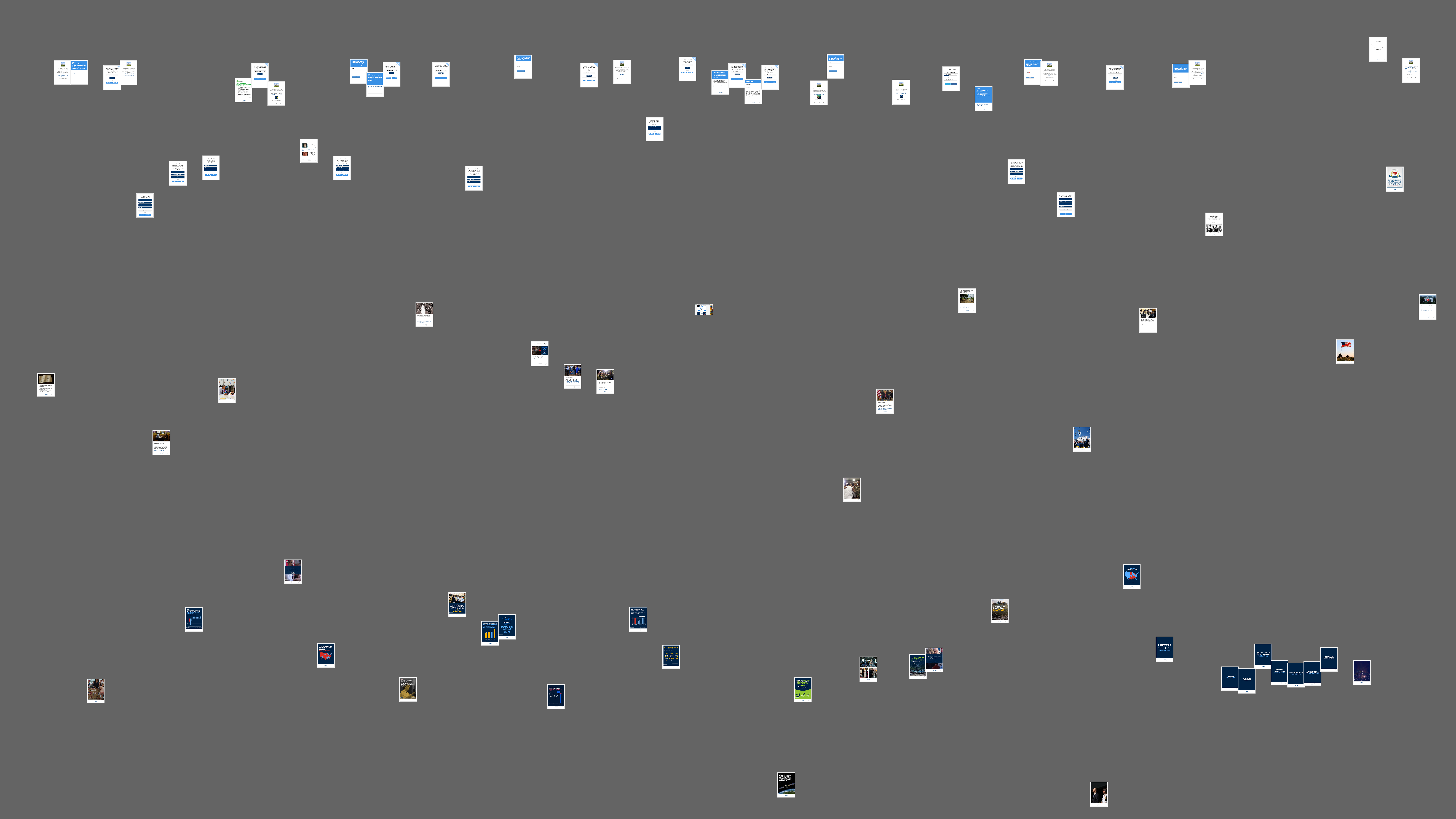
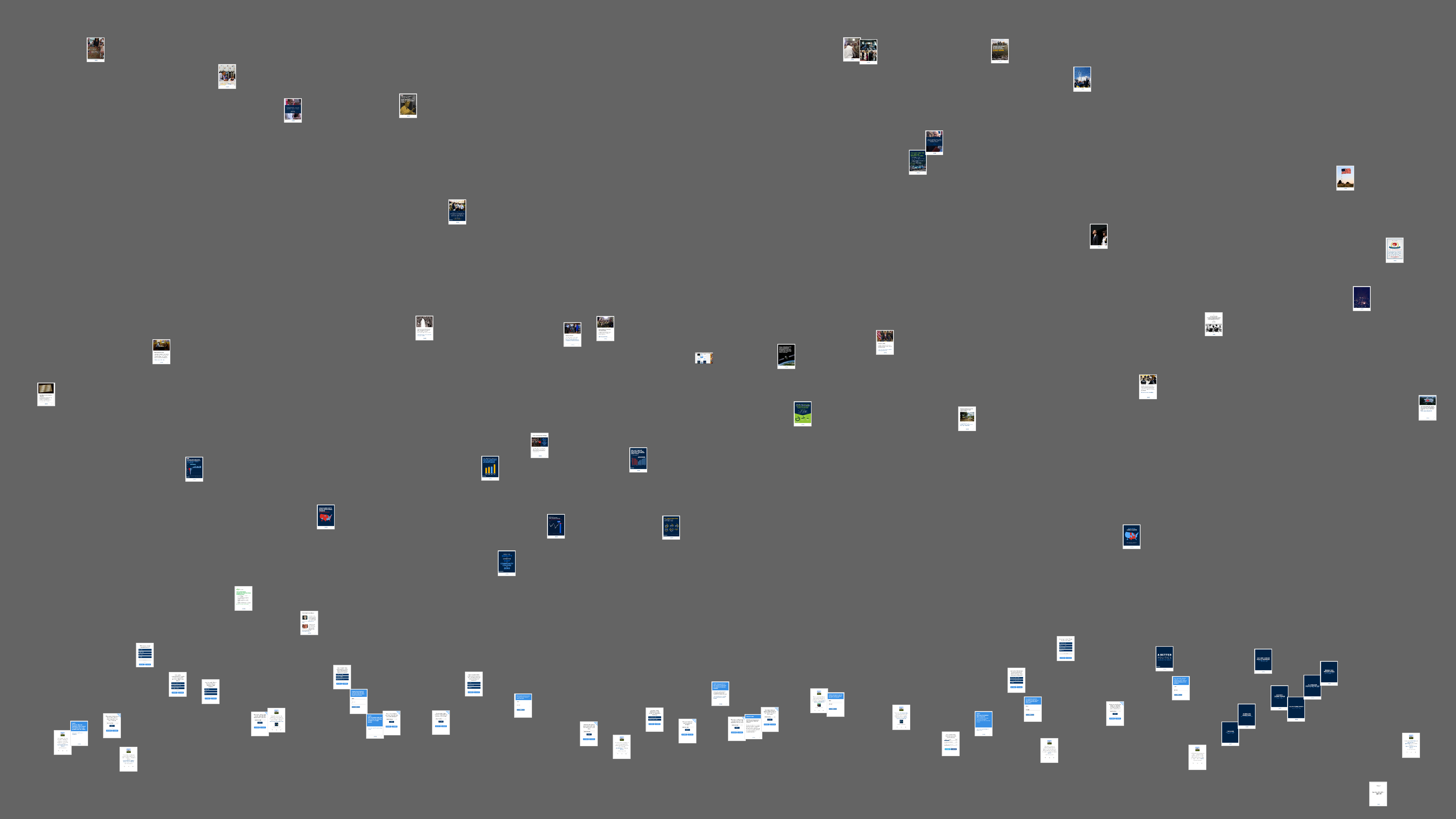
The Slide Show
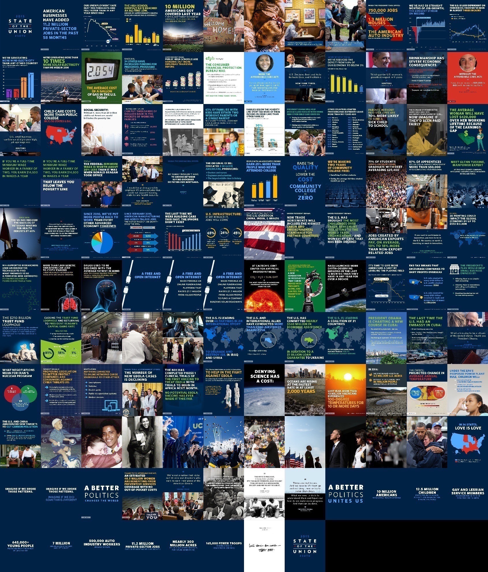
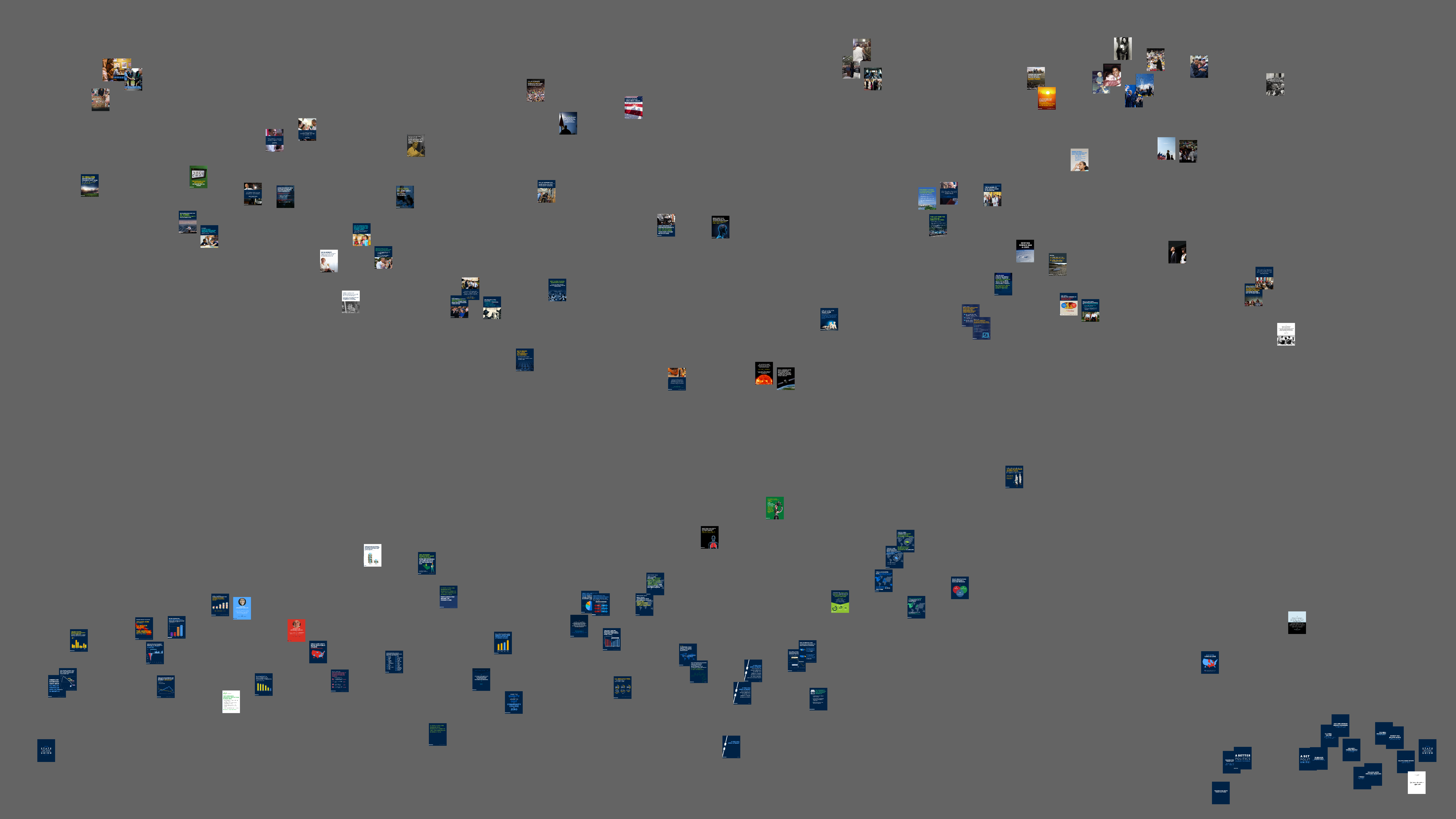
The montage shows the totality of the slide program presented along the side of
the president during the state of the Union. The diptych of the video program
was broken nearly in half, with the image of the slide taking a considerable
amount of screen space on the right side of the image of the president. The
purpose of this slide presentation is ostensibly to provide information that
would support the president’s speech. Both images stacks are read in this
analysis as they pose novel attempts by the president to communicate with the
public.
Between images the use of recurring themes can be identified. Discussions of the
body during mid-speech are marked as medical through their use of the x-ray
view. The normal image properties in the stack are fairly compositionally
simple. Images are similar within regions of the stack, easily marking similar
themes. Slides are typically organized from the top-left with text aligned left.
Reading these slides at a glance would keep the focus of the viewer near the
center of the screen. Occasional slides are aligned to the center, while the
slides in the Internet section are aligned to the right. A quick survey of
graphical styles reveals only a handful of line graphs. Line graphs are
typically used to show a linear relationship, the ideal orientation of the graph
moves in the opposite direction of the practice of reading the slide, from the
bottom left to the top right. Graphics presented in the slides use this
vernacular. Either a relationship is decreasing or increasing over time. Never
are relationships bimodal, stochastic, or noisy.
Designing images to work with basic indexical relationships is an important move
within the presidents argumentative system. Backing for the president’s argument
does not come from generalization, signs, or authority, but from the invocation
of linear cause-effect and effect-cause reasoning. This pattern of claim and
data continues through row nine of the montage at the conclusion of the
discussion of climate change. At this point the image styles change
substantially. After a series of images of the Obamas, the images turn toward
the vision of “A Better Politics.” At a glance it is apparent
that this section is both substantial (nearly a third of the image field if the
family images are included), and visually distinct. Text in these boxes is
aligned center and the total image text is relatively scant compared with other
frames. The degree to which these images, and this section of the speech varies
will become apparent as we read other attributes of the stack.
It may be difficult to notice a distance from the stack, but each individual
slide is marked in the lower left corner with a hashtag. Nominally, Twitter is
organized around shared attention. Hashtags are a form of communicative meta-
data that helps to make sense of the conversation. As a technology, hashtags
organize the communication of a temporal network in ways that are not possible
because of the lack of an affinity or geographic referent. Advertisers suggest
hashtags to organize attention for more efficient control of flow through
commercials [
Faltesek 2015]. The provided for the State of the
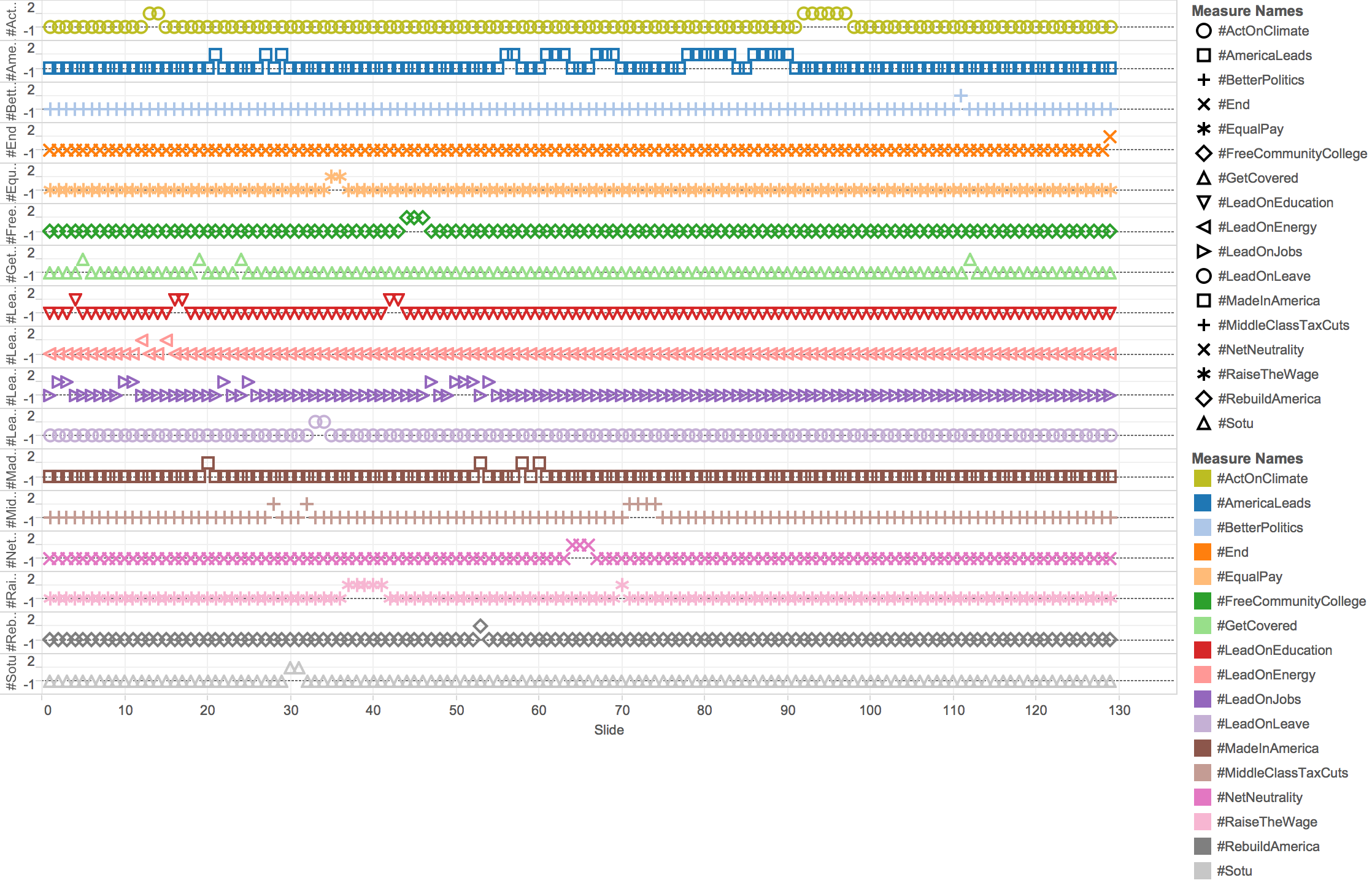
Union, presented in order of first appearance, are:
- #LeadOnJobs (images 2-3, 10-11, 22, 25, 47, 50-52, 54)
- #LeadOnEducation (image 4, 16-17, 42-43)
- #GetCovered (image 5, 19, 24, 112)
- #LeadOnEnergy (image 12, 15)
- #ActOnClimate (image 13-14, 91-97)
- #MadeInAmerica (image 20, 53, 58, 60)
- #AmericaLeads (image 21, 27, 29, 56-57, 59, 61-63, 67-69, 78-83,
86-90)
- #MiddleClassTaxCuts (image 28, 32, 71-74)
- #SOTU (image 30-31)
- #LeadOnLeave (image 33-34)
- #EqualPay (image 35-36)
- #RaiseTheWage (image 37-41, 70)
- #FreeCommunityCollege (44-46)
- #RebuildAmerica(53)
- #NetNeutrality (64-66)
- #BetterPolitics (111)
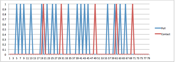
Or, expressed as a timeline:
The final hashtag introduced until the final #BetterPolitics is #NetNeutrality,
which is roughly half way through the speech. The longest individual run of
slides with the same hashtag was the #AmericaLeads section on foreign policy
between images 78-90 with no hashtag used on slides 84-85. Early in the speech
the Hashtags rapidly shift, with similar arguments in different areas switching
hashtags on a point by point basis. As a multiscreen practice this use of
multiple and shifting hashtags would provide for different discussions that
might resonate with different audiences.
Toward the end of the speech the duration of each hashtag increases. This does
not mean that the arguments presented during these longer duration hashtag
episodes are more coherent. Consider #AmericaLeads, the arguments presented in
this hashtag region are a laundry list of foreign policy issues. The conflict
with ISIS/ISIL, the Ebola virus, the embargo of Cuba, the construction of
nuclear devices in Iran, and the problem of organized computer hacking are
organized by a single hashtag. #AmericaLeads also links images related to: the
federal deficit, social security, employer provided day care for children, trade
negotiations, innovation, three-dimensional printing, and new drugs. Instead of
serving to mark a focused argument, #AmericaLeads seems to be a miscellaneous
category, not an argument with any particular depth. The rapid succession of
hashtags related to issues or points unrelated to the longer duration tags other
than #AmericaLeads suggests that the speech has the quality of Taft, a list of
points and arguments presented in short bytes. Once introduced, these hashtags
recur, but could just as easily be left to serve as a scaffolding for debate and
discussion. Research on Twitter hashtag longevity suggests that lifespan of
these posts, likely lacking rich media, is quite short [
Cunha et al 2011]. Hashtags do little for lexical innovation or democratization of contact.
Perhaps more important, during media events, Lin, Keegan, Margolin, and Lazer
have found distinct trends of centralization and decreases in interpersonal
communication via the platform (2014). This suggests that the rapid deployment
of these hashtags was intended to seed possible future posting, not necessarily
to inform conversation during the speech.
#ActOnClimate on the other hand, does have a focused argument. For a number of
slides the president spoke on the same topic in detail, given the rapid change
in hashtags earlier in the speech the use of a sustained hashtag followed be no
hashtag is distinct. The ways in which this argument develops can be observed
through the reading of red in the image stack.
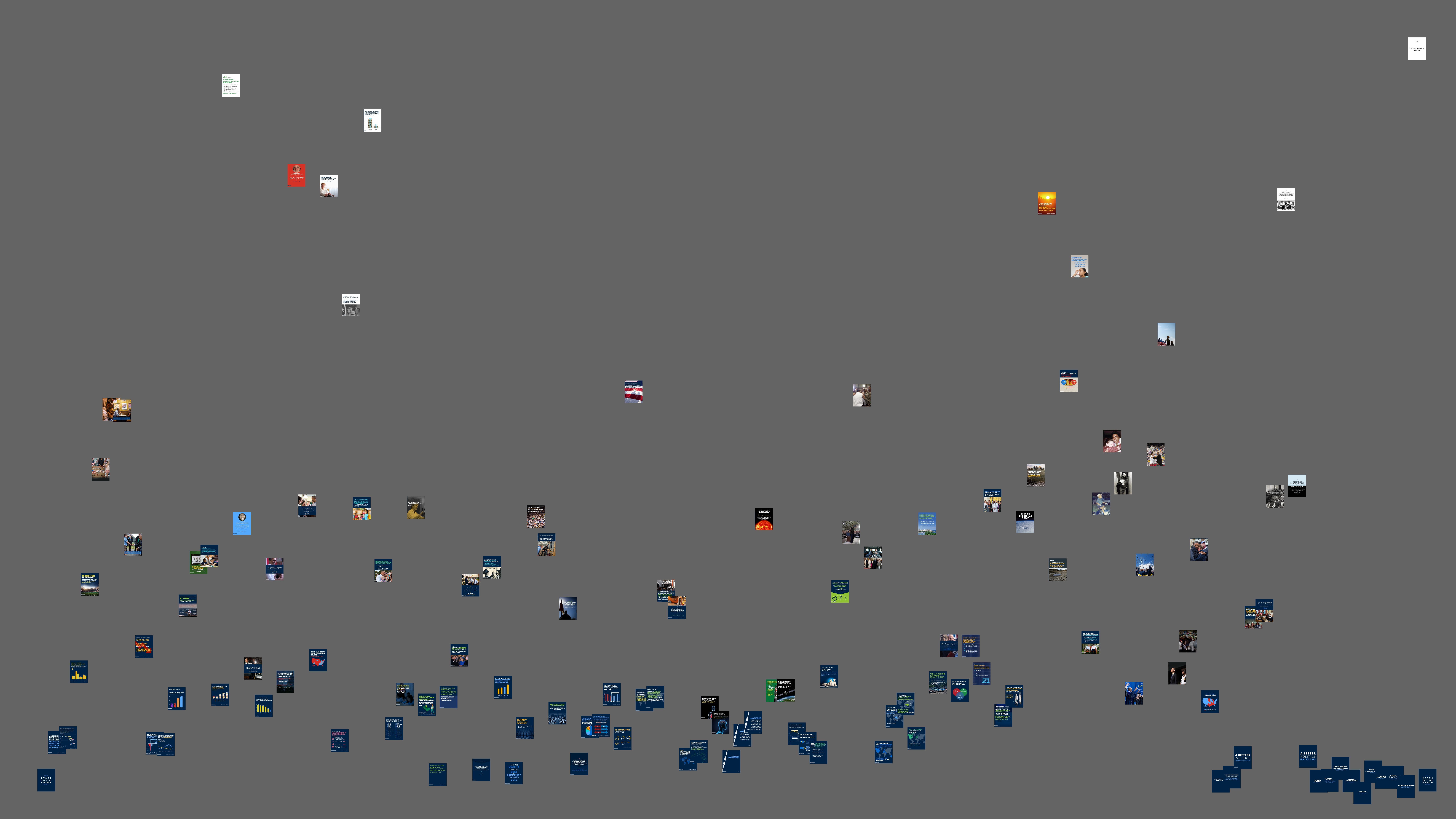
Instead of a montage we can plot the images from the slide deck based on their
image values. The image of the slide stack can be plotted in time against the
mean use of the color red. This measure analyzes the mean red value of each
image, not the peak redness of the frame or the standard deviation of redness
through a particular frame. Although standard deviation red could detect the use
of red points, the use of total red generally will also offset slides that tend
to be very red or very white. Mean measurements are superior for detecting the
overall impression of the color of an image. Unlike print, the primary colors
for analysis in this color space are red, green, and blue; not cyan, magenta,
yellow, and often black.
The images in the first two-thirds of the speech tend not to be particularly red.
Red is limited, and used as a warning color. The first major peak of the use of
red (that is not red mixed into white) is the background of an image describing
the story of a person without the affordable health care act. Juxtaposed by
these slides are the idea of a healthy, happy family and deep medical debt. Red
provides contrast, and in the cultural context of the United States a
signification of danger.
Mid-speech red peaks come through in a full screen image of the flag of the
United States, the text of the slide argues that in 2014, the United States
became the world leader in foreign investment. This image offers the peak
intensity of the #MadeInAmerica section of the speech.
#ActOnClimate marks a turning point from the blue interlude of #AmericaLeads. As
the climate argument moves from providing basic information to the impacts of
rising temperatures the images become dramatically more red. The warning
function returns. A red orange sunset points to the danger of heat. After this
peak, red falls off as the final stanza, nearly one quarter of the images in
this stack, hashtagless, run to the end.
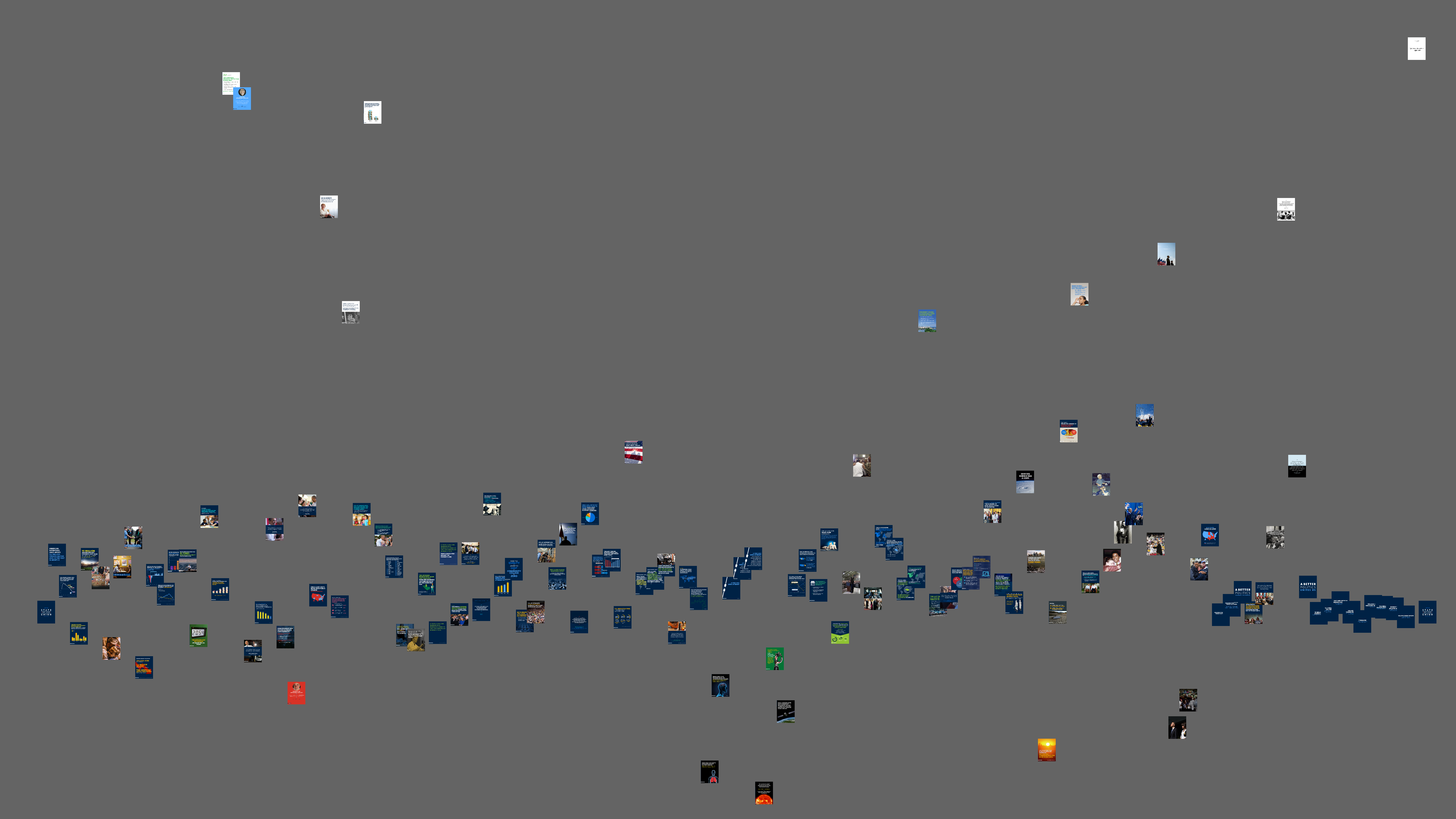
Much of the image stack is quite blue. An early blue peak is the counter-point to
the visual representation of danger and warning for the uninsured. The
midsection of the speech is again, stable and not too intense. Images like the
red hot sun of possible alternative energy against a black space are the
opposite of blue. Much like the rise in red, images in the climate section of
the speech become more intensely blue. Transitioning into a less blue phase are
images of the President from the past, followed by a dark blue final phase.
Ending the speech with a distinct shift in visual style gestures toward this
being the real substance of the presentation, and the substance of that
presentation was less deliberative and policy focused as much as it was
epidictic. The epidictic speech on American values is not particularly
remarkable compared with other speeches by Barak Obama - the central theme of
the speech is that Americans nationally have enough in common that they might
form an effective polity. Obama praises efforts at expanding civil rights and
the safety and security of the nation, while decrying the tonality of politics.
Obama centered his “better politics” stanza on a conception
of public debate, “A better politics is one where we debate without
demonizing each other; where we talk issues and values, and principles
and facts, rather than ‘gotcha’ moments, or trivial
gaffes, or fake controversies that have nothing to do with people’s
daily lives”
(
State of the Union, 2016). The story of the United States in this final section is one of a unified
national family that has recovered from traumatic events to be stronger. There
seem to be very few sound bite worthy moments in this visually homogeneous
section of the speech aside from Obama’s impromptu “I won them
both” reply. What the reading of blue notes is the presentation of
a laundry list of policy priorities was accompanied by a stream of images and
evidence, while the substance of praise and blame and politics requires minimal
visual noise.
Entropy is a measure of the tendency of the image toward disorder.
Entropy is more revealing than Kurtosis, as the measure of
peakedness in the image would require a secondary analysis of the thing that is
peaking. There is a clear break between two categories of slides in the stack:
those with photographic images and those with charts and graphs. This is not to
say that all images without photographs are low entropy, some artificially
created images have a high level of entropy. These lower entropy images tend to
be those making direct points with a cause and effect warrant and those used in
the final stanza of the speech on values. A cluster of higher entropy slides
come as the #ActOnClimate section of the speech turns toward #BetterPolitics.
The use of images in this concluding movement of the speech is sparse until the
final review of key points. This visual strategy makes sense for the material
provided. When arguing about the state of the earth, images are the sort of
evidence that might support the president. When speaking about discourse, the
slides are decidedly plain. It is not that Obama has damaged the occasion of the
State of the Union, but that the context of the speech seems to require the
president to speak to a wide variety of issues in a tightly packed, rapid
presentation of policy ideas ostensibly for deliberation. Entropy measurement
suggests that the longer expositions on a handful of topics are accompanied by
images that are more random, and likely more realistic and more affectively
engaging than those provided for the deliberative policy segments of the speech.
This insight may seem straight-forward, yet the way that the low entropy slides
end almost completely as the use of hashtags on the slides is curtailed speaks
to break in the movements of the speech.
The Waterfall
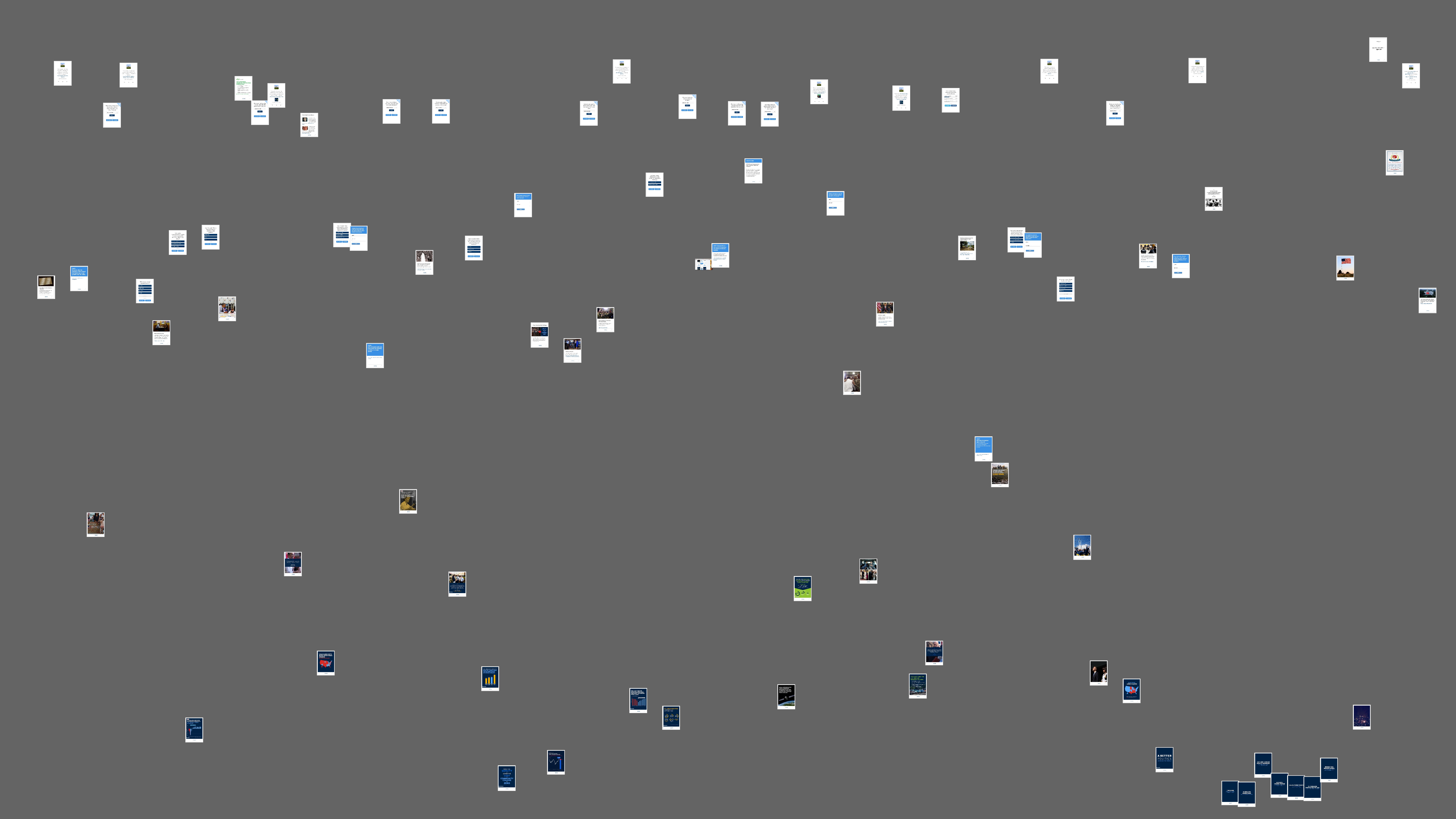
The initial impression of the waterfall stack makes an important point about the
composition of the average slide - it is far whiter than those in the slide
stack. There are templates at work. When compared with the images in the slides,
the waterfall is substantially different.
The variety of base images and formats for this portion of the presentation is
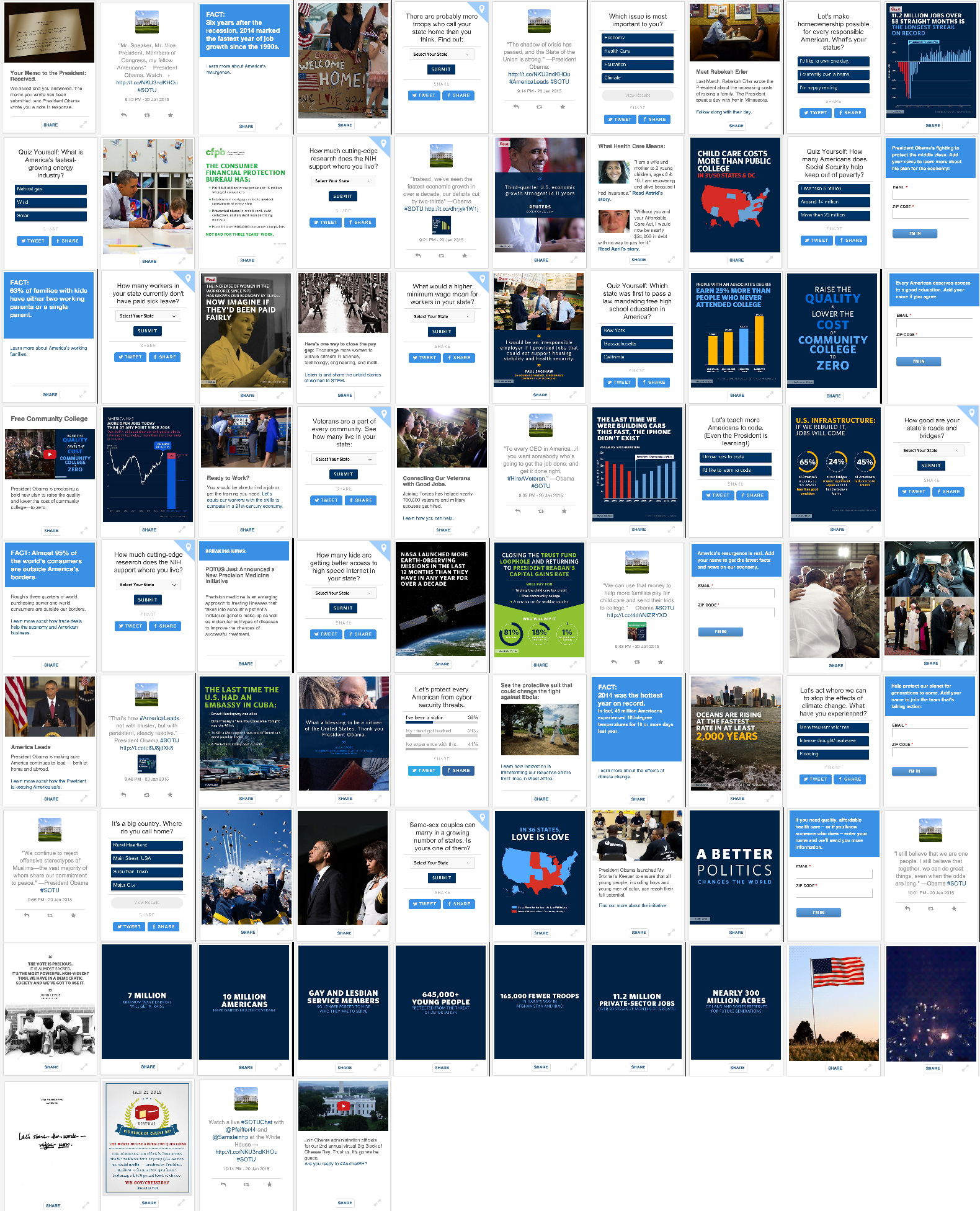
substantially smaller than those on the slide deck. Standardized image formats
are similar to those seen in a smartphone. These are rounded, white cards with
input boxes and symmetrical buttons. Occasionally, images are marked with a
colored corner. Although it is not captured by the montage, several of the
images near the end of the speech are gifs — the slides contain moving images.
Beyond the spectacle of moving images, twenty-five out of seventy-six cards ask
for user input. Mere input should not be confused with true interactivity or
immersion, interactivity is an affordance of a system, true immersion is the
result of real or simulated intersubjective contact [
Ryan 1994].
These moments for input seemingly provide the ability for the audience at home
to provide evidence for claims made in the speech and to participate in the
ongoing project of pressing buttons or entering user information. For the
administration the production of new administrative knowledge through these
interactions is quite real.
Ian Bogost has described the potential for interaction as producing affective
changes as procedural rhetoric. Proceduralism describes the way that the user of
the interface is asked to proceed through a series of tasks that have affective
potentials in themselves [
Bogost 2008]. The rhetorical moves made
by the administration in their deployment of these basic cards come through quiz
questions (confirming and correcting user knowledge) and situating the user
through survey questions (connecting cause and effect relationships) for the
user of the interface. By reading the interface procedurally alongside the
primary presentation (the speech), this approach offers the possibility of
reading the affective differential of screen and interface without flattening
the interaction into a single image or taking a strong ontological stand on the
digital. Although quantitizing sensors provide for the production of digital
images, all too often digital domains of research do not escape the event
horizon of the claim to the new. New-ness has a political appeal as it offers a
hope of a new beginning, yet as Gitelman and Pingree note, the historical flow
between new forms is not neat, continuous, or clear — there are so many examples
of cases where the ostensibly new media are in fact, quite old [
Gitelman and Pingree 2004]. Forms, cultural practices, and power relations
persist between regimes of media technology. Rather than turning to discuss the
idea of the break, the approach to distant reading and rhetoric taken in this
essay supposes that the hinge of analysis is the affective and persuasive
potential of particular interface choices along the lines of Barbara Warnick
(2004). Alexander Galloway makes an important point for media studies to note
the impossibility of the interface [
Galloway 2012]. The impossible
interface contends that there is no transparent communication or pure
meta-language. Careful attention to the procedures that users complete and the
affective dimensions of the buttons they might press or the sequence of events
is critical. Lev Manovich was not wrong in
The Language of
New Media, when he argued that hypertext was more of a distraction
than a form of meaningful communication [
Manovich 2002]. Hypertext
is an important function for lateral thinking and organizing information, not an
alternate universe. The narratological theories that centered hypertext offer
few conceptual resources for evaluating interaction patterns. Mapping the actual
use of experiences is the task of rhetoric online and interface studies for
rhetorical criticism, in the context of the experience of tasks presented to the
audience the procedural view is much more closely in tune with the sort of
explication of the experience of being in the audience that has been
historically suggested by the rhetorical critique of executive address. Bogost
frames this practice as, “authoring arguments through processes”
[
Bogost 2010, 28]. Context comes through consideration of the device and the occasion, an
attention to text requires an engagement with the order of screens, buttons, and
tabs.
On the meta-rhetorical level, the ongoing question of the waterfall of slides is
not one of the user's knowledge in completing the questions, but of the
condition that a user of these slides is asked to respond to the ideological
hail of the president, to engage in the ritual of answering the presidents call
and response. The next step after merely responding is to use the embedded share
buttons to distribute the card to ones friends. As a form of procedural
experience, this asks users to take the step of becoming engaged in political
conversation on their social networks. Even for those who may elect not to
become a political Facebooker, the subject position of the engaged, networked
citizen becomes quite real through this smooth, everyday, procedural rhetoric.
The references to the iPhone are quite apparent in the State of the Union -
these card designs are not new or arbitrary, but exceedingly familiar interface
patterns. Evidence for this similarity is abundant, a particularly noticeable
inclusion is the use of the Apple pinch to expand gesture on the lower left
corner of images in the stack [
Patel 2012]. As a form of
remediation, the cards borrow heavily from a number of image vernaculars
associated with smart phones, from the use of suggested gestures to the use of
button iconography such as the two arrowed square retweet.
The recurrent theme is the idea that one might identify with an imaginary
community on the basis of their state of residence, described as a “horizontal comradeship”
[
Anderson 2006, 7]. Earlier in the speech these poll questions were formatted as a quiz
about policy positions, such as “What is America’s fastest-growing
energy industry?” In the mid-speech these questions are replaced
by drop down boxes asking for the user to situate their location. Of the five
calls for user contact information three of them appear after one-half of the
waterfall cards have been deployed, and the number of calls for users to be
situated or quizzed drops at that point. At one point in the mid-speech, there
is a region where every other card is a call for the user to take some action.
In addition to the laundry list organization of the speech, the para-social
dimension of the waterfall takes on a laundry list dimension as well. Each issue
requires a question, even if that question is not developed into any meaningful
line of argument. To facilitate this sort of contact, the return state of each
card produces a relative answer. For example, in answering the question,
“It’s a big country. Where do you call home?” Answers are
not given in total responses, Rural Heartland (15%), Main Street, USA (13%),
Suburban Town (37%), Major City (35%). What these categories mean is less than
transparent. Other questions provided a more simplistic card without
percentages. No interactive cards were deployed during the end of the speech.
It is important to note that some of the images near the conclusion are not
static, but are instead GIFs. GIF or graphics interchange format files
facilitate the placement of animations created through short file sequences.
These have become quite common as means for producing a short run of video that
does not require a cumbersome video player application on the client side or a
server side video utility. The relative moment of screen images is tracked at
the end of this section through a method for detecting changes in intensity mean
through the progress of the speech.
Reading for red shows a great deal of similarity between images in the waterfall
stack. The outliers in this progression are not the images that are much more
red than others, but the images that are much less red. Or to put it another
way, since the majority of the detected red in the stack comes from the use of
white card images. Aside from the occasional blue image that includes a picture
of things in the world. Unlike the slides, there is no use of red, orange, or
yellow as a marker of warning or attention. Nothing at the bottom of the screen
would call attention away from the visage and voice of President Obama.
It is striking how similar the plots of red and blue are - the difference in the
base level of blue makes the appearance of the cluster of dark images that are
common between the waterfall and the slides stand out. The lack of color
variation is important as it is so different from the use of color in the slides
that accompanied the speech. When users would be engaged with the material that
was designed to be easily transmissible the dynamism of the image, as read
through visual use of red, is minimal.
The entropy measure confirms the stable baseline of images created for
interaction via interface level controls. On closer examination, the image is a
recolored picture of a parking lot of antique cars used to make an argument
about the United States embargo of Cuba. The make of these cars is important -
the designs of these older cars have pronounced lines. The baseline entropy of
images in the waterfall is relatively low. Aesthetic norms in card based design
come across here, as the standard card formats appear to dominate the entropy
chart, with occasional variation for higher entropy real world images.
Entropy maps the randomness of the images. The similarity of the basic image in
the waterfall is established by this metric as well. If we take entropy to be a
potential measure of visual noise, the waterfall follows a similar affective
trajectory to the slide deck. More entropy through the end of the environmental
arguments, followed by a very low entropy period established at the conclusion
of the speech.
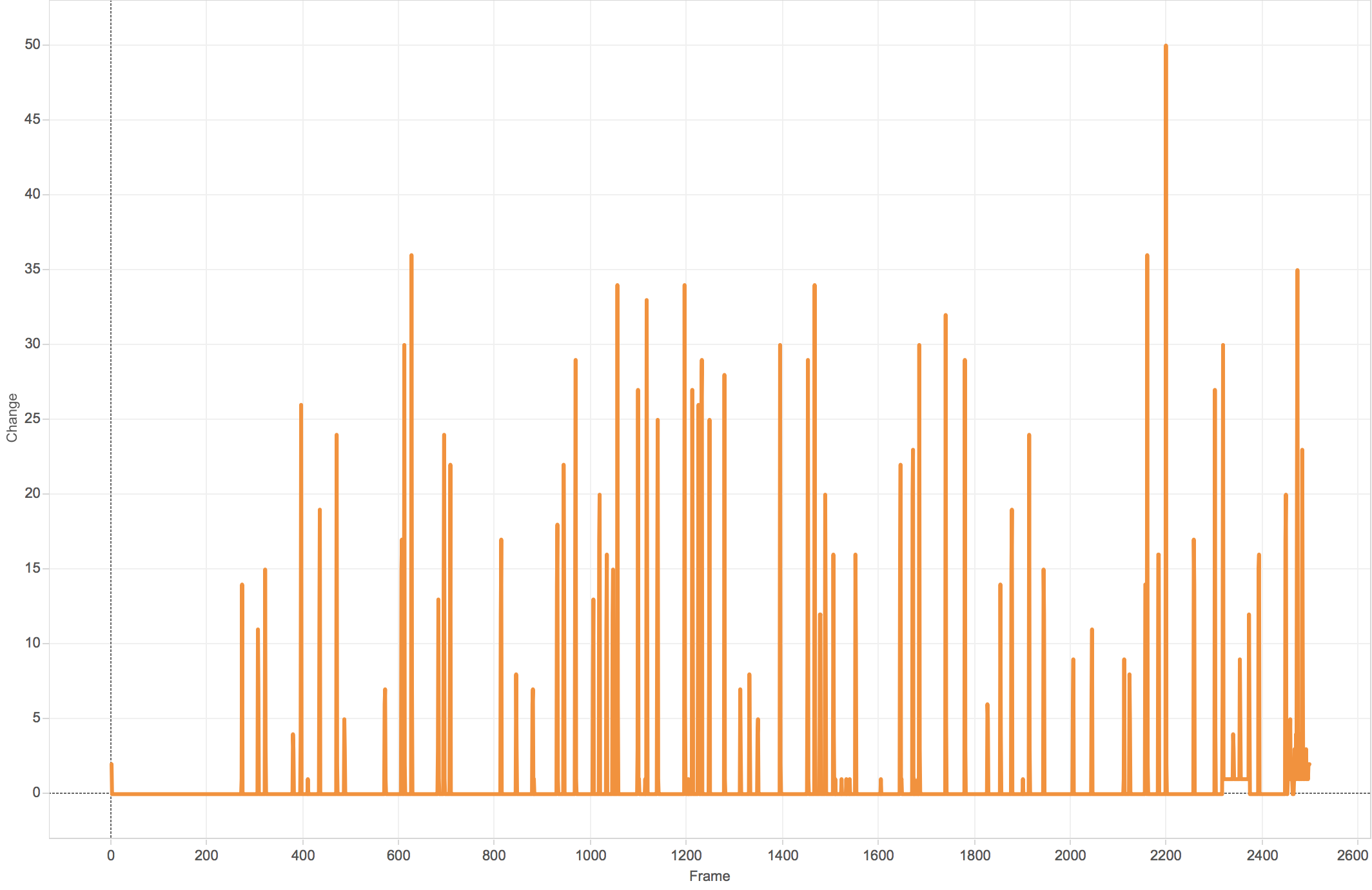
The cadence of images deployed in the waterfall slows toward the end, but as you
can see there is a wash of activity during the otherwise placid concluding run
of images. What is being detected here are the GIFs deployed near the end of the
speech. There are two GIFs in the conclusion of the speech, one of a waiving
American flag, and another of fireworks. Fireworks is the period of rapid
activity near frame number 2497. Fireworks and the waiving flag seem to be
intended to convey a feeling of a spirited conclusion. This is at odds with the
general use of GIFs for the purposes of providing sarcastic emotional modulation
in the listicle genre or to provide show sports highlights in slow motion.
Intensity peaks when slides that are visually distinct are animated on the
screen at the same time, these slides would tend to be those with pictures,
rather than charts or graphs. Slide 1249 marks the half-way point of the
presentation. This low level visual interest could serve the opposite function
of the relatively boring ending to the presentation of the informational images.
Something moving on the bottom of the screen could re-engage members of the
audience who had lost focus. By viewing the flow of the presentation as a
timeline, the ways in which change, cadence, and density affect the final
presentation can be understood more easily. It is interesting to see that the
president’s social media team chose to change the waterfall in bursts, rather
than in regular intervals. Much like visual variation and vocal delivery, the
intensities of engagement wax and wane as the speech ramps up and down. This
only varies at the very end of the presentation when the waterfall slides move
the most while the other elements of the presentation are substantially
down-tuned to make space for the speaker.
Conclusion
The State of the Union has a complex history. The position of the speech as an
epideictic occasion has become increasingly pronounced as the president might
craft an ideographic appeal beyond the late-journalistic narrative structure of
competition. The optical reading of the slides and waterfall shows a speech that
has a distinct laundry list element, much like the style detailed by Tullis as
present in the pre-visual era of presidential address. Large parts of the speech
are constituted by clusters, structured around a longer visual narrative that
increases in intensity in the second half of the policy portion of the speech,
followed by a much more compact epideictic conclusion. Early in the speech,
users were asked to click often, as the speech progressed they were asked to
click less. Interactive speech design in this context brings the user in with a
multiplicity of hooks and appeals, settling into a single coherent argument in
the longer run.
The online State of the Union is characterized by a flurry of activity. Text was
to be entered into boxes. Buttons were to be clicked. Posts to be shared.
Hashtags provided to seed the growth of crystalized conversations were modulated
on a slide-by-slide basis. Coherence is at a premium. Simple cause-effect
warrants are offered in arrays for different audiences. After the mid-point, the
user was to have tired of clicking, opting instead for sustained attention on
the president. Hashtags were left off slides and graphs gave way to photographic
images. The interface procedure for users asks that they engage in situating
activity, and then once engaged, that they take in the final act of the episode.
Organizationally this presentation depends on users being so consumed with
second screens, interest groups, and their relative positions that they needed
to engage in an extended listening and clicking session first, waiting for the
substance of the affective portion of the speech until they have become fully
affectively attuned to the cacophony of different voices speaking through the
slides and waterfall cards. It is not simply that the use of warning colors and
turns around those points occur earlier in the speech, but that these are
associated with the laundry list phase. The preference for graphics over the
photographic image in the first half to three quarters of the speech points at
the need to layout simple cause and effect warrant relationships that might
drive forward a host of densely packed policy arguments. Lower delta (rate of
change) images in the later portion of the speech are given time, they are
allowed to linger without the crass meta-narration of the suggested hashtag.
When these images are combined with the lower density and alternative
compositional style of the concluding data points and GIFs the affective design
of the speech comes to fruition — this feeling of achievement and pride is what
users were asked to sit, click, and Tweet through until they reached the ending
of the speech where they might experience an emotional quilting point.
Obama’s interactive visual rhetoric depends on the idea that users first engage
the affordances of the platform and then turn back toward the immersive context
of the speaker as a form of contact. Users are asked to click and engage the
waterfall for the first portion of the speech, not the conclusion. The visual
design of the waterfall is intended to be a form of blasé remediation. Americans
with cellular telephones are familiar with this design. The learning curve for
this interface is flat. Images in the informative slide deck stabilize the story
and then break apart that vernacular as the laundry list section of the speech
ends. As an update to the theory of the rhetorical presidency, interactive
graphics both constrain and enable the president. The existing mode of
organization in the form of the laundry list is accomplished as an almost
entirely separate unit from the epideictic speech that follows. Obama’s Sixth
Annual Address was marked by claims to new interactivity, and if this is to be
taken as a baseline, it seems that the new organizational scheme for the annual
address is a long list of individual points, clicks, and simple slides, followed
by an emotional speech that seeks to shape the emotional resonance of the public
sphere. If this way of attempting to serve as the president through the
performance of being the leader shapes affective and aesthetic norms in such a
way that it might lead to more effective deliberation it may mark a new way of
thinking about the deliberative potential of the presidency. Uniting close and
distant reading of the enhanced State of the Union offers an approach for the
study of public address delivered through new, social interfaces, examples for
the use of tools in rhetorical criticism, and a vocabulary for the discussion of
rhetorical theory and topics in the context of new areas for analysis. This
essay has demonstrated the potential for optical measurement and montage as
methods that could inform the study of Public Address. Surely future studies of
enhanced addresses will more closely synch speech elements with particular
visual moments, with those moments situated by distant analyses of the speech
program as a whole.
President Obama in this sense asked the public to complete a visual process for a
highly engaged response to the speech followed by sustained attention. This
visual program ran in parallel with a selection of simplified warranting
patterns. Both of these visual programs modulated affect through the careful
deployment of affordances and markings that would be processed in particular
ways at particular times in such a way that they allow users to defer engagement
until they reach the portion of the speech they are intended to engage. This
mode of rhetorical engagement has only recently been deployed in any public
address forum and it will surely be the topic of many essays in the coming
years.
Works Cited
Anderson 2006 Anderson, B., 2006. Imagined Communities: Reflections on the Origin and Spread of
Nationalism, Revised Edition, London; New York: Verso.
Beasely 2011 Beasley, V.B., 2011. You, the People: American National Identity in Presidential
Rhetoric. Reprint edition., Texas A&M University Press.
Bogost 2008 Bogost, I., 2008. The Rhetoric of Video Games. In K. Salen, ed. The Ecology of Games. Cambridge: The MIT Press.
Bogost 2010 Bogost, I., 2010. Persuasive Games: The Expressive Power of Videogames, Cambridge,
MA: The MIT Press.
Campbell and Jamieson 2008 Campbell, K.K. &
Jamieson, K.H., 2008. Presidents Creating the Presidency:
Deeds Done in Words, Chicago: University Of Chicago Press.
Cunha et al 2011 Cunha, Evandro, Gabriel Magno,
Giovanni Comarela, Virgilio Almeida, Marcos André Gonçalves, and Fabrício
Benevenuto. 2011. “Analyzing the Dynamic Evolution of
Hashtags on Twitter: A Language-Based Approach.” In
Proceedings of the Workshop on Languages in Social
Media, 58–65. LSM ’11. Stroudsburg, PA, USA: Association for
Computational Linguistics.
http://dl.acm.org/citation.cfm?id=2021109.2021117.
Erickson 2000 Erickson, Keith V. 2000. “Presidential Rhetoric’s Visual Turn: Performance Fragments and
the Politics of Illusionism.”
Communication Monographs 67 (2): 138–57.
doi:10.1080/03637750009376501.
Faltesek 2015 Faltesek, D., 2015. “Managing Multiscreen.” In Television, Social Media and Fan Culture, edited by Allison Slade.
Lanham, MD: Lexington Books.
Finnegan 2010 Finnegan, C., 2010. “Studying Visual Modes of Public Address.” In S.
Parry-Gilles & M. Hogan, eds. The Handbook of Rhetoric
and Public Address. Hoboken: Blackwell.
Galloway 2012 Galloway, A.R., 2012. The Interface Effect, Polity.
Gitelman and Pingree 2004 Gitelman, Lisa, and
Geoffrey Pingree, 2004. “What’s New About New Media?”
In New Media 1740-1915, xi–xxiii. Cambridge: MIT
Press.
Gries 2015 Gries, Laurie. 2015. Still Life with Rhetoric: A New Materialist Approach for
Visual Rhetorics. Logan: Utah State University Press.
Gronbeck 1996 Gronbeck, B., 1996. “The Presidency in the Age of Secondary Orality.” In M.
Medhurst, ed. Beyond the Rhetorical Presidency.
College Station: Texas A&M University Press.
Jenkins 2014 Jenkins, E. 2014. “The Modes of Visual Rhetoric: Circulating Memes as
Expressions.”
Quarterly Journal of Speech 100 (4): 442–66.
Kittler 2010 Kittler, Fredrich. Optical Media. Translated by Anthony Enns. Stanford:
Stanford University Press, 2010.
Kurr 2015 Kurr, J. 2015. “Going
Digital: Rhetorical Strategies in the Enhanced State of the Union.”
In Rhetoric Across Borders, edited by Anne Teresa
Demo, 146–58. Anderson, South Carolina: Parlor Press.
Leff and Mohrmann 1974 Leff, Michael, and Gerald
Mohrmann. “Lincoln at Cooper Union: A Rhetorical Analysis of
the Text.”
Quarterly Journal of Speech 3 (1974).
Lin et al 2014 Lin, Yu-Ru, Brian Keegan, Drew
Margolin, and David Lazer. 2014. “Rising Tides or Rising
Stars?: Dynamics of Shared Attention on Twitter during Media Events.”
PLoS ONE 9 (5): e94093.
doi:10.1371/journal.pone.0094093.
Losh 2015 Losh, E., 2015. “Nowcasting/Cuturecasting: Big Data, Progonstication, and the Rhetorics of
Scale.” In Rhetoric and the Digital
Humanities, edited by Jim Ridolfo and William Hart-Davidson.
Chicago: Univerity of Chicago Press.
Manovich 2002 Manovich, L., 2002. The Language of New Media, Cambridge: MIT
Press.
Manovich et al 2014 Manovich, Lev, Jeremy
Douglass, Jay Chow, Xiangfei Zeng, Matias Giachino, and Tara Zepel. 2014. ImagePlot 2. Calit2: Software Studies
Initiative.
Moretti 2013 Moretti, F., 2013. Distant Reading, 1st edition., London ; New York:
Verso.
Peters 2010 Peters, John Durham. 2010. “Introduction: Friedrich Kittler’s Light Shows.” In
Optical Media. Malden, MA: Polity.
Tullis 1987 Tullis, J., 1987. The Rhetorical Presidency, Princeton: Princeton University Press.
Warnick 2007 Warnick, B., 2007. Rhetoric Online: Persuasion and Politics on the World Wide
Web, New York: Peter Lang International Academic Publishers.
