Abstract
The popularity of information visualization in academia and practice brings a
renewed emphasis on aesthetic values and visual applications to ensure its
appeal to a wider audience. This paper focuses on visualization aesthetics and
perception by making the case for using graphic design techniques and design
languages to understand and create more aesthetically pleasant and functionally
effective information design and visualization. It uses cross-disciplinary
reviews of background research to demonstrate the value of graphic design
principles and methods in the realm of visualization education. A user-centered
design framework and student projects are discussed by adapting graphic design
elements into the visualization process. It shows that the practice of
developing a visualization should be executed with an understanding of graphic
design basics in mind, and with a balanced consideration of tangible and
conditional design elements, as well as how these design elements fulfill the
purpose of the objective, context, content, audience, and the knowledge of the
design outcomes.
Introduction
Information Visualization is defined as a set of technologies that use visual
computing to amplify human cognition with abstract information. The purpose of
visualization is to communicate complex ideas with clarity, precision, and
efficiency to encourage objective analysis [
Card et al. 1999]. Early
research and applications of Information Visualization (infoVis) mostly
originated from computer science, cartography, and statistics; the teaching
focus was mainly for students fluent in computer systems and technology with the
goal of creating innovative visualization tools [
Bertin 1983]
[
Cleveland 1993]
[
Tufte 1997]. In recent years, many humanities scholars, artists,
designers, and news media outlets have exploited innovative visualization to
deliver data-oriented content. These efforts made visualization more accessible
to the public, and created more demand for information design and infoVis
classes from the education system. The popularity of infoVis also brings a
renewed emphasis on aesthetic values and visual applications to ensure its
appeal to a wider audience.
In a recent collaborative class focusing on data visualization projects between
Computational Data Visualization students and Visual Communication Design
students of the Ohio State University, 36.7% of students ranked the quality of
communication between the two disciplines as less than or equal to 3 on a scale
of 1 to 5 (1 being “impossible” and 5 being “nice
and easy”) in a post-class survey. As expressed in student
comments, some reasons behind the communication gap come from different
problem-solving processes and the overall learning goals of each discipline.
Some are originated from the different perspective on visual literacy education.
However, there are strong connections between modern graphic design and
computational visualization in many aspects. The shared goal of visualization
and graphic design practices is the desire to pursue objectivity, rationality,
and clarity. Visualization as taught in science and engineering disciplines is
considered purely analytical and intellectual, but people’s response to visual
images are also visceral and emotional. Images made from data, as in
Computational Data Visualization courses, are no exception.
More and more infoVis-related projects take a synthesis approach that involves
multi-disciplinary teams of experts, so being able to understand each other and
integrate knowledge and methods from different disciplines can also facilitate
the collaboration process and make the connections among the various sub-fields
clear to students. Therefore, infoVis researchers and practitioners also need to
be educated about the impact of choices in design elements and styles – which
are usually taught in the field of art and design.
This paper focuses on visualization aesthetics and perception by making the case
for using graphic design techniques and design languages to understand and
create more aesthetically pleasant and functionally effective information design
and visualization. Viewpoints from different academic methodologies can often
benefit the development of one discipline, especially a field like infoViz that
has its roots in a variety of areas. In order to formulate a modularity-based
design approach, first the infoVis design process will be introduced to
understand the context of Visualizing. Then the foundation of
aesthetics of both fields – infoVis and graphic design — will be discussed, as
well as the visual parameters included in the two fields. How graphic design
elements can be adapted into the visualization process will be presented through
a user–centered framework and student projects. In this way, researchers and
practitioners who come from a variety of disciplines can understand and
communicate to their students how graphic design is a thread that runs through
all aspects of infoVis.
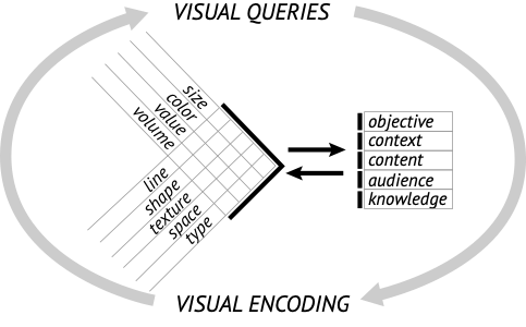
The Process of Information Visualization
The process of infoVis, like all creative design processes, is an iterative
cyclic system. The cycle that involves defining, research, analyzing, ideating,
visualizing, and evaluation are iterative, but also flexible and interconnected
(
Figure 1). The stage of
Visualizing includes a constant interplay between
visual
queries and
visual encoding. In his book
Visual Thinking for Design, Colin Ware defined
visual queries as the acts of attention involved in visual
thinking, which are “driving eye movements and tuning our
pattern-finding circuits”
[
Ware 2008].
Visual encoding is the mapping of information to visually
display elements [
Muzner 2015]. Skilled designers will visually
encode the data to support the visual queries, and different encoding strategies
will also alter the results of visual queries.
Aesthetics of Graphic Design and InfoVis
The visual encoding tools and strategies that have been heavily researched by
scientists and engineers are largely focused on solving functional requirements,
for example, how visual encoding technologies relate to multidimensional
databases or how they are applied to a particular programming language or
software [
Bostock et al. 2011]
[
Stolte et al. 2002]. But less attention has been paid to the aesthetics
or the visual appeals of the information being presented. In recent years, there
have been more efforts spent on visualization methods that are both visually
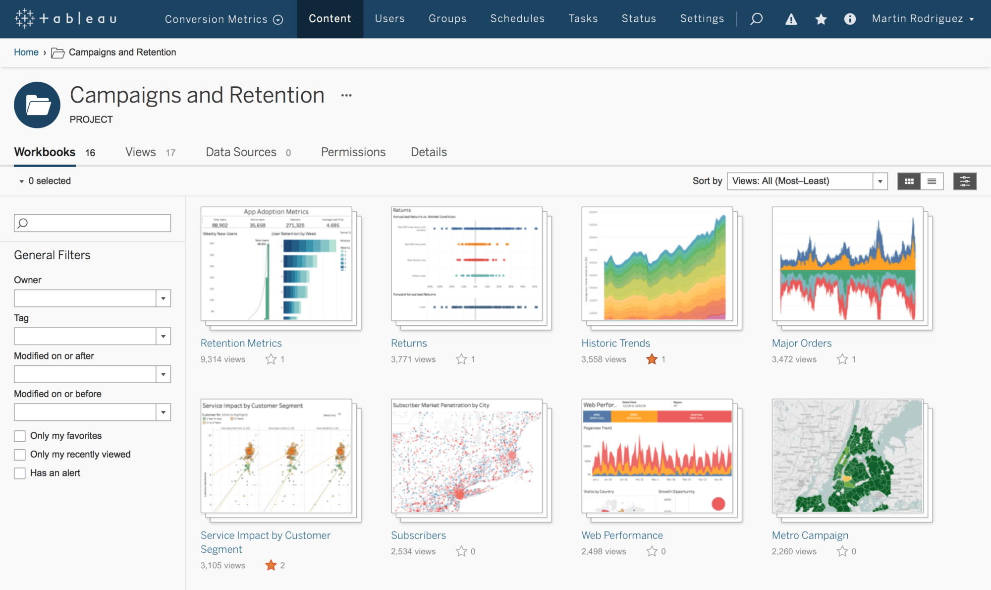
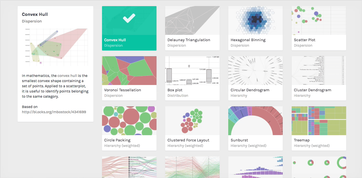
appealing as well as technically efficient. For example, popular visualization
tools such as Tableau and RAWGraphs (
Figures 2 and
3) both adopt modern design aesthetics that support better user
experience and user engagement. This is one way in which the field of graphic
design unifies the multi-faceted infoVis discipline.
The modern graphic design aesthetics, shaped by the Bauhaus School (1919-1933)
and the International Typographic Style (1950s), imply geometric layout, orderly
typography, effective use of white space, and simple color composition, foster
universal forms, and aim to objectify representations of cultural diversity by
making them appear economical and perceptually transparent [
Kostelnick 2004]. Edward Tufte, who is arguably the most
influential theoretician in information design and visualization, also stressed
the importance of “minimal and efficient” design [
Cairo 2013].
Tufte advocates the functionalism of information graphics: “Data graphics should draw the
viewer’s attention to the sense and substance of the data, not to
something else”
[
Tufte 2004, 91]. His notion of visual aesthetics rigidly follows minimalism and
anti-ornamentation for clear and elegant display. As the field of infoVis has
experienced a burst of popularity and growth to include various scientific and
computation-focused disciplines in recent years, graphic design’s involvement
must be reemphasized in regard to visualization content, perception, and
aesthetics.
Graphic designers’ efforts to find the perfect balance in aesthetic and
functional design principles are compatible with the cognition-based approach of
visualization scientists. In scientific fields, infoVis is considered as
cognitive tools in problem solving, so the focus is on visual perception, visual
attention, and the pattern of information processing. Similarly, the
effectiveness and efficiency of content delivery was advocated by modern graphic
designers who championed functional and universal visual language. Graphic
design’s visual language can be layered onto the pattern of information
processing to ensure visual appeal through essential visual elements such as
form, layout, typography, and use of color.
Visual Parameters in Science and Design
Visualization researchers such as Bertin, Cleveland, Ware, and Munzner identified
visual parameters as the foundation to generate well-known visualization
techniques. Visual parameters refer to the set of visual options that are used
to construct design solutions that meet a specific product requirement. This
visual encoding process known by the visualization scientists has a deep
connection with the foundational design education across art and design schools
around the world. The visual principles and attributes that contribute to the
parameters are either aligned with or responding to the design ideologies rooted
in Gestalt psychology and the Bauhaus school. One of the Bauhaus masters Wassily
Kandinsky exploited the design curriculum of studying forms and understanding
colors using psychology and perception (Wassily Kandinsky - Wikipedia, 2018).
However, regardless the shared knowledge base, there still are communication
gaps between visualization scientists and visualization
designers.
The visual education for scientists starts from analyzing data semantics and
types. Then they encode data with marks and channels. Munzner defines graphical
elements as marks, and visual channels are ways to control marks’ appearances
[
Muzner 2015]. Design students’ education starts from learning
points, lines, planes, and composition tactics. In the book
Exploring the Elements of Design, the authors identified two groups
of design elements - tangible and conditional [
Evans et al. 2013]s. The
tangible elements concern physical forms; and the conditional elements are the
ones only exist if the tangible element is established. Visual designers’ work
process pays more attention to achieving the best visual quality by actively
constructing different visual parameters [
Cross 2007]. The
comparisons of visual parameters included in Visualization (science) and Graphic
Design (design) are shown in Table1. The overlapping elements demonstrate the
similarities of visual constructions from the two approaches.
Visualization (science)
(Munzner,
2015) |
|
Graphic Design (design)
(Evans & Thomas,
2013) |
|
| Visual Marks |
Visual Channels |
Design Elements (tangible) |
Design Elements (conditional) |
| Points |
Size |
Space |
Size |
| Lines |
Color |
Line |
Color |
| Areas |
Position |
Texture |
Value |
|
Shape |
Shape |
Volume |
|
Tilt |
Type |
|
Table 1.
The visual parameter comparisons in science and design with shared
parameters italicized.
The shared or similar visual parameters, however, may be considered for different
functions and purposes between science and design. For example, the line mark in
science visualization is commonly seen as an element that can formulate
quantitative value through variation in size or position such as a bar chart or
line graph. But from the graphic design perspective, line is an element that can
be used to separate or divide information as well as to show connections and
links. It can indicate boundary or point out directions. Different styles of
lines also inherit various characteristics. Thin lines suggest delicacy and
convey a tranquil and elegant quality; and thick lines are often associated with
emphasis and strength (
Figure 4). Gesture lines
may also be used to represent form and movement (
Figure
5).
Design Elements in InfoVis Create a User-Centered Framework
InfoVis is a broad and exploratory discipline that requires a galaxy of disparate
tactics bind together to create functional and visually-engaging solutions.
Therefore, infoVis designers should not only know the practical meanings of the
visual parameters defined in the science field, but also understand how the
language of visual design can improve the aesthetic and functional quality. The
relationships between the concepts of form, function, and content may be obvious
to those with design training backgrounds, but less to the science and
humanities community who also create infoVis frequently in their fields [
Vande Moere and Purchase 2011].
In addition to aesthetic and usability concerns, the design considerations are
also crucial in identifying and framing the goals of the visualization.
Figure 6 demonstrates a modularity approach to
understand design elements in the context of visualization. Modern design
strictly follows a user-centered approach [
Norman 2002]. All
stages in the visualization process entail design thinking: the choice of data
set and attributes, as well as the visual encoding choice to support the visual
queries. How the contents are chosen, how the forms are constructed, how the
objective of the project is portrayed to the audiences through visual
representations, and how the messages can ultimately influence people’s
knowledge, attitudes, and behavior – the existence and choice of the design
elements always affect and are affected by these concerns. The connection
between these variables forms a dialogical approach that results in a framework
of the semantic components (right side) to be expressed through a particular set
of syntactic components (left side). Modifications of one side influence the
outcomes of the other. Different methods of organizing and expression can create
different perspectives and influence how the information is perceived. Each
individual component has its own purpose, yet they all rely on each other to
function as a unit.
To better understand the correlations between the two sets of modules, the next
section will study some student project examples that demonstrate how design
elements used in information visualization and information design projects help
to increase the quality of form and function. The examples reflect where design
glossaries are introduced and fed back into the visualization problem in a
non-design major information design and visualization course.
Case Studies
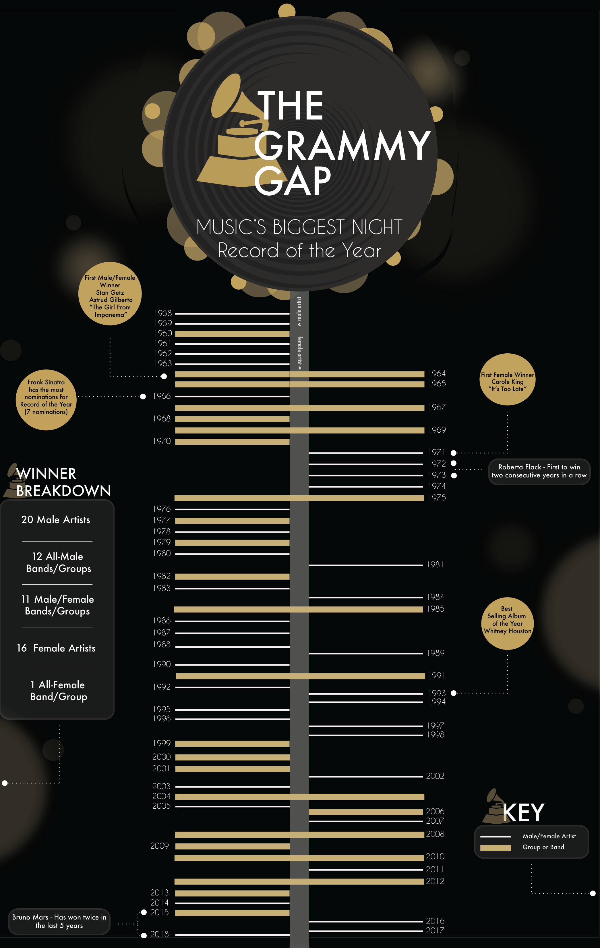
Line and Shape
The student project shown in
Figure 7 is based
on the data record of Grammy award winners. In this print-based project,
lines are used to perform different functions. They are used to separate
events on a timeline; the left or right direction separates the male and
female artists; and the weight variations (the strength, heaviness, or
darkness of a line) indicate different types of artists (a thin line
indicates an individual artist and a thick line indicates a group or a
band). Changing weights pushes the lines closer and further apart, they
create rhythms and dynamism in the composition. The lines and their
intervals also create the illusions of spatial depth that helps viewers have
a quick grasp of the gender distributions of Grammy winners through history.
The line element being considered from a graphic design perspective is able
to bring more meanings and visual dynamics to an otherwise unimaginative
regular timeline approach.
When lines meet to form an enclosed area, it becomes a shape. Every shape, no
matter how abstract it appears, carries meanings. Even the three primary
geometric shapes — circle, square, and triangle — convey different messages
to the audiences. The roundness and the continuity of a circle translate
completion and harmony. The equal straight lines and perfect right angles
make a square seem stable and formal. The sharp angles and points in
triangle embody active and aggressive sensations. The choice of shape is
critical if it is to communicate the right message to the audience.
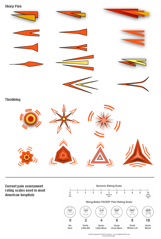
Figure 8 shows a portion of a visual pain study
based on research conducted for a medical pain visualization assessment
tool. Student used abstract shapes to metaphorically represent different
type and the intensity of pain. In contrast to the current popular Numeric
Rating Scale and the Wong–Baker Faces Pain Rating Scale, different qualities
of shapes add more dimensions to the scale of pain measurement. The
connotation of symbols is also an attempt to establish better communication
with the patients.
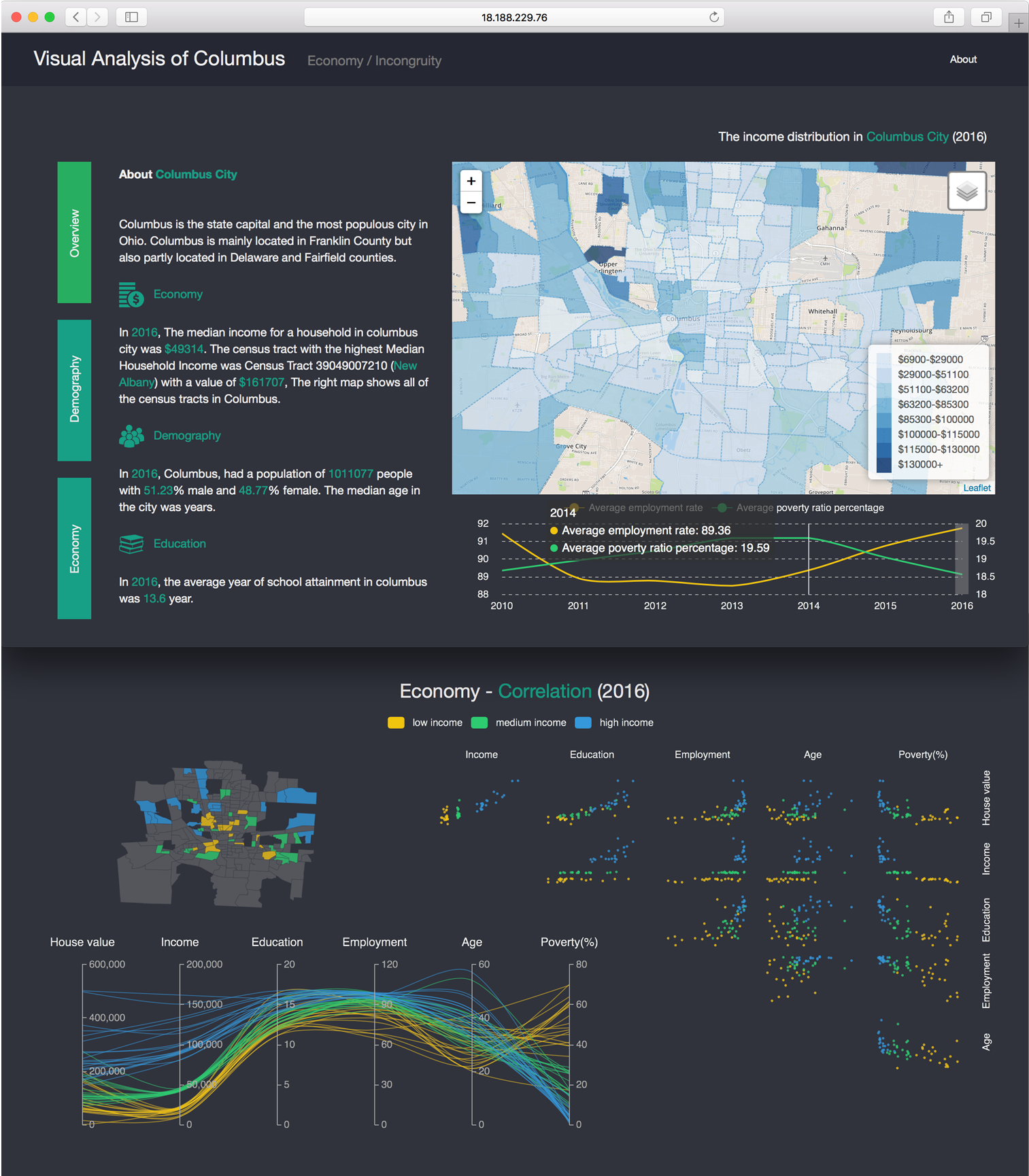
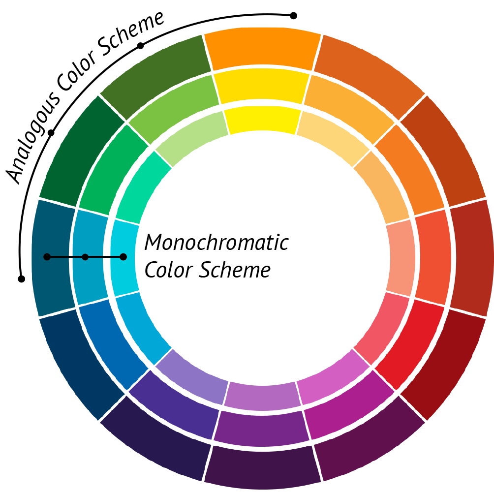
Color, Type, and Space
Colors in infoVis can help distinguish different types of information, as
well as reinforce the connection between groups of information. Charts and
diagrams in information design are often associated with color-coding.
Color-coding is the process of attaching a specific color to a category or
grouping of content to make it instantly recognizable. In the interactive
visualization project shown in
Figure 9,
different color usage strategies are applied to two similar maps. The design
of choropleth maps is based on the scales of value (brightness and darkness
of a particular hue) change so that the audience can easily perceive the
pattern density. Hue contrast (blue, yellow, green) are then applied to the
second map in order to emphasize the comparisons of the three distinct
groups. Graphic designers often rely on color wheels to choose effective and
balanced color palette for a visual composition. The value contrast shown in
the first map is considered as monochromatic color relationships which
include variations of value in one single color. The color choice on the
second map shows analogous color relationships which include one color and
its neighboring colors on a color wheel (
Figure
10). Both color combinations share a common blue hue and all are
closely related on a color wheel. This “designerly” way
of choosing color ensures varieties of colors to fulfil different purposes,
yet still represents a satisfying unity that is pleasing to the eye.
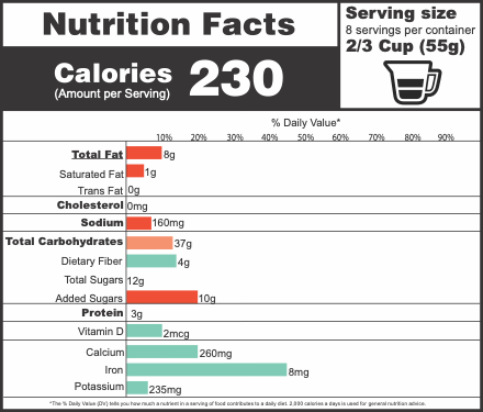
Color also inherits psychological connotations that can be used to influence
content. Its effect on imagery – both abstract and representational – is of
great concern for a given communication. The individual color applied to the
object or subject may influence the emotional responses in the viewer.
Figure 11 shows a nutrition label redesign
exercise that requires students to focus on using and organizing various
pieces of visual information. Complementary colors are used to contrast the
appearances and significations of the two types of nutrition ingredients.
Red color evokes the sense of warning to associate with “negative”
ingredients; while green, the color of life, is applied to healthy
ingredients.
The attention to typography and space are the other design considerations
practiced in this exercise. In infoVis the essential typographic concerns
are legibility and readability. Legibility refers to perception. It is the
ability to clearly distinguish one letter from another within a font.
Readability refers to comprehension. It examines how lines and paragraphs of
text can be easily read. The spatial relationships between letters, words,
and interlines, the length of the text line, the x-height of a letter form
and the font style are all important to readability issues [
Kunz 2002]. The layers of information in the nutrition label
are established through different styles and weight of the type, and how
space is structured within or between the visual elements.
Over the years, the Gestalt Principles have become invaluable tools for
designers to make sure that different visual components within a design
composition are well connected and coherent. Originally developed in the
field of psychology, Gestalt Principles are a set of laws describing how
humans tend to see objects by grouping similar elements, recognizing
patterns and simplifying complex images. Some principles are directly
related to information organization, such as the law of proximity. It
indicates how elements that are close to each other are perceived to be
related when compared with elements that are separate from each other. It
allows designers to use whitespace, for example, to build perceived
relationships between different elements. The label exercise demands
students to divide the information into different parts, then practice the
Gestalt Principles, and use mainly conditional design elements (see
Table 1) to organize content and create
hierarchy based on the level of importance among the content.
Conclusion and Discussion
The design projects discussed in the previous section require students to collect
and analyze structured or unstructured data and information, and use graphic
design principles and techniques to ensure the aesthetic and communication
qualities of the visualization. The visual choices made through graphic design
methods are all through logical reasoning. This essay uses cross-disciplinary
reviews of background research to demonstrate the value of graphic design
principles and methods in the realm of visualization education, without which
there can be a perceived lack of unifying content across the various courses or
disciplines that make up infoVis, especially on the part of students who take
those courses. It shows that the practice of developing a visualization should
be executed with an understanding of graphic design basics in mind, and with a
balanced consideration of tangible and conditional design elements, as well as
how these design elements fulfill the purpose of the objective, context,
content, audience, and the knowledge of the design outcomes.
Information or Data Visualization education would benefit from looking outside
of the traditional science domain, and adopting educational components from the
visual design discipline, such as those described in this paper. In addition to
understanding the basic design principles, tactics commonly used in graphic
design education that can lead to further explorations that fall outside the
scope of this essay may include: analyzing best practices, employing design
research methods, engaging in peer critiques, involving usability testing and
user evaluations, and further expanding the role of infoVis to the content of
service design and the trends of design for social good. They will also assist
the discussion and justification of the visualization process in
cross-disciplinary team practices.
Works Cited
Bertin 1983 Bertin, J. (1983). Semiology of Graphics. Redlands, California: Esri
Press.
Bostock et al. 2011 Bostock, M., Ogievetsky, V.,
& Heer, J. (2011). D3 data-driven documents.
IEEE transactions on visualization and computer
graphics, 17(12), 2301-2309.
Cairo 2013 Cairo, A. (2013). The Functional Art. New Riders.
Card 2007 Card, S. (2007). “Information Vsiualization”. In A. Sears, J. A. Jacko, A. Sears,
& J. A. Jacko (Eds.), The Human-Computer Interaction
Handbook: Fundamentals, Evolving Technologies, and Emerging
Applications (p. 542). Boca Raton, FL: CRC Press.
Card et al. 1999 Card, S., Mackinlay, J. D., &
Shneiderman, B. (1999). Readings in Information
Visualization: Using Vision to Think. San Francisco, CA: Morgan
Kaufmann Publishers Inc.
Cleveland 1993 Cleveland, W. S. (1993). Visualizing Data. Sumit, New Jersey: Hobart
Press.
Cross 2007 Cross, N. (2007). Designerly Ways of Knowing. Basel: Birkhauser.
Evans et al. 2013 Evans, P., & Thomas, M. A.
(2013). Exploring the Elements of Design. Delmar,
NY: Cengage Learning.
Kostelnick 2004 Kostelnick, C. (2004). “Melting-Pot Ideology, Modernist Aesthetics, and the Emergence
of Graphical Conventions: The Statistical Atlases of the United States,
1874-1925”. In C. Kostelnick, Defining Visual
Rehtorics (pp. 215-242). Mahwah, NJ: Lawrence Erlbaum
Associates.
Kunz 2002 Kunz, W. (2002). Typography: Macro-andMicroaesthetics. Sulgen: Niggli.
Muzner 2015 Munzner, T. (2015). Visualization Analysis & Design. Boca Raton:
Taylor & Francis Group.
Norman 2002 Norman, D. (2002). The Design of Everyday Things. New York, New York:
Basic Books.
Samara 2007 Samara, T. (2007). Design Elements - A Graphic Style Manual. Beverly, MA:
Rockport.
Stolte et al. 2002 Stolte, C., Tang, D., &
Hanrahan, P. (2002). “Polaris: A system for query, analysis,
and visualization of multidimensional relational databases”. IEEE Transactions on Visualization and Computer
Graphics, 8(1), 52-65.
Tufte 1997 Tufte, E. R. (1997). Visual Explanations. Cheshire, Connecticut: Graphics
Press.
Tufte 2004 Tufte, E. R. (2004). The Visual Display of Quantitative Inforation.
Cheshire, CT: Graphics Press LLC.
Vande Moere and Purchase 2011 Vande Moere, A.,
& Purchase, H. (2011). “On the Role of Design in
Information Visualization”. Information
Visualization, 356-371.
Ware 2008 Ware, C. (2008). Visual Thinking for Design. Morgan Kaufmann Publishers.
Wikipedia 2018 Wikipedia Contributors. (2018,
May 14). “Wassily Kandinsky”. In Wikipedia, The Free Encyclopedia Retrieved
https://en.wikipedia.org/wiki/Wassily_Kandinsky#Bauhaus_(1922%E2%80%931933)