Abstract
The proliferation of tools that enable anyone to create visualizations of their
data, even with limited experience or skills, has made data visualization more
accessible than ever before. This is true in its use in both teaching and
learning, as data visualization has increasingly taken on an important
pedagogical role in the classroom and in scholarly research. However, with this
proliferation of tools there has been a concomitant awareness that visualization
needs to be employed through a critical lens that acknowledges its
constructedness as explanatory medium and as a product of situated knowledges.
Here, I describe one approach to teaching this notion of constructedness via a
framework oriented around information literacy, which encourages critical
engagement with data, the tools we use to interrogate them, and the
visualizations we design to represent them. I describe this approach through a
collection of “critical dichotomies” used to evaluate the
authority and value of visualizations, which are mapped to a subset of the core
information literacy competencies defined in the ACRL
Framework for Information Literacy in Higher Education. To put these
dichotomies into practice, I further describe an interactive activity called
“Choose Your Own Adventure, with Data
Visualization,” in which participants are given paper and markers to
create booklets in the style of Choose Your Own
Adventure books and asked to consider the relationship between
active choices in the design process of a visualization and how a given
visualization is interpreted. In the process, I explore how this framework can
encourage us all, as critical practitioners of visualization, to think about the
practical relationship between data visualization and information literacy more
generally.
From situated data to constructed visualization
In “Humanities Approaches to Graphical Display”
(2011), Johanna Drucker urged the adoption of new language to encourage scholars
to think about data, their visual representation, and the nature of our
interpretation of them in a discourse more inclusive of humanistic and
qualitative modes of inquiry:
capta. “
Data are
capta,”
Drucker writes, continuing that data are “taken not given, constructed as an interpretation of
the phenomenal world, not inherent in it.” Whereas
capta
are collected and parametrized in ways that depend directly upon the modes
through which we observe them – an act in which we ourselves are implicated as
collectors, reporters, and creators –
data are often conceived as
existing a priori, waiting around somewhere to be observed. Thus, whereas
data presumes observer independence and absolutism,
capta acknowledges the situatedness and observer codependence
of the interpretive act. Reinterpreted through another frame, these sentiments
are echoed by scholars such as Catherine D’Ignazio and Hill et al. who write on
feminist perspectives on data, noting that feminist frameworks about the
situatedness of knowledge can be helpful for thinking about how we engage with
data and their representations as objective representations of reality [
D’Ignazio 2015]
[
Hill et al. 2016]. Zooming out further, such interrogations of the
social and technological pedigrees of objectivity and neutrality have been
increasingly found in other disciplines as well, such as science and technology
studies [
Daston and Galison 2007], critical cartography [
Crampton and Krygier 2006], and critical race theory [
Gillborn et al. 2018], to name a few.
Examined through these lenses, it appears there is no shortage of humanistic
inquiry into the privileged authority granted to objective expressions of the
phenomenal world that are pervasive in quantitative research, reinvigorated by
the data-dense environment of the current age. Moving from data to their visual
representation, then, requires few leaps to see the consequences that a
framework oriented around situated knowledge has on how we engage with the media
we use to interpret them. To think in these terms is to conceive of data
communicated in visually or graphically motivated form – a data visualization –
as constructed space, one in which the value of a visualization is inflected by
the cultural and political forces embedded within the design choices of its
creator and the interpretive act of the user. While we may perceive
visualizations as objective, complete, and authoritative [
Kennedy et al. 2016], the reality is that they too are constructed, just
as the
capta that underlie them are themselves. And yet, the
visualization still often stands for, in one-to-one identity, that which it
actually represents, as a statement of fact. As Drucker more recently notes
(2017), we continue to prioritize approaches to visualization that assume this
one-to-one correspondence:
In a representational paradigm,
the relation between data and display is uni-directional, the data
precede the display, and the data are presumed to have some reliable
representational relation to the phenomena from which they have been
abstracted. The display functions as a surrogate for the data — which is
itself a surrogate, adequate or inadequate, for some phenomena. Simply
put, the display stands for the data, is a re-presentation of the data.
But visualizations are generally taken to be a presentation, a statement
(of fact, or argument, or process), rather than a representation
(surrogate) produced by a complex process…Instead, we should consider
that visualizations are usually representations (constructions) passing
themselves off as presentations (statements of self-evident
fact).
[Drucker 2017]
Understood in this way, objectivity in visual representation is thus
inherently compromised by the intervention of human hands; when the
visualization itself stands in as surrogate for that which is beneath it, what
results is the illusion that mediated knowledge is actually absolute if
interrogated and framed in the rightly-phrased way.
These perspectives are not particularly new, but what is momentous is their
interrogation in those domains that are grappling with the role of the
computational and quantitative in the scholarly process – including digital
humanities. Across the humanities disciplines that have integrated computational
modes of analysis, data visualization (or information visualization) is an
increasingly dominant force, and as such it carries with it the requisite
challenges that accompany any new medium or discourse of analysis employed in
humanistic scholarship and teaching. Given visual representation conceived as
constructed space, how do we validate the authority and utility of visualization
as both process and artifact of research, especially with the proliferation of
tools that make creating data visualizations easy with minimal user
intervention? From a critical theory perspective, this is an important question.
To explore this question is to formulate a more holistic understanding of
visualization and its consequences in both theory and practice, one that
accounts for not only visualization in the methodological domain but also the
social, ethical, political, and epistemological ones [
Kennedy et al. 2016]. In short, this means literacies in many forms that extend beyond the written
word – numerical, graphical/visual, information – that enable the individual to
critically engage with data, the tools that organize and engage with them, and
the visual representations we craft of them to facilitate interpretation.
Becoming critical practitioners of data and visualization in this way can happen
via many modalities and in many spaces. Perhaps surprisingly, I argue that
libraries are among those spaces that are naturally positioned to encourage this
kind of engagement, given their interest in information literacy, and libraries
can offer useful entry points for considering how such literacies around data
and visualization might be integrated into the curriculum. A clear example of
this is offered by the
ACRL Framework for Information
Literacy in Higher Education, which outlines six core frames or
competencies in information literacy around which libraries are encouraged to
provide support [
ACRL Board 2016]. These frames emphasize the
theoretical underpinnings necessary for handling information with a critical
eye, defining information literacy “as
the set of integrated abilities encompassing the reflective discovery of
information, the understanding of how information is produced and valued,
and the use of information in creating new knowledge and participating
ethically in communities of learning.” Data, as one particular
expression of information, falls within the purview of information literacy [
Koltay 2017] – and by extension, I argue, as do those
representations based on data with which we commonly engage, including
visualization.
In the Northeastern University Library, the competencies described in the ACRL Framework have become an integral component in
how concepts and principles in information design are taught in workshops,
lectures, and consultations. Given the university’s strategic orientation
towards data- and computation-motivated modes of scholarly inquiry, exploring
what it means from the perspective of librarianship to critically engage with
data visualization in increasingly interdisciplinary spaces has been a useful
exercise for collaborations with digital humanities researchers on campus. In
this paper, I describe how these elements of the Framework manifest in my approach to teaching information literacy
through data visualization. I then describe one interactive activity I have
employed to teach these concepts that comes in the form of a Choose Your Own Adventure book, using data
visualization instead of prose as the medium of narrative. In the process, I
discuss the role that data visualization can more generally play in teaching
core competencies in information literacy.
The ACRL Framework in information visualization
Although the
ACRL Framework focuses on competencies
related to critical engagement with information sources more generally, it also
provides a useful starting point for discussions on what it means to employ such
competencies specifically in the context of data visualization. The
Framework as a whole consists of six different frames,
each of which focuses on a different facet of the information creation and
consumption process:
- Authority is constructed and contextual
- Information creation as a process
- Information has value
- Research as inquiry
- Scholarship as conversation
- Searching as strategic exploration
When examined from the
capta and
visualization as
constructed space perspectives described above, two of these
prescribed frames emerge as being particularly significant. In the first of
these,
Authority is constructed and contextual, the
Framework notes that the authority of information is a
product of many intersecting influences and may be fluid depending upon the
context in which it is created and used. Accordingly, mastery of this frame
indicates an understanding of “the need to
determine the validity of the information created by different authorities
and to acknowledge biases that privilege some sources of authority over
others, especially in terms of others’ worldviews, gender, sexual
orientation, and cultural orientations.” Meanwhile, the second frame,
Information creation as a process, emphasizes the idea that the
quality, meaning, and value of information is a product of the processes of
scholarship in which it is created. “Recognizing the nature of information creation,” this frame asserts,
“experts look to the underlying processes
of creation as well as the final product to critically evaluate the
usefulness of the information.” In this way, the
Framework offers a useful backdrop against which critical thinking
about information visualization can be taught.
In the Northeastern University Library, where support services are available to
researchers in the campus community around information visualization and design,
these basic concepts are taught and discussed through “critical
dichotomies” that can help guide our thinking about specific
design choices we make in the creative process of data visualization (
Figure 1). These dichotomies are conceptualized as
modes of wayfinding for evaluating the design choices we make in the process of
creating a visualization, emphasizing the idea that design is an embodied
process, not merely an endpoint. By examining these dichotomies, I argue, we can
become better-equipped to critically dissect the meaning, value, and authority
of a particular visualization, following the guidelines of the frames described
above, given the contexts in which it is created and interpreted. These
dichotomies provide a theoretical foundation upon which practical design
considerations may be evaluated and through which a
data as capta
perspective may be discussed.
The first of these dichotomies is
proxy and artifact, which
encourages design choices that principally reflect real observed changes in data
as opposed to those that suggest the appearance of patterns that are actually
artifacts of human perception. Research in cognitive science and psychology has
shown that human visual perception is susceptible to biases that can distort
what we see. Optical illusions, for example, achieve this effect of distortion
by taking advantage of the limitations and inaccuracies of human vision to
create mismatches between what the brain believes it is seeing and what it is
actually seeing. As a result, human eyes can be tricked into seeing shapes and
colors that are not physically present by merely combining elements of geometry,
color, and space to artificially alter the perspective that the brain constructs
in the process of perception [
Meirelles 2013]. In the process of
designing a visualization, these effects can arise as well in ways we may not
notice. A good example is the use of perceptually non-uniform color palettes in
visualizations, especially with respect to the widely-used rainbow color scheme,
which can produce impressions of artificial boundaries between hues and
consequently artificial boundaries in data [
Borland 2007]. In the
language of capta, the proxy/artifact dichotomy emphasizes the constructedness
of interpreted meaning in a visualization, especially when that meaning is
facilitated by design choices that prioritize approaches to visualization that
presume a visualization stands in as declarative presentation of the data that
precede it. In this sense, this dichotomy also maps to the frame
Authority
is constructed and contextual, emphasizing the role that design can
specifically play in crafting the relative perceived authority of any given
visualization.
The second critical dichotomy is
parsimony and diminishing returns.
Modeled after Edward Tufte’s data-ink ratio concept, which argues that the
amount of ink in a visualization should change proportionately with changes in
the data that such ink represents [
Tufte 2001], this dichotomy
aims to remind us that not all design choices are made equal in their
contribution to a visualization. While the addition of data, ink, and complexity
to a visualization may be accompanied by a proportional increase in meaning,
value, and utility up to a certain point, there are additions to a design of the
type that yield no appreciable return in the efficacy of what it is trying to
communicate. Thus,
parsimony and diminishing returns encourages an
economical understanding of data visualization, arguing that good design is a
careful balance between choices that maximize the message being communicated and
the aesthetics of the medium through which that communication occurs. Such a
framing encourages a tighter hermeneutical association between data and their
visualization by minimizing the space for purely positivist and representational
channels for crafting meaning in data. This dichotomy also points attention to
the notion of information creation as process, whereby the meaning and value of
a visualization is tightly coupled to the procedure by which it is created.
This dichotomy is followed by
reductionism and holism, which
describes the wide range of scales and resolutions across which visualizations
operate in practical usage. In the language of Franco Moretti, this is also
understood as the relationship between distant and close reading of a text;
through visualization, we may switch between a close reading of a set of data
that emphasizes a high degree of detail in the data or a more distant reading
that emphasizes the bigger picture of patterns in the data [
Moretti 2013]. When we design a visualization, we must maintain
awareness of these different levels of understanding as the resolution at which
we communicate our message informs the ways in which that message may be
interpreted – put another way, the ways in which our data become crafted,
composed, and graphically motivated.
Collectively, these first three dichotomies map to the Framework frame of Information creation as a process,
highlighting the reality that the design of a visualization requires an ongoing
reassessment of objectives and assumptions in the choices we make. The final
critical dichotomy, which is authority and bias, maps primarily to
the frame of Authority is constructed and contextual. In this
dichotomy, we are reminded that there is no such thing as the singular
visualization, the best possible visual representation of a set of data.
Instead, any single visualization grabs only a differential slice of a larger
narrative, and it is incumbent upon us as practitioners of information design to
remember that for any one visual representation, there are many other
possibilities that have not been expressed. In this way, signatures of authority
and bias operate in tension with one another because a visualization is at once
a statement of information authority and the product of a design process that is
intrinsically biased by the motivations of the designer and interpreter.
The concepts behind these dichotomies are taught in the Northeastern University
Library within a conceptual framework that discusses ways of building and
shifting visual narrative, as shown in
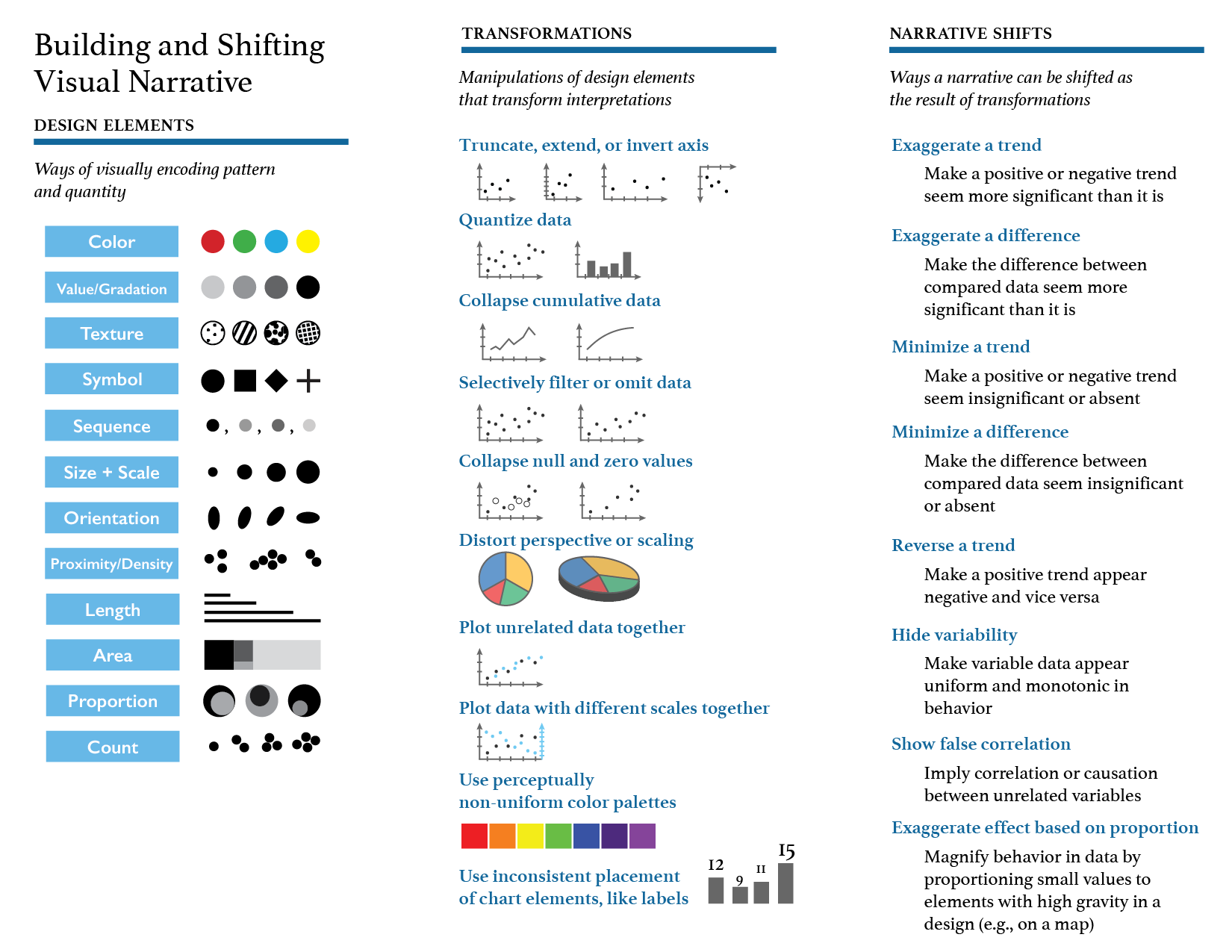
Figure 2.
This framework is built upon a set of design elements (i.e., preattentive
graphical elements and visual encodings used in visualization design, like
color, symbol, size, and length [
Ware 2008]) from which
transformations, or manipulations of design elements, may be used to engender
narrative shifts, or ways the meaning or interpretation of a visualization can
be shifted. These transformations and shifts include typical manipulations
commonly seen in visualizations, such as skewing or truncating axes to
exaggerate or minimize trends, as well as less noticeable manipulations, like
the use of perceptually non-uniform color palettes to exaggerate effects in data
based on proportional design area (such as when coloring geographic or cadastral
maps). By examining how these manipulations occur organically in examples of
real visualizations seen in the academic literature and popular media, students
become better-equipped to recognize manipulations in the visualizations they
produce and encounter in their daily lives.
The use of real life examples of visualizations is a good starting point to help
students understand these concepts, but I have employed other more creative
strategies for enabling students to grapple with and apply them in direct,
practical, and engaging ways. What does it mean to practically apply these
concepts in the process of visualizing data, and how do the impressions they
leave behind in the design process inform interpretation of the final
visualization created? Put another way, what does it mean to create a
visualization that is self-aware, one in which the situatedness of its data (or
capta) is faithfully communicated? In one such strategy, I devised an activity
titled “Choose Your Own Adventure, with Data
Visualization.” In this activity, participants are asked to design
their own flipbook in the style of
Choose Your Own
Adventure books
[1], which are short novels
in which the reader is invited to follow multiple different possible storylines
based on prompts that follow branching page sequences. Using this format, it
becomes possible to engage participants in discussion about how small changes in
design can result in significant changes in the meaning communicated by a
visualization, especially when framed around the critical dichotomies described
above and their correlating interpretive shifts.
Choose Your Own Adventure, with Data Visualization
In this activity, each participant is invited to create their own
Choose Your Own Adventure book using paper and
markers. The page templates, described in
Table 1,
are printed and cut out, and each participant is asked to take the required
number of pages to create their book. Markers are handed out that participants
may use for this process.
| Type |
Quantity |
| Cover page |
1 |
| Introduction: “Lo, brave traveler!” |
1 |
| Data declaration page |
1 |
| Data selection page |
1 |
| Stop page: “How will you continue?” |
As many as needed |
| Outcome page |
As many as needed |
Table 1.
Page components required for the “Choose Your Own Adventure, with Data
Visualization” activity
To begin, each participant is asked to select 2 different sets of data from a
bank of sample data provided. These data sets, examples of which are shown in
Table 2, are taken from Tyler Vigen’s website
Spurious Correlations[2], a
collection of visualizations that demonstrate humorous examples of variables
that appear to be correlated statistically but have no real-life causal
connection between them. After this, participants are asked to choose six to
eight outcomes from the narrative shift options provided, as well as two to
three different kinds of visualizations (for example, bar charts and line
charts) to use in constructing those narrative shifts. For each narrative shift
outcome, the participant draws out the different transformation step sequences
required to reach it, using the design transformation techniques presented.
Finally, once the sequential visualizations for each narrative shift outcome are
all created, the participants number the pages, fill in any page references
within the book structure, and assemble the book’s pages with a stapler.
| Year |
1999 |
2000 |
2001 |
2002 |
2003 |
2004 |
2005 |
2006 |
2007 |
2008 |
2009 |
| Per capita consumption of whole milk in
gallons |
|
-- |
7.7 |
7.4 |
7.3 |
7.2 |
7 |
6.6 |
6.5 |
6.1 |
5.9 |
5.7 |
| Divorce rate in Washington per 1000
people |
|
-- |
4.6 |
4.5 |
4.6 |
4.4 |
4.3 |
4.3 |
4.1 |
4 |
3.9 |
3.9 |
| Per capita consumption of cheese
(pounds) |
|
-- |
29.8 |
30.1 |
30.5 |
30.6 |
31.3 |
31.7 |
32.6 |
33.1 |
32.7 |
32.8 |
| Number of people who drown by falling into a
pool |
|
109 |
102 |
102 |
98 |
85 |
95 |
96 |
98 |
123 |
94 |
102 |
| Number of films Nicolas Cage appeared in |
|
2 |
2 |
2 |
3 |
1 |
1 |
2 |
3 |
4 |
1 |
4 |
| Number of people killed by venomous
spiders |
|
6 |
5 |
5 |
10 |
8 |
14 |
10 |
4 |
8 |
5 |
6 |
Table 2.
Example data sets, taking from Tyler Vigen’s Spurious Correlations
In the process of creating these books, participants are asked to think about the
design choices they commonly make when creating visualizations of their own as
well as the design elements they encounter in visualizations on a daily basis.
To guide this thinking, the following questions are asked as participants work
with their data:
- What patterns appear to be intrinsic to the sets of data being used,
and how do we validate the truthfulness of those patterns?
- What conclusions emerge organically from those patterns, and what
conclusions may be crafted?
- How do we confirm or dispute the validity of those conclusions?
- What knowledge do those conclusions impart, and how is that knowledge
motivated by the way the data are visualized?
- How can particular design choices be used to translate those patterns
into knowledge in a way that is faithful to the data themselves?
In this way, participants are encouraged to think of visualizations as
forms of dialogue rather than statements of fact – a nod to Drucker’s
characterization of the declarative nature of representational approaches to
visualization [
Drucker 2017]. When elements of design are
understood as the language and grammar used in expressing a narrative in
graphical form, it becomes easier to acknowledge the subjective nature of
visualization and representation.
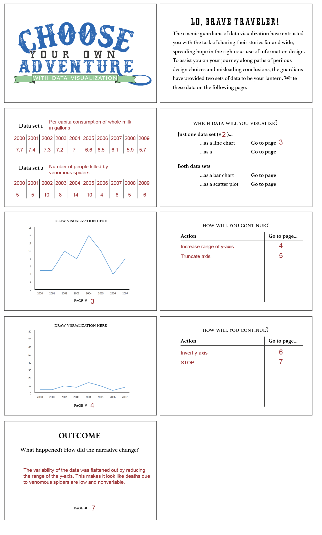
Figure 3 provides the general process for creating
a book, and
Figure 4 provides an example of a
small section from a completed book. In this example, two data sets are
selected: one about per capita consumption of whole milk in gallons from the
years 2000–2009, and another about the number of people killed by venomous
spiders over the same range of years. The book begins with an appeal to its
author:
Lo, brave traveler! The cosmic
guardians of data visualization have entrusted you with the task of sharing
their stories far and wide, spreading hope in the righteous use of
information design. To assist you on your journey along paths of perilous
design choices and misleading conclusions, the guardians have provided two
sets of data to be your lantern. Write these data on the following
page.
With this provocation, the participant is subsequently asked
to create the visualization paths for the book. In this example, the data about
venomous spider deaths is used to create a line chart. This line chart is then
manipulated by skewing the range of the y-axis, which leads to an outcome page.
Here, the outcome that results is a flattening of the variability in the data by
reducing the range of the axis, making it appear as though deaths due to
venomous spiders are low and invariable.
In this way, participants are invited to engage with the two frames from the
ACRL Framework stated above. By physically
going through the process of manipulating simple visualizations and creating
their own books, participants are invited to reflect on the idea that
information creation is indeed a process, one that is mired in a complex
intersection of influences and biases that informs how a visualization may be
interpreted. Likewise, participants also see that authority is indeed
contextual, the value and meaning of a visualization being directly dependent
upon those influences and biases. By engaging with the medium of data
visualization through the “Choose Your Own
Adventure” activity, participants are encouraged to consider what it
means to be more critical practitioners of data visualization in these frames in
their own scholarship and daily lives. And in that process, thinking about data
as capta becomes an embodied act, particularly as participants explore what it
means to parse out the design process of a visualization in a way that makes the
visualization more self-aware.
This activity has been attempted twice, and both times it was received well
overall by participants, who found it to be an exercise that was both useful and
fun for thinking about the critical choices they make when designing a
visualization. It also benefitted from the added bonus of providing participants
with something tangible to take away from the workshop, to which they could
refer in the future when designing their own visualizations. The only major
challenge to the activity is the often limited availability of time – at least
one hour is needed to provide plenty of space for creative expression and
critical assessment.
The materials for these pages are available in the Northeastern University
Library Digital Repository Service
[3]. In the future, it
may be possible to create an online interactive version of this exercise that
automates the creation of pages while enabling users to create and manipulate
their visualizations within a graphical user interface.
Conclusion
As data visualization becomes an increasingly important and common tool in
scholarship and teaching, there has been a concomitant increase in the
recognized importance of being able to engage with visualization critically.
Here, I described one approach to supporting this kind of critical engagement as
expressed through competencies in information literacy, leveraging the ACRL Framework, a collection of critical dichotomies
for evaluating visualizations, and an activity that seeks to teach these
concepts in the format of a Choose Your Own
Adventure book. Collectively, this approach emphasizes the active
role the individual plays in designing and interpreting visualizations,
encouraging students to interrogate what it means to conceptualize visualization
as a creative, constructive medium where representation is discursive rather
than absolutely defined.
Designing for data visualization in this way requires a holistic view of the
complex relationships that exist between all entities involved, including data,
representation (visualization), designer, and user. When considered as a complex
system of interactions and conversations between these entities, the design of a
visualization becomes an exercise in which we are actively engaged with the
discursive dimensions of data and information. This discursive dimension is a
reflection of Drucker’s definition of capta, which
emphasizes the ways in which we are fundamentally implicated in the construction
of data and their representation we may conventionally perceive as static,
absolute, objective, and authoritative. An understanding of these relationships
is essential for engaging holistically with visualization as a medium of
knowledge, and as a result, it is important to acknowledge the influence that
our conceptions of information, knowledge, and the relationship between them –
as evidenced by the critical dichotomies described above – impart to the design
process.
Through creative activities like the one described here, it becomes easier to
effectively teach core competencies around critical thinking in information
design, especially when framed around concepts in information literacy. As
information design is itself a creative act, pedagogical approaches that are
inherently creative and experientially oriented can play a significant role in
generating tangible, hands-on understanding of highly abstract concepts. In the
process, students can be encouraged to assess the ways in which they form
relationships between information and their representation, at the same time
tuning into the constructedness of data. By understanding visualization as a
medium for exposing these relationships, students can become better equipped to
be critical practitioners of all forms of visual representation, not only as
designers but also as consumers.