Abstract
My paper contains original “Word Processor Art” compositions and an
explanation of the theoretical grounding for my work. I compose visual images
(comprised of words primarily taken from advertisements about the object they
construct) in a program not intended for that purpose (Microsoft Word). I break
from the expected form of the “Word Processor Document” to scrutinize how
machines, especially computer programs and the graphical user interface (GUI),
influence the consumer's utilization of computers. In particular, my project
questions how machines influence users' thinking and how the
“user-friendly” inhibits creativity. The process disassembles the
notion of “user-friendly” as a transparent influence and reveals how media
shapes the author's imagination and creations.
The ever-present PC, in many ways, parallels the presence of the typewriter in
the 1950s, 60s and 70s, which led artists to experiment with the grid-like form
of mechanical type to create concrete and, eventually, dirty concrete poetry. My
work is inspired by these artists and the typewriter poetry they composed. My
work also references art collective JODI's compositions and how our contemporary
society resists the limitations of the GUI.
My intent is to draw attention to the media of the composition. My work disobeys
the prompts of the GUI to emphasize the idea that pre-packaged programs elicit
conditioned responses and stifle genuinely creative uses of computing devices.
Nietzsche writes that “our writing
tools are also working on our thoughts” (quoted in [Kittler 1986, 200]). My purpose in producing this work is not
a rejection of computing or the GUI, but to draw attention to an interface’s
existence and influence on its user. My work points to a creative space outside
of conditioned responses to the GUI.
Nietzsche writes that “our writing tools
are also working on our thoughts” (Nietzsche, cited in [
Kittler 1986, 200]). Avid users of technology justify their
reliance on technology, because they believe that these devices facilitate, speed,
strengthen, or seemingly eliminate the unnecessary or unproductive from commonly
occurring activities. However, this relationship between the user and the device is
anything but one-sided. Rather, a user begins to anticipate the exclusion of these
processes, trading cognition for output. Nietzsche’s observation translates to the
21st century: our digital tools work on our thoughts, and the result is undesirable.
The standardization of “user-friendly” and its seemingly invisible presence
teaches its users, through inculcation, to respond to machines' prompts. Users
engage particular programs for prescribed purposes and anticipate a predictable type
of product. Contemporary, American, techno-centric culture accepts the incredibly
specific role “creators,” the makers of machines and their programs, design for
consumers of computers. The constant exposure to media as tools for communication
and expression dulls creative thought processes by training users to simply respond
as the program's designers expect. This does not have to be the case.
In the following paper, I disobey the conventions of Microsoft Word to demonstrate
that, despite the corporate intention of its marketers, the controlled ways users
interact with their machines need not be obstacles to creative thought; rather,
these mechanisms, programs and the Graphical User Interface (GUI), can serve to
assist in the creation of new forms of expression. In my project, I create visual
images out of words, using a program not intended for that purpose (Microsoft Word).
By breaking from the expected form of output, which resembles what I am creating in
this text, I ask the audience to scrutinize how machines, especially the GUI of
modern computers, limit the consumer's creative utilization of computers. The GUI
utilizes visual icons (trash cans, menus, etc.) as an electronic platform through
which users interact with technology in lieu of command-line interfaces. My work
questions how the manufacturers’ notion of “user-friendly”, both through
programs and the GUI, deliberately inhibits creativity in the effort to create
passive, unthinking consumers, who use uniform products in predictable and
prescribed ways. Resisting this level of corporate control, I manipulate a program
in ways not intended by its creators. By fighting limitations inherent in the
average consumer’s personal computing experience, I disassemble the notion of
“user-friendly” as a transparent and benign influence. Rather, digital
tools, which should aid the user, hazard becoming potentially
disruptive censors, which discourage exploration of the digital page and stifle the
author’s creative imagination.
The first digital poetry surfaced in the 1950s and surged with the emergence of the
personal computer in the 1980s. As digital compositions evolved from the printed
page to include generative, kinetic, interactive, and multimedia work, these pieces
continued to rely on the computer screen as a space for composition. Since my work
draws much inspiration from the work of concrete and dirty concrete poets, my poems
rely on the “shaping of the poem [as]
an embodiment of its content,” or in some cases as the foil of its
content [
Funkhouser 2007, 13]. This qualifies my work as what
Christopher Funkhouser names static visual digital poetry. He states that
Static works – or poems that do not
move – are made from one of two distinct approaches: they are either shaped
by an artist (presented to readers in print or in an exhibition setting) or
built as viewer-activated work (viewed onscreen or printed out). Digitally
rendered poems portray at least three different traits: words are arranged
into literal shapes; words show patterns that represent dispersal or
displacement of language; or words are combined with images (as in a
collage).
[Funkhouser 2007]
I shaped my work as a static presentation, meant to be viewed, not altered, by the
reader. The “literal shape” of my compositions alters the way in which the
reader engages with both the text and image, and draws attention to how form and
content intertwine. Rather than simply reading the words that make up my
compositions, a reader must grapple with the shape the poem has taken. According to
Funkhouser, the diverse body of static visual poetry relies on both shape and text
in its composition, but engages with the visual and textual in widely different
ways.
[1] My own work expands on the body of currently existing visual digital poetry,
through my method of selecting and arranging textual material.
On the most basic level, my poems purposefully layer media to deconstruct the
marketed purpose of their medium (Word Processor). Their new construction creates a
place where printed advertisements, physical objects, producer intentions, interface
restrictions, and user creativities collide. First and foremost, my poems undermine
the comfortable and familiar constraints of the word processor. Instead of using
Word to compose the expected products (8.5 x 11 inch page after page), I imitate
hacker-typewriter artists of the dirty concrete movement like Steve McCaffrey, bp
Nichol, John Riddell, and Robert Zend, who relied on the grid of the typewriter page
as a canvas for their creations. Much like these authors reimagined the grid of the
typewriter page as a place where typographical rules might or might not apply, I
envision the digital page as a place for something other than prose
compositions.
In my own compositions, I draw attention to the limitations and requirements of the
computer as media and the word processor as a program, when it is obeyed. As I
deviate from the expected format, a remarkable number of red, green, or blue
squiggly lines alert that my composition has not behaved well. Spellchecking and
grammar warnings initially mar these reconstructions. Becoming an unfriendly user, I
click through layers of menus and disable the bulk of the surface-level constraints
Microsoft Word imposes and continue composing.
Distributers prime consumers to be receptive to their product long before it is ever
in their hands. That is, consumers use a product in the way producers instruct them
to use it; they color within the lines. In order to simplify production, minimize
user error, protect copyrights, and make money, producers standardize not only their
products, but also the marketed uses of these products. They eliminate access to the
product’s inner workings to promote only particular utilization of the machine. They
teach their consumers obedience, which
The Oxford English
Dictionary defines as “compliance with or performance of a
command, law, etc.”
[
OED Online]. The producers of a machine rely on the willingness of its customers to
comply with the marketed use of the machine and its applications, in order to
achieve a product that universally appeals.
By disobeying machines' prompts, a creator can use constraints as a source of
inspiration to rediscover a space for creativity that has long been ignored, in lieu
of mass-marketed, user-friendly technology. My compositions criticize the media’s
self-promoted user-friendliness by using its original product advertising as the
foundation of each poem. I reassemble old advertisements, articles, and instruction
manuals in the two dimensional shape of the product on the pages of a word
processor. Visual icons and rhetorical devices, meant to seduce the user into
“properly” using this newly available technology, confront the user in this
new construction, which takes shape in a program intended for prose-like
compositions. In
Media Parasites in the Early
Avant-Garde, Arndt Niebisch informs that the “abuse of media” requires one to “(ab)use media technologies… in the
system in a way not intended by hegemonic powers”
[
Niebisch 2012]. Rather than conforming to the expectations of the digital page, one ought to
defy them. This deliberate, albeit limited, subversion demonstrates the author’s
awareness of processes behind the most accessible interface. Working against these
constraints creates opportunities to think critically in forgotten, invisible
spaces, and to shirk off the often unacknowledged influences of user-friendly.
But why resist these constraints in this way? Well-meaning producers of products,
who want to sell lots and lots of their products, inhibit (intentionally or
unintentionally) the creative uses of their products by stressing their
user-friendliness and cutting off the user’s access to the product’s inner workings.
Although this logic follows from a marketing standpoint (why
not
protect the interests of the company through copyrights and closing off the
system?), it involuntarily circumvents the machine’s processes, writing them off as
necessary and seamless. The old adage, “It’s about the journey, not the
destination” surprisingly simplifies what should be obvious to the consumer.
In always skipping to the end, the user misses opportunities for creation and
innovation. In his chapter “The Unworkable Interface”,
Alexander Galloway revises McLuhan’s idea that the “medium is the message”, writing:
Politics thus reveals why the door
or window theory of the interface is inadequate. The door-window model,
handed down from McLuhan, can only ever reveal one thing, that the
interface is a palimpsest. It can only ever reveal that the interface is
a reprocessing of some other media that came before.
On this point I will be absolutely clear; a palimpsest the interface may
be; yet it is still more useful to take the ultimate step, to suggest
that the layers of the palimpsest themselves are “data” that must
be interpreted. To this end, it is more useful to analyze the intraface
using the principle of parallel aesthetic events, and to claim that
these parallel events reveal something about the medium and about
contemporary life. [Galloway 2012]
Galloway stresses the idea that each “layer” of the medium reveals something
about the culture in which that medium exists. If we are to follow the layers of
traces that he describes, then we should expect to access some essential truth by
sifting through the effaced, the constructed, and the erased. The fact is, consumers
have been taught to accept that there is nothing to excavate below the surface of
the GUI. The GUI masks the product’s processes under the guise of facilitation, not
inhibition. Does this make the processes and programs of our computers and smart
phones faster and more accessible? Sure. Do users feel like unimpeded, even
liberated, creators, who need not be bogged down with the particulars of messy
programming? Mostly. However, this compulsory system, which reveals nothing to the
vast majority of users about what happens between input A and output Z, provides
almost no opportunity for an individual who might find meaning in what occurs in
between. That space is a missed opportunity to create, expand, and innovate, if the
user is willing to fight the system rather than merely conform to conditioned
expectations.
Fighting the system is difficult, especially when the producers of the systems are
working hard to make working with their products seem effortless. Galloway describes
the artistic impulse of these programmers, stating “Today’s ludic capitalist is
therefore the consummate poet-designer, forever coaxing new value out of
raw, systemic interactions (consider the example of Google). And all the
rest has changed to follow the same rubric: labor itself is now play, just
as play becomes more and more laborious […]”
[
Galloway 2012, 29]. The overlap of work and play conflate our society’s ideas about the
boundaries of those two worlds. To take Galloway’s example of Google further, if he
is correct, then the makers of Google’s seemingly infinite algorithms, maps, search
engines, etc. are the ultimate magicians. The data-mining, the prioritization of
information, the masking of processes all disappear behind the blank white search
page of Google. When users play, they supply user-generated content that producers
need to develop and market a new product back to that very consumer. These moments
of play become essential to development, production, and consumption. These
interactions are camouflaged in the most accessible interface. As consumers, we
consume the simplicity of the product.
I designed my poems as easy to view, but tricky to read. The in-your-face simplicity
of the GUI functions in a similar way. These compositions emphasize the presence of
a GUI in the “user-friendly.” They are products of the program in which (and
artifacts from which) they were composed. If the observer interacts only
superficially, casually observing the image with no interrogation of the words, the
item remains “user-friendly.” It appears a jumbled amalgamation of letters that
presents a cohesive picture. With this approach, the composition remains merely
visual, masking the meaning of its text. However, as the reader transitions to
reading the project actively, work becomes vital to discovering what occurs
underneath the most accessible interface. To marry the meaning of the text with the
visual image it constructs, the reader must link words across gaps and lines,
unearthing meaning along the way. The process of reading is necessarily enhanced and
disrupted by the visual form of the composition. Funkhouser describes the experience
of reading static visual digital poetry, stating “Reading the embedded text is not
as fluid an experience as reading it on a blank page without visual
distraction. Readers are more likely to scan the compacted version,
receiving the language in bits and pieces”
[
Funkhouser 2007]. This method of excavation rewards readers, as they work to link shape and
content. In my compositions, this process reveals history about the product and its
marketing. Much like Galloway’s layers of the medium, each layer of these
compositions shows how producers portrayed, marketed, and utilized these machines.
Moreover, the marketed uses of these first computers contrast starkly with the
black-boxed programming inherent in many devices today.
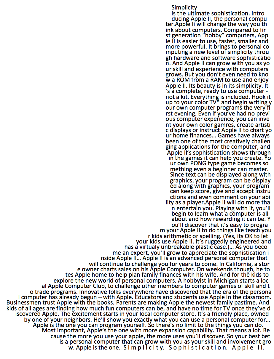
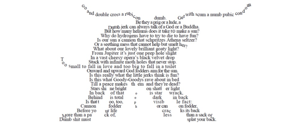
In my composition “Simplicity (Apple II),” I focus on
Apple's marketed simplicity: simple design, simple to use, and simple to purchase.
When Steve Jobs introduced the Apple Macintosh in 1984, he designed his product with
“user-friendly” in mind. The Macintosh was the first personal computer
marketed specifically for the masses. The Macintosh features a GUI, which allows the
user to initiate computer processes by using a mouse to navigate the visual images
on a virtual desktop, in lieu of textual commands.
[2] These substitutions allowed a user to master
the machine with minimal training. For the shape of the poem, I imitate the profile
of the Apple IIe that is on the cover of its user manual (see fig. 2). This
photograph is white and tan, a single finger hovers over the keyboard. This image,
reminiscent of Michelangelo’s “The Creation of Adam”
suggests that humans have now stepped into the ultimate role of creator. This
machine is developed as a divine extension of our own selves. For the text, I draw
from three advertisements (Figures 3, 4, and 5). Each of these texts boasts the
sophistication, user-friendliness, and simplicity of the machine. For example, in
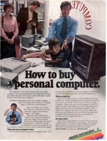
“How to buy a personal computer,” the advertisement
states that
And kids of all ages are finding how
much fun computers can be, and have no time for TV once they’ve discovered
Apple. The excitement starts in your local computer store. It’s a friendly
place, owned by one of your neighbors. He’ll show you exactly what you can
use a personal computer for….
[How To Buy a Personal Computer 1979]
The machine is so simple that kids can use it. It is such fun that it can
replace passive entertainment of the television. Just as Galloway earlier suggests,
the lines between work and play overlap in this medium. Instead of elevating this
machine to perform solely adults' work or minimize it as a venue only for play, the
user is encouraged to search instruction on “exactly what you can use a personal computer for[,]” which includes
programming, “expansion capability,”
and “a personal computer that can grow with
you as your skill and involvement grow”
[
How To Buy a Personal Computer 1979]. Ironically, in this phase Apple celebrated Apple IIe as “the one you can program yourself. So
there’s no limit to the things you can do”
[
How To Buy a Personal Computer 1979]. Shortly thereafter, Apple developed the Macintosh, which severely restricted
the user's access to the system, starting a trend that made the GUI of its operating
system nearly impermeable for the average user.
In a blog post excerpt from the second chapter of her book
Reading Writing Interfaces: From the Digital to the
Bookbound, Lori Emerson outlines the effect of contemporary
GUIs on the consumer. She points to the accepted and prevalent model, originating in
the Macintosh, as a point of man’s exclusion from the functions of the machine,
which the user accepts because of his illusion of control. She writes that:
“user-friendly” now takes the
shape of keeping users steadfastly unaware and uninformed about how their
computers, their reading/writing interfaces, work let alone how they shape
and determine their access to knowledge and their ability to produce
knowledge. As Wendy Chun points out, the user-friendly system is one in
which users are, on the one hand, given the ability to “map, to zoom in
and out, to manipulate, and to act” but the result is a
“seemingly sovereign individual” who is mostly a
devoted consumer of ready-made software and ready-made information whose
framing and underlying mechanisms we are not privy to. However, it’s not
necessarily the GUI per se that is responsible for the creation
of Chun’s “seemingly sovereign individual” but rather a
particular philosophy of computing and design underlying a model of the GUI
that has become the standard for nearly all interface design.
[Emerson 2013]
Modern personal computers rely on the popularized GUI model to cultivate the
consumer's superficial relationship with the product. Instead of the user imagining
what a computer might do and programming it to do so, that individual surveys the
list of available, ready-made programs and uses one for its intended function. A
user, for example, might not understand how a search engine like Google shapes his
experience of information. This user might equate a search on Google to searching
the entire internet (or the entirety of human knowledge, for that matter). Because
of this assumption, he remains unaware of websites Google excludes from its database
and oblivious to how Google presents and privileges information. Furthermore, the
user gains access to this database by responding to the keyword prompt Google's
search engine requires. The “user-friendly” design shapes how the user searches
and filters his experience of information. In spite of the seemingly infinite
expanse of information presented, the program limits the creativity of the user and
the diversity of the resultant information. Emerson explains that “Without a fully open, flexible, and
extensible architecture, the home computer becomes less a tool for learning
and creativity and more a tool for simply ‘handling information’”
[
Emerson 2013]. User-friendly transforms into a tool of unquestioning passivity. Its systems
stifle originality. The system allows users to control, access, and move
information, but it trains the user to react to prompts. The user composes on word
processors, calculates in spreadsheets, and draws in
Paint. And, since the use of these machines saturate our society (at
the time I composed this, I had a PC, a tablet, and a smart phone within three feet
of me), it is natural that the habit of interacting with these machines increasingly
influences users’ cognitive processes and patterns.
The term user-friendly is of course loaded and slippery. It derives from consumer
desires and creator requirements. Consumers want to be masters of their machines
without feeling dumb or discouraged. Moreover, many resist investing the time,
energy, or attention it requires to become experts. Computer corporations devote
themselves to creating user-friendly GUIs and programs for their devices, which make
the consumer believe that they control their product and that the device empowers
the consumer. Creators construct the glossy illusion of user-friendly with intense
labor. In a 1995 issue of
Forbes, an article titled
“New Hope for Computer Illiterates” cites the general
manager of IBM personal systems division Richard Thoman's estimate that one in three
personal computers taken home “fails”
[
Pitta 1995]. This overwhelming failure rate motivated creators of personal computers to
improve how the consumer both interacts with computers and anticipates interacting
with computers.
Creators devoted themselves to discovering how average consumers consume computers.
Kelly Stapleton, leader of one of Microsoft’s “usability” think-groups cited in
“New Hope,” says that her research division works
towards understanding what types of frustrations “novice” users encounter while
computing. She relates that “We found surprising things, like people
doing budgets in the word processor rather than a spreadsheet because the
spreadsheet was too intimidating”
[
Pitta 1995, 89]. The article stresses that “It’s not enough to establish standards
so that different parts of a computer system can talk the same language. You
have to get inside the mind of the consumer and figure out how to make that
language intelligible to him, too”
[
Pitta 1995, 89]. In order to achieve “user-friendly,” programmers watched consumers
through one-way mirrors, product teams met for tens of hours with computer-using
families, and companies fluxed telephone support lines. Designing computers that
spoke and were understood became a manufacturer priority.
Creators trumpeted the “user-friendliness” and transparency of their machines,
which came increasingly under criticism as “novice” consumers bought their way
into personal computing. “New Hope” laments the “unfriendliness” of computers still
experienced in 1995:
Mail merge lets Microsoft Word, the
company’s popular word processor, add names and addresses ‘instantly’ to a
form letter. But there’s nothing instant about mastering the feature:
Walking a perplexed user through mail merge typically takes 30 minutes.
Computer pros might have laughed off such problems a few years ago, when
most computers sat in offices that had in-house help. But now that the
personal computer business is moving to the home market, murky, quirky
software and hardware can lose a customer forever. Some marvel that
consumers keep on buying, despite their disappointments.
[Pitta 1995, 88]
The economic impetus of “user-friendly” certainly gained momentum in the
1970s and 1980s, but the battle against “murky, quirky software and hardware” waged on through the 1990s [
Pitta 1995, 88]. It continues today. In fact, Microsoft's
redesign of the time-tried, user-trained, classic desktop has met mixed receptions.
In response to complaints about Windows 8's user-unfriendliness, classicshell.net
created a program, which simulates the previously existing, familiar PC desktop.
Classic Shell boasts that it provides “free software that improves your
productivity, enhances the usability of Windows and empowers you to use the
computer the way you like it”
[
Classic Shell 2014]. They laud their product's popularity, showcasing 12,000 Facebook likes and
15 million downloads over four years. The threat of losing consumers, through a
not-so-transparent GUI model, drives software development and determines the
marketability of a machine.
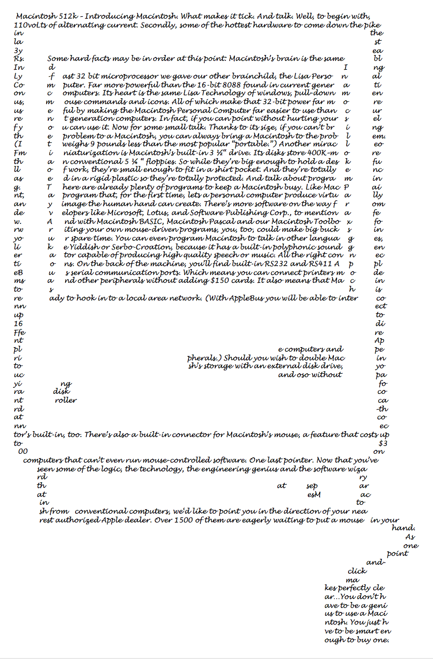
In my composition “Lisa,” the intersection of simplicity,
individuality, and technology reflects the manufacturer’s focus in its
advertisements. I excerpted the text from an advertisement entitled “Introducing Macintosh. What makes it tick. And Talk” (see
figure 5) [
Introducing Macintosh 1984]. Hoping to allay technological
resistance, Apple personifies its machine, dubbing the Macintosh 512k with a
domestically appealing name (Lisa) and emphasizing her dexterity. In the
advertisement, her name is scrawled across the screen in cursive. The advertisement
boasts of Lisa’s creative and cognitive capacities with interfaces
Like Mac Paint, a program that,
for the first time, lets a personal computer produce virtually any image the
human hand can create. There’s more software on the way from developers like
Microsoft, Lotus, and Software Publishing Corp., to mention a few. And with
Macintosh BASIC, Macintosh Pascal and our Macintosh Toolbox for writing your
own mouse-driven programs, you, too, could make big bucks in your spare
time. You can even program Macintosh to talk in other languages, like
Yiddish or Serbo-Croation, because it has a built-in polyphonic sound
generator capable of producing high quality speech or music…
[Introducing Macintosh 1984]
Apple clearly moves towards using its computer as a human improved extension
of the self. This extension draws exquisitely, speaks foreign languages with ease,
and produces prodigious music with the click of a mouse. By focusing the user on the
ease of navigating visual icons, the efficiency of the machine to produce specific
output becomes to the focus of the personal computer, not the adaptability for
personal use.
In order to create this type of system, which runs more efficiently and is therefore
more universally user-friendly, the system of variables must be closed. Creators
need to standardize the production of computers and their components and relegate
users to their place as interchangeable parts of the system. The concept of
conforming to new media rather than controlling it, although cultivated in computing
in the 1980s and 90s, has been an element of how mankind experiences media for as
long as media have existed. Systems of writing, paper, and writing utensils
standardize written language. Humans, as consumers over time, become increasingly
passive in mediatic participation, especially as systems become more complex. In
Jonathan Crary’s essay “Techniques of the Observer,” he
discusses Sir David Brewster’s kaleidoscope, which was invented in 1815. According
to Crary, Brewster views “productivity and
efficiency” as essential to this visual machine (Brewster, cited in [
Crary 1988]). More importantly, he considers it a “mechanical means for the reformation of art according to an
industrial paradigm” (Brewster, cited in [
Crary 1988, 22]). The resultant art form, a reflection and collection of still
images, orders seemingly common objects into a beautiful narrative. As the observer
interacts with the machine, minimal work creates endlessly original forms to admire.
This action and its product is, of course, limited. For the machine to function
properly, the user maintains distance from the inner workings and plays the role
expected by the designer. Evolving visual and industrial technologies require users
to play a specific part in the functioning of the machine.
No longer the maker, the user becomes an element of the apparatus, a cog in the
machine. Crary justifies this move by applying Marxist theory to elucidate
human-machine relationships, “In the factory, Marx contend[s], the
machine makes use of man by subjecting him to a relation of contiguity, of
part to other parts, and of exchangeability… the apparently passive
observers of the stereoscope and Phenakistiscope were in fact made into
producers, by virtue of specific physical capacities, of forms of
verisimilitude”
[
Crary 1988, 33]. By becoming necessary not to the functioning, but to the purpose of the
machine, the user becomes part of the machine itself. In order to create the artwork
these machines were designed to produce, the user must actively contribute. That is,
the observer must work to observe. The consumer continually embraces illusions,
which deceive him into thinking he maintains control: “An apparatus openly based on a
principle of disparity […] inevitably would give way to a form that
preserved the referential illusion more fully than anything before
it”
[
Crary 1988, 35]. The user depends on the illusion of natural, human privilege to structure
his consumer existence. For our current society, the ways in which consumers want
and expect the quick, accessible, and “user-friendly” still denote these
individuals as components of the machine. They become increasingly dependent on
technologies as self-explanatory extensions of themselves. Users engage with digital
technology in much the same way that the observer engages with the phenakistiscope.
In both cases, the user works as an element of the machine in order to produce
beautiful objects that are limited by the medium of their creation.
No one exemplifies how to defy the limits a medium, using its constraints as a source
of inspiration, better than the makers of concrete poetry. Concrete poetry became
internationally significant beginning in the 1950s. In her seminal work entitled
Concrete Poetry: A World View, published in 1968,
Mary Ellen Solt traces the emergence of concrete poetry on the international stage.
The movement originated simultaneously in Switzerland, with poet Eugen Gomringer,
and in Brazil, with the Noigandres group. In her introduction, Solt offers a broad
definition of concrete poetry:
Generally speaking the material of the
concrete poem is language: words reduced to their elements of letters (to
see) syllables (to hear). Some concrete poets stay with whole words. Others
find fragments of letters or individual speech sounds more suited to their
needs. The essential is reduced language... the concrete poet is concerned
with establishing his linguistic materials in a new relationship to space
(the page or its equivalent) and/or to time (abandoning the old linear
measure). Put another way this means the concrete poet is concerned with
making an object to be perceived rather than read. The visual poem is
intended to be seen like a painting; the sound poem is composed to be
listened to like music. Concrete poets, then, are united in their efforts to
make objects or compositions of sounds from particular materials.
[Solt 1968]
Concrete poetry breaks with traditional forms set out by canonical poetry and
constructs previously uncharted structures on the page. Juri Valoch, a
Czechoslovakian poet, states that concrete poetry permits “as much freedom as possible” and that the concrete
poet’s goal is “to move as far as possible
from traditional poetry” and write his “own things, unhampered, yet with a sense of form”
(Valoch, cited in [
Solt 1968]). This focus on structure occupies the
focus of the artist, but form must be of the artist’s own creation, uninhibited by
the formalities and expectations of the existing canon of literature. The concrete
poets revise what it means to compose. They rethink and revise the literary,
historical, and media expectations in order to create a space for their own creative
imaginations to flourish. In
Culture is Our Business,
McLuhan describes creative composers as the ultimate visionaries. He writes that “Poets and artists live on frontiers.
They have no feedback, only feedforward. They have no identities. They are
probes”
[
McLuhan 1970, 44]. These individuals, like their work, accept no boundaries. Concrete poets
compose with multimedia, often appealing in diverse ways (through writing, sound,
and sight), in what the Noigandres refer to as “verbivocovisual.” These “experimental” poems serve “as an act of protest against... traditionalism” (Ernst
Jandl, cited in [
Solt 1968]). The authors of these often intense
compositions use concrete methodology to reject prescribed methods of creative
thinking.
The typewriter fulfilled a central role to authors' rising interest in composing
concrete poetry. Charles Olsen describes the appeal of the technology, “It is the advantage of the typewriter that, due
to its rigidity and its space precisions, it can, for a poet, indicate exactly
the breath, the pauses, the suspensions even of syllables, the juxtapositions
even of parts of phrases, which he intends” (Olsen, cited in [
Solt 1968]). Emerson writes that the pervasiveness of the typewriter
made it “invisible to its users. The point at
which a technology saturates a culture is the point at which writers and
artists, whose craft is utterly informed by a sensitivity to their tools,
begin to break apart that same technology to once again draw attention to
the way in which it offers certain limits and possibilities to thought and
expression”
[
Emerson 2014b]. Poet Ronal Johnson supports Emerson's theory, when he admits, “As I am unable to think except on the
typewriter, my poems have been, from the beginning, all 8 1/2" X 11”
(Johnson, cited in [
Solt 1968]). The ever-present typewriter so
completely permeates this time period that concrete poets, resisting the formalism
inherent in the tradition of the poem, come to reject the normalized use of the
typewriter, too. Instead of obeying the restrictions of the grid, they disrupt the
expected pattern to draw attention to their intentional misuse of the apparatus.
In spite of this radical refusal of traditional verse, concrete poetry attracted
attention as being overtly academic and excessively “clean.” bp Nichol coined
the phrase “dirty concrete” to
describe a less prescribed, more authentic style of composition. These poets
achieved “dirty” by “court[ing] a visual and linguistic
non-linearity and illegibility by putting the typewriter to the test. As these
poets created smeared letters with inked ribbons or different carbons while
turning and twisting the page, the result was often the imprint of letters that
appeared literally dirty or rough around their edges”
[
Emerson 2014b]. Authors like bp Nichol implemented these
compositional tactics to avoid falling into the “trap” of “clean” concrete. He stresses that the author must
remain “open and flexible... willing to
keep seeking new exits and entrances with regard to the poem” (Nichol,
cited in [
Emerson 2014b]. By resisting the strict concrete poetry or
even Solt's suggestion that a generalized definition exists, dirty concrete remains
aggressively counter to its ostensibly mainstream counterpart.
The ever-present PC, in many ways, parallels the presence of the typewriter in the
1950s, 60s and 70s, which led artists to experiment with the grid-like form of
mechanical type to create concrete poetry. Perhaps the most obvious reincarnation of
these dirty typewriter artists and their goals is through glitch art. Glitch art or
glitch aesthetics has its roots in the most basic malfunctioning of electronic
equipment (glitch). Its aesthetics reside in those moments when the digital, visual,
or auditory performs in unexpected ways: the “wrong” colors, extreme
pixilation, a skipping recording, an alien-like photo, an upside-down video, a link
that leads nowhere, etc. Glitch aesthetics, then, as Emerson explains it in
The John Hopkins Guide to Digital Media, “involves experimentation with the
visible results of provoked or unprovoked computer error”
[
Emerson 2014a, 235]. The artists who “glitch” rely on the unanticipated, and often
anxiety-producing, behaviors of technology as the foundation of their art form. That
is, theirs are compositions focus on what usually creates unease in the user,
something other than the standard, anticipated construct of the GUI.
Disobeying through art, especially digital art, is nothing new. Art collective JODI,
comprised of Joan Heemskerk and Dirk Paesmans, chose the Internet as its medium in
the mid-1990s and, since then, have built one of the most expansive collections of
digital art, radicalizing what is expected, respected, and produced. JODI revels in
the inconstancy of technology and machines. Its creators juxtapose any number of
tools (glitch art, unseen hyperlinks, familiar formatting, uncomfortably distorted
interfaces, etc.) with the user's expectations for what the interface should do.
They masterfully and unpredictably upset those expectations. On March 17, 1999,
Christiane Paul wrote, “There are interfaces so commonplace that
we hardly notice them anymore. The computer presents itself as a desktop,
with a little trash can bottom right, pull-down menus, scroll bars, system
icons. With its 'interface in your face' approach, the website of jodi.org
might be an antidote to our obliviousness to interface
standardization”
[
JODI 1999]. Users have been so successfully trained to interact with their machines that
responding to the interface requires hardly any concentration. It is second-nature.
As true as Paul’s observation of the commonplace, invisible interface was in 1999,
how much more so might it be today? In this age of smart phones, tablets, laptops,
and (increasingly) wearables, the pervasiveness and touted user-friendly,
self-explanatory nature of these multi-media devices has become the norm for any who
can afford it and many who cannot. Perhaps Paul is correct, maybe our society needs
JODI to draw attention to the processes in which the user partakes. When a user
clicks “I Agree” under a “User Agreement,” the system is not supposed to
shut down (as it inevitably will at
wwwwwwwww.jodi.org). When the user mouses over nothing, that mouse should
not encounter a hyperlink. That very hyperlink should, the user is taught, direct
the computer’s flow to a new, recognizable interface.
JODI does not subscribe to these “shoulds,” rather they revel in glitch to
disrupt the user’s passive compliance to their machines. In
Technology and Industry News – Chicago, tech-artist Nick Briz explains
that “Where technology attempts to be
transparent and nonintrusive, JODI makes it obvious, abrupt, unsettling,
confusing”
[
Briz 2011]. As JODI provides opportunities for an individual to toy with their
creations, they interrupt the user’s expectations of the interface. The user must
confront the idea that the apparent transparency of the taken-for-granted GUI is
actually a disguise for many complicated processes, which lie beneath the surface of
the interface and which overtly shape what the user creates. When a user encounters
JODI’s work, that individual is made “forcefully aware of the role technology
is playing in [his/her] relationship to the world (or at the very least
aware that it is playing a role)”
[
Briz 2011]. Through their disruption of the norm, JODI highlights how distant the user
is from what happens behind the interface.
To distract the user from his or her ignorance of a device’s inner workings,
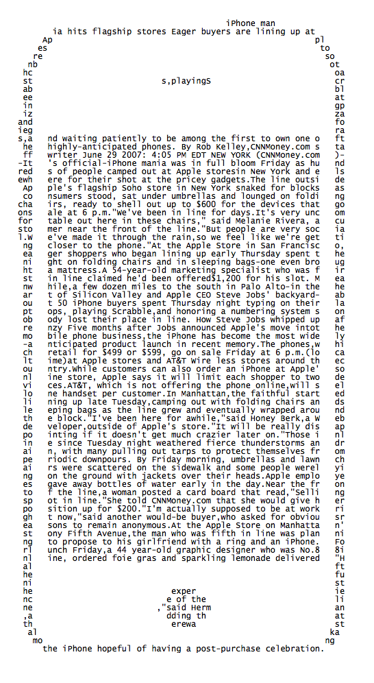
manufacturers place humanity at the center of a device’s advertising. My “iPhone” composition shows how the element of community
became central to “iPhone mania.” Unlike my previous compositions, I drew the
text for this poem from Rob Kelley’s article, titled “iPhone
mania hits flagship stores”
[
Kelley 2007]. This piece hearkens back to the human qualities Apple
began to emphasize with Lisa. Instead of recognizing this device as an extension of
an individual’s cognitive and creative abilities, the iPhone morphed into a promise
of “connectedness” and community. Although smart phones supply knowledge at the
swipe of a finger, they (more importantly) reconnect the isolated with the
community. Kelley points out that when this new technology (the iPhone) came out,
individuals lined the streets for days in advance. However, the technical prowess of
the machine was rarely the focus:
At the Apple Store on Manhattan's tony
Fifth Avenue, the man who was fifth in line was planning to propose to his
girlfriend with a ring and an iPhone. For lunch Friday, a 44 year-old
graphic designer who was No.88 in line, ordered foie gras and sparkling
lemonade delivered. “Half the fun is the experience of the line,”
said Herman, adding that there was talk among the iPhone hopeful of having a
post-purchase celebration.
[Kelley 2007]
This article points to engagements, shared meals, and celebrations, as the
appeal of purchasing an iPhone. Although ease of use and technological capabilities
certainly play a role in convincing consumers to purchase a device, it seems
undeniable that the calculated inclusion of human capabilities, including social
connectivity and individual creativity, remains central to the lure of these
products.
Considering Apple’s successes invoking humanity to market their technology, shouldn’t
a move which allows for less-impeded creation be the next step? Rather than
continuing the process of packaged, disjointed functions, creators
could unlock the interface for its users. They could
design more flexible, penetrable programs. By opting for transparency in the GUI,
allowing their users to meddle and make mistakes, developers could remove some
obstacles to creative production, which have been in place for decades.
In spite of my criticisms, I do not suggest personal computing would be better off
without user-friendly programs or GUIs. In fact, I doubt that a realistic
alternative to user-friendly currently exists. In some way or another, every device
since the beginning of time has appealed to its user for the purpose of being (often
easily) used. My aim in producing this work is not rejection of our computers’
limitations, but awareness. My compositions point to the creative space neglected by
users as they blindly work in supposedly invisible interfaces. My poems encourage
users to acknowledge how machines influence their thoughts and creations. The intent
is to draw attention to the media of the composition and the constraints and
expectations built into that program or interface. My work disobeys the prompts of
the machine to emphasize what the user sacrifices for user-friendly.
I acknowledge that my poems may not stir Apple, Microsoft, or any of the other
technological monoliths to make the inner-workings of their products transparent and
accessible. As the authors of
Electronic Civil Disobedience
write, “Since revolution is not a viable
option, the negation of negation is the only realistic course of action.
After two centuries of revolution and near-revolution, one historical lesson
continually appears – authoritarian structure cannot be smashed; it can only
be resisted”
[
Critical Art Ensemble 1997, 24]. That is, I am not deluded. My poems and what they stand for are not going to
start a revolution. However, they
may make people think. Again in
ECD, it states that changes “can happen in a realistic sense,
not because of a corporate-military ideological shift, but because it would
be cheaper to reform than to continue the battle”
[
Critical Art Ensemble 1997, 25]. In a battle there is the effort of fighting. So, my goal is individual
effective resistance: resisting machines’ default settings, denying information
access, unearthing what goes on behind even the most basic programs, and thinking
creatively outside the “page.” I hope to inspire the idea that, although
functionality and user-friendliness are comfortable and convenient, they should not
only be available at the cost of lock-boxed, streamlined, productive output.
Works Cited
Apple 1980 Apple Computer 1980, Apple IIe Owner’s Manual. Apple Computer, Media
Archaeology Lab at the University of Colorado, Boulder. Personal photograph,
2013.
Crary 1988 Crary, J 1988, “Techniques of the Observer”
The MIT Press. October, Vol. 45, Summer, 1988, pp.
3-35. Available from JSTOR
http://www.jstor.org/stable/779041 [15 May 2015]
Critical Art Ensemble 1997 Critical Art
Ensemble, 1997, Electronic Civil Disobedience: and Other
Unpopular Ideas, Autonomedia, New York.
Emerson 2014a Emerson, L 2014, “Glitch Aesthetics”. in The Johns
Hopkins Guide to Digital Media, eds M Ryan, L Emerson, and B
Robertson, Johns Hopkins University Press, Baltimore, 2014.
Emerson 2014b Emerson, L 2014, Reading Writing Surfaces, University of Minnesota
Press, Minneapolis, 2014.
Funkhouser 2007 Funkhouser, C 2007. Prehistoric Digital Poetry. University of Alabama
Press, Tuscaloosa, 2007.
Galloway 2012 Galloway, A 2012, “The Unworkable Interface”. in The
Interface Effect, Polity Press, Cambridge, 2012.
JODI 1999 The Art, Technology, and Culture
Colloquium 1999, 1999.
Jodi, UC Berkley’s Center
for New Media. Available from:
http://atc.berkeley.edu/bio/JODI/. [1 November 2015].
Kittler 1986 Kittler, F 1986, Gramophone, Film, Typewriter, Stanford University
Press, Stanford.
McLuhan 1964 McLuhan, M 1964, Understanding Media: The extensions of man, Routledge,
London.
McLuhan 1970 McLuhan, M 1970, Culture Is Our Business, McGraw-Hill Book Co.,
Toronto.
Niebisch 2012 Niebisch, A 2012, Media Parasites in the Early Avant-Garde: On the Abuse of
Technology and Communication, Palgrave, New York.
OED Online ‘obedience, n.’ OED
Online 2000, n. p.: Oxford University Press, 2000-, USMA Library
Catalog, EBSCOhost, viewed [11 May 2015].
Pitta 1995 Pitta, J 1995. “New
hope for computer illiterates?”, Forbes,
pp. 88-89.
Solt 1968 Solt, M E 1968,
Concrete Poetry: A World View, Indiana University Press,
Bloomington, Indiana. Available from:
http://www.ubu.com/papers/solt. [15 September 2015].